This tutorial covers how to read in a NEON lidar Canopy Height Model (CHM) geotiff file into a Python rasterio object, shows some basic information about the raster data, and then ends with classifying the CHM into height bins.
Learning Objectives
After completing this tutorial, you will be able to:
User rasterio to read in a NEON lidar raster geotiff file
Plot a raster tile and histogram of the data values
Create a classified raster object using thresholds
For this lesson, we will read in a Canopy Height Model data collected at NEON's Lower Teakettle (TEAK) site in California. This data is downloaded in the first part of the tutorial, using the Python neonutilities package.
In this tutorial, we will work with the NEON AOP L3 LiDAR ecoysystem structure (Canopy Height Model) data product. For more information about NEON data products and the CHM product DP3.30015.001, see the Ecosystem structure data product page on NEON's Data Portal.
First, let's import the required packages and set our plot display to be in-line:
import dotenv
import os
import copy
import neonutilities as nu
import numpy as np
import rasterio as rio
from rasterio.plot import show, show_hist
import matplotlib.pyplot as plt
As of June 2026, NEON requires an API token for data downloads, to reduce bot scraping and improve user support. Tokens can be generated in NEON data portal user accounts - log in to your account or create one, and go to the API Tokens section. For best practices in storing and using tokens, follow the instructions here. Once you've set up your token as an environment variable, you can load it using the python-dotenv package as follows, optionally specifying the path to the .env file in load_dotenv().
Provisional NEON data are not included. To download provisional data, use input parameter include_provisional=True.


Continuing will download 2 NEON data files totaling approximately 2.9 MB. Do you want to proceed? (y/n)  y


Downloading 2 NEON data files totaling approximately 2.9 MB

100%|███████████████████████████████████████| 2/2 [00:00<00:00,  2.22it/s]
# iterate over directory recursively to show path of downloaded CHM.tif file
for root, dirs, files in os.walk(r'C:\NEON_Data\DP3.30015.001'):
    for name in files:
        if name.endswith('.tif'):
            chm_tile = os.path.join(root, name)
            print(chm_tile)
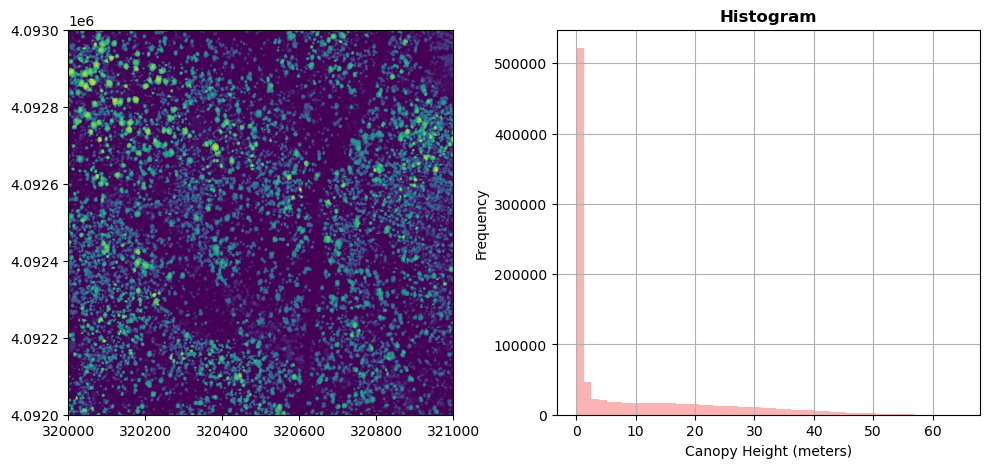
Let's look at the TEAK Canopy Height Model (CHM) to start. We can open and read this in Python using the rasterio.open function:
# read the chm file to the variable chm_dataset
chm_dataset = rio.open(chm_tile)
Now we can look at a few properties of this dataset to start to get a feel for the rasterio object:
print('chm_dataset:\n',chm_dataset)
print('\nshape:\n',chm_dataset.shape)
print('\nno data value:\n',chm_dataset.nodata)
print('\nspatial extent:\n',chm_dataset.bounds)
print('\ncoordinate information (crs):\n',chm_dataset.crs)
chm_dataset:
 <open DatasetReader name='C:\NEON_Data\DP3.30015.001\neon-aop-products\2024\FullSite\D17\2024_TEAK_7\L3\DiscreteLidar\CanopyHeightModelGtif\NEON_D17_TEAK_DP3_320000_4092000_CHM.tif' mode='r'>

shape:
 (1000, 1000)

no data value:
 -9999.0

spatial extent:
 BoundingBox(left=320000.0, bottom=4092000.0, right=321000.0, top=4093000.0)

coordinate information (crs):
 PROJCS["WGS 84 / UTM zone 11N",GEOGCS["WGS 84",DATUM["World Geodetic System 1984",SPHEROID["WGS 84",6378137,298.257223563]],PRIMEM["Greenwich",0],UNIT["degree",0.0174532925199433,AUTHORITY["EPSG","9122"]]],PROJECTION["Transverse_Mercator"],PARAMETER["latitude_of_origin",0],PARAMETER["central_meridian",-117],PARAMETER["scale_factor",0.9996],PARAMETER["false_easting",500000],PARAMETER["false_northing",0],UNIT["metre",1,AUTHORITY["EPSG","9001"]],AXIS["Easting",EAST],AXIS["Northing",NORTH]]
Plot the Canopy Height Map and Histogram
We can use rasterio's built-in functions show and show_hist to plot and visualize the CHM tile. It is often useful to plot a histogram of the geotiff data in order to get a sense of the range and distribution of values.
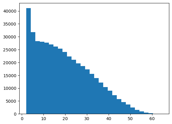
On your own, adjust the number of bins, and range of the y-axis to get a better sense of the distribution of the canopy height values. We can see that a large portion of the values are zero. These correspond to bare ground. Let's look at a histogram and plot the data without these zero values which are dominating the frequency distribution. To do this, we'll remove all values > 2 m. Due to the vertical range resolution of the lidar sensor, data collected with the older Optech Gemini sensor can only resolve the ground to within 2 m, so anything below that height would be rounded down to zero. Our newer sensors (Riegl Q780 and Optech Galaxy Prime) have a higher range resolution, so the ground can be resolved to within ~0.7 m. To see which lidar sensor collected a given site, refer to the table at the bottom of the Flight Schedules and Coverage page (https://www.neonscience.org/data-collection/flight-schedules-coverage).
From the histogram we can see that the majority of the trees are < 60m. The frequency of tall trees rapidly drops off.
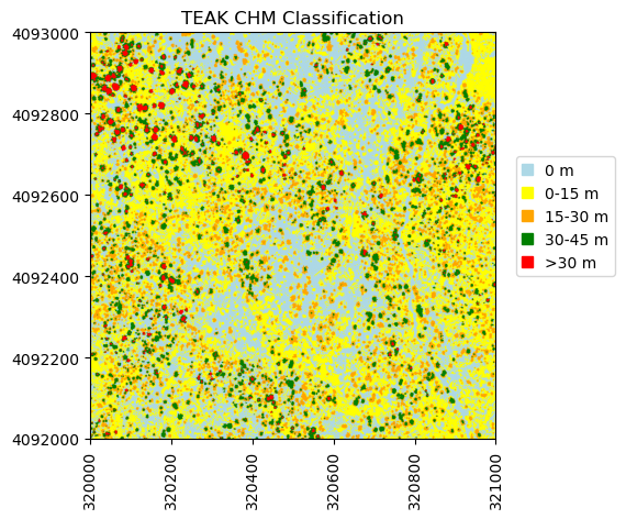
Threshold Based Raster Classification
Next, we will create a classified raster object. To do this, we will use the numpy.where function to create a new raster based off boolean classifications. Let's classify the canopy height into five groups:
Class 1: CHM = 0 m
Class 2: 0m < CHM <= 15m
Class 3: 10m < CHM <= 30m
Class 4: 20m < CHM <= 45m
Class 5: CHM > 45m
We can use np.where to find the indices where the specified criteria is met.
Lastly we can use matplotlib to display this re-classified CHM. We will define our own colormap to plot these discrete classifications, and create a custom legend to label the classes. First, to include the spatial information in the plot, create a new variable called ext that pulls from the rasterio "bounds" field to create the extent in the expected format for plotting.
In this tutorial, we will learn how to extract and plot a spectral reflectance profile (or spectral signature) from a single pixel of a reflectance band in a NEON hyperspectral HDF5 file.
In this lesson, we will cover how to extract and plot a spectral profile from a single pixel of a reflectance band in a NEON hyperspectral hdf5 file. To do this, we will use the aop_h5refl2array function to read in and clean our h5 reflectance data, and Python pandas to create a dataframe for the reflectance and associated wavelength data. We will end with an option example showing how to interactively view spectra from any pixel in a reflectance h5 tile.
Spectral Signatures
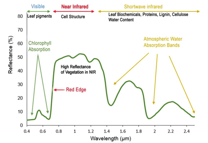
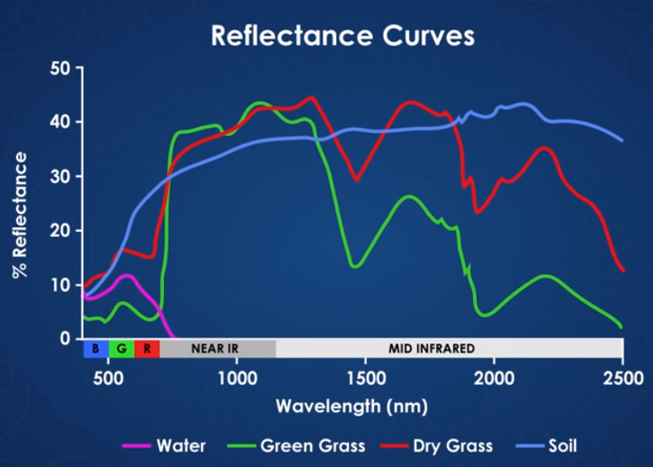
A spectral signature is a plot of the amount of light energy reflected by an object throughout the range of wavelengths in the electromagnetic spectrum. The spectral signature of an object conveys useful information about its structural and chemical composition. We can use these signatures to identify and classify different objects from a spectral image.
For example, vegetation has a distinct spectral signature.
Spectral signature of vegetation. Source: Roman, Anamaria & Ursu, Tudor. (2016). Multispectral satellite imagery and airborne laser scanning techniques for the detection of archaeological vegetation marks.
Vegetation has a unique spectral signature characterized by high reflectance in the near infrared wavelengths, and much lower reflectance in the green portion of the visible spectrum. For more details, refer to Vegetation Analysis: Using Vegetation Indices in ENVI. We can extract reflectance values in the NIR and visible spectrums from hyperspectral data in order to map vegetation on the earth's surface. You can also use spectral curves as a proxy for vegetation health. We will explore this concept more in the next lesson, where we will calculate vegetation indices.
Example spectra of water, green grass, dry grass, and soil. Source: National Ecological Observatory Network (NEON)
Let's get started. First import the required packages.
import os
import dotenv
import neonutilities as nu
import numpy as np
import pandas as pd
import matplotlib.pyplot as plt
import requests
import sys
This next function provides a handy way to download the Python module that we will use in this lesson. This uses the requests package.
# function to download data stored on the internet in a public url to a local file
def download_url(url,download_dir):
    if not os.path.isdir(download_dir):
        os.makedirs(download_dir)
    filename = url.split('/')[-1]
    r = requests.get(url, allow_redirects=True)
    file_object = open(os.path.join(download_dir,filename),'wb')
    file_object.write(r.content)
Download the module from its location on GitHub, add the python_modules to the path and import the neon_aop_hyperspectral.py module.
module_url = "https://raw.githubusercontent.com/NEONScience/NEON-Data-Skills/main/tutorials/Python/AOP/aop_python_modules/neon_aop_hyperspectral.py"
download_url(module_url,'../python_modules')
# os.listdir('../python_modules') #optionally show the contents of this directory to confirm the file downloaded

sys.path.insert(0, '../python_modules')

# import the neon_aop_hyperspectral module
import neon_aop_hyperspectral as neon_hs;
Now that we've imported the required packages and the hyperspectral module, we can download a reflectance dataset using neonutilities and start to explore it. We'll download data from the NEON site Smithsonian Environmental Research Center (SERC). First, use nu.list_available_dates to find what years of data are available for the bidirectional reflectance dataset at SERC.
nu.list_available_dates('DP3.30006.002','SERC')
PROVISIONAL Available Dates: 2022-05, 2025-06
Here we can see the available dates for this dataset. Let's use data from 2025.
As of June 2026, NEON requires an API token for data downloads, to reduce bot scraping and improve user support. Tokens can be generated in NEON data portal user accounts - log in to your account or create one, and go to the API Tokens section. For best practices in storing and using tokens, follow the instructions here. Once you've set up your token as an environment variable, you can load it using the dotenv package as follows, optionally specifying the path to the .env file.
For this example, download the reflectance tile with southwest coordinates of 368000, 4306000 using nu.by_tile_aop. Click y to continue the download after verifying the size (around 660 MB).
Provisional NEON data are included. To exclude provisional data, use input parameter include_provisional=False.


Continuing will download 2 NEON data files totaling approximately 661.3 MB. Do you want to proceed? (y/n)  y
The reflectance data tile is now downloaded into the 'C:/NEON_Data/DP3.30006.002' directory. You can use the code cell below to walk through all the directories and display where the .h5 file was downloaded.
# display .h5 data in the savepath
for root, dirs, files in os.walk(r'C:\Data\DP3.30006.002'):
    for file in files:
        if file.endswith(".h5"):
             h5_tile = os.path.join(root, file)
             print(h5_tile)
# read in the data using the neon_hs module
serc_refl, serc_refl_md, wavelengths = neon_hs.aop_h5refl2array(h5_tile,'Reflectance')
Reading in C:\Data\DP3.30006.002\neon-aop-provisional-products\2025\FullSite\D02\2025_SERC_7\L3\Spectrometer\Reflectance\NEON_D02_SERC_DP3_368000_4306000_bidirectional_reflectance.h5
Optionally, you can view the data stored in the metadata dictionary, and print the minimum, maximum, and mean reflectance values in the tile. In order to ignore NaN values, use numpy.nanmin/nanmax/nanmean.
for item in sorted(serc_refl_md):
    print(item + ':',serc_refl_md[item])

print('\nSERC Tile Reflectance Stats:')
print('min:',np.nanmin(serc_refl))
print('max:',round(np.nanmax(serc_refl),2))
print('mean:',round(np.nanmean(serc_refl),2))
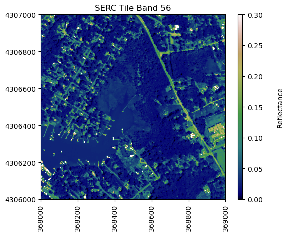
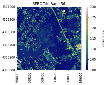
neon_hs.plot_aop_refl(sercb56,
                      serc_refl_md['extent'],
                      colorlimit=(0,0.3),
                      title='SERC Tile Band 56',
                      cmap_title='Reflectance',
                      colormap='gist_earth')
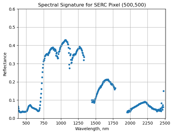
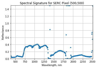
We can use pandas to create a dataframe containing the wavelength and reflectance values for a single pixel - in this example, we'll look at the center pixel of the tile (500,500). To extract all reflectance values from a single pixel, use splicing as we did before to select a single band, but now we need to specify (y,x) and select all bands (using :).
We can now plot the spectra, stored in this dataframe structure. pandas has a built in plotting routine, which can be called by typing .plot at the end of the dataframe.
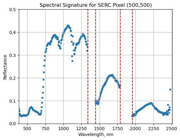
We can see from the spectral profile above that there are spikes in reflectance around ~1400nm and ~1800nm. These result from water vapor which absorbs light between wavelengths 1340-1445 nm and 1790-1955 nm. The atmospheric correction that converts radiance to reflectance subsequently results in a spike at these two bands. The wavelengths of these water vapor bands is stored in the reflectance attributes, which is saved in the reflectance metadata dictionary created with h5refl2array:
bbw1 = serc_refl_md['bad_band_window1'];
bbw2 = serc_refl_md['bad_band_window2'];
print('Bad Band Window 1:',bbw1)
print('Bad Band Window 2:',bbw2)
Bad Band Window 1: [1340 1445]
Bad Band Window 2: [1790 1955]
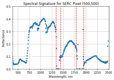
Below we repeat the plot we made above, but this time draw in the edges of the water vapor band windows that we need to remove.
serc_pixel_df.plot(x='wavelengths',y='reflectance',kind='scatter',edgecolor='none');
plt.title('Spectral Signature for SERC Pixel (500,500)')
ax1 = plt.gca(); ax1.grid('on')
ax1.set_xlim([np.min(serc_pixel_df['wavelengths']),np.max(serc_pixel_df['wavelengths'])]);
ax1.set_ylim(0,0.5)
ax1.set_xlabel("Wavelength, nm"); ax1.set_ylabel("Reflectance")

#Add in red dotted lines to show boundaries of bad band windows:
ax1.plot((1340,1340),(0,1.5), 'r--');
ax1.plot((1445,1445),(0,1.5), 'r--');
ax1.plot((1790,1790),(0,1.5), 'r--');
ax1.plot((1955,1955),(0,1.5), 'r--');
We can now set these bad band windows to nan, along with the last 10 bands, which are also often noisy (as seen in the spectral profile plotted above). First make a copy of the wavelengths so that the original metadata doesn't change.
w = wavelengths.copy() #make a copy to deal with the mutable data type
w[((w >= 1340) & (w <= 1445)) | ((w >= 1790) & (w <= 1955))]=np.nan #can also use bbw1[0] or bbw1[1] to avoid hard-coding in
w[-10:]=np.nan;  # the last 10 bands sometimes have noise - best to eliminate
#print(w) #optionally print wavelength values to show that -9999 values are replaced with nan
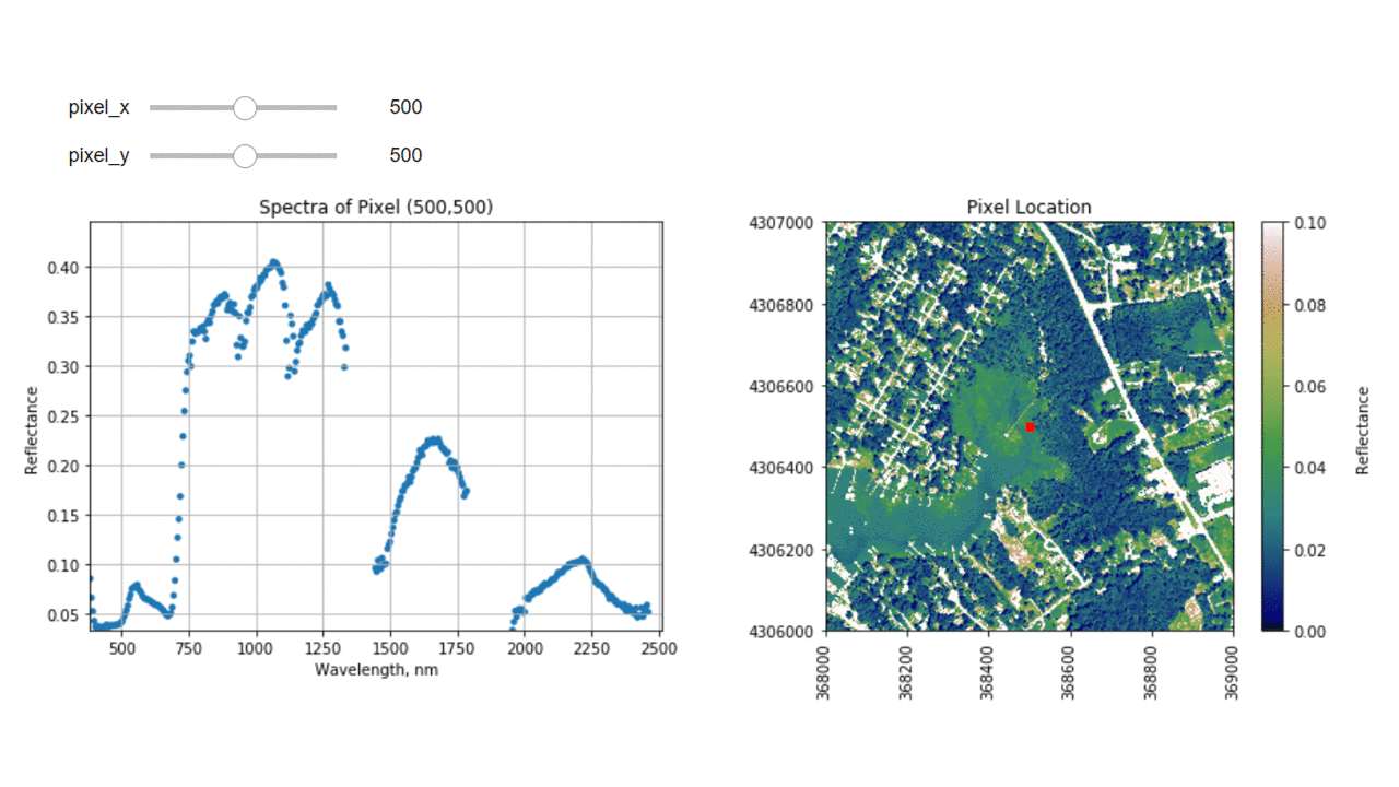
Interactive Spectra Visualization
Finally, we can create a widget to interactively view the spectra of different pixels along the reflectance tile. Run the cell below, and select different pixel_x and pixel_y values to gain a sense of what the spectra look like for different materials on the ground.
In this tutorial, we will learn how to extract and plot a spectral profile from a single pixel of a reflectance band in a NEON hyperspectral HDF5 file.
In this exercise, we will learn how to extract and plot a spectral profile from
a single pixel of a reflectance band in a NEON hyperspectral hdf5 file. To do
this, we will use the aop_h5refl2array function to read in and clean our h5
reflectance data, and the Python package pandas to create a dataframe for the
reflectance and associated wavelength data.
Spectral Signatures
A spectral signature is a plot of the amount of light energy reflected by an
object throughout the range of wavelengths in the electromagnetic spectrum. The
spectral signature of an object conveys useful information about its structural
and chemical composition. We can use these signatures to identify and classify
different objects from a spectral image.
Vegetation has a unique spectral signature characterized by high reflectance in
the near infrared wavelengths, and much lower reflectance in the green portion
of the visible spectrum. We can extract reflectance values in the NIR and visible
spectrums from hyperspectral data in order to map vegetation on the earth's
surface. You can also use spectral curves as a proxy for vegetation health. We
will explore this concept more in the next lesson, where we will caluclate
vegetation indices.
Example spectra of water, green grass, dry grass, and soil. Source: National Ecological Observatory Network (NEON)
import numpy as np
import matplotlib.pyplot as plt
%matplotlib inline
import warnings
warnings.filterwarnings('ignore') #don't display warnings
Import the hyperspectral functions file that you downloaded into the variable neon_hs (for neon hyperspectral):
import os

# Note: you will need to update this filepath according to your local machine
os.chdir("/Users/olearyd/Git/data/")
import neon_aop_hyperspectral as neon_hs
# Note: you will need to update this filepath according to your local machine
sercRefl, sercRefl_md = neon_hs.aop_h5refl2array('/Users/olearyd/Git/data/NEON_D02_SERC_DP3_368000_4306000_reflectance.h5')
Optionally, you can view the data stored in the metadata dictionary, and print the minimum, maximum, and mean reflectance values in the tile. In order to handle any nan values, use Numpynanminnanmax and nanmean.
for item in sorted(sercRefl_md):
    print(item + ':',sercRefl_md[item])

print('SERC Tile Reflectance Stats:')
print('min:',np.nanmin(sercRefl))
print('max:',round(np.nanmax(sercRefl),2))
print('mean:',round(np.nanmean(sercRefl),2))
For reference, plot the red band of the tile, using splicing, and the plot_aop_refl function:
We can use pandas to create a dataframe containing the wavelength and reflectance values for a single pixel - in this example, we'll look at the center pixel of the tile (500,500).
import pandas as pd
To extract all reflectance values from a single pixel, use splicing as we did before to select a single band, but now we need to specify (y,x) and select all bands (using :).
We can now plot the spectra, stored in this dataframe structure. pandas has a built in plotting routine, which can be called by typing .plot at the end of the dataframe.
We can see from the spectral profile above that there are spikes in reflectance around ~1400nm and ~1800nm. These result from water vapor which absorbs light between wavelengths 1340-1445 nm and 1790-1955 nm. The atmospheric correction that converts radiance to reflectance subsequently results in a spike at these two bands. The wavelengths of these water vapor bands is stored in the reflectance attributes, which is saved in the reflectance metadata dictionary created with h5refl2array:
bbw1 = sercRefl_md['bad band window1'];
bbw2 = sercRefl_md['bad band window2'];
print('Bad Band Window 1:',bbw1)
print('Bad Band Window 2:',bbw2)
Bad Band Window 1: [1340 1445]
Bad Band Window 2: [1790 1955]
Below we repeat the plot we made above, but this time draw in the edges of the water vapor band windows that we need to remove.
serc_pixel_df.plot(x='wavelengths',y='reflectance',kind='scatter',edgecolor='none');
plt.title('Spectral Signature for SERC Pixel (500,500)')
ax1 = plt.gca(); ax1.grid('on')
ax1.set_xlim([np.min(serc_pixel_df['wavelengths']),np.max(serc_pixel_df['wavelengths'])]);
ax1.set_ylim(0,0.5)
ax1.set_xlabel("Wavelength, nm"); ax1.set_ylabel("Reflectance")

#Add in red dotted lines to show boundaries of bad band windows:
ax1.plot((1340,1340),(0,1.5), 'r--')
ax1.plot((1445,1445),(0,1.5), 'r--')
ax1.plot((1790,1790),(0,1.5), 'r--')
ax1.plot((1955,1955),(0,1.5), 'r--')
[<matplotlib.lines.Line2D at 0x81aaccb70>]
We can now set these bad band windows to nan, along with the last 10 bands, which are also often noisy (as seen in the spectral profile plotted above). First make a copy of the wavelengths so that the original metadata doesn't change.
import copy
w = copy.copy(sercRefl_md['wavelength']) #make a copy to deal with the mutable data type
w[((w >= 1340) & (w <= 1445)) | ((w >= 1790) & (w <= 1955))]=np.nan #can also use bbw1[0] or bbw1[1] to avoid hard-coding in
w[-10:]=np.nan;  # the last 10 bands sometimes have noise - best to eliminate
#print(w) #optionally print wavelength values to show that -9999 values are replaced with nan
Interactive Spectra Visualization
Finally, we can create a widget to interactively view the spectra of different pixels along the reflectance tile. Run the two cells below, and interact with them to gain a better sense of what the spectra look like for different materials on the ground.
#define index corresponding to nan values:
nan_ind = np.argwhere(np.isnan(w))

#define refl_band, refl, and metadata
refl_band = sercb56
refl = copy.copy(sercRefl)
metadata = copy.copy(sercRefl_md)
This tutorial introduces NEON's Level 3 (mosaicked) RGB camera images, Data Product (DP3.30010.001) and uses the Python package rasterio to read in and plot the camera data in Python. In this lesson, we will read in an RGB camera tile collected over the NEON Smithsonian Environmental Research Center (SERC) site and plot the mutliband image, as well as the individual bands. This lesson was adapted from the rasterio plotting documentation.
Learning Objectives
After completing this tutorial, you will be able to:
Have an idea of some research applications using airborne camera imagery
Plot a NEON RGB camera geotiff tile in Python using rasterio
For this lesson, we will work with L3 RGB Camera data collected at NEON's Smithsonian Environmental Research Center (SERC) site. This data is downloaded in the first part of the tutorial, using the Python neonutilities package.
Background
As part of the
NEON Airborne Operation Platform's
suite of remote sensing instruments, the digital camera produces high-resolution (<= 10 cm) photographs of the earth’s surface. The camera records light energy that has reflected off the ground in the visible portion (red, green and blue) of the electromagnetic spectrum. Often the camera images are used to provide context for the hyperspectral and LiDAR data, but they can also be used for research purposes in their own right. One such example is the tree-crown mapping work by Weinstein et al. - see the links below for more information!
For more interactive notebooks showing examples of working with airborne camera imagery, including with the DeepForest package (and other environmental applications), check out:
In this lesson we will keep it simple and show how to read in and plot a single camera file (1km x 1km ortho-mosaicked tile) - a first step in any research incorporating the AOP camera data (in Python).
Tip: To run a code chunk (cell) in Jupyter Notebook you can either select Cell > Run Cells with your cursor placed in the cell you want to run, or use the shortcut key Shift + Enter. For more handy shortcuts, refer to the tab Help > Keyboard Shortcuts.
Import required packages
First let's import the packages that we'll be using in this lesson.
import os
import dotenv
import neonutilities as nu
import rasterio as rio
from rasterio.plot import show, show_hist
import matplotlib.pyplot as plt
Next, let's download a single camera file (1 km x 1 km tile).
As of June 2026, NEON requires an API token for data downloads, to reduce bot scraping and improve user support. Tokens can be generated in NEON data portal user accounts - log in to your account or create one, and go to the API Tokens section. For best practices in storing and using tokens, follow the instructions here. Once you've set up your token as an environment variable, you can load it using the python-dotenv package as follows, optionally specifying the path to the .env file in load_dotenv().
# download the RGB Camera data to the C:/data directory - change this if desired
nu.by_tile_aop(dpid='DP3.30010.001',
               site='SERC',
               year=2021,
               easting=368000,
               northing=4306000,
               token=token,
               savepath=r'C:\data')
Provisional NEON data are not included. To download provisional data, use input parameter include_provisional=True.


Continuing will download 2 NEON data files totaling approximately 68.8 MB. Do you want to proceed? (y/n)  y


Downloading 2 NEON data files totaling approximately 68.8 MB

100%|█████████████████████████████████████████████████████████████████████████████████████████████████████████████████████████| 2/2 [00:01<00:00,  1.05it/s]
Display the RGB tile that you've downloaded:
rgb_dir = os.path.expanduser(r"C:\data\DP3.30010.001")

for root, dirs, files in os.walk(rgb_dir):
    for file in files:
        if file.endswith('.tif'):
            rgb_file = os.path.join(root, file)
            print(rgb_file)
We can open and read this RGB data that we downloaded in Python using the rasterio.open function:
# read the RGB file (including the full path) to the variable rgb_dataset
rgb_dataset = rio.open(rgb_file)
Let's look at a few properties of this dataset to get a sense of the information stored in the rasterio object:
print('rgb_dataset:\n',rgb_dataset)
print('\nshape:\n',rgb_dataset.shape)
print('\nspatial extent:\n',rgb_dataset.bounds)
print('\ncoordinate information (crs):\n',rgb_dataset.crs)
rgb_dataset:
<open DatasetReader name='C:\data\DP3.30010.001\neon-aop-products\2021\FullSite\D02\2021_SERC_5\L3\Camera\Mosaic\2021_SERC_5_368000_4306000_image.tif' mode='r'>
shape:
(10000, 10000)
spatial extent:
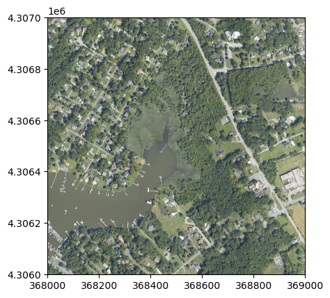
BoundingBox(left=368000.0, bottom=4306000.0, right=369000.0, top=4307000.0)
coordinate information (crs):
PROJCS["WGS 84 / UTM zone 18N",GEOGCS["WGS 84",DATUM["World Geodetic System 1984",SPHEROID["WGS 84",6378137,298.257223563]],PRIMEM["Greenwich",0],UNIT["degree",0.0174532925199433,AUTHORITY["EPSG","9122"]]],PROJECTION["Transverse_Mercator"],PARAMETER["latitude_of_origin",0],PARAMETER["central_meridian",-75],PARAMETER["scale_factor",0.9996],PARAMETER["false_easting",500000],PARAMETER["false_northing",0],UNIT["metre",1,AUTHORITY["EPSG","9001"]],AXIS["Easting",EAST],AXIS["Northing",NORTH]]
Unlike the other AOP data products, camera imagery is generated at 10cm resolution, so each 1km x 1km tile will contain 10000 pixels (other 1m resolution data products will have 1000 x 1000 pixels per tile, where each pixel represents 1 meter).
Plot the RGB multiband image
We can use rasterio's built-in functions show to plot the CHM tile.
show(rgb_dataset);
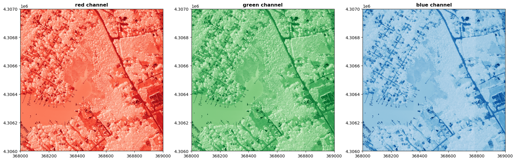
Plot each band of the RGB image
We can also plot each band (red, green, and blue) individually as follows:
That's all for this example! Most of the other AOP raster data are all single band images so you can't make a 3-band composite like for the camera. You can make RGB composites using different bands of the hyperspectral data. In summary, rasterio is a handy Python package for working with any geotiff files. You can download and visualize the lidar and spectrometer derived raster images similarly.
There are myriad resources out there to learn programming in R. After linking to
a tutorial on how to install R and RStudio on your computer, we then outline a
few different paths to learn R basics depending on how you enjoy learning, and
finally we include a few resources for intermediate and advanced learning.
Setting Up your Computer
Start out by installing R and, we recommend, RStudio, on your computer. RStudio
is an Interactive Development Environment (IDE) for the R program. It
is optional, but recommended when working with R. Directions
for installing can be found within the tutorial Install Git, Bash Shell, R & RStudio.
You will need administrator permissions on your computer.
Pathways to Learning the Basics of R
In-person trainings
If you prefer to learn through in-person trainings, consider local workshops
from The Carpentries Software Carpentry or Data Carpentry (generally ~$25 for a
2-day workshop), courses offered by a local college or university (prices vary),
or organize your colleagues to meet regularly to learn R together (free!).
Online interactive courses
If you prefer to learn in a semi-structured online environment, there are a wide
variety of online courses for learning R including Data Camp, Coursera, edX, and
Lynda.com. Many of these options include free introductory lessons or trial
periods as well as paid courses. We do not have personal experience with
these courses and do not recommend or specifically promote any course.
In program interactive course
Swirl
is guided introduction to R where you code along with the instructions in R. You
get direct feedback when you type a command incorrectly. To use this package,
once you have R or RStudio open and running, use the following commands to start
the first lesson.
install.packages("swirl")
library(swirl)
swirl()
Online tutorials
If you prefer a less structured online environment, these tutorial series may be
better suited for you.
Learn R with a focus on data analysis. Beyond the basics, it covers dyplr for
data aggregation & manipulation, ggplot2 for plotting, and touches on
interacting with an SQL database. Designed to be taught by an instructor but the
materials also work for independent learning online.
This comprehensive course contains an R section. While the overall focus is on
data science skills, learning R is a portion of it (note, this is an extensive
course).
RStudio links to many other learning opportunities. Start with the 'Beginners'
learning path.
Video tutorials
A blend of having an instructor and self-paced, video tutorials may also be of
interest. New stand-alone video tutorials are out each day, so we aren’t going
to recommend a specific series. Find what works for you by searching
“R Programming video tutorials” on YouTube.
Books
Books are still a great way to learn R (and other languages). Many books are
available at local libraries (university or community) or online, if you want to
try them out before buying. Below are a few of the many, many books that data
scientists working on the NEON project have found useful.
Michael Crawley’s The R Book
is a classic that takes you from beginning steps to analyses and modelling.
Grolemun and Wickham’s R for Data Science
focuses on using R in data science applications using Hadley Wickham’s
“tidyverse”. It does assume some basic familiarity with R. Bonus: it is available
online or in book format!
(If you are completely new, they recommend starting with
Hands-on Programming with R).
Beyond the Basics
There are many intermediate and advanced courses, lessons, and tutorials linked
in the above resources. For example, the Swirl package offers intermediate and
advanced courses on specific topics, as does RStudio's list. See courses here;
development is ongoing so new courses may be added.
However, once the basics are handled, you will find that much of your learning
will happen through solving individual problems you encounter. To solve these
problems, your favorite search engine is your friend. Paste the error (without
specifics to your file/data) into the search menu and find answers from those
who have had similar questions.
For more on working with NEON data in particular, be sure to check out the other
NEON data tutorials.
This tutorial provides the basics on how to set up Docker on one's local computer
and then connect to an eddy4R Docker container in order to use the eddy4R R package.
There are no specific skills needed for this tutorial, however, you will need to
know how to access the command line tool for your operating system
(basic instructions given).
Learning Objectives
After completing this tutorial, you will be able to:
Access Docker on your local computer.
Access the eddy4R package in a RStudio Docker environment.
Things You’ll Need To Complete This Tutorial
You will need internet access and an up to date browser.
Sources
The directions on how to install docker are heavily borrowed from the author's
of CyVerse's Container Camp's
Intro to Docker and we thank them for providing the information.
The directions for how to access eddy4R comes from
Metzger, S., D. Durden, C. Sturtevant, H. Luo, N. Pingintha-durden, and T. Sachs (2017). eddy4R 0.2.0: a DevOps model for community-extensible processing and analysis of eddy-covariance data based on R, Git, Docker, and HDF5. Geoscientific Model Development 10:3189–3206. doi:
10.5194/gmd-10-3189-2017.
The eddy4R versions within the tutorial have been updated to the 1.0.0 release that accompanied the following manuscript:
Metzger, S., E. Ayres, D. Durden, C. Florian, R. Lee, C. Lunch, H. Luo, N. Pingintha-Durden, J.A. Roberti, M. SanClements, C. Sturtevant, K. Xu, and R.C. Zulueta, 2019: From NEON Field Sites to Data Portal: A Community Resource for Surface–Atmosphere Research Comes Online. Bull. Amer. Meteor. Soc., 100, 2305–2325, https://doi.org/10.1175/BAMS-D-17-0307.1.
In the tutorial below, we give the very barest of information to get Docker set
up for use with the NEON R package eddy4R. For more information on using Docker,
consider reading through the content from CyVerse's Container Camp's
Intro to Docker.
Install Docker
To work with the eddy4R–Docker image, you first need to sign up for an
account at DockerHub.
Once logged in, getting Docker up and running on your favorite operating system
(Mac/Windows/Linux) is very easy. The "getting started" guide on Docker has
detailed instructions for setting up Docker. Unless you plan on being a very
active user and devoloper in Docker, we recommend starting with the stable channel
(not edge channel) as you may encounter fewer problems.
If you're using Docker for Windows make sure you have
shared your drive.
If you're using an older version of Windows or MacOS, you may need to use
Docker Machine
instead.
Test Docker installation
Once you are done installing Docker, test your Docker installation by running
the following command to make sure you are using version 1.13 or higher.
You will need an open shell window (Linux; Mac=Terminal) or the Docker
Quickstart Terminal (Windows).
docker --version
When run, you will see which version of Docker you are currently running.
Note: If you run just the word docker you should see a whole bunch of
lines showing the different options available with docker. Alternatively
you can test your installation by running the following:
docker run hello-world
Notice that the first line states that the image can't be found locally. The
next few lines are pulling the image, so if you were to run the hello-world
prompt again, it would already be local and you'd see the message start at
"Hello from Docker!".
If these steps work, you are ready to go on to access the
eddy4R-Docker image that houses the suite of eddy4R R
packages. If these steps have not worked, follow the installation
instructions a second time.
Accessing eddy4R
Download of the eddy4R–Docker image and subsequent creation of a local container
can be performed by two simple commands in an open shell (Linux; Mac = Terminal)
or the Docker Quickstart Terminal (Windows).
The first command docker login will prompt you for your DockerHub ID and password.
The second command docker run -d -p 8787:8787 -e PASSWORD=YOURPASSWORD stefanmet/eddy4r:1.0.0 will
download the latest eddy4R–Docker image and start a Docker container that
utilizes port 8787 for establishing a graphical interface via web browser.
docker run: docker will preform some process on an isolated container
-d: the container will start in a detached mode, which means the container
run in the background and will print the container ID
-p: publish a container to a specified port (which follows)
8787:8787: specify which port you want to use. The default 8787:8787
is great if you are running locally. The first 4 digits are the
port on your machine, the last 4 digits are the port communicating with
RStudio on Docker. You can change the first 4 digits if you want to use a
different port on your machine, or if you are running many containers or
are on a shared network, but the last 4 digits need to be 8787.
-e PASSWORD=YOURPASSWORD: define a password environmental variable to use upon login to the Rstudio instance. YOURPASSWORD can be anything you want.
stefanmet/eddy4r:1.0.0: finally, which container do you want to run.
Now try it.
docker login

docker run -d -p 8787:8787 -e PASSWORD=YOURPASSWORD stefanmet/eddy4r:1.0.0
This last command will run a specified release version (eddy4r:1.0.0) of the
Docker image. Alternatively you can use eddy4r:latest to get the most up-to-date
development image of eddy4r.
If you are using data stored on your local machine, rather than cloud hosting, a
physical file system location on the host computer (local/dir) can be mounted
to a file system location inside the Docker container (docker/dir). This is
achieved with the Docker run option -v local/dir:docker/dir.
Access RStudio session
Now you can access the interactive RStudio session for using eddy4r by using any
web browser and going to http://host-ip-address:8787 where host-ip-address
is the internal IP address of the Docker host. For example, if your host IP address
is 10.100.90.169 then you should type http://10.100.90.169:8787 into your browser.
To determine the IP address of your Docker host, follow the instructions below
for your operating system.
Windows
Depending on the version of Docker, older Docker Toolbox versus the newer Docker Desktop for Windows, there are different way to get the docker machine IP address:
Docker Toolbox - Type docker-machine ip default into cmd.exe window. The output will be your local IP address for the docker machine.
Docker Desktop for Windows - Type ipconfig into cmd.exe window. The output will include either DockerNAT IPv4 address or vEthernet IPv4 address that docker uses to communicate to the internet, which in most cases will be 10.0.75.1.
Mac
Type ifconfig | grep "inet " | grep -v 127.0.0.1 into your Terminal window.
The output will be one or more local IP addresses for the docker machine. Use
the numbers after the first inet output.
Linux
Type localhost in a shell session and the local IP will be the output.
Once in the web browser you can log into this instance of the RStudio session
with the username as rstudio and password as defined by YOURPASSWORD. Once complete you are now in
a RStudio user interface with eddy4R installed and ready to use.
This tutorial provides an overview of functions in the
neonUtilities package in R and the
neonutilities package in Python. These packages provide a
toolbox of basic functionality for working with NEON data.
This tutorial is primarily an index of functions and their inputs;
for more in-depth guidance in using these functions to work with NEON
data, see the
Download
and Explore tutorial. If you are already familiar with the
neonUtilities package, and need a quick reference guide to
function inputs and notation, see the
neonUtilities
cheat sheet.
Function index
The neonUtilities/neonutilities package
contains several functions (use the R and Python tabs to see the syntax
in each language):
R
stackByTable(): Takes zip files downloaded from the
Data Portal or
downloaded by zipsByProduct(), unzips them, and joins the
monthly files by data table to create a single file per table.
zipsByProduct(): A wrapper for the
NEON
API; downloads data based on data product and site criteria. Stores
downloaded data in a format that can then be joined by
stackByTable().
readTableNEON(): Reads NEON data tables into R, using
the variables file to assign R classes to each column.
loadByProduct(): Combines the functionality of
zipsByProduct(), stackByTable(), and readTableNEON(): Downloads
the specified data, stacks the files, and loads the files to the R
environment.
byFileAOP(): A wrapper for the NEON API; downloads
remote sensing data based on data product, site, and year criteria.
Preserves the file structure of the original data.
byTileAOP(): Downloads remote sensing data for the
specified data product, subset to tiles that intersect a list of
coordinates.
getCitation(): Get a BibTeX citation for a particular
data product and release.
Python
stack_by_table(): Takes zip files downloaded from the
Data Portal or
downloaded by zips_by_product(), unzips them, and joins the
monthly files by data table to create a single file per table.
zips_by_product(): A wrapper for the
NEON
API; downloads data based on data product and site criteria. Stores
downloaded data in a format that can then be joined by
stack_by_table().
read_table_neon(): Reads NEON data tables into R, using
the variables file to assign R classes to each column.
load_by_product(): Combines the functionality of
zips_by_product(), stack_by_table(), and read_table_neon():
Downloads the specified data, stacks the files, and loads the files to
the R environment.
by_file_aop(): A wrapper for the NEON API; downloads
remote sensing data based on data product, site, and year criteria.
Preserves the file structure of the original data.
by_tile_aop(): Downloads remote sensing data for the
specified data product, subset to tiles that intersect a list of
coordinates.
get_citation(): Get a BibTeX citation for a particular
data product and release.
If you are only interested in joining data
files downloaded from the NEON Data Portal, you will only need to use
stackByTable(). Follow the instructions in the first
section of the
Download
and Explore tutorial.
Install and load packages
First, install and load the package. The installation step only needs
to be run once, and then periodically to update when new package
versions are released. The load step needs to be run every time you run
your code.
# do this in the command line
pip install neonutilities
pip install python-dotenv
# load neonutilities in working environment
import neonutilities as nu
import dotenv
import os
Download files and load to working environment
The most popular function in neonUtilities is
loadByProduct() (or load_by_product() in
neonutilities). This function downloads data from the NEON
API, merges the site-by-month files, and loads the resulting data tables
into the programming environment, classifying each variable’s data type
appropriately. It combines the actions of the
zipsByProduct(), stackByTable(), and
readTableNEON() functions, described below.
This is a popular choice because it ensures you’re always working
with the latest data, and it ends with ready-to-use tables. However, if
you use it in a workflow you run repeatedly, keep in mind it will
re-download the data every time.
loadByProduct() works on most observational (OS) and
sensor (IS) data, but not on surface-atmosphere exchange (SAE) data and
remote sensing (AOP) data. For functions that download AOP data, see the
byFileAOP() and byTileAOP() sections in this
tutorial. For SAE data, use zipsByProduct() and then
stackEddy(), and see the
flux
data tutorial.
As of June 2026, NEON requires an API token for data downloads, to
reduce bot scraping and improve user support. Tokens can be generated in
NEON data portal user accounts - log in to your account or create one,
and go to the API Tokens section. For best practices in storing and
using tokens, follow the instructions
here.
The inputs to loadByProduct() control which data to
download and how to manage the processing:
R
dpID: The data product ID, e.g. DP1.00002.001
site: Defaults to “all”, meaning all sites with
available data; can be a vector of 4-letter NEON site codes, e.g.
c("HARV","CPER","ABBY").
startdate and enddate: Defaults to NA,
meaning all dates with available data; or a date in the form YYYY-MM,
e.g. 2017-06. Since NEON data are provided in month packages, finer
scale querying is not available. Both start and end date are
inclusive.
package: Either basic or expanded data package.
Expanded data packages generally include additional information about
data quality, such as chemical standards and quality flags. Not every
data product has an expanded package; if the expanded package is
requested but there isn’t one, the basic package will be
downloaded.
timeIndex: Defaults to “all”, to download all data; or
the number of minutes in the averaging interval. See example below; only
applicable to IS data.
release: Specify a particular data Release, e.g.
"RELEASE-2024". Defaults to the most recent Release. For
more details and guidance, see the
Release and Provisional tutorial.
include.provisional: T or F: Should provisional data be
downloaded? If release is not specified, set to T to
include provisional data in the download. Defaults to F.
savepath: the file path you want to download to;
defaults to the working directory.
check.size: T or F: should the function pause before
downloading data and warn you about the size of your download? Defaults
to T; if you are using this function within a script or batch process
you will want to set it to F.
token: NEON API token.
cloud.mode: Can be set to True if you are working in a
cloud environment; provides more efficient data transfer from NEON cloud
storage to other cloud environments.
progress: Set to False to omit the progress bar during
download and stacking.
Python
dpid: the data product ID, e.g. DP1.00002.001
site: defaults to “all”, meaning all sites with
available data; can be a list of 4-letter NEON site codes, e.g.
["HARV","CPER","ABBY"].
startdate and enddate: defaults to NA,
meaning all dates with available data; or a date in the form YYYY-MM,
e.g. 2017-06. Since NEON data are provided in month packages, finer
scale querying is not available. Both start and end date are
inclusive.
package: either basic or expanded data package.
Expanded data packages generally include additional information about
data quality, such as chemical standards and quality flags. Not every
data product has an expanded package; if the expanded package is
requested but there isn’t one, the basic package will be
downloaded.
timeindex: defaults to “all”, to download all data; or
the number of minutes in the averaging interval. See example below; only
applicable to IS data.
release: Specify a particular data Release, e.g.
"RELEASE-2024". Defaults to the most recent Release. For
more details and guidance, see the
Release and Provisional tutorial.
include_provisional: True or False: Should provisional
data be downloaded? If release is not specified, set to T
to include provisional data in the download. Defaults to F.
savepath: the file path you want to download to;
defaults to the working directory.
check_size: True or False: should the function pause
before downloading data and warn you about the size of your download?
Defaults to True; if you are using this function within a script or
batch process you will want to set it to False.
token: NEON API token.
cloud_mode: Can be set to True if you are working in a
cloud environment; provides more efficient data transfer from NEON cloud
storage to other cloud environments.
progress: Set to False to omit the progress bar during
download and stacking.
The dpID (dpid) is the data product
identifier of the data you want to download. The DPID can be found on
the
Explore Data Products page. It will be in the form DP#.#####.###
Demo data download and read
Let’s get triple-aspirated air temperature data (DP1.00003.001) from
Moab and Onaqui (MOAB and ONAQ), from May-August 2018, and name the data
object triptemp:
The object returned by loadByProduct() is a named list
of data tables, or a dictionary of data tables in Python. To work with
each of them, select them from the list.
If you prefer to extract each table from the list and work with it as
an independent object, you can use globals().update():
globals().update(triptemp)
For more details about the contents of the data tables and metadata
tables, check out the
Download
and Explore tutorial.
Join data files: stackByTable()
The function stackByTable() joins the month-by-site
files from a data download. The output will yield data grouped into new
files by table name. For example, the single aspirated air temperature
data product contains 1 minute and 30 minute interval data. The output
from this function is one .csv with 1 minute data and one .csv with 30
minute data.
Depending on your file size this function may run for a while. For
example, in testing for this tutorial, 124 MB of temperature data took
about 4 minutes to stack. A progress bar will display while the stacking
is in progress.
Download the Data
To stack data from the Portal, first download the data of interest
from the NEON
Data Portal. To stack data downloaded from the API, see the
zipsByProduct() section below.
Your data will download from the Portal in a single zipped file.
The stacking function will only work on zipped Comma Separated Value
(.csv) files and not on NEON data stored in other formats (HDF5,
etc).
Run stackByTable()
The example data below are single-aspirated air temperature.
To run the stackByTable() function, input the file path
to the downloaded and zipped file.
R
# Modify the file path to the file location on your computer
stackByTable(filepath="~data/NEON_temp-air-single.zip")
Python
# Modify the file path to the file location on your computer
nu.stack_by_table(filepath="/data/NEON_temp-air-single.zip")
In the same directory as the zipped file, you should now have an
unzipped directory of the same name. When you open this you will see a
new directory called stackedFiles. This directory
contains one or more .csv files (depends on the data product you are
working with) with all the data from the months & sites you
downloaded. There will also be a single copy of the associated
variables, validation, and sensor_positions files, if applicable
(validation files are only available for observational data products,
and sensor position files are only available for instrument data
products).
These .csv files are now ready for use with the program of your
choice.
To read the data tables, we recommend using
readTableNEON(), which will assign each column to the
appropriate data type, based on the metadata in the variables file. This
ensures time stamps and missing data are interpreted correctly.
savepath : allows you to specify the file path where
you want the stacked files to go, overriding the default. Set to
"envt" to load the files to the working environment.
saveUnzippedFiles : allows you to keep the unzipped,
unstacked files from an intermediate stage of the process; by default
they are discarded.
The function zipsByProduct() is a wrapper for the NEON
API, it downloads zip files for the data product specified and stores
them in a format that can then be passed on to
stackByTable().
Input options for zipsByProduct() are the same as those
for loadByProduct() described above.
Here, we’ll download single-aspirated air temperature (DP1.00002.001)
data from Wind River Experimental Forest (WREF) for April and May of
2019.
For many sensor data products, download sizes can get very large, and
stackByTable() takes a long time. The 1-minute or 2-minute
files are much larger than the longer averaging intervals, so if you
don’t need high- frequency data, the timeIndex input option
lets you choose which averaging interval to download.
This option is only applicable to sensor (IS) data, since OS data are
not averaged.
Download by averaging interval
Download only the 30-minute data for single-aspirated air temperature
at WREF:
The 30-minute files can be stacked and loaded as usual.
Download remote sensing files
Remote sensing data files can be very large, and NEON remote sensing
(AOP) data are stored in a directory structure that makes them easier to
navigate. byFileAOP() downloads AOP files from the API
while preserving their directory structure. This provides a convenient
way to access AOP data programmatically.
Be aware that downloads from byFileAOP() can take a VERY
long time, depending on the data you request and your connection speed.
You may need to run the function and then leave your machine on and
downloading for an extended period of time.
Here the example download is the Ecosystem Structure data product at
Hop Brook (HOPB) in 2017; we use this as the example because it’s a
relatively small year-site-product combination.
The files should now be downloaded to a new folder in your working
directory.
Download remote sensing files for specific
coordinates
Often when using remote sensing data, we only want data covering a
certain area - usually the area where we have coordinated ground
sampling. byTileAOP() queries for data tiles containing a
specified list of coordinates. It only works for the tiled, AKA
mosaicked, versions of the remote sensing data, i.e. the ones with data
product IDs beginning with “DP3”.
Here, we’ll download tiles of vegetation indices data (DP3.30026.001)
corresponding to select observational sampling plots. For more
information about accessing NEON spatial data, see the
API tutorial and the in-development
geoNEON package.
For now, assume we’ve used the API to look up the plot centroids of
plots SOAP_009 and SOAP_011 at the Soaproot Saddle site. You can also
look these up in the Spatial Data folder of the
document library. The coordinates of the two plots in UTMs are
298755,4101405 and 299296,4101461. These are 40x40m plots, so in looking
for tiles that contain the plots, we want to include a 20m buffer. The
“buffer” is actually a square, it’s a delta applied equally to both the
easting and northing coordinates.