For a full tutorial on rasters & raster data, please go through the
Intro to Raster Data in R tutorial
which provides a foundational concepts even if you aren't working with R.
A raster is a dataset made up of cells or pixels. Each pixel represents a value
associated with a region on the earth’s surface.
The spatial resolution of a raster refers the size of each cell
in meters. This size in turn relates to the area on the ground that the pixel
represents. Source: National Ecological Observatory Network
There are several ways that we can get from the point data collected by lidar to
the surface data that we want for different Digital Elevation Models or similar
data we use in analyses and mapping.
Basic gridding does not allow for the recovery/classification of data in any area
where data are missing. Interpolation (including Triangulated Irregular Network
(TIN) Interpolation) allows for gaps to be covered so that there are not holes
in the resulting raster surface.
Interpolation can be done in a number of different ways, some of which are
deterministic and some are probabilistic.
When converting a set of sample points to a grid, there are many
different approaches that should be considered. Source: National Ecological
Observatory Network
Gridding Points
When creating a raster, you may chose to perform a direct gridding of the data.
This means that you calculate one value for every cell in the raster where there
are sample points. This value may be a mean of all points, a max, min or some other
mathematical function. All other cells will then have no data values associated with
them. This means you may have gaps in your data if the point spacing is not well
distributed with at least one data point within the spatial coverage of each raster
cell.
When you directly grid a dataset, values will only be calculated
for cells that overlap with data points. Thus, data gaps will not be filled.
Source: National Ecological Observatory Network
We can create a raster from points through a process called gridding. Gridding is the process of taking a set of points and using them to create a surface composed of a regular grid.
Animation showing the general process of taking lidar point
clouds and converting them to a raster format. Source: Tristan Goulden,
National Ecological Observatory Network
Spatial Interpolation
Spatial interpolation involves calculating the value for a query point (or
a raster cell) with an unknown value from a set of known sample point values that
are distributed across an area. There is a general assumption that points closer
to the query point are more strongly related to that cell than those farther away.
However this general assumption is applied differently across different
interpolation functions.
Interpolation methods will estimate values for cells where no known values exist.
Deterministic & Probabilistic Interpolators
There are two main types of interpolation approaches:
Deterministic: create surfaces directly from measured points using a
weighted distance or area function.
Probabilistic (Geostatistical): utilize the statistical properties of the
measured points. Probabilistic techniques quantify the spatial auto-correlation
among measured points and account for the spatial configuration of the sample
points around the prediction location.
Different methods of interpolation are better for different datasets. This table
lays out the strengths of some of the more common interpolation methods.
We will focus on deterministic methods in this tutorial.
Deterministic Interpolation Methods
Let's look at a few different deterministic interpolation methods to understand
how different methods can affect an output raster.
Inverse Distance Weighted (IDW)
Inverse distance weighted (IDW) interpolation calculates the values of a query
point (a cell with an unknown value) using a linearly weighted combination of values
from nearby points.
IDW interpolation calculates the value of an unknown cell center value (a query point) using surrounding points with the assumption that closest points
will be the most similar to the value of interest. Source: QGIS
Key Attributes of IDW Interpolation
The raster is derived based upon an assumed linear relationship between the
location of interest and the distance to surrounding sample points. In other
words, sample points closest to the cell of interest are assumed to be more related
to its value than those further away.ID
Bounded/exact estimation, hence can not interpolate beyond the min/max range
of data point values. This estimate within the range of existing sample point
values can yield "flattened" peaks and valleys -- especially if the data didn't
capture those high and low points.
Interpolated points are average values
Good for point data that are equally distributed and dense. Assumes a consistent
trend or relationship between points and does not accommodate trends within the
data(e.g. east to west, elevational, etc).
IDW interpolation looks at the linear distance between the unknown value and surrounding points. Source: J. Abrecht, CUNY
Power
The power value changes the "weighting" of the IDW interpolation by specifying
how strongly points further away from the query point impact the calculated value
for that point. Power values range from 0-3+ with a default settings generally
being 2. A larger power value produces a more localized result - values further
away from the cell have less impact on it's calculated value, values closer to
the cell impact it's value more. A smaller power value produces a more averaged
result where sample points further away from the cell have a greater impact on
the cell's calculated value.
lower power values more averaged result, potential for a smoother surface.
As power decreases, the influence of sample points is larger. This yields a smoother
surface that is more averaged.
greater power values: more localized result, potential for more peaks and
valleys around sample point locations. As power increases, the influence of
sample points falls off more rapidly with distance. The query cell values become
more localized and less averaged.
IDW Take Home Points
IDW is good for:
Data whose distribution is strongly (and linearly) correlated with
distance. For example, noise falls off very predictably with distance.
Providing explicit control over the influence of distance (compared to Spline
or Kriging).
IDW is not so good for:
Data whose distribution depends on more complex sets of variables
because it can account only for the effects of distance.
Other features:
You can create a smoother surface by decreasing the power, increasing the
number of sample points used or increasing the search (sample points) radius.
You can create a surface that more closely represents the peaks and dips of
your sample points by decreasing the number of sample points used, decreasing
the search radius or increasing the power.
You can increase IDW surface accuracy by adding breaklines to the
interpolation process that serve as barriers. Breaklines represent abrupt
changes in elevation, such as cliffs.
Spline
Spline interpolation fits a curved surface through the sample points of your
dataset. Imagine stretching a rubber sheet across your points and gluing it to
each sample point along the way -- what you get is a smooth stretched sheet with
bumps and valleys. Unlike IDW, spline can estimate values above and below the
min and max values of your sample points. Thus it is good for estimating high
and low values not already represented in your data.
Estimating values outside of the range of sample input data.
Creating a smooth continuous surface.
Spline is not so good for:
Points that are close together and have large value differences. Slope calculations can yield over and underestimation.
Data with large, sudden changes in values that need to be represented (e.g., fault lines, extreme vertical topographic changes, etc). NOTE: some tools like ArcGIS have introduced a spline with barriers function in recent years.
Natural Neighbor Interpolation
Natural neighbor interpolation finds the closest subset of data points to the
query point of interest. It then applies weights to those points to calculate an
average estimated value based upon their proportionate areas derived from their
corresponding
Voronoi polygons
(see figure below for definition). The natural neighbor interpolator adapts
locally to the input data using points surrounding the query point of interest.
Thus there is no radius, number of points or other settings needed when using
this approach.
This interpolation method works equally well on regular and irregularly spaced data.
A Voronoi diagram is created by taking pairs of points that are close together and drawing a line that is equidistant between them and perpendicular to the line connecting them. Source: Wikipedia
Natural neighbor interpolation uses the area of each Voronoi polygon associated
with the surrounding points to derive a weight that is then used to calculate an
estimated value for the query point of interest.
To calculate the weighted area around a query point, a secondary Voronoi diagram
is created using the immediately neighboring points and mapped on top of the
original Voronoi diagram created using the known sample points (image below).
A secondary Voronoi diagram is created using the immediately neighboring points and mapped on top of the original Voronoi diagram created using the
known sample points to created a weighted Natural neighbor interpolated raster.
Image Source: ESRI
Data where spatial distribution is variable (and data that are equally distributed).
Categorical data.
Providing a smoother output raster.
Natural Neighbor Interpolation is not as good for:
Data where the interpolation needs to be spatially constrained (to a particular number of points of distance).
Data where sample points further away from or beyond the immediate "neighbor points" need to be considered in the estimation.
Other features:
Good as a local interpolator
Interpolated values fall within the range of values of the sample data
Surface passes through input samples; not above or below
Supports breaklines
Triangulated Irregular Network (TIN)
The Triangulated Irregular Network (TIN) is a vector based surface where sample
points (nodes) are connected by a series of edges creating a triangulated surface.
The TIN format remains the most true to the point distribution, density and
spacing of a dataset. It also may yield the largest file size!
A TIN creating from LiDAR data collected by the NEON AOP over
the NEON San Joaquin (SJER) field site.
For more on the TIN process see this information from ESRI:
Overview of TINs
Interpolation in R, GrassGIS, or QGIS
These additional resources point to tools and information for gridding in R, GRASS GIS and QGIS.
R functions
The packages and functions maybe useful when creating grids in R.
gstat::idw()
stats::loess()
akima::interp()
fields::Tps()
fields::splint()
spatial::surf.ls()
geospt::rbf()
QGIS tools
Check out the documentation on different interpolation plugins
Interpolation
These hyperspectral remote sensing data provide information on the National Ecological Observatory Network'sSan Joaquin Experimental Range (SJER) field site in March of 2021. The data used in this lesson is the 1km by 1km mosaic tile named NEON_D17_SJER_DP3_257000_4112000_reflectance.h5. If you already completed the previous lesson in this tutorial series, you do not need to download this data again. The entire SJER reflectance dataset can be accessed from the NEON Data Portal.
Set Working Directory: This lesson assumes that you have set your working directory to the location of the downloaded and unzipped data subsets.
For this tutorial, you should be comfortable reading data from a HDF5 file and have a general familiarity with hyperspectral data. If you aren't familiar with these steps already, we highly recommend you work through the Introduction to Working with Hyperspectral Data in HDF5 Format in R tutorial before moving on to this tutorial.
Everything on our planet reflects electromagnetic radiation from the Sun, and different types of land cover often have dramatically different reflectance properties across the spectrum. One of the most powerful aspects of the NEON Imaging Spectrometer (NIS, or hyperspectral sensor) is that it can accurately measure these reflectance properties at a very high spectral resolution. When you plot the reflectance values across the observed spectrum, you will see
that different land cover types (vegetation, pavement, bare soils, etc.) have distinct patterns in their reflectance values, a property that we call the
'spectral signature' of a particular land cover class.
In this tutorial, we will extract the reflectance values for all bands of a single pixel to plot a spectral signature for that pixel. In order to do this,
we need to pair the reflectance values for that pixel with the wavelength values of the bands that are represented in those measurements. We will also need to adjust the reflectance values by the scaling factor that is saved as an 'attribute' in the HDF5 file. First, let's start by defining the working
directory and reading in the example dataset.
# Call required packages

library(rhdf5)

library(plyr)

library(ggplot2)

library(neonUtilities)


wd <- "~/data/" #This will depend on your local environment

setwd(wd)
If you haven't already downloaded the hyperspectral data tile (in one of the previous tutorials in this series), you can use the neonUtilities function byTileAOP to download a single reflectance tile. You can run help(byTileAOP) to see more details on what the various inputs are. For this exercise, we'll specify the UTM Easting and Northing to be (257500, 4112500), which will download the tile with the lower left corner (257000, 4112000).
byTileAOP(dpID = 'DP3.30006.001',

          site = 'SJER',

          year = '2021',

          easting = 257500,

          northing = 4112500,

          savepath = wd)
This file will be downloaded into a nested subdirectory under the ~/data folder (your working directory), inside a folder named DP3.30006.001 (the Data Product ID). The file should show up in this location: ~/data/DP3.30006.001/neon-aop-products/2021/FullSite/D17/2021_SJER_5/L3/Spectrometer/Reflectance/NEON_D17_SJER_DP3_257000_4112000_reflectance.h5.
Now we can read in the file and look at the contents using h5ls. You can move this file to a different location, but make sure to change the path accordingly.
Next, let's read in the wavelength center associated with each band in the HDF5 file. We will later match these with the reflectance values and show both in our final spectral signature plot.
# read in the wavelength information from the HDF5 file

wavelengths <- h5read(h5_file,"/SJER/Reflectance/Metadata/Spectral_Data/Wavelength")
Extract Z-dimension data slice
Next, we will extract all reflectance values for one pixel. This makes up the spectral signature or profile of the pixel. To do that, we'll use the h5read() function. Here we pick an arbitrary pixel at (100,35), and use the NULL value to select all bands from that location.
# extract all bands from a single pixel

aPixel <- h5read(h5_file,"/SJER/Reflectance/Reflectance_Data",index=list(NULL,100,35))


# The line above generates a vector of reflectance values.

# Next, we reshape the data and turn them into a dataframe

b <- adply(aPixel,c(1))


# create clean data frame

aPixeldf <- b[2]


# add wavelength data to matrix

aPixeldf$Wavelength <- wavelengths


head(aPixeldf)

##    V1 Wavelength
## 1 206   381.6035
## 2 266   386.6132
## 3 274   391.6229
## 4 297   396.6327
## 5 236   401.6424
## 6 236   406.6522
Scale Factor
Then, we can pull the spatial attributes that we'll need to adjust the reflectance values. Often, large raster data contain floating point (values with decimals) information. However, floating point data consume more space (yield a larger file size) compared to integer values. Thus, to keep the file sizes smaller, the data will be scaled by a factor of 10, 100, 10000, etc. This scale factor will be noted in the data attributes.
After completing this tutorial, you will be able to:
Filter data, alone and combined with simple pattern matching grepl().
Use the group_by function in dplyr.
Use the summarise function in dplyr.
"Pipe" functions using dplyr syntax.
Things You’ll Need To Complete This Tutorial
You will need the most current version of R and, preferably, RStudio loaded
on your computer to complete this tutorial.
Install R Packages
neonUtilities: install.packages("neonUtilities") tools for working with
NEON data
dplyr: install.packages("dplyr") used for data manipulation
Intro to dplyr
When working with data frames in R, it is often useful to manipulate and
summarize data. The dplyr package in R offers one of the most comprehensive
group of functions to perform common manipulation tasks. In addition, the
dplyr functions are often of a simpler syntax than most other data
manipulation functions in R.
Elements of dplyr
There are several elements of dplyr that are unique to the library, and that
do very cool things!
Dplyr aims to provide a function for each basic verb of data manipulating, like:
filter() (and slice())
filter rows based on values in specified columns
arrange()
sort data by values in specified columns
select() (and rename())
view and work with data from only specified columns
distinct()
view and work with only unique values from specified columns
mutate() (and transmute())
add new data to the data frame
summarise()
calculate specified summary statistics on data
sample_n() and sample_frac()
return a random sample of rows
Format of function calls
The single table verb functions share these features:
The first argument is a data.frame (or a dplyr special class tbl_df, known
as a 'tibble').
dplyr can work with data.frames as is, but if you're dealing with large
data it's worthwhile to convert them to a tibble, to avoid printing
a lot of data to the screen. You can do this with the function as_tibble().
Calling the class function on a tibble will return the vector
c("tbl_df", "tbl", "data.frame").
The subsequent arguments describe how to manipulate the data (e.g., based on
which columns, using which summary statistics), and you can refer to columns
directly (without using $).
The result is always a new tibble.
Function calls do not generate 'side-effects'; you always have to assign the
results to an object
Grouped operations
Certain functions (e.g., group_by, summarise, and other 'aggregate functions')
allow you to get information for groups of data, in one fell swoop. This is like
performing database functions with knowing SQL or any other db specific code.
Powerful stuff!
Piping
We often need to get a subset of data using one function, and then use
another function to do something with that subset (and we may do this multiple
times). This leads to nesting functions, which can get messy and hard to keep
track of. Enter 'piping', dplyr's way of feeding the output of one function into
another, and so on, without the hassleof parentheses and brackets.
Let's say we want to start with the data frame my_data, apply function1(),
then function2(), and then function3(). This is what that looks like without
piping:
function3(function2(function1(my_data)))
This is messy, difficult to read, and the reverse of the order our functions
actually occur. If any of these functions needed additional arguments, the
readability would be even worse!
The piping operator %>% takes everything in front of it and "pipes" it into
the first argument of the function after. So now our example looks like this:
This runs identically to the original nested version!
For example, if we want to find the mean body weight of male mice, we'd do this:
	myMammalData %>%                     # start with a data frame
		filter(sex=='M') %>%               # first filter for rows where sex is male
		summarise (mean_weight = mean(weight))  # find the mean of the weight
                                            # column, store as mean_weight
This is read as "from data frame myMammalData, select only males and return
the mean weight as a new list mean_weight".
Download Small Mammal Data
Before we get started, we will need to download our data to investigate. To
do so, we will use the loadByProduct() function from the neonUtilities
package to download data straight from the NEON servers. To learn more about
this function, please see the Download and Explore NEON data tutorial here.
Let's look at the NEON small mammal capture data from Harvard Forest (within
Domain 01) for all of 2014. This site is located in the heart of the Lyme
disease epidemic.
# load packages
library(dplyr)
library(neonUtilities)

# load the NEON small mammal capture data
# NOTE: the check.size = TRUE argument means the function
# will require confirmation from you that you want to load
# the quantity of data requested
loadData <- loadByProduct(dpID="DP1.10072.001", site = "HARV",
                 startdate = "2014-01", enddate = "2014-12",
                 check.size = TRUE) # Console requires your response!

# if you'd like, check out the data
str(loadData)
The loadByProduct() function calls the NEON server, downloads the monthly
data files, and 'stacks' them together to form two tables of data called
'mam_pertrapnight' and 'mam_perplotnight'. It also saves the readme file,
explanations of variables, and validation metadata, and combines these all into
a single 'list' that we called 'loadData'. The only part of this list that we
really need for this tutorial is the 'mam_pertrapnight' table, so let's extract
just that one and call it 'myData'.
myData <- loadData$mam_pertrapnight

class(myData) # Confirm that 'myData' is a data.frame

## [1] "data.frame"
Use dplyr
For the rest of this tutorial, we are only going to be working with three
variables within 'myData':
scientificName a string of "Genus species"
sex a string with "F", "M", or "U"
identificationQualifier a string noting uncertainty in the species
identification
filter()
This function:
extracts only a subset of rows from a data frame according to specified
conditions
is similar to the base function subset(), but with simpler syntax
inputs: data object, any number of conditional statements on the named columns
of the data object
output: a data object of the same class as the input object (e.g.,
data.frame in, data.frame out) with only those rows that meet the conditions
For example, let's create a new dataframe that contains only female Peromyscus
mainculatus, one of the key small mammal players in the life cycle of Lyme
disease-causing bacterium.
# filter on `scientificName` is Peromyscus maniculatus and `sex` is female.
# two equals signs (==) signifies "is"
data_PeroManicFemales <- filter(myData,
                   scientificName == 'Peromyscus maniculatus',
                   sex == 'F')

# Note how we were able to put multiple conditions into the filter statement,
# pretty cool!
So we have a dataframe with our female P. mainculatus but how many are there?
# how many female P. maniculatus are in the dataset
# would could simply count the number of rows in the new dataset
nrow(data_PeroManicFemales)

## [1] 98

# or we could write is as a sentence
print(paste('In 2014, NEON technicians captured',
                   nrow(data_PeroManicFemales),
                   'female Peromyscus maniculatus at Harvard Forest.',
                   sep = ' '))

## [1] "In 2014, NEON technicians captured 98 female Peromyscus maniculatus at Harvard Forest."
That's awesome that we can quickly and easily count the number of female
Peromyscus maniculatus that were captured at Harvard Forest in 2014. However,
there is a slight problem. There are two Peromyscus species that are common
in Harvard Forest: Peromyscus maniculatus (deer mouse) and Peromyscus leucopus
(white-footed mouse). These species are difficult to distinguish in the field,
leading to some uncertainty in the identification, which is noted in the
'identificationQualifier' data field by the term "cf. species" or "aff. species".
(For more information on these terms and 'open nomenclature' please see this great Wiki article here).
When the field technician is certain of their identification (or if they forget
to note their uncertainty), identificationQualifier will be NA. Let's run the
same code as above, but this time specifying that we want only those observations
that are unambiguous identifications.
# filter on `scientificName` is Peromyscus maniculatus and `sex` is female.
# two equals signs (==) signifies "is"
data_PeroManicFemalesCertain <- filter(myData,
                   scientificName == 'Peromyscus maniculatus',
                   sex == 'F',
                   identificationQualifier =="NA")

# Count the number of un-ambiguous identifications
nrow(data_PeroManicFemalesCertain)

## [1] 0
Woah! So every single observation of a Peromyscus maniculatus had some level
of uncertainty that the individual may actually be Peromyscus leucopus. This
is understandable given the difficulty of field identification for these species.
Given this challenge, it will be best for us to consider these mice at the genus
level. We can accomplish this by searching for only the genus name in the
'scientificName' field using the grepl() function.
grepl()
This is a function in the base package (e.g., it isn't part of dplyr) that is
part of the suite of Regular Expressions functions. grepl uses regular
expressions to match patterns in character strings. Regular expressions offer
very powerful and useful tricks for data manipulation. They can be complicated
and therefore are a challenge to learn, but well worth it!
Here, we present a very simple example.
inputs: pattern to match, character vector to search for a match
output: a logical vector indicating whether the pattern was found within
each element of the input character vector
Let's use grepl to learn more about our possible disease vectors. In reality,
all species of Peromyscus are viable players in Lyme disease transmission, and
they are difficult to distinguise in a field setting, so we really should be
looking at all species of Peromyscus. Since we don't have genera split out as
a separate field, we have to search within the scientificName string for the
genus -- this is a simple example of pattern matching.
We can use the dplyr function filter() in combination with the base function
grepl() to accomplish this.
# combine filter & grepl to get all Peromyscus (a part of the
# scientificName string)
data_PeroFemales <- filter(myData,
                   grepl('Peromyscus', scientificName),
                   sex == 'F')

# how many female Peromyscus are in the dataset
print(paste('In 2014, NEON technicians captured',
                   nrow(data_PeroFemales),
                   'female Peromyscus spp. at Harvard Forest.',
                   sep = ' '))

## [1] "In 2014, NEON technicians captured 558 female Peromyscus spp. at Harvard Forest."
group_by() + summarise()
An alternative to using the filter function to subset the data (and make a new
data object in the process), is to calculate summary statistics based on some
grouping factor. We'll use group_by(), which does basically the same thing as
SQL or other tools for interacting with relational databases. For those
unfamiliar with SQL, no worries - dplyr provides lots of additional
functionality for working with databases (local and remote) that does not
require knowledge of SQL. How handy!
The group_by() function in dplyr allows you to perform functions on a subset
of a dataset without having to create multiple new objects or construct for()
loops. The combination of group_by() and summarise() are great for
generating simple summaries (counts, sums) of grouped data.
NOTE: Be continentious about using summarise with other summary functions! You
need to think about weighting for means and variances, and summarize doesn't
work precisely for medians if there is any missing data (e.g., if there was no
value recorded, maybe it was for a good reason!).
Continuing with our small mammal data, since the diversity of the entire small
mammal community has been shown to impact disease dynamics among the key
reservoir species, we really want to know more about the demographics of the
whole community. We can quickly generate counts by species and sex in 2 lines of
code, using group_by and summarise.
# how many of each species & sex were there?
# step 1: group by species & sex
dataBySpSex <- group_by(myData, scientificName, sex)

# step 2: summarize the number of individuals of each using the new df
countsBySpSex <- summarise(dataBySpSex, n_individuals = n())

## `summarise()` regrouping output by 'scientificName' (override with `.groups` argument)

# view the data (just top 10 rows)
head(countsBySpSex, 10)

## # A tibble: 10 x 3
## # Groups:   scientificName [5]
##    scientificName          sex   n_individuals
##    <chr>                   <chr>         <int>
##  1 Blarina brevicauda      F                50
##  2 Blarina brevicauda      M                 8
##  3 Blarina brevicauda      U                22
##  4 Blarina brevicauda      <NA>             19
##  5 Glaucomys volans        M                 1
##  6 Mammalia sp.            U                 1
##  7 Mammalia sp.            <NA>              1
##  8 Microtus pennsylvanicus F                 2
##  9 Myodes gapperi          F               103
## 10 Myodes gapperi          M                99
Note: the output of step 1 (dataBySpSex) does not look any different than the
original dataframe (myData), but the application of subsequent functions (e.g.,
summarise) to this new dataframe will produce distinctly different results than
if you tried the same operations on the original. Try it if you want to see the
difference! This is because the group_by() function converted dataBySpSex
into a "grouped_df" rather than just a "data.frame". In order to confirm this,
try using the class() function on both myData and dataBySpSex. You can
also read the help documentation for this function by running the code:
?group_by()
# View class of 'myData' object
class(myData)

## [1] "data.frame"

# View class of 'dataBySpSex' object
class(dataBySpSex)

## [1] "grouped_df" "tbl_df"     "tbl"        "data.frame"

# View help file for group_by() function
?group_by()
Pipe functions together
We created multiple new data objects during our explorations of dplyr
functions, above. While this works, we can produce the same results more
efficiently by chaining functions together and creating only one new data object
that encapsulates all of the previously sought information: filter on only
females, grepl to get only Peromyscus spp., group_by individual species, and
summarise the numbers of individuals.
# combine several functions to get a summary of the numbers of individuals of
# female Peromyscus species in our dataset.

# remember %>% are "pipes" that allow us to pass information from one function
# to the next.

dataBySpFem <- myData %>%
                  filter(grepl('Peromyscus', scientificName), sex == "F") %>%
                  group_by(scientificName) %>%
                  summarise(n_individuals = n())

## `summarise()` ungrouping output (override with `.groups` argument)

# view the data
dataBySpFem

## # A tibble: 3 x 2
##   scientificName         n_individuals
##   <chr>                          <int>
## 1 Peromyscus leucopus              455
## 2 Peromyscus maniculatus            98
## 3 Peromyscus sp.                     5
Cool!
Base R only
So that is nice, but we had to install a new package dplyr. You might ask,
"Is it really worth it to learn new commands if I can do this is base R." While
we think "yes", why don't you see for yourself. Here is the base R code needed
to accomplish the same task.
# For reference, the same output but using R's base functions

# First, subset the data to only female Peromyscus
dataFemPero  <- myData[myData$sex == 'F' &
                   grepl('Peromyscus', myData$scientificName), ]

# Option 1 --------------------------------
# Use aggregate and then rename columns
dataBySpFem_agg <-aggregate(dataFemPero$sex ~ dataFemPero$scientificName,
                   data = dataFemPero, FUN = length)
names(dataBySpFem_agg) <- c('scientificName', 'n_individuals')

# view output
dataBySpFem_agg

##           scientificName n_individuals
## 1    Peromyscus leucopus           455
## 2 Peromyscus maniculatus            98
## 3         Peromyscus sp.             5

# Option 2 --------------------------------------------------------
# Do it by hand

# Get the unique scientificNames in the subset
sppInDF <- unique(dataFemPero$scientificName[!is.na(dataFemPero$scientificName)])

# Use a loop to calculate the numbers of individuals of each species
sciName <- vector(); numInd <- vector()
for (i in sppInDF) {
  sciName <- c(sciName, i)
  numInd <- c(numInd, length(which(dataFemPero$scientificName==i)))
}

#Create the desired output data frame
dataBySpFem_byHand <- data.frame('scientificName'=sciName,
                   'n_individuals'=numInd)

# view output
dataBySpFem_byHand

##           scientificName n_individuals
## 1    Peromyscus leucopus           455
## 2 Peromyscus maniculatus            98
## 3         Peromyscus sp.             5
R Script & Challenge Code: NEON data lessons often contain challenges that reinforce
learned skills. If available, the code for challenge solutions is found in the
downloadable R script of the entire lesson, available in the footer of each lesson page.
Additional Resources
Consider reviewing the documentation for the
RHDF5 package.
About HDF5
The HDF5 file can store large, heterogeneous datasets that include metadata. It
also supports efficient data slicing, or extraction of particular subsets of a
dataset which means that you don't have to read large files read into the
computers memory / RAM in their entirety in order work with them.
To access HDF5 files in R, we will use the rhdf5 library which is part of
the Bioconductor
suite of R libraries. It might also be useful to install
the
free HDF5 viewer
which will allow you to explore the contents of an HDF5 file using a graphic interface.
First, let's get R setup. We will use the rhdf5 library. To access HDF5 files in
R, we will use the rhdf5 library which is part of the Bioconductor suite of R
packages. As of May 2020 this package was not yet on CRAN.
# Install rhdf5 package (only need to run if not already installed)
#install.packages("BiocManager")
#BiocManager::install("rhdf5")

# Call the R HDF5 Library
library("rhdf5")

# set working directory to ensure R can find the file we wish to import and where
# we want to save our files
wd <- "~/Git/data/" #This will depend on your local environment
setwd(wd)
Now, let's create a basic H5 file with one group and one dataset in it.
# Create hdf5 file
h5createFile("vegData.h5")

## [1] TRUE

# create a group called aNEONSite within the H5 file
h5createGroup("vegData.h5", "aNEONSite")

## [1] TRUE

# view the structure of the h5 we've created
h5ls("vegData.h5")

##   group      name     otype dclass dim
## 0     / aNEONSite H5I_GROUP
Next, let's create some dummy data to add to our H5 file.
# create some sample, numeric data
a <- rnorm(n=40, m=1, sd=1)
someData <- matrix(a,nrow=20,ncol=2)
Write the sample data to the H5 file.
# add some sample data to the H5 file located in the aNEONSite group
# we'll call the dataset "temperature"
h5write(someData, file = "vegData.h5", name="aNEONSite/temperature")

# let's check out the H5 structure again
h5ls("vegData.h5")

##        group        name       otype dclass    dim
## 0          /   aNEONSite   H5I_GROUP
## 1 /aNEONSite temperature H5I_DATASET  FLOAT 20 x 2
View a "dump" of the entire HDF5 file. NOTE: use this command with CAUTION if you
are working with larger datasets!
# we can look at everything too
# but be cautious using this command!
h5dump("vegData.h5")

## $aNEONSite
## $aNEONSite$temperature
##              [,1]       [,2]
##  [1,]  0.33155432  2.4054446
##  [2,]  1.14305151  1.3329978
##  [3,] -0.57253964  0.5915846
##  [4,]  2.82950139  0.4669748
##  [5,]  0.47549005  1.5871517
##  [6,] -0.04144519  1.9470377
##  [7,]  0.63300177  1.9532294
##  [8,] -0.08666231  0.6942748
##  [9,] -0.90739256  3.7809783
## [10,]  1.84223101  1.3364965
## [11,]  2.04727590  1.8736805
## [12,]  0.33825921  3.4941913
## [13,]  1.80738042  0.5766373
## [14,]  1.26130759  2.2307994
## [15,]  0.52882731  1.6021497
## [16,]  1.59861449  0.8514808
## [17,]  1.42037674  1.0989390
## [18,] -0.65366487  2.5783750
## [19,]  1.74865593  1.6069304
## [20,] -0.38986048 -1.9471878

# Close the file. This is good practice.
H5close()
Add Metadata (attributes)
Let's add some metadata (called attributes in HDF5 land) to our dummy temperature
data. First, open up the file.
# open the file, create a class
fid <- H5Fopen("vegData.h5")
# open up the dataset to add attributes to, as a class
did <- H5Dopen(fid, "aNEONSite/temperature")

# Provide the NAME and the ATTR (what the attribute says) for the attribute.
h5writeAttribute(did, attr="Here is a description of the data",
                 name="Description")
h5writeAttribute(did, attr="Meters",
                 name="Units")
Now we can add some attributes to the file.
# let's add some attributes to the group
did2 <- H5Gopen(fid, "aNEONSite/")

h5writeAttribute(did2, attr="San Joaquin Experimental Range",
                 name="SiteName")

h5writeAttribute(did2, attr="Southern California",
                 name="Location")

# close the files, groups and the dataset when you're done writing to them!
H5Dclose(did)

H5Gclose(did2)

H5Fclose(fid)
Working with an HDF5 File in R
Now that we've created our H5 file, let's use it! First, let's have a look at
the attributes of the dataset and group in the file.
# look at the attributes of the precip_data dataset
h5readAttributes(file = "vegData.h5",
                 name = "aNEONSite/temperature")

## $Description
## [1] "Here is a description of the data"
##
## $Units
## [1] "Meters"

# look at the attributes of the aNEONsite group
h5readAttributes(file = "vegData.h5",
                 name = "aNEONSite")

## $Location
## [1] "Southern California"
##
## $SiteName
## [1] "San Joaquin Experimental Range"

# let's grab some data from the H5 file
testSubset <- h5read(file = "vegData.h5",
                 name = "aNEONSite/temperature")

testSubset2 <- h5read(file = "vegData.h5",
                 name = "aNEONSite/temperature",
                 index=list(NULL,1))
H5close()
Once we've extracted data from our H5 file, we can work with it
in R.
# create a quick plot of the data
hist(testSubset2)
### Challenge: Work with HDF5 Files
Time to practice the skills you've learned. Open up the D17_2013_SJER_vegStr.csv
in R.
Create a new HDF5 file called vegStructure.
Add a group in your HDF5 file called SJER.
Add the veg structure data to that folder.
Add some attributes the SJER group and to the data.
Now, repeat the above with the D17_2013_SOAP_vegStr csv.
Name your second group SOAP
Hint: read.csv() is a good way to read in .csv files.
Publish & share an interactive plot of the data using Plotly.
Subset data by date (if completing Additional Resources code).
Set a NoData Value to NA in R (if completing Additional Resources code).
Things You'll Need To Complete This Lesson
Please be sure you have the most current version of R and, preferably,
RStudio to write your code.
R Libraries to Install:
ggplot2:install.packages("ggplot2")
plotly:install.packages("plotly")
Data to Download
Part of this lesson is to access and download the data directly from NOAA's National
Climate Divisional Database. If instead you would prefer to download the data as a
single compressed file, it can be downloaded from the NEON Data Skills account
on FigShare.
Set Working Directory This lesson assumes that you have set your working
directory to the location of the downloaded and unzipped data subsets.
R Script & Challenge Code: NEON data lessons often contain challenges that
reinforce learned skills. If available, the code for challenge solutions is found
in the downloadable R script of the entire lesson, available in the footer of each lesson page.
Research Question
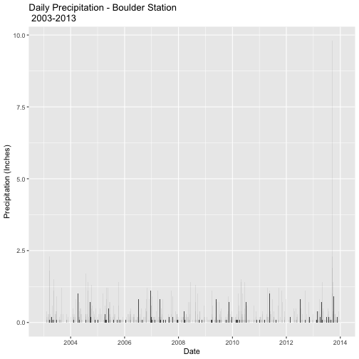
What was the pattern of drought leading up to the 2013 flooding events in Colorado?
Drought Data - the Palmer Drought Index
The Palmer Drought Severity Index
is an overall index of drought that is useful to understand drought associated
with agriculture. It uses temperature, precipitation and soil moisture data
to calculate water supply and demand. The values of the Palmer Drought Severity Index range from extreme drought
(values <-4.0) through near normal (-.49 to .49) to extremely moist (>4.0).
Access the Data
This section of the tutorial describes how to access and download the data
directly from NOAA's National Climate Divisional Database. You can also
download the pre-compiled data as a compressed file following the directions
in the Data Download section at the top of this lesson. Even if you choose to
use the pre-compiled data, you should still go through this section to learn
about the data we are using and the metadata that accompanies it.
The data used in this tutorial comes from
NOAA's Climate Divisional Database (nCLIMDIV).
This dataset contains temperature, precipitation, and drought indication data
from across the United States. Data can be accessed over national, state, or
divisional extents.
Explore the
nCLIMDIV portal
to learn more about the data they provide and how to retrieve it.
The nCLIMDIV page shows several boxes where we can enter search criteria to find
the particular datasets we need. First, though, we should figure out:
what data are available,
what format the data are available in,
what spatial and temporal extent for the data can we access,
the meaning of any abbreviations & technical terms used in the data files, and
any other information that we'd need to know before deciding which datasets to work with.
What data are available?
Below the search boxes, the nCLIMDIV page shows a table (reproduced below) with the different
indices that are included in any downloaded dataset. Here we see that the
Palmer Drought Severity Index (PDSI) is one of many indices available.
Indecies
Abbreviation
Index
PCP
Precipitation Index
TAVG
Temperature Index
TMIN
Minimum Temperature Index
TMAX
Maximum Temperature Index
PDSI
Palmer Drought Severity Index
PHDI
Palmer Hydrological Drought Index
ZNDX
Palmer Z-Index
PMDI
Modified Palmer Drought Severity Index
CDD
Cooling Degree Days
HDD
Heating Degree Days
SPnn
Standard Precipitation Index
Sample Data
Below the table is a link to the Comma Delimited Sample where you can see
a sample of what the data looks like. Using the table above we can can identify
most of the headers. YearMonth is also pretty self-explanatory - it is the year
then the month digit (YYYYMM) with no space. However, what do StateCode
and Division mean? We need to know more about these abbreviations before we can use this dataset.
Metadata File
Below the table is another link to the Divisional Data Description. Click on
this link and you will be taken to a page with the metadata for the nCLIMDIV data (this file
is included in the Download Data .zip file -- divisional-readme.txt).
Skim through this metadata file.
Can you find out what the StateCode is?
What other information is important or interesting to you?
We are interested in the Palmer Drought Severity Index. What information
does the metadata give you about this Index?
Download the Data
Now that we know a bit more about the contents of the dataset, we can access and download
the particular data we need explore the drought leading up to the 2013 flooding
events in Colorado.
Let's look at a 25-year period from 1990-2015. We will enter the following
information on the State tab to get our desired dataset:
Select Nation: US
Select State: Colorado
Start Period: January (01) 1991
End Period: December (12) 2015
Text Output: Comma Delimited
These search criteria result in a text file (.txt) that you can open in
your browser or download and open with a text editor.
Save the Data
To save this data file to your computer, right click on the link and select Save link as.
Each download from this site is given a unique code, therefore your file
will have a slightly different name from this examples. To help remember where the data
are from, add the initials _CO to the end of the file name (but before the
file extension) so that it looks like this CDODiv8506877122044_CO.txt (remember
that the code name for your file will be different).
Save the file to the ~/Documents/data/disturb-events-co13/drought directory
that you created in the set up for this tutorial.
Load the Data in R
Now that we have the data we can start working with it in R.
R Libraries
We will use ggplot2 to efficiently plot our data and plotly to create
interactive plots of our data.
We are interested in looking at the severity (or lack thereof) of drought in
Colorado before the 2013 floods. The first step is to import the data we just downloaded into R.
Our data have a header (which we saw in the sample file). This first row represents the
variable name for each column. We will use header=TRUE when we import the
data to tell R to use that first row as a list of column names rather than a row of data.
## Set your working directory to ensure R can find the file we wish to import and where we want to save our files. Be sure to move the downloaded files into your working directory!
wd <- "~/Git/data/" # This will depend on your local environment
setwd(wd)

# Import CO state-wide nCLIMDIV data
nCLIMDIV <- read.csv(paste0(wd,"disturb-events-co13/drought/CDODiv8506877122044_CO.txt"), header = TRUE)

# view data structure
str(nCLIMDIV)

## 'data.frame':	300 obs. of  21 variables:
##  $ StateCode: int  5 5 5 5 5 5 5 5 5 5 ...
##  $ Division : int  0 0 0 0 0 0 0 0 0 0 ...
##  $ YearMonth: int  199101 199102 199103 199104 199105 199106 199107 199108 199109 199110 ...
##  $ PCP      : num  0.8 0.44 1.98 1.27 1.63 1.88 2.69 2.44 1.36 1.06 ...
##  $ TAVG     : num  21.9 32.5 34.9 41.9 53.5 62.5 66.5 65.5 57.5 47.4 ...
##  $ PDSI     : num  -1.37 -1.95 -1.77 -1.89 -2.11 0.11 0.6 1.03 0.95 0.67 ...
##  $ PHDI     : num  -1.37 -1.95 -1.77 -1.89 -2.11 -1.79 -1.11 1.03 0.95 0.67 ...
##  $ ZNDX     : num  -0.9 -2.17 -0.07 -0.92 -1.25 0.33 1.49 1.5 0.07 -0.54 ...
##  $ PMDI     : num  -0.4 -1.48 -1.28 -1.63 -2.11 -1.57 -0.15 1.03 0.89 0.09 ...
##  $ CDD      : int  0 0 0 0 3 62 95 73 12 0 ...
##  $ HDD      : int  1296 868 900 678 343 113 30 45 227 555 ...
##  $ SP01     : num  -0.4 -1.78 0.89 -0.56 -0.35 0.65 0.96 0.7 -0.01 -0.26 ...
##  $ SP02     : num  -0.47 -1.42 -0.11 0.09 -0.67 0.15 1.01 1.07 0.42 -0.26 ...
##  $ SP03     : num  0.05 -1.28 -0.36 -0.56 -0.19 -0.28 0.55 1.11 0.78 0.13 ...
##  $ SP06     : num  0.42 0.15 0.03 -0.47 -0.86 -0.48 -0.03 0.51 0.24 0.35 ...
##  $ SP09     : num  0.41 0.11 0.85 -0.07 -0.07 -0.19 -0.02 0 0.03 0.01 ...
##  $ SP12     : num  0.69 0.41 0.43 0.08 -0.06 0.39 0.19 0.49 0.21 0.03 ...
##  $ SP24     : num  -0.41 -0.72 -0.49 -0.37 -0.26 -0.24 -0.06 0.12 0.05 0.11 ...
##  $ TMIN     : num  9.5 17.7 22.3 28.4 39.3 48.1 52 51.6 43.1 31.9 ...
##  $ TMAX     : num  34.3 47.4 47.5 55.3 67.7 76.9 81.1 79.5 72 62.9 ...
##  $ X        : logi  NA NA NA NA NA NA ...
Using head() or str() allows us to view just a sampling of our data.
One of the first things we always check is if whether the format that R
interpreted the data to be in is the format we want.
The Palmer Drought Severity Index (PDSI) is a number, so it was imported correctly!
Date Fields
Let's have a look at the date field in our data, which has the column name YearMonth.
Viewing the structure, it appears as if it is not in a standard date format.
It imported into R as an integer (int).
$ YearMonth: int 199001 199002 199003 199004 199005 ...
We want to convert these numbers into a date field. We might be able to use the
as.Date function to convert our string of numbers into a date that R will
recognize.
# convert to date, and create a new Date column
nCLIMDIV$Date <- as.Date(nCLIMDIV$YearMonth, format="%Y%m")
Oops, that doesn't work! R returned an origin error. The date class expects to
have day, month, and year data instead of just year and month. R needs a day
of the month in order to properly
convert this to a date class. The origin error is saying that it doesn't know where
to start counting the dates. (Note: If you have the zoo package installed you
will not get this error but Date will be filled with NAs.)
We can add a fake "day" to our YearMonth data using the paste0 function. Let's
add 01 to each field so R thinks that each date represents the first of the
month.
#add a day of the month to each year-month combination
nCLIMDIV$Date <- paste0(nCLIMDIV$YearMonth,"01")

#convert to date
nCLIMDIV$Date <- as.Date(nCLIMDIV$Date, format="%Y%m%d")

# check to see it works
str(nCLIMDIV$Date)

##  Date[1:300], format: "1991-01-01" "1991-02-01" "1991-03-01" "1991-04-01" ...
We've now successfully converted our integer class YearMonth column into the
Date column in a date class.
Plot the Data
Next, let's plot the data using ggplot().
# plot the Palmer Drought Index (PDSI)
palmer.drought <- ggplot(data=nCLIMDIV,
			 aes(Date,PDSI)) +  # x is Date & y is drought index
	     geom_bar(stat="identity",position = "identity") +   # bar plot
       xlab("Date") + ylab("Palmer Drought Severity Index") +  # axis labels
       ggtitle("Palmer Drought Severity Index - Colorado \n 1991-2015")   # title on 2 lines (\n)

# view the plot
palmer.drought
Great - we've successfully created a plot!
Questions
Which values, positive or negative, correspond to years of drought?
Were the months leading up to the September 2013 floods a drought?
What overall patterns do you see in "wet" and "dry" years over these 25 years?
Is the average year in Colorado wet or dry?
Are there more wet years or dry years over this period of time?
These last two questions are a bit hard to determine from this plot. Let's look
at a quick summary of our data to help us out.
#view summary stats of the Palmer Drought Severity Index
summary(nCLIMDIV$PDSI)

##    Min. 1st Qu.  Median    Mean 3rd Qu.    Max.
##  -9.090  -1.702   0.180  -0.310   1.705   5.020

#view histogram of the data
hist(nCLIMDIV$PDSI,   # the date we want to use
     main="Histogram of PDSI",  # title
		 xlab="Palmer Drought Severity Index (PDSI)",  # x-axis label
     col="wheat3")  #  the color of the bars
Now we can see that the "median" year is slightly wet (0.180) but the
"mean" year is slightly dry (-0.310), although both are within the "near-normal"
range of -0.41 to 0.41. We can also see that there is a longer tail on the dry side
of the histogram than on the wet side.
Both of these figures only give us a static view of the data. There are
packages in R that allow us to create figures that can be published
to the web and allow us to explore the data in a more interactive way.
Plotly - Interactive (and Online) Plots
Plotly
allows you to create interactive plots that can be shared online. If
you are new to Plotly, view the companion mini-lesson
Interactive Data Vizualization with R and Plotly
to learn how to set up an account and access your username and API key.
Step 1: Connect your Plotly account to R
First, we need to connect our R session to our Plotly account. If you only want
to create interactive plots and not share them on a Plotly account, you can skip
this step.
# set plotly user name
Sys.setenv("plotly_username"="YOUR_plotly_username")

# set plotly API key
Sys.setenv("plotly_api_key"="YOUR_api_key")
Step 2: Create a Plotly plot
We can create an interactive version of our plot using plot.ly. We should simply be able to use our existing ggplot palmer.drought with the
ggplotly() function to create an interactive plot.
# Use existing ggplot plot & view as plotly plot in R
palmer.drought_ggplotly <- ggplotly(palmer.drought)
palmer.drought_ggplotly
That doesn't look right. The current plotly package has a bug! This
bug has been reported and a fix may come out in future updates to the package.
Until that happens, we can build our plot again using the plot_ly() function.
In the future, you could just skip the ggplot() step and plot directly with
plot_ly().
# use plotly function to create plot
palmer.drought_plotly <- plot_ly(nCLIMDIV,    # the R object dataset
	type= "bar", # the type of graph desired
	x=nCLIMDIV$Date,      # our x data
	y=nCLIMDIV$PDSI,      # our y data
	orientation="v",   # for bars to orient vertically ("h" for horizontal)
	title=("Palmer Drought Severity Index - Colorado 1991-2015"))

palmer.drought_plotly
Questions
Check out the differences between the ggplot() and the plot_ly() plot.
From both plots, answer these questions (Hint: Hover your cursor over the bars
of the plotly plot)
What is the minimum value?
In what month did the lowest PDSI occur?
In what month, and of what magnitude, did the highest PDSI occur?
What was the drought severity value in August 2013, the month before the
flooding?
Contrast ggplot() and plot_ly() functions.
What are the biggest differences you see between ggplot & plot_ly function?
When might you want to use ggplot()?
When might plotly() be better?
Step 3: Push to Plotly online
Once the plot is built with a Plotly related function (plot_ly or ggplotly) you can post the plot to your online account. Make sure you are signed in to Plotly to complete this step.
# publish plotly plot to your plot.ly online account when you are happy with it
# skip this step if you haven't connected a Plotly account

api_create(palmer.drought_plotly)
Questions
Now that we can see the online Plotly user interface, we can explore our plots a bit more.
Each plot can have comments added below the plot to serve as a caption. What would be appropriate information to add for this plot?
Who might you want to share this plot with? What tools are there to share this plot?
Challenge: Does spatial scale affect the pattern?
In the steps above we have been looking at data aggregated across the entire state of Colorado. What if we look just at the watershed that includes the Boulder area where our investigation is centered?
If you zoom in on the
Divisional Map,
you can see that Boulder, CO is in the CO-04 Platte River Drainage.
Use the divisional data and the process you've just learned to create a plot of
the PDSI for Colorado Division 04 to compare to the plot for the state of
Colorado that you've already made.
If you are using the downloaded dataset accompanying this lesson, this data can be found at "drought/CDODiv8868227122048_COdiv04.txt".
Challenge: Do different measures show the same pattern?
The nCLIMDIV dataset includes not only the Palmer Drought Severity Index
but also several other measures of precipitation, drought, and temperature.
Choose one and repeat the steps above to see if a different but related
measure shows a similar pattern. Make sure to go back to the
metadata so that you understand what the index or measurement you choose represents.
Additional Resources
No Data Values
If you choose to explore other time frames or spatial scales you may
come across data that appear as if they have a negative value -99.99.
If this were real, it would be a very severe drought!
This value is just a common placeholder for a No Data Value.
Think about what happens if the instruments failed for a little while and stopped producing meaningful data. The instruments can't record 0 for this Index because 0 means "normal" levels. Using a blank entry isn't a good idea for several
reason: they cause problems for software reading a file, they can mess up table structure, and you don't know if the data was missing (someone forgot to enter it)
or if no data were available. Therefore, a placeholder value is often used. This value changes between disciplines but -9999 or -99.99 are common.
In R, we need to assign this placeholder value to NA, which is R's
representation of a null or NoData value. If we don't, R will include the -99.99 value whenever calculations are performed
or plots are created. By defining the placeholders as NA, R will correctly interpret, and not plot, the bad values.
Using the nCLIMDIV dataset for the entire US, this is how we'd assign the placeholder
value to NA and plot the data.
# NoData Value in the nCLIMDIV data from 1990-2015 US spatial scale
nCLIMDIV_US <- read.csv(paste0(wd,"disturb-events-co13/drought/CDODiv5138116888828_US.txt"), header = TRUE)

# add a day of the month to each year-month combination
nCLIMDIV_US$Date <- paste0(nCLIMDIV_US$YearMonth,"01")

# convert to date
nCLIMDIV_US$Date <- as.Date(nCLIMDIV_US$Date, format="%Y%m%d")

# check to see it works
str(nCLIMDIV_US$Date)

##  Date[1:312], format: "1990-01-01" "1990-02-01" "1990-03-01" "1990-04-01" ...

# view histogram of data -- great way to check the data range
hist(nCLIMDIV_US$PDSI,
     main="Histogram of PDSI values",
     col="springgreen4")
# easy to see the "wrong" values near 100
# check for these values using min() - what is the minimum value?
min(nCLIMDIV_US$PDSI)

## [1] -99.99

# assign -99.99 to NA in the PDSI column
# Note: you may want to do this across the entire data.frame or with other columns
# but check out the metadata -- there are different NoData Values for each column!
nCLIMDIV_US[nCLIMDIV_US$PDSI==-99.99,] <-  NA  # == is the short hand for "it is"

#view the histogram again - does the range look reasonable?
hist(nCLIMDIV_US$PDSI,
     main="Histogram of PDSI value with NA value assigned",
     col="springgreen4")
# that looks better!

#plot Palmer Drought Index data
ggplot(data=nCLIMDIV_US,
       aes(Date,PDSI)) +
       geom_bar(stat="identity",position = "identity") +
       xlab("Year") + ylab("Palmer Drought Severity Index") +
       ggtitle("Palmer Drought Severity Index - Colorado\n1991 thru 2015")

## Warning: Removed 2 rows containing missing values (geom_bar).
# The warning message lets you know that two "entries" will be missing from the
# graph -- these are the ones we assigned NA.
Subsetting Data
After you have downloaded the data, you might decide that you want to plot only
a subset of the data range you downloaded -- say, just the decade 2005 to 2015
instead of the full record from 1990 to 2015. With the Plotly interactive plots you can zoom in on
that section, but even so you might want a plot with only a section of the data.
You could re-download the data with a new search, but that would create extra,
possibly confusing, data files! Instead, we can easily select a subset of the data within R. Once we
have a column of data defined as a Date class in R, we can quickly
subset the data by date and create a new R object using the subset() function.
To subset, we use the subset function, and specify:
the R object that we wish to subset,
the date column and start date of the subset, and
the date column and end date of the subset.
Let's subset the data.
# subset out data between 2005 and 2015
nCLIMDIV2005.2015 <- subset(nCLIMDIV,    # our R object dataset
                        Date >= as.Date('2005-01-01') &  # start date
                        Date <= as.Date('2015-12-31'))   # end date

# check to make sure it worked
head(nCLIMDIV2005.2015$Date)  # head() shows first 6 lines

## [1] "2005-01-01" "2005-02-01" "2005-03-01" "2005-04-01" "2005-05-01"
## [6] "2005-06-01"

tail(nCLIMDIV2005.2015$Date)  # tail() shows last 6 lines

## [1] "2015-07-01" "2015-08-01" "2015-09-01" "2015-10-01" "2015-11-01"
## [6] "2015-12-01"
Now we can plot this decade of data. Hint, we can copy/paste and edit the
previous code.
# use plotly function to create plot
palmer_plotly0515 <- plot_ly(nCLIMDIV2005.2015,    # the R object dataset
				type= "bar", # the type of graph desired
				x=nCLIMDIV2005.2015$Date,      # our x data
				y=nCLIMDIV2005.2015$PDSI,      # our y data
				orientation="v",   # for bars to orient vertically ("h" for horizontal)
        title=("Palmer Drought Severity Index - Colorado 2005-2015"))

palmer_plotly0515


# publish plotly plot to your plot.ly online account when you are happy with it
# skip this step if you haven't connected a Plotly account

api_create(palmer_plotly0515)
Several factors contributed to the extreme flooding that occurred in Boulder,
Colorado in 2013. In this data activity, we explore and visualize the data for
stream discharge data collected by the United States Geological Survey (USGS).
The tutorial is part of the Data Activities that can be used
with the
Quantifying The Drivers and Impacts of Natural Disturbance Events Teaching Module.
Learning Objectives
After completing this tutorial, you will be able to:
Publish & share an interactive plot of the data using Plotly.
Things You'll Need To Complete This Lesson
Please be sure you have the most current version of R and, preferably,
RStudio to write your code.
R Libraries to Install:
ggplot2:install.packages("ggplot2")
plotly:install.packages("plotly")
Data to Download
We include directions on how to directly find and access the data from USGS's
National National Water Information System Database. However, depending on your
learning objectives you may prefer to use the
provided teaching data subset that can be downloaded from the NEON Data Skills account
on FigShare.
Set Working Directory This lesson assumes that you have set your working
directory to the location of the downloaded and unzipped data subsets.
R Script & Challenge Code: NEON data lessons often contain challenges that
reinforce learned skills. If available, the code for challenge solutions is found
in the downloadable R script of the entire lesson, available in the footer of each lesson page.
Research Question
What were the patterns of stream discharge prior to and during the 2013 flooding
events in Colorado?
About the Data - USGS Stream Discharge Data
The USGS has a distributed network of aquatic sensors located in streams across
the United States. This network monitors a suit of variables that are important
to stream morphology and health. One of the metrics that this sensor network
monitors is Stream Discharge, a metric which quantifies the volume of water
moving down a stream. Discharge is an ideal metric to quantify flow, which
increases significantly during a flood event.
As defined by USGS: Discharge is the volume of water moving down a stream or
river per unit of time, commonly expressed in cubic feet per second or gallons
per day. In general, river discharge is computed by multiplying the area of
water in a channel cross section by the average velocity of the water in that
cross section.
For more on stream discharge by USGS.
The USGS tracks stream discharge through time at locations across the United
States. Note the pattern observed in the plot above. The peak recorded discharge
value in 2013 was significantly larger than what was observed in other years.
Source: USGS, National Water Information System.
Obtain USGS Stream Gauge Data
This next section explains how to find and locate data through the USGS's
National Water Information System portal.
If you want to use the pre-compiled dataset at the FigShare link above, you can skip this
section and start again at the Work With Stream Gauge Data header.
Step 1: Search for the data
To search for stream gauge data in a particular area, we can use the
interactive map of all USGS stations.
By searching for locations around "Boulder, CO", we can find 3 gauges in the area.
For this lesson, we want data collected by USGS stream gauge 06730200 located on
Boulder Creek at North 75th St. This gauge is one of the few the was able to continuously
collect data throughout the 2013 Boulder floods.
You can directly access the data for this station through the "Access Data" link
on the map icon or searching for this site on the
National Water Information System portal .
On the
Boulder Creek stream gauge 06730200 page
, we can now see summary information about the types of data available for this
station. We want to select Daily Data and then the following parameters:
Available Parameters = 00060 Discharge (Mean)
Output format = Tab-separated
Begin Date = 1 October 1986
End Date = 31 December 2013
Now click "Go".
Step 2: Save data to .txt
The output is a plain text page that you must copy into a spreadsheet of
choice and save as a .csv. Note, you can also download the teaching dataset
(above) or access the data through an API (see Additional Resources, below).
Work with Stream Gauge Data
R Packages
We will use ggplot2 to efficiently plot our data and plotly to create interactive plots.
# load packages

library(ggplot2) # create efficient, professional plots

library(plotly) # create cool interactive plots


## Set your working directory to ensure R can find the file we wish to import and where we want to save our files. Be sure to move the downloaded files into your working directory!

wd <- "~/data/" # This will depend on your local environment

setwd(wd)
Import USGS Stream Discharge Data Into R
Now that we better understand the data that we are working with, let's import it into R. First, open up the discharge/06730200-discharge_daily_1986-2013.txt file in a text editor.
What do you notice about the structure of the file?
The first 24 lines are descriptive text and not actual data. Also notice that this file is separated by tabs, not commas. We will need to specify the
tab delimiter when we import our data.We will use the read.csv() function to import it into an R object.
When we use read.csv(), we need to define several attributes of the file
including:
The data are tab delimited. We will this tell R to use the "\\t"separator, which defines a tab delimited separation.
The first group of 24 lines in the file are not data; we will tell R to skip
those lines when it imports the data using skip=25.
Our data have a header, which is similar to column names in a spreadsheet. We
will tell R to set header=TRUE to ensure the headers are imported as column
names rather than data values.
Finally we will set stringsAsFactors = FALSE to ensure our data come in as individual values.
Let's import our data.
(Note: you can use the discharge/06730200-discharge_daily_1986-2013.csv file
and read it in directly using read.csv() function and then skip to the View
Data Structure section).
#import data

discharge <- read.csv(paste0(wd,"disturb-events-co13/discharge/06730200-discharge_daily_1986-2013.txt"),
                      sep= "\t", skip=24,
                      header=TRUE,
                      stringsAsFactors = FALSE)


#view first few lines

head(discharge)

##   agency_cd  site_no   datetime X17663_00060_00003 X17663_00060_00003_cd
## 1        5s      15s        20d                14n                   10s
## 2      USGS 06730200 1986-10-01                 30                     A
## 3      USGS 06730200 1986-10-02                 30                     A
## 4      USGS 06730200 1986-10-03                 30                     A
## 5      USGS 06730200 1986-10-04                 30                     A
## 6      USGS 06730200 1986-10-05                 30                     A
When we import these data, we can see that the first row of data is a second
header row rather than actual data. We can remove the second row of header
values by selecting all data beginning at row 2 and ending at the
total number or rows in the file and re-assigning it to the variable discharge. The nrow function will count the total
number of rows in the object.
# nrow: how many rows are in the R object

nrow(discharge)

## [1] 9955

# remove the first line from the data frame (which is a second list of headers)

# the code below selects all rows beginning at row 2 and ending at the total

# number of rows.

discharge <- discharge[2:nrow(discharge),]
Metadata
We now have an R object that includes only rows containing data values. Each
column also has a unique column name. However the column names may not be
descriptive enough to be useful - what is X17663_00060_00003?.
Reopen the discharge/06730200-discharge_daily_1986-2013.txt file in a text editor or browser. The text at
the top provides useful metadata about our data. On rows 10-12, we see that the
values in the 5th column of data are "Discharge, cubic feed per second (Mean)". Rows 14-16 tell us more about the 6th column of data,
the quality flags.
Now that we know what the columns are, let's rename column 5, which contains the
discharge value, as disValue and column 6 as qualFlag so it is more "human
readable" as we work with it
in R.
#view structure of data

str(discharge)

## 'data.frame':	9954 obs. of  5 variables:
##  $ agency_cd: chr  "USGS" "USGS" "USGS" "USGS" ...
##  $ site_no  : chr  "06730200" "06730200" "06730200" "06730200" ...
##  $ datetime : chr  "1986-10-01" "1986-10-02" "1986-10-03" "1986-10-04" ...
##  $ disValue : chr  "30" "30" "30" "30" ...
##  $ qualCode : chr  "A" "A" "A" "A" ...
It appears as if the discharge value is a character (chr) class. This is
likely because we had an additional row in our data. Let's convert the discharge
column to a numeric class. In this case, we can reassign that column to be of
class: integer given there are no decimal places.
# view class of the disValue column

class(discharge$disValue)

## [1] "character"

# convert column to integer

discharge$disValue <- as.integer(discharge$disValue)


str(discharge)

## 'data.frame':	9954 obs. of  5 variables:
##  $ agency_cd: chr  "USGS" "USGS" "USGS" "USGS" ...
##  $ site_no  : chr  "06730200" "06730200" "06730200" "06730200" ...
##  $ datetime : chr  "1986-10-01" "1986-10-02" "1986-10-03" "1986-10-04" ...
##  $ disValue : int  30 30 30 30 30 30 30 30 30 31 ...
##  $ qualCode : chr  "A" "A" "A" "A" ...
Converting Time Stamps
We have converted our discharge data to an integer class. However, the time
stamp field, datetime is still a character class.
To work with and efficiently plot time series data, it is best to convert date
and/or time data to a date/time class. As we have both date and time date, we
will use the class POSIXct.
#view class

class(discharge$datetime)

## [1] "character"

#convert to date/time class - POSIX

discharge$datetime <- as.POSIXct(discharge$datetime, tz ="America/Denver")


#recheck data structure

str(discharge)

## 'data.frame':	9954 obs. of  5 variables:
##  $ agency_cd: chr  "USGS" "USGS" "USGS" "USGS" ...
##  $ site_no  : chr  "06730200" "06730200" "06730200" "06730200" ...
##  $ datetime : POSIXct, format: "1986-10-01" "1986-10-02" "1986-10-03" ...
##  $ disValue : int  30 30 30 30 30 30 30 30 30 31 ...
##  $ qualCode : chr  "A" "A" "A" "A" ...
No Data Values
Next, let's query our data to check whether there are no data values in
it. The metadata associated with the data doesn't specify what the values would
be, NA or -9999 are common values
# check total number of NA values

sum(is.na(discharge$datetime))

## [1] 0

# check for "strange" values that could be an NA indicator

hist(discharge$disValue)
Excellent! The data contains no NoData values.
Plot The Data
Finally, we are ready to plot our data. We will use ggplot from the ggplot2
package to create our plot.
ggplot(discharge, aes(datetime, disValue)) +
  geom_point() +
  ggtitle("Stream Discharge (CFS) for Boulder Creek") +
  xlab("Date") + ylab("Discharge (Cubic Feet per Second)")
Questions:
What patterns do you see in the data?
Why might there be an increase in discharge during a particular time of year?
Plot Data Time Subsets With ggplot
We can plot a subset of our data within ggplot() by specifying the start and
end times (in a limits object) for the x-axis with scale_x_datetime. Let's
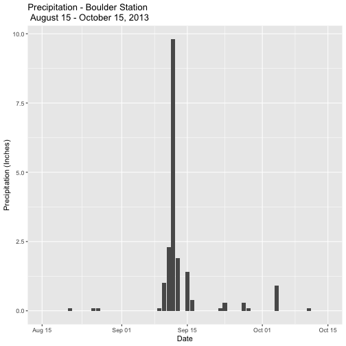
plot data for the months directly around the Boulder flood: August 15 2013 -
October 15 2013.
# Define Start and end times for the subset as R objects that are the time class

start.end <- as.POSIXct(c("2013-08-15 00:00:00","2013-10-15 00:00:00"),tz= "America/Denver")


# plot the data - Aug 15-October 15

ggplot(discharge,
      aes(datetime,disValue)) +
      geom_point() +
      scale_x_datetime(limits=start.end) +
      xlab("Date") + ylab("Discharge (Cubic Feet per Second)") +
      ggtitle("Stream Discharge (CFS) for Boulder Creek\nAugust 15 - October 15, 2013")

## Warning: Removed 9892 rows containing missing values (`geom_point()`).
We get a warning message because we are "ignoring" lots of the data in the
dataset.
Plotly - Interactive (and Online) Plots
We have now successfully created a plot. We can turn that plot into an interactive
plot using Plotly. Plotly
allows you to create interactive plots that can also be shared online. If
you are new to Plotly, view the companion mini-lesson
Interactive Data Vizualization with R and Plotly
to learn how to set up an account and access your username and API key.
Time subsets in plotly
To plot a subset of the total data we have to manually subset the data as the Plotly
package doesn't (yet?) recognize the limits method of subsetting.
Here we create a new R object with entries corresponding to just the dates we want and then plot that data.
# subset out some of the data - Aug 15 - October 15

discharge.aug.oct2013 <- subset(discharge,

                        datetime >= as.POSIXct('2013-08-15 00:00',

                                              tz = "America/Denver") &

                        datetime <= as.POSIXct('2013-10-15 23:59',

                                              tz = "America/Denver"))


# plot the data

disPlot.plotly <- ggplot(data=discharge.aug.oct2013,

        aes(datetime,disValue)) +

        geom_point(size=3)     # makes the points larger than default


disPlot.plotly


# add title and labels

disPlot.plotly <- disPlot.plotly +

	theme(axis.title.x = element_blank()) +

	xlab("Time") + ylab("Stream Discharge (CFS)") +

	ggtitle("Stream Discharge - Boulder Creek 2013")


disPlot.plotly
You can now display your interactive plot in R using the following command:
# view plotly plot in R

ggplotly(disPlot.plotly)
If you are satisfied with your plot you can now publish it to your Plotly account, if desired.
# set username

Sys.setenv("plotly_username"="yourUserNameHere")

# set user key

Sys.setenv("plotly_api_key"="yourUserKeyHere")


# publish plotly plot to your plotly online account if you want.

api_create(disPlot.plotly)
Additional Resources
Additional information on USGS streamflow measurements and data:
USGS data can be downloaded via an API using a command line interface. This is
particularly useful if you want to request data from multiple sites or build the
data request into a script.
Read more here about API downloads of USGS data.
R Script & Challenge Code: NEON data lessons often contain challenges that
reinforce learned skills. If available, the code for challenge solutions is found
in the downloadable R script of the entire lesson, available in the footer of each lesson page.
Research Question: How do We Measure Changes in Terrain?
Questions
How can LiDAR data be collected?
How might we use LiDAR to help study the 2013 Colorado Floods?
Additional LiDAR Background Materials
This data activity below assumes basic understanding of remote sensing and
associated landscape models and the use of raster data and plotting raster objects
in R. Consider using these other resources if you wish to gain more background
in these areas.
Digital Terrain Models, Digital Surface Models and Canopy Height
Models are three common LiDAR-derived data products. The digital terrain model
allows scientists to study changes in terrain (topography) over time.
How might we use a CHM, DSM or DTM model to better understand what happened
in the 2013 Colorado Flood?
Would you use only one of the models or could you use two or more of them
together?
In this Data Activity, we will be using Digital Terrain Models (DTMs).
More Details on LiDAR
If you are particularly interested in how LiDAR works consider taking a closer
look at how the data are collected and represented by going through this tutorial
on
"Light Detection and Ranging."
Digital Terrain Models
We can use a digital terrain model (DTM) to view the surface of the earth. By
comparing a DTM from before a disturbance event with one from after a disturbance
event, we can get measurements of where the landscape changed.
First, we need to load the necessary R packages to work with raster files and
set our working directory to the location of our data.
Then we can read in two DTMs. The first DTM preDTM3.tif is a terrain model created from data
collected 26-27 June 2013 and the postDTM3.tif is a terrain model made from data collected
on 8 October 2013.
Among the information we now about our data from looking at the raster structure,
is that the units are in meters for both rasters.
Hillshade layers are models created to add visual depth to maps. It represents
what the terrain would look like in shadow with the sun at a specific azimuth.
The default azimuth for many hillshades is 315 degrees -- to the NW.
# Creating hillshade for DTM_pre & DTM_post
# In order to generate the hillshde, we need both the slope and the aspect of
# the extent we are working on.

DTM_pre_slope <- terrain(DTM_pre, v="slope", unit="radians")
DTM_pre_aspect <- terrain(DTM_pre, v="aspect", unit="radians")
DTM_pre_hillshade <- shade(DTM_pre_slope, DTM_pre_aspect)

DTM_post_slope <- terrain(DTM_post, v="slope", unit="radians")
DTM_post_aspect <- terrain(DTM_post, v="aspect", unit="radians")
DTM_post_hillshade <- shade(DTM_post_slope, DTM_post_aspect)
Now we can plot the raster objects (DTM & hillshade) together by using add=TRUE
when plotting the second plot. To be able to see the first (hillshade) plot,
through the second (DTM) plot, we also set a value between 0 (transparent) and 1
(not transparent) for the alpha= argument.
# plot Pre-flood w/ hillshade
plot(DTM_pre_hillshade,
        col=grey(1:90/100),  # create a color ramp of grey colors for hillshade
        legend=FALSE,         # no legend, we don't care about the values of the hillshade
        main="Pre-Flood DEM: Four Mile Canyon, Boulder County",
        axes=FALSE)           # makes for a cleaner plot, if the coordinates aren't necessary

plot(DTM_pre,
        axes=FALSE,
        alpha=0.3,   # sets how transparent the object will be (0=transparent, 1=not transparent)
        add=TRUE)  # add=TRUE (or T), add plot to the previous plotting frame
Zoom in on the main stream bed. Are changes more visible? Can you tell
where erosion has occurred? Where soil deposition has occurred?
Digital Elevation Model of Difference (DoD)
A Digital Elevation Model of Difference (DoD) is a model of the
change (or difference) between two other digital elevation models - in our case
DTMs.
# DoD: erosion to be neg, deposition to be positive, therefore post - pre
DoD <- DTM_post-DTM_pre

plot(DoD,
        main="Digital Elevation Model (DEM) Difference",
        axes=FALSE)
Here we have our DoD, but it is a bit hard to read. What does the scale bar tell
us?
Everything in the yellow shades are close to 0m of elevation change, those areas
toward green are up to 10m increase of elevation, and those areas to red and
white are a 5m or more decrease in elevation.
We can see a distribution of the values better by viewing a histogram of all
the values in the DoD raster object.
# histogram of values in DoD
hist(DoD)

## Warning: [hist] a sample of25% of the cells was used
Most of the areas have a very small elevation change. To make the map easier to
read, we can do two things.
Set breaks for where we want the color to represent: The plot of the DoD
above uses a continuous scale to show the gradation between the loss of
elevation and the gain in elevation. While this provides a great deal of
information, in this case with much of the change around 0 and only a few outlying
values near -5m or 10m a categorical scale could help us visualize the data better.
In the plotting code we can set this with the breaks= argument in the plot()
function. Let's use breaks of -5, -1, -0.5, 0.5, 1, 10 -- which will give use 5
categories.
Change the color scheme: We can specify a color for each of elevation
categories we just specified with the breaks.
ColorBrewer 2.0 is a great reference for choosing mapping color palettes and
provide the hex codes we need for specifying the colors of the map. Once we've
chosen appropriate colors, we can create a vector of those colors and then use
that vector with the `col=` argument in the `plot()` function to specify these.
Let's now implement these two changes in our code.
# Color palette for 5 categories
difCol5 = c("#d7191c","#fdae61","#ffffbf","#abd9e9","#2c7bb6")

# Alternate palette for 7 categories - try it out!
#difCol7 = c("#d73027","#fc8d59","#fee090","#ffffbf","#e0f3f8","#91bfdb","#4575b4")

# plot hillshade first
plot(DTM_post_hillshade,
        col=grey(1:90/100),  # create a color ramp of grey colors
        legend=FALSE,
        main="Elevation Change Post-Flood: Four Mile Canyon, Boulder County",
        axes=FALSE)

# add the DoD to it with specified breaks & colors
plot(DoD,
        breaks = c(-5,-1,-0.5,0.5,1,10),
        col= difCol5,
        axes=FALSE,
        alpha=0.3,
        add =T)
Question
Do you think this is the best color scheme or set point for the breaks? Create
a new map that uses different colors and/or breaks. Does it more clearly show
patterns than this plot?
Optional Extension: Crop to Defined Area
If we want to crop the map to a smaller area, say the mouth of the canyon
where most of the erosion and deposition appears to have occurred, we can crop
by using known geographic locations (in the same CRS as the raster object) or
by manually drawing a box.
Method 1: Manually draw cropbox
# plot the rasters you want to crop from
plot(DTM_post_hillshade,
        col=grey(1:90/100),  # create a color ramp of grey colors
        legend=FALSE,
        main="Pre-Flood Elevation: Four Mile Canyon, Boulder County",
        axes=FALSE)

plot(DoD,
        breaks = c(-5,-1,-0.5,0.5,1,10),
        col= difCol5,
        axes=FALSE,
        alpha=0.3,
        add =T)

# crop by designating two opposite corners
cropbox1 <- draw()
After executing the draw() function, we now physically click on the plot
at the two opposite corners of the box you want to crop to. You should see a
red bordered polygon display on the raster at this point.
When we call this new object, we can view the new extent.
# view the extent of the cropbox1
cropbox1

## [1]  473814  474982 4434537 4435390
It is a good idea to write this new extent down, so that you can use the extent
again the next time you run the script.
Method 2: Define the cropbox
If you know the desired extent of the object you can also use it to crop the box,
by creating an object that is a vector containing the four vertices (x min,
x max, y min, and y max) of the polygon.
# desired coordinates of the box
cropbox2 <- c(473792.6,474999,4434526,4435453)
Once you have the crop box defined, either by manually clicking or by setting
the coordinates, you can crop the desired layer to the crop box.
# crop desired layers to the cropbox2 extent
DTM_pre_crop <- crop(DTM_pre, cropbox2)
DTM_post_crop <- crop(DTM_post, cropbox2)
DTMpre_hill_crop <- crop(DTM_pre_hillshade,cropbox2)
DTMpost_hill_crop <- crop(DTM_post_hillshade,cropbox2)
DoD_crop <- crop(DoD, cropbox2)

# plot the pre- and post-flood elevation + DEM difference rasters again, using the cropped layers

# PRE-FLOOD (w/ hillshade)
plot(DTMpre_hill_crop,
        col=grey(1:90/100),  # create a color ramp of grey colors:
        legend=FALSE,
        main="Pre-Flood Elevation: Four Mile Canyon, Boulder County ",
        axes=FALSE)

plot(DTM_pre_crop,
        axes=FALSE,
        alpha=0.3,
        add=T)
# POST-FLOOD (w/ hillshade)
plot(DTMpost_hill_crop,
        col=grey(1:90/100),  # create a color ramp of grey colors
        legend=FALSE,
        main="Post-Flood Elevation: Four Mile Canyon, Boulder County",
        axes=FALSE)

plot(DTM_post_crop,
        axes=FALSE,
        alpha=0.3,
        add=T)
# ELEVATION CHANGE - DEM Difference
plot(DTMpost_hill_crop,
        col=grey(1:90/100),  # create a color ramp of grey colors
        legend=FALSE,
        main="Post-Flood Elevation Change: Four Mile Canyon, Boulder County",
        axes=FALSE)

plot(DoD_crop,
        breaks = c(-5,-1,-0.5,0.5,1,10),
        col= difCol5,
        axes=FALSE,
        alpha=0.3,
        add =T)
Now you have a graphic of your particular area of interest.
The St. Vrain River in Boulder County, CO after (left) and before
(right) the 2013 flooding event. Source: Boulder County via KRCC.
A major disturbance event like this flood causes significant changes in a
landscape. The St. Vrain River in the image above completely shifted its course
of flow in less than 5 days! This brings major changes for aquatic organisms,
like crayfish, that lived along the old stream bed that is now bare and dry, or
for, terrestrial organisms, like a field vole, that used to have a burrow under
what is now the St. Vrain River. Likewise, the people living in the house that
is now on the west side of the river instead of the eastern bank have a
completely different yard and driveway!
Why might this storm have caused so much flooding?
What other weather patterns could have contributed to pronounced flooding?
Introduction to Disturbance Events
Definition: In ecology, a disturbance event
is a temporary change in environmental conditions that causes a pronounced
change in the ecosystem. Common disturbance events include floods, fires,
earthquakes, and tsunamis.
Within ecology, disturbance events are those events which cause dramatic change
in an ecosystem through a temporary, often rapid, change in environmental
conditions. Although the disturbance events themselves can be of short duration,
the ecological effects last decades, if not longer.
Common examples of natural ecological disturbances include hurricanes, fires,
floods, earthquakes and windstorms.
Common natural ecological disturbances.
Disturbance events can also be human caused: clear cuts when logging, fires to
clear forests for cattle grazing or the building of new housing developments
are all common disturbances.
Common human-caused ecological disturbances.
Ecological communities are often more resilient to some types of disturbance than
others. Some communities are even dependent on cyclical disturbance events.
Lodgepole pine (Pinuscontorta) forests in the Western US are dependent on
frequent stand-replacing fires to release seeds and spur the growth of young
trees.
Regrowth of Lodgepole Pine (Pinus contorta) after a stand-replacing fire.
Source: Jim Peaco, September 1998, Yellowstone Digital Slide Files;
Wikipedia Commons.
However, in discussions of ecological disturbance events we think about events
that disrupt the status of the ecosystem and change the structure of the
landscape.
In this lesson we will dig into the causes and disturbances caused during a storm
in September 2013 along the Colorado Front Range.
Driver: Climatic & Atmospheric Patterns
Drought
How do we measure drought?
Definition: The Palmer Drought Severity
Index is a measure of soil moisture content. It is calculated from soil
available water content,precipitation and temperature data. The values range
from extreme drought (values <-4.0) through near normal (-.49 to .49)
to extremely moist (>4.0).
Bonus: There are several other commonly used drought indices. The
National Drought Mitigation Center
provides a comparison of the different indices.
This interactive plot shows the Palmer Drought Severity Index from 1991 through
2015 for Colorado.
Palmer Drought Severity Index for Colorado 1991-2015. Source: National
Ecological Observatory Network (NEON) based on data from
National Climatic Data Center–NOAA.
Questions
Use the figure above to answer these questions:
In this dataset, what years are near normal, extreme drought, and
extreme wet on the Palmer Drought Severity Index?
What are the patterns of drought within Colorado that you observe using this
Palmer Drought Severity Index?
What were the drought conditions immediately before the September 2013
floods?
Over this decade and a half, there have been several cycles of dry and wet
periods. The 2013 flooding occurred right at the end of a severe drought.
There is a connection between the dry soils during a drought and the potential
for flooding. In a severe drought the top layers of the soil dry out. Organic
matter, spongy and absorbent in moist topsoil, may desiccate and be transported
by the winds to other areas. Some soil types, like clay, can dry to a
near-impermeable brick causing water to flow across the top instead of sinking
into the soils.
In early September 2013, a slow moving cold front moved through Colorado
intersecting with a warm, humid front. The clash between the cold and warm
fronts yielded heavy rain and devastating flooding across the Front Range in
Colorado.
The storm that caused the 2013 Colorado flooding was kept in a confined area
over the Eastern Range of the Rocky Mountains in Colorado by these water vapor
systems.
Driver: Precipitation
How do we measure precipitation?
Definition: Precipitation is the moisture that
falls from clouds including rain, hail and snow.
Precipitation can be measured by different types of gauges; some must be
manually read and emptied, others automatically record the amount of
precipitation. If the precipitation is in a frozen form (snow, hail, freezing rain)
the contents of the gauge must be melted to get the water equivalency for
measurement. Rainfall is generally reported as the total amount of rain
(millimeters, centimeters, or inches) over a given per period of time.
Boulder, Colorado lays on the eastern edge of the Rocky Mountains where they meet
the high plains. The average annual precipitation is near 20". However, the
precipitation comes in many forms -- winter snow, intense summer thunderstorms,
and intermittent storms throughout the year.
The figure below show the total precipitation each month from 1948 to 2013 for
the National Weather Service's COOP site Boulder 2 (Station ID:050843) that is
centrally located in Boulder, CO.
Notice the general pattern of rainfall across the 65 years.
How much rain generally falls within one month?
Is there a strong annual or seasonal pattern? (Remember, with
interactive Plotly plots you can zoom in on the data)
Do any other events over the last 65 years equal the September 2013 event?
Now that we've looked at 65 years of data from Boulder, CO. Let's focus more
specifically on the September 2013 event. The plot below shows daily
precipitation between August 15 - October 15, 2013.
Explore the data and answer the following questions:
What dates were the highest precipitation values observed?
The USGS has a distributed network of aquatic sensors located in streams across
the United States. This network monitors a suit of variables that are important
to stream morphology and health. One of the metrics that this sensor network
monitors is stream discharge, a metric which quantifies the volume of water
moving down a stream. Discharge is an ideal metric to quantify flow, which
increases significantly during a flood event.
How is stream discharge measured?
Most USGS streamgages operate by measuring the elevation of the water in the
river or stream and then converting the water elevation (called 'stage') to a
streamflow ('discharge') by using a curve that relates the elevation to a set
of actual discharge measurements. This is done because currently the
technology is not available to measure the flow of the water accurately
enough directly. From the
USGS National Streamflow Information Program
A typical USGS stream gauge using a stilling well. Source: USGS.
What was the stream discharge prior to and during the flood events?
The data for the stream gauge along Boulder Creek 5 miles downstream of downtown
Boulder is reported in daily averages. Take a look at the interactive plot
below to see how patterns of discharge seen in these data?
And it isn't just floods, major hurricanes are forecast to strike New Orleans,
Louisiana once every
20 years.
Yet in 2005 New Orleans was pummeled by 4 hurricanes and 1
tropical storm. Hurricane Cindy in July 2013 caused the worst black out in New
Orleans for 40 years. Eight weeks later Hurricane Katrina came ashore over New
Orleans, changed the landscape of the city and became the costliest natural
disaster to date in the United States. It was frequently called a 100-year
storm.
If we say the return period is 20 years then how did 4 hurricanes strike New
Orleans in 1 year?
The return period of extreme events is also referred to as recurrenceinterval. It is an estimate of the likelihood of an extreme event
based on the statistical analysis of data (including flood records, fire
frequency, historical climatic records) that an event of a given magnitude will
occur in a given year. The probability can be used to assess the risk of these
events for human populations but can also be used by biologists when creating
habitat management plans or conservation plans for endangered species. The
concept is based on the magnitude-frequencyprinciple, where large magnitude
events (such as major hurricanes) are comparatively less frequent than smaller
magnitude incidents (such as rain showers). (For more information visit Climatica's Return Periods of Extreme Events.)
Question
Your friend is thinking about buying a house near Boulder Creek. The
house is above the level of seasonal high water but was flooded in the 2013
flood. He realizes how expensive flood insurance is and says, "Why do I have to
buy this insurance, a flood like that won't happen for another 100 years?
I won't live here any more." How would you explain to him that even though the
flood was a 100-year flood he should still buy the flood insurance?
Flood Plains
Definition: A flood plain is land adjacent to a waterway, from the
channel banks to the base of the enclosing valley walls, that experiences
flooding during periods of high discharge.
Flood plain through the city of Boulder. The LiDAR data used in
the lesson is from Four Mile Canyon Creek. Source:floodsafety.com.
Impact: Erosion & Sedimentation
How can we evaluate the impact of a flooding event?
We could view photos from before and after the disturbance event to see where
erosion or sedimentation has occurred.
Images are great for an overall impression of what happened, where soil has
eroded, and where soil or rocks have been deposited. But it is hard to
get measurements of change from these 2D images. There are several ways that we can
measure the apparent erosion and soil deposition.
3. Field Surveys
Standard surveys can be done to map the three-dimensional position of points allowing
for measurement of distance between points and elevation. However, this requires
extensive effort by land surveyors to visit each location and collect a large
number of points to precisely map the region. This method can be very time intensive.
Survey of a NEON field site done with a total station Source: Michael Patterson.
This method is challenging to use over a large spatial scale.
4. Stereoscopic Images
We could view stereoscopic images, two photos taken from slightly different
perspectives to give the illusion of 3D, one can view, and even measure,
elevation changes from 2D pictures.
A Sokkisha MS-16 stereoscope and the overlapping imaged used to
create 3-D visuals from a aerial photo. Source: Brian Haren.
However, this relies on specialized equipment and is challenging to automate.
5. LiDAR
A newer technology is Light Detection and Ranging (LiDAR or lidar).
Watch this video to see how LiDAR works.
Using LiDAR to Measure Change
LiDAR data allows us to create models of the earth's surface. The general term
for a model of the elevation of an area is a Digital Elevation Model (DEM). DEMs
come in two common types:
Digital Terrain Models (DTM): The elevation of the ground (terrain).
Digital Surface Models (DSM): The elevation of everything on the surface of the earth,
including trees, buildings, or other structures. Note: some DSMs have been post-processed to remove buildings and other human-made objects.
Digital Terrain Models and Digital Surface Models are two common
LiDAR-derived data products. The digital terrain model allows scientists to
study changes in terrain (topography) over time.
Digital Terrain Models (DTMs)
Here we have Digital Terrain Model of lower Four-Mile Canyon Creek from before
the 2013 flood event (left) and from after the 2013 flood event (right). We can
see some subtle differences in the elevation, especially along the stream bed,
however, even on this map it is still challenging to see.
Digital Elevation Model of Difference (DoD)
If we have a DEM from before and after an event, we can can create a model that
shows the change that occurred during the event. This new model is called a
Digital Elevation Model of Difference (DoD).
A cross-section showing the data represented by a Digital
Elevation Model of Difference (DoD) created by subtracting one DTM from
another. The resultant DoD shows the change that has occurred in a given
location- here, in orange, the areas where the earth's surface is lower than
before and, in teal, the areas where the earth's surface is higher than
before.
Questions
Here we are using DTMs to create our Digital Elevation Model of Difference (DoD)
to look at the changes after a flooding event. What types of disturbance events
or what research question might one want to look at DoDs from Digital Surface
Models?
Four Mile Canyon Creek DoD
Areas in red are those were the elevation is lower after the flood
and areas in blue are those where the elevation is higher after the flood event.
We've used the data from drought, atmospheric conditions, precipitation, stream flow,
and the digital elevation models to help us understand what caused the 2013
Boulder County, Colorado flooding event and where there was change in the stream
bed around Four Mile Canyon Creek at the outskirts of Boulder, Colorado.
Quantifying the change that we can see from images of the flooding streams or
post-flood changes to low lying areas allows scientists, city planners, and
homeowners to make choices about future land use plans.
Follow-up Questions
What other types of questions could this or similar data be used to answer?
What types of disturbance events in your local area could you use data to
quantify the causes and impact of?
Several factors contributed to extreme flooding that occurred in Boulder,
Colorado in 2013. In this data activity, we explore and visualize the data for
precipitation (rainfall) data collected by the National Weather Service's
Cooperative Observer Program. The tutorial is part of the Data Activities that can be used
with the
Quantifying The Drivers and Impacts of Natural Disturbance Events Teaching Module.
Learning Objectives
After completing this tutorial, you will be able to:
Publish & share an interactive plot of the data using Plotly.
Subset data by date (if completing Additional Resources code).
Set a NoData Value to NA in R (if completing Additional Resources code).
Things You'll Need To Complete This Lesson
Please be sure you have the most current version of R and, preferably,
RStudio to write your code.
R Libraries to Install:
ggplot2:install.packages("ggplot2")
plotly:install.packages("plotly")
Data to Download
Part of this lesson is to access and download the data directly from NOAA's
National Climate Divisional Database. If instead you would prefer to download the data as a single compressed file, it can be downloaded from the
NEON Data Skills account on FigShare.
Set Working Directory This lesson assumes that you have set your working
directory to the location of the downloaded and unzipped data subsets.
R Script & Challenge Code: NEON data lessons often contain challenges that reinforce learned skills. If available, the code for challenge solutions is found in the downloadable R script of the entire lesson, available in the footer of each lesson page.
Research Question
What were the patterns of precipitation leading up to the 2013 flooding events in Colorado?
Precipitation Data
The heavy precipitation (rain) that occurred in September 2013 caused much
damage during the 2013 flood by, among other things, increasing
stream discharge (flow). In this lesson we will download, explore, and
visualize the precipitation data collected during this time to better understand
this important flood driver.
"Through the National Weather Service (NWS) Cooperative Observer Program
(COOP), more than 10,000 volunteers take daily weather observations at National
Parks, seashores, mountaintops, and farms as well as in urban and suburban
areas. COOP data usually consist of daily maximum and minimum temperatures,
snowfall, and 24-hour precipitation totals."
Quoted from NOAA's National Centers for Environmental Information
Data are collected at different stations, often on paper data sheets like the
one below, and then entered into a central database where we can access that data
and download it in the .csv (Comma Separated Values) format.
An example of the data sheets used to collect the precipitation
data for the Cooperative Observer Network. Source: Cooperative Observer
Network, NOAA
Note: If you are using the pre-compiled data subset that can be downloaded as a
compressed file above, you should still read through this section to know where
the data comes from before proceeding with the lesson.
Step 1: Search for the data
To obtain data we must first choose a location of interest.
The COOP site Boulder 2 (Station ID:050843) is centrally located in Boulder, CO.
Cooperative Observer Network station 050843 is located in
central Boulder, CO. Source: National Centers for Environmental Information
Then we must decide what type of data we want to download for that station. As
shown in the image below, we selected:
the desired date range (1 January 2003 to 31 December 2013),
the type of dataset ("Precipitation Hourly"),
the search type ("Stations") and
the search term (e.g. the # for the station located in central Boulder, CO: 050843).
Climate Data Online search page for the central Boulder, CO, station:050843
Once the data are entered and you select Search, you will be directed to a
new page with a map. You can find out more information about the data by selecting
View Full Details.
Notice that this dataset goes all the way back to 1 August 1948! However, we've
selected only a portion of this time frame.
Step 2: Request the data
Once you are sure this is the data that you want, you need to request it by
selecting Add to Cart. The data can then be downloaded as a .csv file
which we will use to conduct our analyses. Be sure to double check the date
range before downloading.
On the options page, we want to make sure we select:
Station Name
Geographic Location (this gives us longitude & latitude; optional)
Include Data Flags (this gives us information if the data are problematic)
Units (Standard)
Precipitation (w/ HPCP automatically checked)
On the next page you must enter an email address for the dataset to be sent
to.
Step 3: Get the data
As this is a small dataset, it won't take long for you to get an email telling
you the dataset is ready. Follow the link in the email to download your dataset.
You can also view documentation (metadata) for the data.
Each data subset is downloaded with a unique order number. The order number in
our example dataset is 805325. If you are using a dataset you've downloaded
yourself, make sure to substitute in your own order number in the code below.
To ensure that we remember what our data file is, we've added a descriptor to
the order number: 805325-precip_daily_2003-2013. You may wish to do the same.
Work with Precipitation Data
R Libraries
We will use ggplot2 to efficiently plot our data and plotly to create i
nteractive plots.
# load packages
library(ggplot2) # create efficient, professional plots
library(plotly) # create cool interactive plots

##
## Attaching package: 'plotly'

## The following object is masked from 'package:ggmap':
##
##     wind

## The following object is masked from 'package:ggplot2':
##
##     last_plot

## The following object is masked from 'package:stats':
##
##     filter

## The following object is masked from 'package:graphics':
##
##     layout

# set your working directory to ensure R can find the file we wish to import
# and where we want to save our files. Be sure to move the download into
# your working direectory!
wd <- "~/Git/data/" # This will depend on your local environment
setwd(wd)
Import Precipitation Data
We will use the 805325-Preciptation_daily_2003-2013.csv file
in this analysis. This dataset is the daily precipitation date from the COOP
station 050843 in Boulder, CO for 1 January 2003 through 31 December 2013.
Since the data format is a .csv, we can use read.csv to import the data. After
we import the data, we can take a look at the first few lines using head(),
which defaults to the first 6 rows, of the data.frame. Finally, we can explore
the R object structure.
# import precip data into R data.frame by
# defining the file name to be opened

precip.boulder <- read.csv(paste0(wd,"disturb-events-co13/precip/805325-precip_daily_2003-2013.csv"), stringsAsFactors = FALSE, header = TRUE )

# view first 6 lines of the data
head(precip.boulder)

##       STATION    STATION_NAME ELEVATION LATITUDE LONGITUDE
## 1 COOP:050843 BOULDER 2 CO US    1650.5 40.03389 -105.2811
## 2 COOP:050843 BOULDER 2 CO US    1650.5 40.03389 -105.2811
## 3 COOP:050843 BOULDER 2 CO US    1650.5 40.03389 -105.2811
## 4 COOP:050843 BOULDER 2 CO US    1650.5 40.03389 -105.2811
## 5 COOP:050843 BOULDER 2 CO US    1650.5 40.03389 -105.2811
## 6 COOP:050843 BOULDER 2 CO US    1650.5 40.03389 -105.2811
##             DATE HPCP Measurement.Flag Quality.Flag
## 1 20030101 01:00  0.0                g
## 2 20030201 01:00  0.0                g
## 3 20030202 19:00  0.2
## 4 20030202 22:00  0.1
## 5 20030203 02:00  0.1
## 6 20030205 02:00  0.1

# view structure of data
str(precip.boulder)

## 'data.frame':	1840 obs. of  9 variables:
##  $ STATION         : chr  "COOP:050843" "COOP:050843" "COOP:050843" "COOP:050843" ...
##  $ STATION_NAME    : chr  "BOULDER 2 CO US" "BOULDER 2 CO US" "BOULDER 2 CO US" "BOULDER 2 CO US" ...
##  $ ELEVATION       : num  1650 1650 1650 1650 1650 ...
##  $ LATITUDE        : num  40 40 40 40 40 ...
##  $ LONGITUDE       : num  -105 -105 -105 -105 -105 ...
##  $ DATE            : chr  "20030101 01:00" "20030201 01:00" "20030202 19:00" "20030202 22:00" ...
##  $ HPCP            : num  0 0 0.2 0.1 0.1 ...
##  $ Measurement.Flag: chr  "g" "g" " " " " ...
##  $ Quality.Flag    : chr  " " " " " " " " ...
About the Data
Viewing the structure of these data, we can see that different types of data are included in
this file.
STATION and STATION_NAME: Identification of the COOP station.
ELEVATION, LATITUDE and LONGITUDE: The spatial location of the station.
DATE: Gives the date in the format: YYYYMMDD HH:MM. Notice that DATE is
currently class chr, meaning the data are interpreted as a character class and
not as a date.
HPCP: The total precipitation given in inches
(since we selected Standard for the units), recorded
for the hour ending at the time specified by DATE. Importantly, the metadata
(see below) notes that the value 999.99 indicates missing data. Also important,
hours with no precipitation are not recorded.
Measurement Flag: Indicates if there are any abnormalities with the
measurement of the data. Definitions of each flag can be found in Table 2 of the
documentation.
Quality Flag: Indicates if there are any potential quality problems with
the data. Definitions of each flag can be found in Table 3 of the documentation.
Additional information about the data, known as metadata, is available in the
PRECIP_HLY_documentation.pdf file that can be downloaded along with the data.
(Note, as of Sept. 2016, there is a mismatch in the data downloaded and the
documentation. The differences are in the units and missing data value:
inches/999.99 (standard) or millimeters/25399.75 (metric)).
Clean the Data
Before we can start plotting and working with the data we always need to check
several important factors:
data class: is R interpreting the data the way we expect it. The function
str() is an important tools for this.
NoData Values: We need to know if our data contains a specific value that
means "data are missing" and if this value has been assigned to NA in R.
Convert Date-Time
As we've noted, the date field is in a character class. We can convert it to a date/time
class that will allow R to correctly interpret the data and allow us to easily
plot the data. We can convert it to a date/time class using as.POSIXct().
# convert to date/time and retain as a new field
precip.boulder$DateTime <- as.POSIXct(precip.boulder$DATE,
                                  format="%Y%m%d %H:%M")
                                  # date in the format: YearMonthDay Hour:Minute

# double check structure
str(precip.boulder$DateTime)

##  POSIXct[1:1840], format: "2003-01-01 01:00:00" "2003-02-01 01:00:00" ...
We've also learned that missing values, also known as NoData
values, are labelled with the placeholder 999.99. Do we have any NoData values in our data?
# histogram - would allow us to see 999.99 NA values
# or other "weird" values that might be NA if we didn't know the NA value
hist(precip.boulder$HPCP)
Looking at the histogram, it looks like we have mostly low values (which makes sense) but a few values
up near 1000 -- likely 999.99. We can assign these entries to be NA, the value that
R interprets as no data.
# assing NoData values to NA
precip.boulder$HPCP[precip.boulder$HPCP==999.99] <- NA

# check that NA values were added;
# we can do this by finding the sum of how many NA values there are
sum(is.na(precip.boulder))

## [1] 94
There are 94 NA values in our dataset. This is missing data.
Questions:
Do we need to worry about the missing data?
Could they affect our analyses?
This depends on what questions we are asking. Here we are looking at
general patterns in the data across 10 years. Since we have just over 3650
days in our entire dataset, missing 94 probably won't affect the general trends
we are looking at.
Can you think of a research question where we would need to be concerned about
the missing data?
Plot Precipitation Data
Now that we've cleaned up the data, we can view it. To do this we will plot using
ggplot() from the ggplot2 package.
#plot the data
precPlot_hourly <- ggplot(data=precip.boulder,  # the data frame
      aes(DateTime, HPCP)) +   # the variables of interest
      geom_bar(stat="identity") +   # create a bar graph
      xlab("Date") + ylab("Precipitation (Inches)") +  # label the x & y axes
      ggtitle("Hourly Precipitation - Boulder Station\n 2003-2013")  # add a title

precPlot_hourly

## Warning: Removed 94 rows containing missing values (position_stack).
As we can see, plots of hourly date lead to very small numbers and is difficult
to represent all information on a figure. Hint: If you can't see any bars on your
plot you might need to zoom in on it.
Plots and comparison of daily precipitation would be easier to view.
Plot Daily Precipitation
There are several ways to aggregate the data.
Daily Plots
If you only want to view the data plotted by date you need to create a column
with only dates (no time) and then re-plot.
# convert DATE to a Date class
# (this will strip the time, but that is saved in DateTime)
precip.boulder$DATE <- as.Date(precip.boulder$DateTime, # convert to Date class
                                  format="%Y%m%d %H:%M")
                                  #DATE in the format: YearMonthDay Hour:Minute

# double check conversion
str(precip.boulder$DATE)

##  Date[1:1840], format: "2003-01-01" "2003-02-01" "2003-02-03" "2003-02-03" ...

precPlot_daily1 <- ggplot(data=precip.boulder,  # the data frame
      aes(DATE, HPCP)) +   # the variables of interest
      geom_bar(stat="identity") +   # create a bar graph
      xlab("Date") + ylab("Precipitation (Inches)") +  # label the x & y axes
      ggtitle("Daily Precipitation - Boulder Station\n 2003-2013")  # add a title

precPlot_daily1

## Warning: Removed 94 rows containing missing values (position_stack).
R will automatically combine all data from the same day and plot it as one entry.
Daily Plots & Data
If you want to record the combined hourly data for each day, you need to create a new data frame to store the daily data. We can
use the aggregate() function to combine all the hourly data into daily data.
We will use the date class DATE field we created in the previous code for this.
# aggregate the Precipitation (PRECIP) data by DATE
precip.boulder_daily <-aggregate(precip.boulder$HPCP,   # data to aggregate
	by=list(precip.boulder$DATE),  # variable to aggregate by
	FUN=sum,   # take the sum (total) of the precip
	na.rm=TRUE)  # if the are NA values ignore them
	# if this is FALSE any NA value will prevent a value be totalled

# view the results
head(precip.boulder_daily)

##      Group.1   x
## 1 2003-01-01 0.0
## 2 2003-02-01 0.0
## 3 2003-02-03 0.4
## 4 2003-02-05 0.2
## 5 2003-02-06 0.1
## 6 2003-02-07 0.1
So we now have daily data but the column names don't mean anything. We can
give them meaningful names by using the names() function. Instead of naming the column of
precipitation values with the original HPCP, let's call it PRECIP.
# plot daily data
precPlot_daily <- ggplot(data=precip.boulder_daily,  # the data frame
      aes(DATE, PRECIP)) +   # the variables of interest
      geom_bar(stat="identity") +   # create a bar graph
      xlab("Date") + ylab("Precipitation (Inches)") +  # label the x & y axes
      ggtitle("Daily Precipitation - Boulder Station\n 2003-2013")  # add a title

precPlot_daily
Compare this plot to the plot we created using the first method. Are they the same?
R Tip: This manipulation, or aggregation, of data
can also be done with the package plyr using the summarize() function.
Subset the Data
Instead of looking at the data for the full decade, let's now focus on just the
2 months surrounding the flood on 11-15 September. We'll focus on the window from 15
August to 15 October.
Just like aggregating, we can accomplish this by interacting with the larger plot through the graphical interface or
by creating a subset of the data and protting it separately.
Subset Within Plot
To see only a subset of the larger plot, we can simply set limits for the
scale on the x-axis with scale_x_date().
# First, define the limits -- 2 months around the floods
limits <- as.Date(c("2013-08-15", "2013-10-15"))

# Second, plot the data - Flood Time Period
precPlot_flood <- ggplot(data=precip.boulder_daily,
      aes(DATE, PRECIP)) +
      geom_bar(stat="identity") +
      scale_x_date(limits=limits) +
      xlab("Date") + ylab("Precipitation (Inches)") +
      ggtitle("Precipitation - Boulder Station\n August 15 - October 15, 2013")

precPlot_flood

## Warning: Removed 770 rows containing missing values (position_stack).
Now we can easily see the dramatic rainfall event in mid-September!
R Tip: If you are using a date-time class, instead
of just a date class, you need to use scale_x_datetime().
Subset The Data
Now let's create a subset of the data and plot it.
# subset 2 months around flood
precip.boulder_AugOct <- subset(precip.boulder_daily,
                        DATE >= as.Date('2013-08-15') &
												DATE <= as.Date('2013-10-15'))

# check the first & last dates
min(precip.boulder_AugOct$DATE)

## [1] "2013-08-21"

max(precip.boulder_AugOct$DATE)

## [1] "2013-10-11"

# create new plot
precPlot_flood2 <- ggplot(data=precip.boulder_AugOct, aes(DATE,PRECIP)) +
  geom_bar(stat="identity") +
  xlab("Time") + ylab("Precipitation (inches)") +
  ggtitle("Daily Total Precipitation \n Boulder Creek 2013")

precPlot_flood2
Interactive Plots - Plotly
Let's turn our plot into an interactive Plotly plot.
# setup your plot.ly credentials; if not already set up
#Sys.setenv("plotly_username"="your.user.name.here")
#Sys.setenv("plotly_api_key"="your.key.here")


# view plotly plot in R
ggplotly(precPlot_flood2)


# publish plotly plot to your plot.ly online account when you are happy with it
api_create(precPlot_flood2)
Challenge: Plot Precip for Boulder Station Since 1948
The Boulder precipitation station has been recording data since 1948. Use the
steps above to create a plot of the full record of precipitation at this station (1948 - 2013).
The full dataset takes considerable time to download, so we recommend you use the dataset provided in the compressed file ("805333-precip_daily_1948-2013.csv").
As an added challenge, aggregate the data by month instead of by day.
Additional Resources
Units & Scale
If you are using a dataset downloaded before 2016, the units were in
hundredths of an inch, this isn't the most useful measure. You might want to
create a new column PRECIP that contains the data from HPCP converted to
inches.
# convert from 100th inch by dividing by 100
precip.boulder$PRECIP<-precip.boulder$HPCP/100

# view & check to make sure conversion occurred
head(precip.boulder)

##       STATION    STATION_NAME ELEVATION LATITUDE LONGITUDE       DATE
## 1 COOP:050843 BOULDER 2 CO US    1650.5 40.03389 -105.2811 2003-01-01
## 2 COOP:050843 BOULDER 2 CO US    1650.5 40.03389 -105.2811 2003-02-01
## 3 COOP:050843 BOULDER 2 CO US    1650.5 40.03389 -105.2811 2003-02-03
## 4 COOP:050843 BOULDER 2 CO US    1650.5 40.03389 -105.2811 2003-02-03
## 5 COOP:050843 BOULDER 2 CO US    1650.5 40.03389 -105.2811 2003-02-03
## 6 COOP:050843 BOULDER 2 CO US    1650.5 40.03389 -105.2811 2003-02-05
##   HPCP Measurement.Flag Quality.Flag            DateTime PRECIP
## 1  0.0                g              2003-01-01 01:00:00  0.000
## 2  0.0                g              2003-02-01 01:00:00  0.000
## 3  0.2                               2003-02-02 19:00:00  0.002
## 4  0.1                               2003-02-02 22:00:00  0.001
## 5  0.1                               2003-02-03 02:00:00  0.001
## 6  0.1                               2003-02-05 02:00:00  0.001
Question
Compare HPCP and PRECIP. Did we do the conversion correctly?
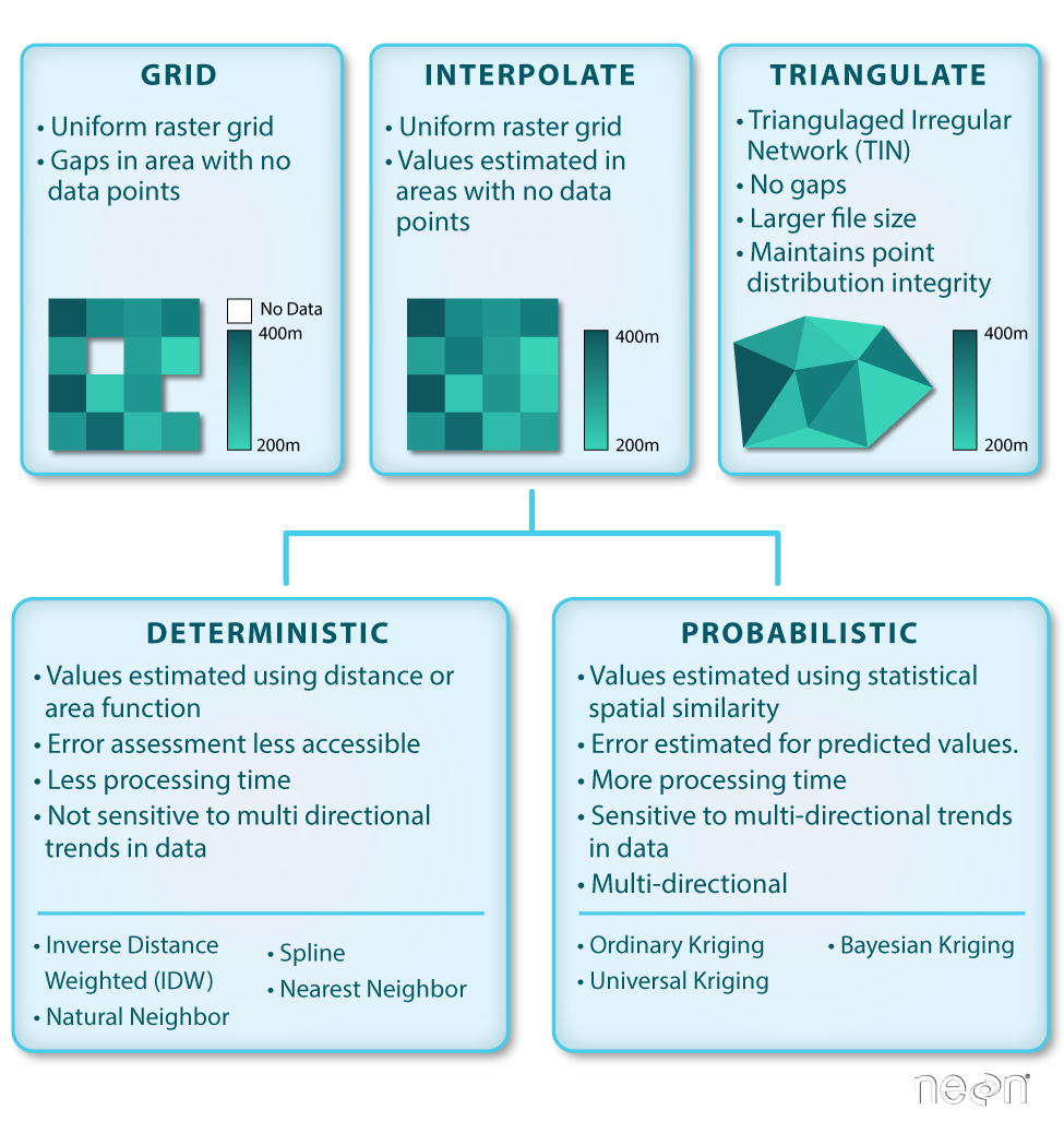


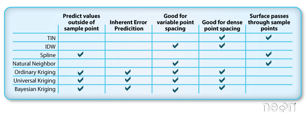
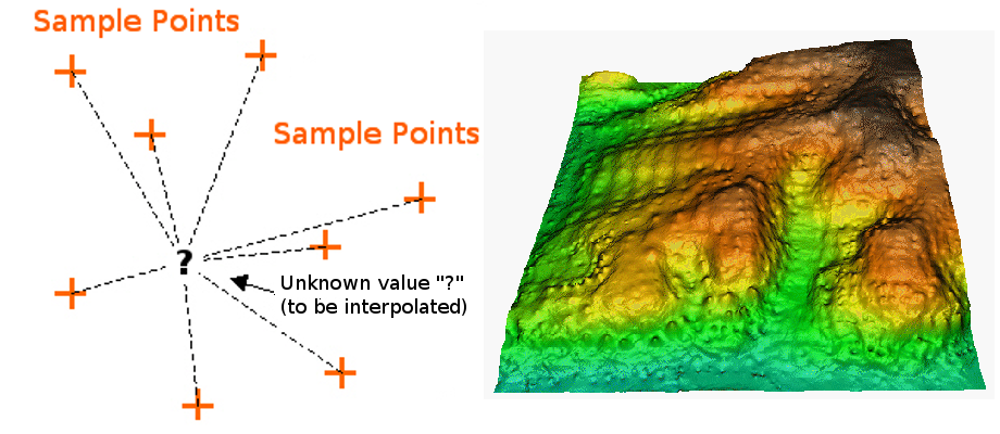
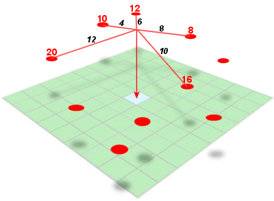
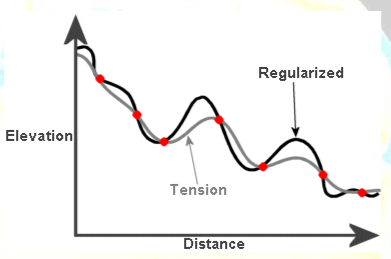


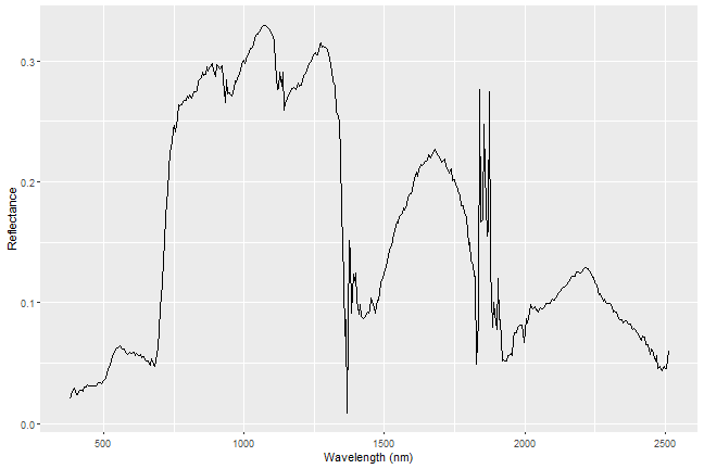
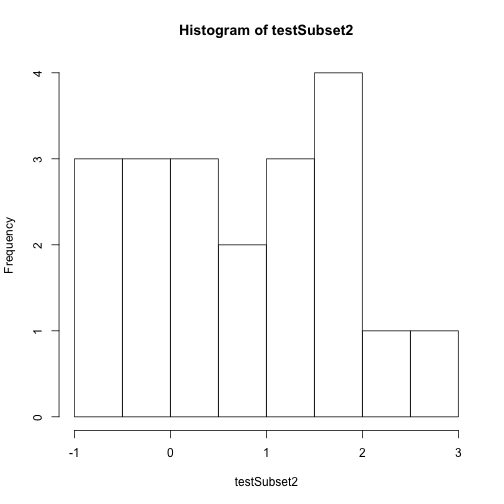
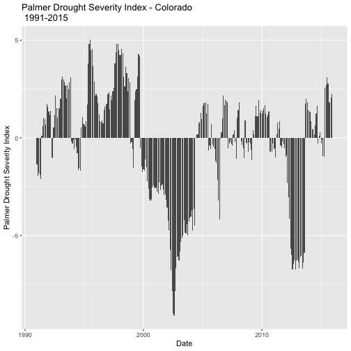
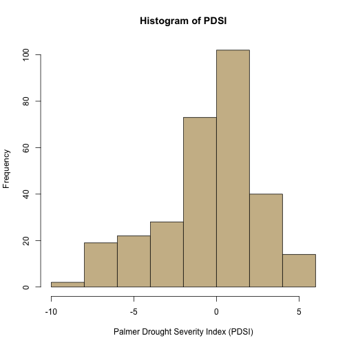
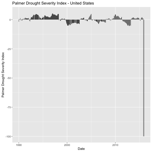
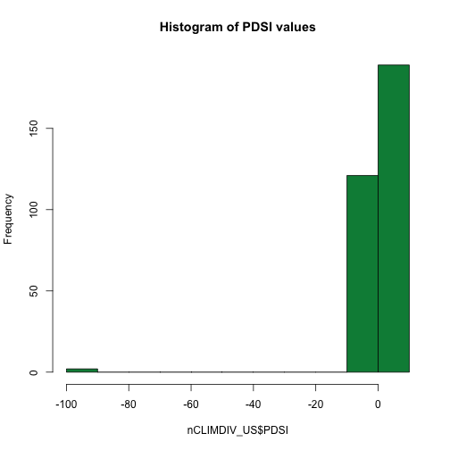
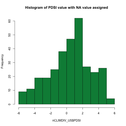
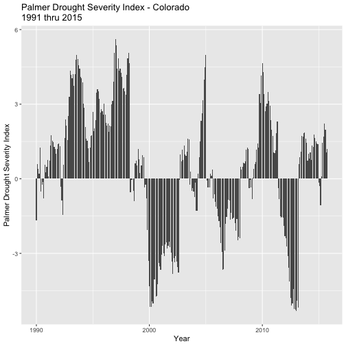
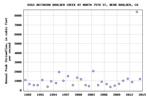
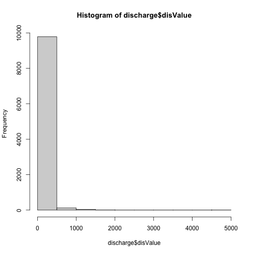
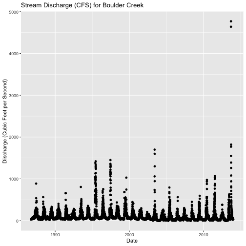
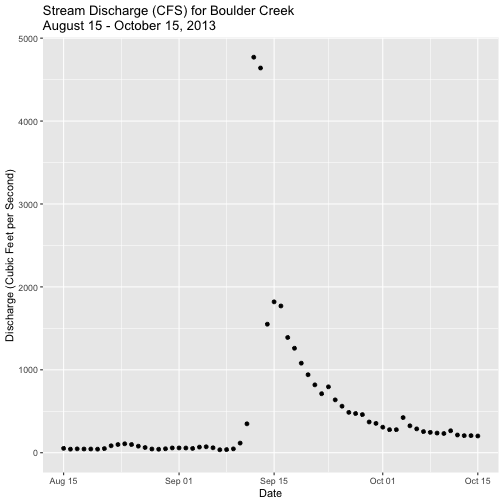
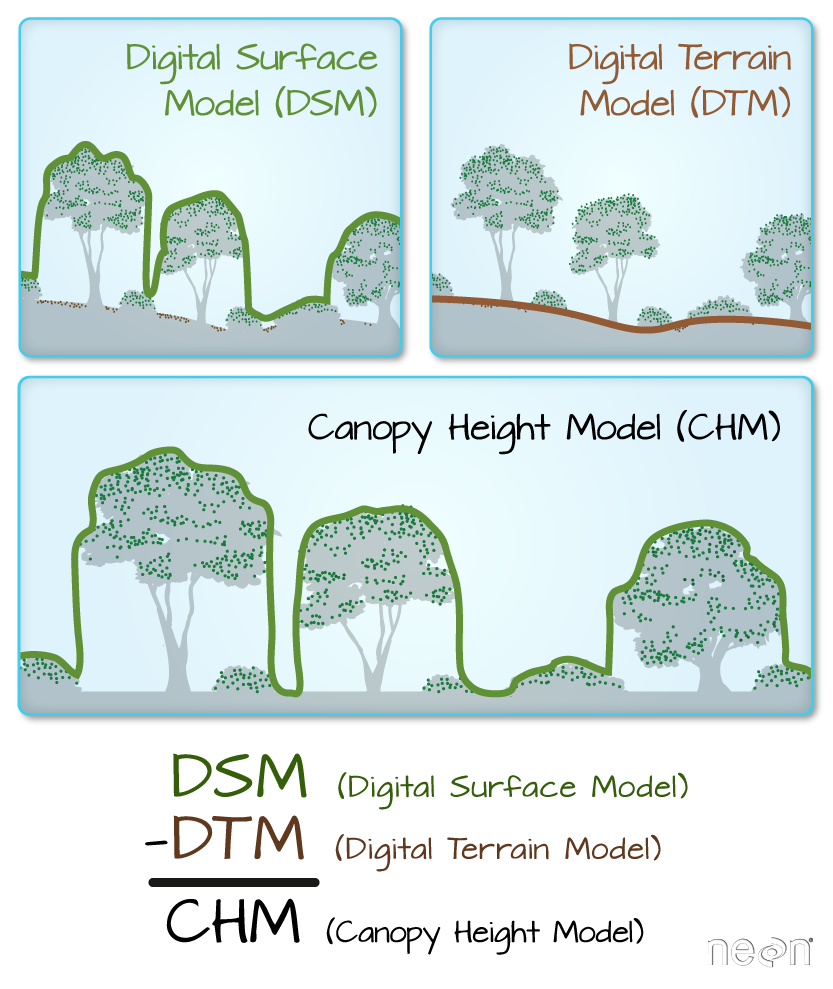


.")
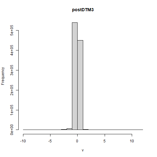
.")


.")