R Script & Challenge Code: NEON data lessons often contain challenges that reinforce
learned skills. If available, the code for challenge solutions is found in the
downloadable R script of the entire lesson, available in the footer of each lesson page.
Recommended Tutorials
This tutorial uses both dplyr and ggplot2. If you are new to either of these
R packages, we recommend the following NEON Data Skills tutorials before
working through this one.
Normalized Difference Vegetation Index (NDVI) is an indicator of how green
vegetation is.
Watch this two and a half minute video from
Karen Joyce
that explains what NDVI is and why it is used.
NDVI is derived from remote sensing data based on a ratio the
reluctance of visible red spectra and near-infrared spectra. The NDVI values
vary from -1.0 to 1.0.
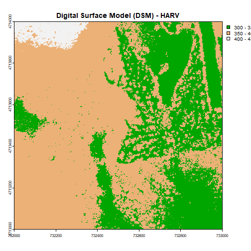
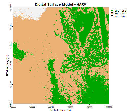
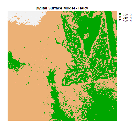
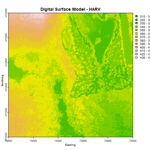
The imagery data used to create this NDVI data were collected over the National
Ecological Observatory Network's
Harvard Forest
field site.
We need to read in two datasets: the 2009-2011 micrometeorological data and the
2011 NDVI data for the Harvard Forest.
# Remember it is good coding technique to add additional libraries to the top of
# your script

library(lubridate) # for working with dates
library(ggplot2)  # for creating graphs
library(scales)   # to access breaks/formatting functions
library(gridExtra) # for arranging plots
library(grid)   # for arranging plots
library(dplyr)  # for subsetting by season

# set working directory to ensure R can find the file we wish to import
wd <- "~/Git/data/"

# read in the Harvard micro-meteorological data; if you don't already have it
harMetDaily.09.11 <- read.csv(
  file=paste0(wd,"NEON-DS-Met-Time-Series/HARV/FisherTower-Met/Met_HARV_Daily_2009_2011.csv"),
  stringsAsFactors = FALSE
  )

#check out the data
str(harMetDaily.09.11)

## 'data.frame':	1095 obs. of  47 variables:
##  $ X        : int  2882 2883 2884 2885 2886 2887 2888 2889 2890 2891 ...
##  $ date     : chr  "2009-01-01" "2009-01-02" "2009-01-03" "2009-01-04" ...
##  $ jd       : int  1 2 3 4 5 6 7 8 9 10 ...
##  $ airt     : num  -15.1 -9.1 -5.5 -6.4 -2.4 -4.9 -2.6 -3.2 -9.9 -11.1 ...
##  $ f.airt   : chr  "" "" "" "" ...
##  $ airtmax  : num  -9.2 -3.7 -1.6 0 0.7 0 -0.2 -0.5 -6.1 -8 ...
##  $ f.airtmax: chr  "" "" "" "" ...
##  $ airtmin  : num  -19.1 -15.8 -9.5 -11.4 -6.4 -10.1 -5.1 -9.9 -12.5 -15.9 ...
##  $ f.airtmin: chr  "" "" "" "" ...
##  $ rh       : int  58 75 69 59 77 65 97 93 78 77 ...
##  $ f.rh     : chr  "" "" "" "" ...
##  $ rhmax    : int  76 97 97 78 97 88 100 100 89 92 ...
##  $ f.rhmax  : chr  "" "" "" "" ...
##  $ rhmin    : int  33 47 41 40 45 38 77 76 63 54 ...
##  $ f.rhmin  : chr  "" "" "" "" ...
##  $ dewp     : num  -21.9 -12.9 -10.9 -13.3 -6.2 -10.9 -3 -4.2 -13.1 -14.5 ...
##  $ f.dewp   : chr  "" "" "" "" ...
##  $ dewpmax  : num  -20.4 -6.2 -6.4 -9.1 -1.7 -7.5 -0.5 -0.6 -11.2 -10.5 ...
##  $ f.dewpmax: chr  "" "" "" "" ...
##  $ dewpmin  : num  -23.5 -21 -14.3 -16.3 -12.1 -13 -7.6 -11.8 -15.2 -18 ...
##  $ f.dewpmin: chr  "" "" "" "" ...
##  $ prec     : num  0 0 0 0 1 0 26.2 0.8 0 1 ...
##  $ f.prec   : chr  "" "" "" "" ...
##  $ slrt     : num  8.4 3.7 8.1 8.3 2.9 6.3 0.8 2.8 8.8 5.7 ...
##  $ f.slrt   : chr  "" "" "" "" ...
##  $ part     : num  16.7 7.3 14.8 16.2 5.4 11.7 1.8 7 18.2 11.4 ...
##  $ f.part   : chr  "" "" "" "" ...
##  $ netr     : num  -39.4 -16.6 -35.3 -24.7 -19.4 -18.9 5.6 -21.7 -31.1 -16 ...
##  $ f.netr   : chr  "" "" "" "" ...
##  $ bar      : int  1011 1005 1004 1008 1006 1009 991 987 1005 1015 ...
##  $ f.bar    : chr  "" "" "" "" ...
##  $ wspd     : num  2.4 1.4 2.7 1.9 2.1 1 1.4 0 1.3 1 ...
##  $ f.wspd   : chr  "" "" "" "" ...
##  $ wres     : num  2.1 1 2.5 1.6 1.9 0.7 1.3 0 1.1 0.6 ...
##  $ f.wres   : chr  "" "" "" "" ...
##  $ wdir     : int  294 237 278 292 268 257 86 0 273 321 ...
##  $ f.wdir   : chr  "" "" "" "" ...
##  $ wdev     : int  29 42 24 31 26 44 24 0 20 50 ...
##  $ f.wdev   : chr  "" "" "" "" ...
##  $ gspd     : num  13.4 8.1 13.9 8 11.6 5.1 9.1 0 10.1 5 ...
##  $ f.gspd   : chr  "" "" "" "" ...
##  $ s10t     : num  1 1 1 1 1 1 1.1 1.2 1.4 1.3 ...
##  $ f.s10t   : logi  NA NA NA NA NA NA ...
##  $ s10tmax  : num  1.1 1 1 1 1.1 1.1 1.1 1.3 1.4 1.4 ...
##  $ f.s10tmax: logi  NA NA NA NA NA NA ...
##  $ s10tmin  : num  1 1 1 1 1 1 1 1.1 1.3 1.2 ...
##  $ f.s10tmin: logi  NA NA NA NA NA NA ...

# read in the NDVI CSV data; if you dont' already have it
NDVI.2011 <- read.csv(
  file=paste0(wd,"NEON-DS-Met-Time-Series/HARV/NDVI/meanNDVI_HARV_2011.csv"),
  stringsAsFactors = FALSE
  )

# check out the data
str(NDVI.2011)

## 'data.frame':	11 obs. of  6 variables:
##  $ X        : int  1 2 3 4 5 6 7 8 9 10 ...
##  $ meanNDVI : num  0.365 0.243 0.251 0.599 0.879 ...
##  $ site     : chr  "HARV" "HARV" "HARV" "HARV" ...
##  $ year     : int  2011 2011 2011 2011 2011 2011 2011 2011 2011 2011 ...
##  $ julianDay: int  5 37 85 133 181 197 213 229 245 261 ...
##  $ Date     : chr  "2011-01-05" "2011-02-06" "2011-03-26" "2011-05-13" ...
In the NDVI dataset, we have the following variables:
'X': an integer identifying each row
meanNDVI: the daily total NDVI for that area. (It is a mean of all pixels in
the original raster).
site: "HARV" means all NDVI values are from the Harvard Forest
year: "2011" all values are from 2011
julianDay: the numeric day of the year
Date: a date in format "YYYY-MM-DD"; currently in chr class
### Challenge: Class Conversion & Subset by Time
The goal of this challenge is to get our datasets ready so that we can work
with data from each, within the same plots or analyses.
Ensure that date fields within both datasets are in the Date class. If not,
convert the data to the Date class.
The NDVI data are limited to 2011, however, the meteorological data are from
2009-2011. Subset and retain only the 2011 meteorological data. Name it
harMet.daily2011.
Now that we have our datasets with Date class dates and limited to 2011, we can
begin working with both.
Plot NDVI Data from a .csv
These NDVI data were derived from a raster and are now integers in a
data.frame, therefore we can plot it like any of our other values using
ggplot(). Here we plot meanNDVI by Date.
# plot NDVI by date
ggplot(NDVI.2011, aes(Date, meanNDVI))+
  geom_point(colour = "forestgreen", size = 4) +
  ggtitle("Daily NDVI at Harvard Forest, 2011")+
  theme(legend.position = "none",
        plot.title = element_text(lineheight=.8, face="bold",size = 20),
        text = element_text(size=20))
Two y-axes or Side-by-Side Plots?
When we have different types of data like NDVI (scale: 0-1 index units),
Photosynthetically Active Radiation (PAR, scale: 0-65.8 mole per meter squared),
or temperature (scale: -20 to 30 C) that we want to plot over time, we cannot
simply plot them on the same plot as they have different y-axes.
One option, would be to plot both data types in the same plot space but each
having it's own axis (one on left of plot and one on right of plot). However,
there is a line of graphical representation thought that this is not a good
practice. The creator of ggplot2 ascribes to this dislike of different y-axes
and so neither qplot nor ggplot have this functionality.
Instead, plots of different types of data can be plotted next to each other to
allow for comparison. Depending on how the plots are being viewed, they can
have a vertical or horizontal arrangement.
### Challenge: Plot Air Temperature and NDVI
Plot the NDVI vs Date (previous plot) and PAR vs Date (create a new plot) in the
same viewer so we can more easily compare them.
The figures from this Challenge are nice but a bit confusing as the dates on the
x-axis don't exactly line up. To fix this we can assign the same min and max
to both x-axes so that they align. The syntax for this is:
limits=c(min=VALUE,max=VALUE).
In our case we want the min and max values to
be based on the min and max of the NDVI.2011$Date so we'll use a function
specifying this instead of a single value.
We can also assign the date format for the x-axis and clearly label both axes.
### Challenge: Plot Air Temperature and NDVI
Create a plot, complementary to those above, showing air temperature (`airt`)
throughout 2011. Choose colors and symbols that show the data well.
Second, plot PAR, air temperature and NDVI in a single pane for ease of
comparison.
R Script & Challenge Code: NEON data lessons often contain challenges that reinforce
learned skills. If available, the code for challenge solutions is found in the
downloadable R script of the entire lesson, available in the footer of each lesson page.
Recommended Tutorials
This tutorial uses both dplyr and ggplot2. If you are new to either of these
R packages, we recommend the following NEON Data Skills tutorials before
working through this one.
In this tutorial we will learn how to create a panel of individual plots - known
as facets in ggplot2. Each plot represents a particular data_frame
time-series subset, for example a year or a season.
Load the Data
We will use the daily micro-meteorology data for 2009-2011 from the Harvard
Forest. If you do not have this data loaded into an R data_frame, please
load them and convert date-time columns to a date-time class now.
# Remember it is good coding technique to add additional libraries to the top of
# your script
library(lubridate) # for working with dates
library(ggplot2)  # for creating graphs
library(scales)   # to access breaks/formatting functions
library(gridExtra) # for arranging plots
library(grid)   # for arranging plots
library(dplyr)  # for subsetting by season

# set working directory to ensure R can find the file we wish to import
wd <- "~/Git/data/"

# daily HARV met data, 2009-2011
harMetDaily.09.11 <- read.csv(
  file=paste0(wd,"NEON-DS-Met-Time-Series/HARV/FisherTower-Met/Met_HARV_Daily_2009_2011.csv"),
  stringsAsFactors = FALSE
  )

# covert date to Date  class
harMetDaily.09.11$date <- as.Date(harMetDaily.09.11$date)
ggplot2 Facets
Facets allow us to plot subsets of data in one cleanly organized panel. We use
facet_grid() to create a plot of a particular variable subsetted by a
particular group.
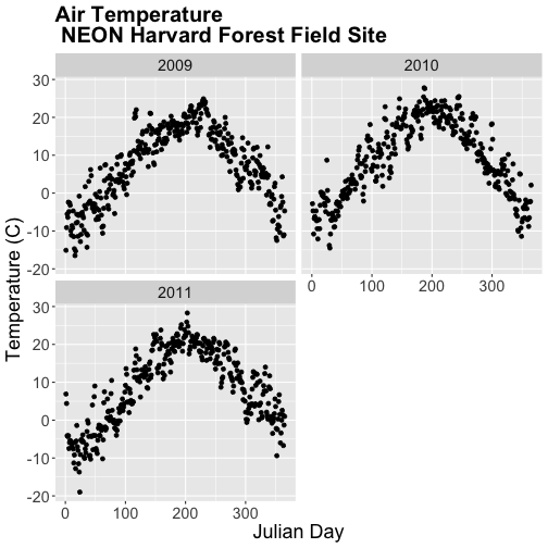
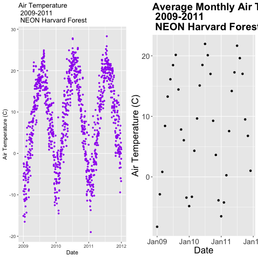
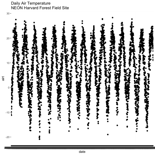
Let's plot air temperature as we did previously. We will name the ggplot
object AirTempDaily.
**Data Tip:** If you are working with a date & time
class (e.g. POSIXct), you can use `scale_x_datetime` instead of `scale_x_date`.
This plot tells us a lot about the annual increase and decrease of temperature
at the NEON Harvard Forest field site. However, what if we want to plot each
year's worth of data individually?
We can use the facet() element in ggplot to create facets or a panel of
plots that are grouped by a particular category or time period. To create a
plot for each year, we will first need a year column in our data to use as a
subset factor. We created a year column using the year function in the
lubridate package in the
Subset and Manipulate Time Series Data with dplyr tutorial.
# add year column to daily values
harMetDaily.09.11$year <- year(harMetDaily.09.11$date)

# view year column head and tail
head(harMetDaily.09.11$year)

## [1] 2009 2009 2009 2009 2009 2009

tail(harMetDaily.09.11$year)

## [1] 2011 2011 2011 2011 2011 2011
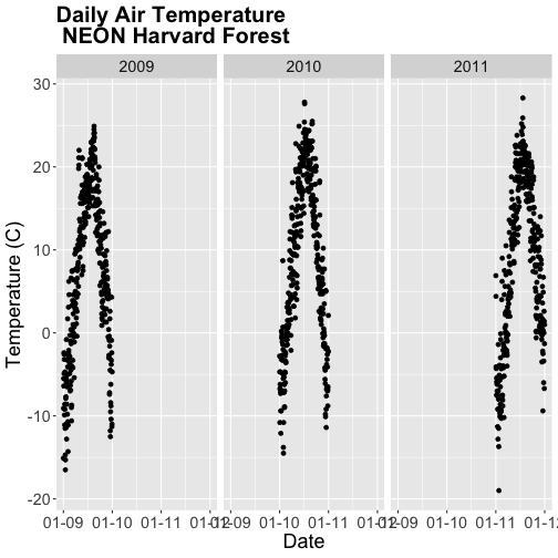
Facet by Year
Once we have a column that can be used to group or subset our data, we can
create a faceted plot - plotting each year's worth of data in an individual,
labelled panel.
# run this code to plot the same plot as before but with one plot per season
AirTempDaily + facet_grid(. ~ year)

## Error: At least one layer must contain all faceting variables: `year`.
## * Plot is missing `year`
## * Layer 1 is missing `year`
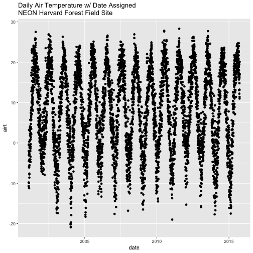
Oops - what happened? The plot did not render because we added the year column
after creating the ggplot object AirTempDaily. Let's rerun the plotting code
to ensure our newly added column is recognized.
The faceted plot is interesting, however the x-axis on each plot is formatted
as: month-day-year starting in 2009 and ending in 2011. This means that the data
for 2009 is on the left end of the x-axis and the data for 2011 is on the right
end of the x-axis of the 2011 plot.
Our plots would be easier to visually compare if the days were formatted in
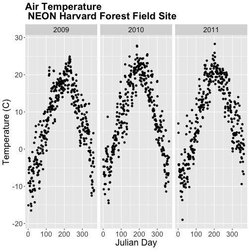
Julian or year days rather than date. We have Julian days stored in our
data_frame (harMetDaily.09.11) as jd.
Using Julian day, our plots are easier to visually compare. Arranging our plots
this way, side by side, allows us to quickly scan for differences along the
y-axis. Notice any differences in min vs max air temperature across the three
years?
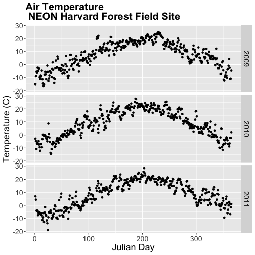
Arrange Facets
We can rearrange the facets in different ways, too.
# move labels to the RIGHT and stack all plots
AirTempDaily_jd + facet_grid(year ~ .)
If we use facet_wrap we can specify the number of columns.
# display in two columns
AirTempDaily_jd + facet_wrap(~year, ncol = 2)
Graph Two Variables on One Plot
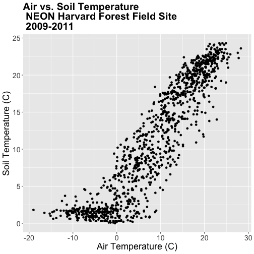
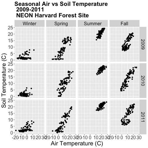
Next, let's explore the relationship between two variables - air temperature
and soil temperature. We might expect soil temperature to fluctuate with changes
in air temperature over time.
We will use ggplot() to plot airt and s10t (soil temperature 10 cm below
the ground).
airSoilTemp_Plot <- ggplot(harMetDaily.09.11, aes(airt, s10t)) +
           geom_point() +
           ggtitle("Air vs. Soil Temperature\n NEON Harvard Forest Field Site\n 2009-2011") +
           xlab("Air Temperature (C)") + ylab("Soil Temperature (C)") +
           theme(plot.title = element_text(lineheight=.8, face="bold",
                 size = 20)) +
           theme(text = element_text(size=18))

airSoilTemp_Plot
The plot above suggests a relationship between the air and soil temperature as
we might expect. However, it clumps all three years worth of data into one plot.
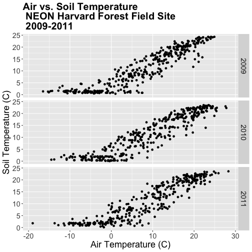
Let's create a stacked faceted plot of air vs. soil temperature grouped by year.
Lucky for us, we can do this quickly with one line of code while reusing the
plot we created above.
Have a close look at the data. Are there any noticeable min/max temperature
differences between the three years?
### Challenge: Faceted Plot
Create a faceted plot of air temperature vs soil temperature by month rather
than year.
HINT: To create this plot, you will want to add a month column to our
data_frame. We can use lubridate month in the same way we used year to add
a year column.
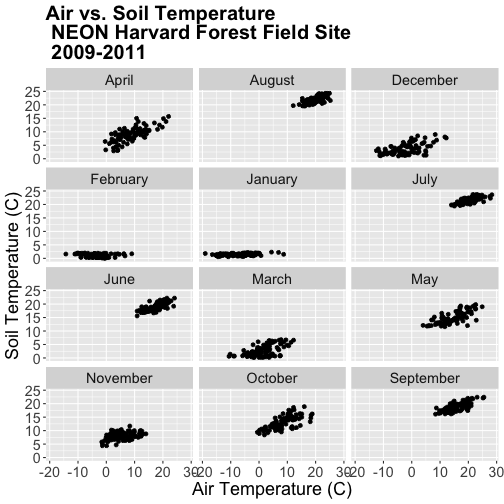
Faceted Plots & Categorical Groups
In the challenge above, we grouped our data by month - specified by a numeric
value between 1 (January) and 12 (December). However, what if we wanted to
organize our plots using a categorical (character) group such as month name?
Let's do that next.
If we want to group our data by month name, we first need to create a month
name column in our data_frame. We can create this column using the following
syntax:
format(harMetDaily.09.11$date,"%B"),
which tells R to extract the month name (%B) from the date field.
# add text month name column
harMetDaily.09.11$month_name <- format(harMetDaily.09.11$date,"%B")
# view head and tail
head(harMetDaily.09.11$month_name)
## [1] "January" "January" "January" "January" "January" "January"
tail(harMetDaily.09.11$month_name)
## [1] "December" "December" "December" "December" "December" "December"
# recreate plot
airSoilTemp_Plot <- ggplot(harMetDaily.09.11, aes(airt, s10t)) +
geom_point() +
ggtitle("Air vs. Soil Temperature \n NEON Harvard Forest Field Site\n 2009-2011") +
xlab("Air Temperature (C)") + ylab("Soil Temperature (C)") +
theme(plot.title = element_text(lineheight=.8, face="bold",
size = 20)) +
theme(text = element_text(size=18))
# create faceted panel
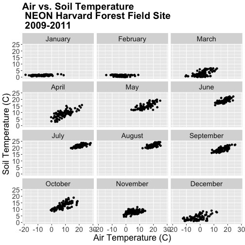
airSoilTemp_Plot + facet_wrap(~month_name, nc=3)
Great! We've created a nice set of plots by month. However, how are the plots
ordered? It looks like R is ordering things alphabetically, yet we know
that months are ordinal not character strings. To account for order, we can
reassign the month_name field to a factor. This will allow us to specify
an order to each factor "level" (each month is a level).
The syntax for this operation is
Turn field into a factor: factor(fieldName) .
Designate the levels using a list c(level1, level2, level3).
In our case, each level will be a month.
# order the factors
harMetDaily.09.11$month_name = factor(harMetDaily.09.11$month_name,
                                      levels=c('January','February','March',
                                               'April','May','June','July',
                                               'August','September','October',
                                               'November','December'))
Once we have specified the factor column and its associated levels, we can plot
again. Remember, that because we have modified a column in our data_frame, we
need to rerun our ggplot code.
# recreate plot
airSoilTemp_Plot <- ggplot(harMetDaily.09.11, aes(airt, s10t)) +
           geom_point() +
           ggtitle("Air vs. Soil Temperature \n NEON Harvard Forest Field Site\n 2009-2011") +
            xlab("Air Temperature (C)") + ylab("Soil Temperature (C)") +
           theme(plot.title = element_text(lineheight=.8, face="bold",
                 size = 20)) +
           theme(text = element_text(size=18))

# create faceted panel
airSoilTemp_Plot + facet_wrap(~month_name, nc=3)
Subset by Season - Advanced Topic
Sometimes we want to group data by custom time periods. For example, we might
want to group by season. However, the definition of various seasons may vary by
region which means we need to manually define each time period.
In the next coding section, we will add a season column to our data using a
manually defined query. Our field site is Harvard Forest (Massachusetts),
located in the northeastern portion of the United States. Based on the climate
of this region, we can divide the year into 4 seasons as follows:
Winter: December - February
Spring: March - May
Summer: June - August
Fall: September - November
In order to subset the data by season we will use the dplyr package. We
can use the numeric month column that we added to our data earlier in this
tutorial.
# add month to data_frame - note we already performed this step above.
harMetDaily.09.11$month  <- month(harMetDaily.09.11$date)

# view head and tail of column
head(harMetDaily.09.11$month)

## [1] 1 1 1 1 1 1

tail(harMetDaily.09.11$month)

## [1] 12 12 12 12 12 12
We can use mutate() and a set of ifelse statements to create a new
categorical variable called season by grouping three months together.
Within dplyr%in% is short-hand for "contained within". So the syntax
ifelse(month %in% c(12, 1, 2), "Winter",
can be read as "if the month column value is 12 or 1 or 2, then assign the
value "Winter"".
Our ifelse statement ends with
ifelse(month %in% c(9, 10, 11), "Fall", "Error")
which we can translate this as "if the month column value is 9 or 10 or 11,
then assign the value "Winter"."
The last portion , "Error" tells R that if a month column value does not
fall within any of the criteria laid out in previous ifelse statements,
assign the column the value of "Error".
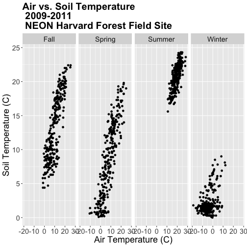
Now that we have a season column, we can plot our data by season!
# recreate plot
airSoilTemp_Plot <- ggplot(harMetDaily.09.11, aes(airt, s10t)) +
           geom_point() +
           ggtitle("Air vs. Soil Temperature\n 2009-2011\n NEON Harvard Forest Field Site") +
            xlab("Air Temperature (C)") + ylab("Soil Temperature (C)") +
           theme(plot.title = element_text(lineheight=.8, face="bold",
                 size = 20)) +
           theme(text = element_text(size=18))

# run this code to plot the same plot as before but with one plot per season
airSoilTemp_Plot + facet_grid(. ~ season)
Note, that once again, we re-ran our ggplot code to make sure our new column
is recognized by R. We can experiment with various facet layouts next.
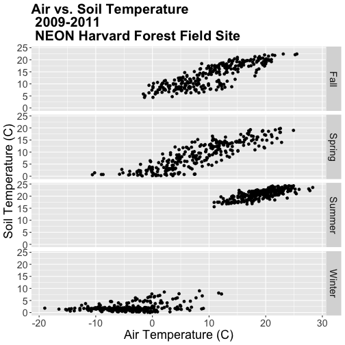
# for a landscape orientation of the plots we change the order of arguments in
# facet_grid():
airSoilTemp_Plot + facet_grid(season ~ .)
Once again, R is arranging the plots in an alphabetical order not an order
relevant to the data.
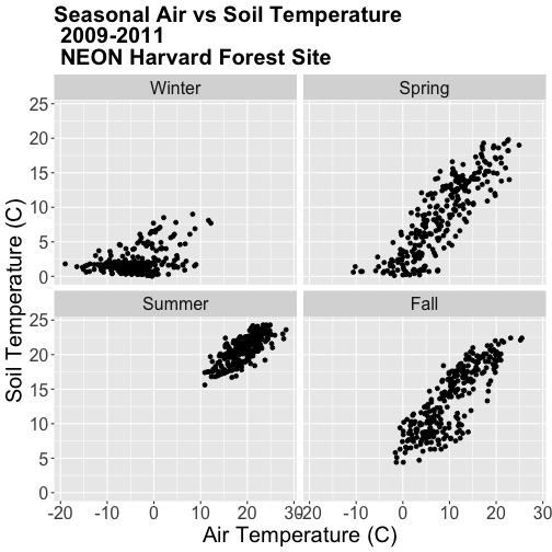
### Challenge: Create Plots by Season
The goal of this challenge is to create plots that show the relationship between
air and soil temperature across the different seasons with seasons arranged in
an ecologically meaningful order.
Create a factor class season variable by converting the season column that
we just created to a factor, then organize the seasons chronologically as
follows: Winter, Spring, Summer, Fall.
Create a new faceted plot that is 2 x 2 (2 columns of plots). HINT: One can
neatly plot multiple variables using facets as follows:
facet_grid(variable1 ~ variable2).
Create a plot of air vs soil temperature grouped by year and season.
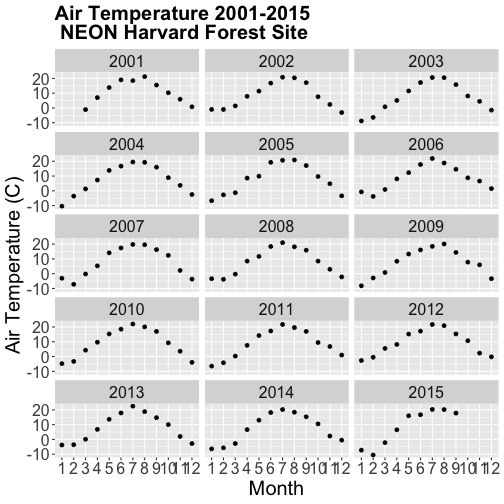
Work with Year-Month Data: base R and zoo Package
Some data will have month formatted in Year-Month
(e.g. met_monthly_HARV$date).
(Note: You will load this file in the Challenge below)
For many analyses, we might want to summarize this data into a yearly total.
Base R does NOT have a distinct year-month date class. Instead to work with a
year-month field using base R, we need to convert to a Date class, which
necessitates adding an associated day value. The syntax would be:
The syntax above creates a Date column from the met_montly_HARV$date column.
We then add the arbitrary date - the first ("-01"). The final bit of code
(sep="") designates the character string used to separate the month, day,
and year portions of the returned string (in our case nothing, as we have
included the hyphen with our inserted date value).
Alternatively, to work directly with a year-month data we could use the zoo
package and its included year-month date class - as.yearmon. With zoo the
syntax would be:
as.Date(as.yearmon(met_monthly_HARV$date))
### Challenge: Convert Year-Month Data
The goal of this challenge is to use both the base R and the `zoo` package
methods for working with year-month data.
Load the NEON-DS-Met-Time-Series/HARV/FisherTower-Met/hf001-04-monthly-m.csv
file and give it the name met_monthly_HARV. Then:
Convert the date field into a date/time class using both base R and the
zoo package. Name the new fields date_base and ymon_zoo respectively.
Look at the format and check the class of both new date fields.
Convert the ymon_zoo field into a new Date class field (date_zoo) so it
can be used in base R, ggplot, etc.
HINT: be sure to load the zoo package, if you have not already.
Do you prefer to use base R or zoo to convert these data to a date/time
class?
**Data Tip:** `zoo` date/time classes cannot be used
directly with ggplot2. If you deal with date formats that make sense to
primarily use `zoo` date/time classes, you can use ggplot2 with the addition of
other functions. For details see the
ggplot2.zoo documentation.
### Challenge: Plot Year-Month Data
Using the date field `date_base` (or `date_zoo`) that you created in the
previous challenge, create a faceted plot of annual air temperature for each
year (2001-2015) with month as the x-axis for the NEON Harvard Forest field
site.
This tutorial uses ggplot2 to create customized plots of time
series data. We will learn how to adjust x- and y-axis ticks using the scales
package, how to add trend lines to a scatter plot and how to customize plot
labels, colors and overall plot appearance using ggthemes.
Learning Objectives
After completing this tutorial, you will be able to:
Create basic time series plots using ggplot() in R.
Explain the syntax of ggplot() and know how to find out more about the
package.
Plot data using scatter and bar plots.
Things You’ll Need To Complete This Tutorial
You will need the most current version of R and, preferably, RStudio loaded on
your computer to complete this tutorial.
R Script & Challenge Code: NEON data lessons often contain challenges that reinforce
learned skills. If available, the code for challenge solutions is found in the
downloadable R script of the entire lesson, available in the footer of each lesson page.
Plotting our data allows us to quickly see general patterns including
outlier points and trends. Plots are also a useful way to communicate the
results of our research. ggplot2 is a powerful R package that we use to
create customized, professional plots.
Load the Data
We will use the lubridate, ggplot2, scales and gridExtra packages in
this tutorial.
Our data subset will be the daily meteorology data for 2009-2011 for the NEON
Harvard Forest field site
(NEON-DS-Met-Time-Series/HARV/FisherTower-Met/Met_HARV_Daily_2009_2011.csv).
If this subset is not already loaded, please load it now.
# Remember it is good coding technique to add additional packages to the top of
# your script
library(lubridate) # for working with dates
library(ggplot2)  # for creating graphs
library(scales)   # to access breaks/formatting functions
library(gridExtra) # for arranging plots

# set working directory to ensure R can find the file we wish to import
wd <- "~/Git/data/"

# daily HARV met data, 2009-2011
harMetDaily.09.11 <- read.csv(
  file=paste0(wd,"NEON-DS-Met-Time-Series/HARV/FisherTower-Met/Met_HARV_Daily_2009_2011.csv"),
  stringsAsFactors = FALSE)

# covert date to Date class
harMetDaily.09.11$date <- as.Date(harMetDaily.09.11$date)

# monthly HARV temperature data, 2009-2011
harTemp.monthly.09.11<-read.csv(
  file=paste0(wd,"NEON-DS-Met-Time-Series/HARV/FisherTower-Met/Temp_HARV_Monthly_09_11.csv"),
  stringsAsFactors=FALSE
  )

# datetime field is actually just a date
#str(harTemp.monthly.09.11)

# convert datetime from chr to date class & rename date for clarification
harTemp.monthly.09.11$date <- as.Date(harTemp.monthly.09.11$datetime)
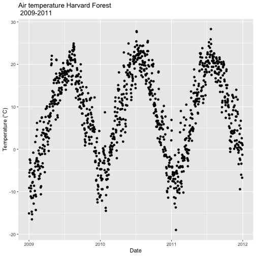
Plot with qplot
We can use the qplot() function in the ggplot2 package to quickly plot a
variable such as air temperature (airt) across all three years of our daily
average time series data.
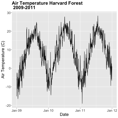
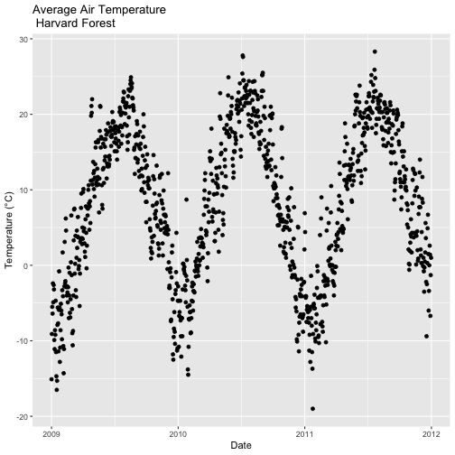
# plot air temp
qplot(x=date, y=airt,
      data=harMetDaily.09.11, na.rm=TRUE,
      main="Air temperature Harvard Forest\n 2009-2011",
      xlab="Date", ylab="Temperature (°C)")
The resulting plot displays the pattern of air temperature increasing and
decreasing over three years. While qplot() is a quick way to plot data, our
ability to customize the output is limited.
Plot with ggplot
The ggplot() function within the ggplot2 package gives us more control
over plot appearance. However, to use ggplot we need to learn a slightly
different syntax. Three basic elements are needed for ggplot() to work:
The data_frame: containing the variables that we wish to plot,
aes (aesthetics): which denotes which variables will map to the x-, y-
(and other) axes,
geom_XXXX (geometry): which defines the data's graphical representation
(e.g. points (geom_point), bars (geom_bar), lines (geom_line), etc).
The syntax begins with the base statement that includes the data_frame
(harMetDaily.09.11) and associated x (date) and y (airt) variables to be
plotted:
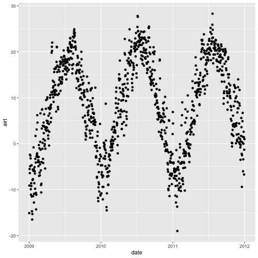
ggplot(harMetDaily.09.11, aes(date, airt))
To successfully plot, the last piece that is needed is the geometry type. In
this case, we want to create a scatterplot so we can add + geom_point().
Let's create an air temperature scatterplot.
# plot Air Temperature Data across 2009-2011 using daily data
ggplot(harMetDaily.09.11, aes(date, airt)) +
           geom_point(na.rm=TRUE)
Customize A Scatterplot
We can customize our plot in many ways. For instance, we can change the size and
color of the points using size=, shape pch=, and color= in the geom_point
element.
geom_point(na.rm=TRUE, color="blue", size=1)
# plot Air Temperature Data across 2009-2011 using daily data
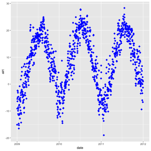
ggplot(harMetDaily.09.11, aes(date, airt)) +
geom_point(na.rm=TRUE, color="blue", size=3, pch=18)
Modify Title & Axis Labels
We can modify plot attributes by adding elements using the + symbol.
For example, we can add a title by using + ggtitle="TEXT", and axis
labels using + xlab("TEXT") + ylab("TEXT").
# plot Air Temperature Data across 2009-2011 using daily data
ggplot(harMetDaily.09.11, aes(date, airt)) +
geom_point(na.rm=TRUE, color="blue", size=1) +
ggtitle("Air Temperature 2009-2011\n NEON Harvard Forest Field Site") +
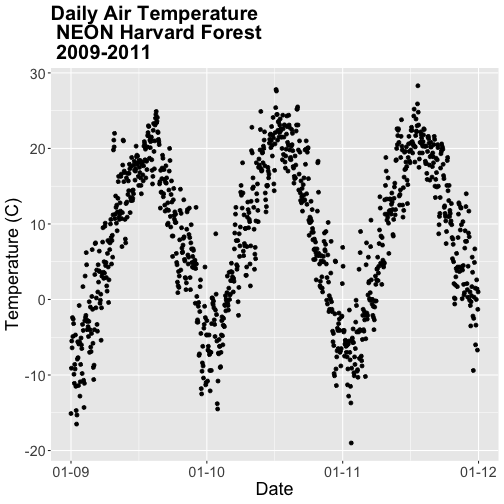
xlab("Date") + ylab("Air Temperature (C)")
**Data Tip:** Use `help(ggplot2)` to review the many
elements that can be defined and added to a `ggplot2` plot.
Name Plot Objects
We can create a ggplot object by assigning our plot to an object name.
When we do this, the plot will not render automatically. To render the plot, we
need to call it in the code.
Assigning plots to an R object allows us to effectively add on to,
and modify the plot later. Let's create a new plot and call it AirTempDaily.
# plot Air Temperature Data across 2009-2011 using daily data
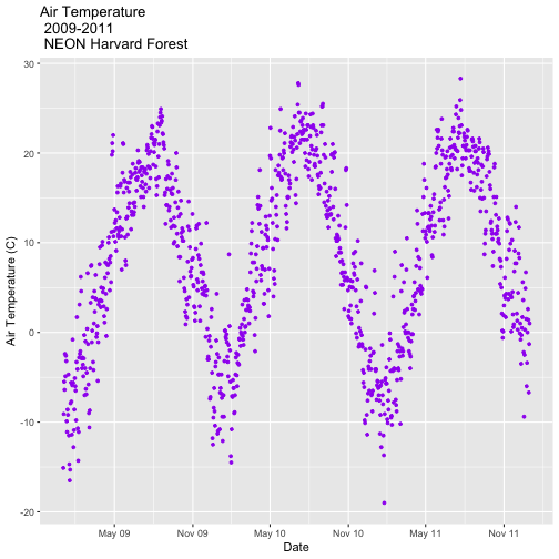
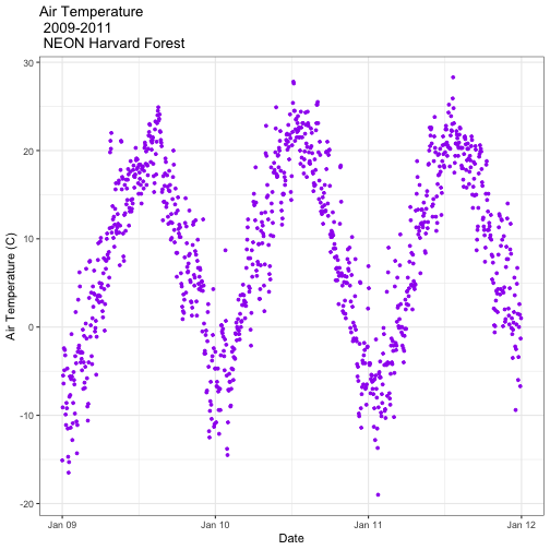
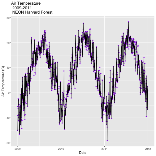
AirTempDaily <- ggplot(harMetDaily.09.11, aes(date, airt)) +
geom_point(na.rm=TRUE, color="purple", size=1) +
ggtitle("Air Temperature\n 2009-2011\n NEON Harvard Forest") +
xlab("Date") + ylab("Air Temperature (C)")
# render the plot
AirTempDaily
Format Dates in Axis Labels
We can adjust the date display format (e.g. 2009-07 vs. Jul 09) and the number
of major and minor ticks for axis date values using scale_x_date. Let's
format the axis ticks so they read "month year" (%b %y). To do this, we will
use the syntax:
scale_x_date(labels=date_format("%b %y")
Rather than re-coding the entire plot, we can add the scale_x_date element
to the plot object AirTempDaily that we just created.
**Data Tip:** You can type `?strptime` into the R
console to find a list of date format conversion specifications (e.g. %b = month).
Type `scale_x_date` for a list of parameters that allow you to format dates
on the x-axis.
**Data Tip:** If you are working with a date & time
class (e.g. POSIXct), you can use `scale_x_datetime` instead of `scale_x_date`.
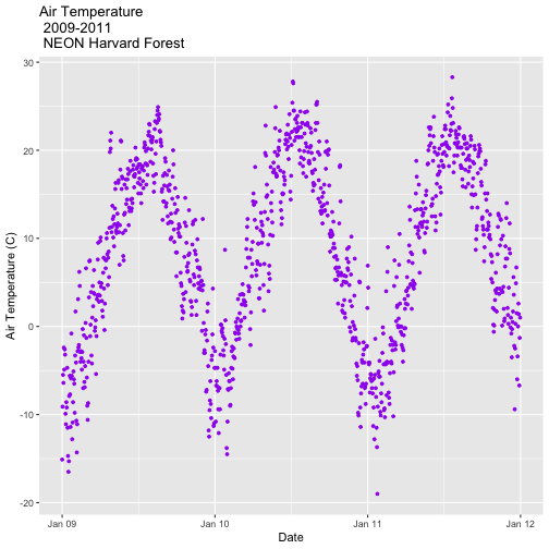
Adjust Date Ticks
We can adjust the date ticks too. In this instance, having 1 tick per year may
be enough. If we have the scales package loaded, we can use
breaks=date_breaks("1 year") within the scale_x_date element to create
a tick for every year. We can adjust this as needed (e.g. 10 days, 30 days, 1
month).
From R HELP (?date_breaks): width an interval specification, one of "sec",
"min", "hour", "day", "week", "month", "year". Can be by an integer and a
space, or followed by "s".
# format x-axis: dates
AirTempDaily_1y <- AirTempDaily +
    (scale_x_date(breaks=date_breaks("1 year"),
      labels=date_format("%b %y")))

AirTempDaily_1y
**Data Tip:** We can adjust the tick spacing and
format for x- and y-axes using `scale_x_continuous` or `scale_y_continuous` to
format a continue variable. Check out `?scale_x_` (tab complete to view the
various x and y scale options)
ggplot - Subset by Time
Sometimes we want to scale the x- or y-axis to a particular time subset without
subsetting the entire data_frame. To do this, we can define start and end
times. We can then define the limits in the scale_x_date object as
follows:
scale_x_date(limits=start.end) +
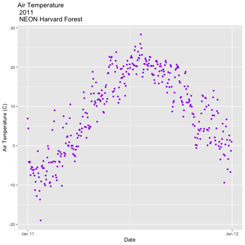
# Define Start and end times for the subset as R objects that are the time class
startTime <- as.Date("2011-01-01")
endTime <- as.Date("2012-01-01")
# create a start and end time R object
start.end <- c(startTime,endTime)
start.end
## [1] "2011-01-01" "2012-01-01"
# View data for 2011 only
# We will replot the entire plot as the title has now changed.
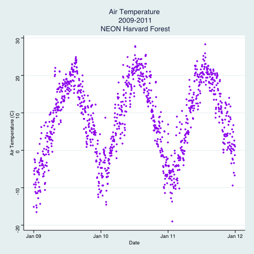
AirTempDaily_2011 <- ggplot(harMetDaily.09.11, aes(date, airt)) +
geom_point(na.rm=TRUE, color="purple", size=1) +
ggtitle("Air Temperature\n 2011\n NEON Harvard Forest") +
xlab("Date") + ylab("Air Temperature (C)")+
(scale_x_date(limits=start.end,
breaks=date_breaks("1 year"),
labels=date_format("%b %y")))
AirTempDaily_2011
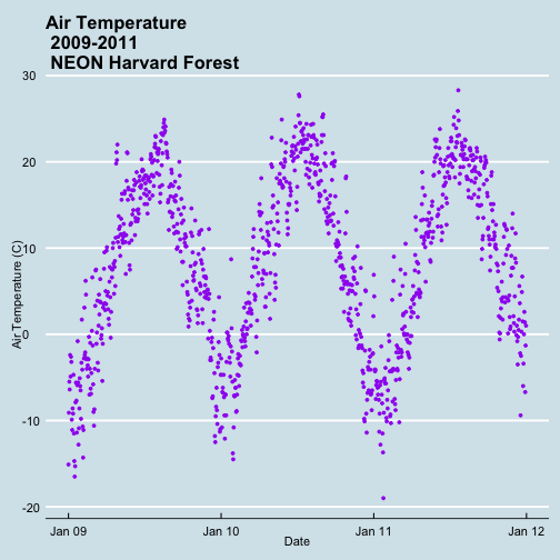
ggplot() Themes
We can use the theme() element to adjust figure elements.
There are some nice pre-defined themes that we can use as a starting place.
# Apply a black and white stock ggplot theme
AirTempDaily_bw<-AirTempDaily_1y +
  theme_bw()

AirTempDaily_bw
Using the theme_bw() we now have a white background rather than grey.
Import New Themes BonusTopic
There are externally developed themes built by the R community that are worth
mentioning. Feel free to experiment with the code below to install ggthemes.
A list of themes loaded in the ggthemes library is found here.
Customize ggplot Themes
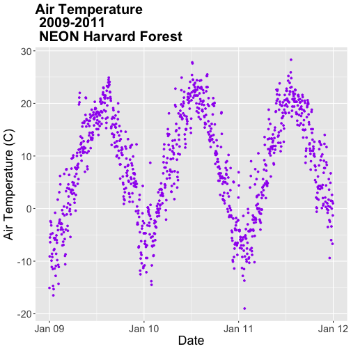
We can customize theme elements manually too. Let's customize the font size and
style.
# format x axis with dates
AirTempDaily_custom<-AirTempDaily_1y +
  # theme(plot.title) allows to format the Title separately from other text
  theme(plot.title = element_text(lineheight=.8, face="bold",size = 20)) +
  # theme(text) will format all text that isn't specifically formatted elsewhere
  theme(text = element_text(size=18))

AirTempDaily_custom
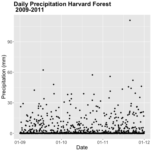
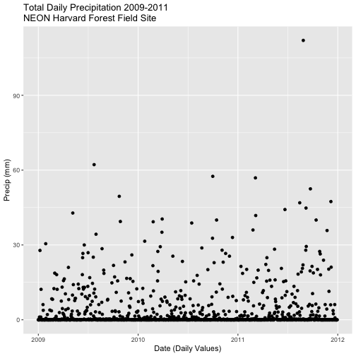
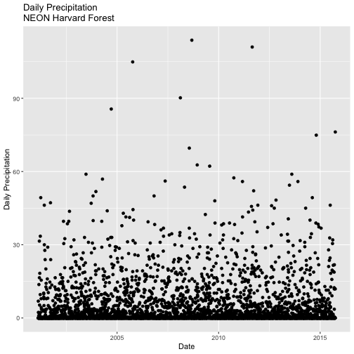
### Challenge: Plot Total Daily Precipitation
Create a plot of total daily precipitation using data in the `harMetDaily.09.11`
`data_frame`.
Format the dates on the x-axis: Month-Year.
Create a plot object called PrecipDaily.
Be sure to add an appropriate title in addition to x and y axis labels.
Increase the font size of the plot text and adjust the number of ticks on the
x-axis.
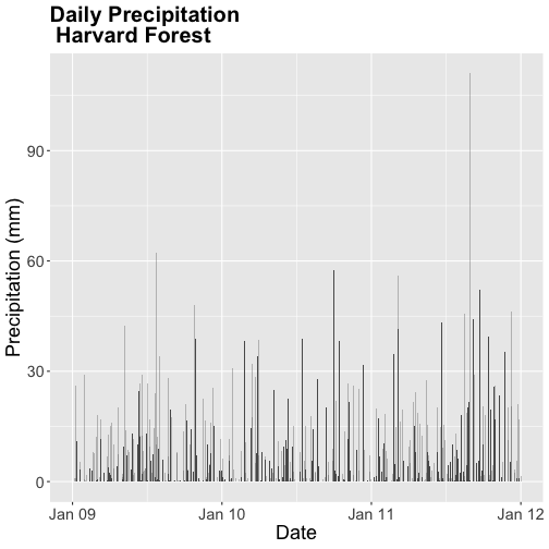
Bar Plots with ggplot
We can use ggplot to create bar plots too. Let's create a bar plot of total
daily precipitation next. A bar plot might be a better way to represent a total
daily value. To create a bar plot, we change the geom element from
geom_point() to geom_bar().
The default setting for a ggplot bar plot - geom_bar() - is a histogram
designated by stat="bin". However, in this case, we want to plot actual
precipitation values. We can use geom_bar(stat="identity") to force ggplot to
plot actual values.
Note that some of the bars in the resulting plot appear grey rather than black.
This is because R will do it's best to adjust colors of bars that are closely
spaced to improve readability. If we zoom into the plot, all of the bars are
black.
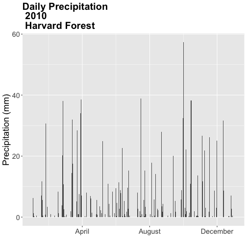
### Challenge: Plot with scale_x_data()
Without creating a subsetted dataframe, plot the precipitation data for
*2010 only*. Customize the plot with:
a descriptive title and axis labels,
breaks every 4 months, and
x-axis labels as only the full month (spelled out).
HINT: you will need to rebuild the precipitation plot as you will have to
specify a new scale_x_data() element.
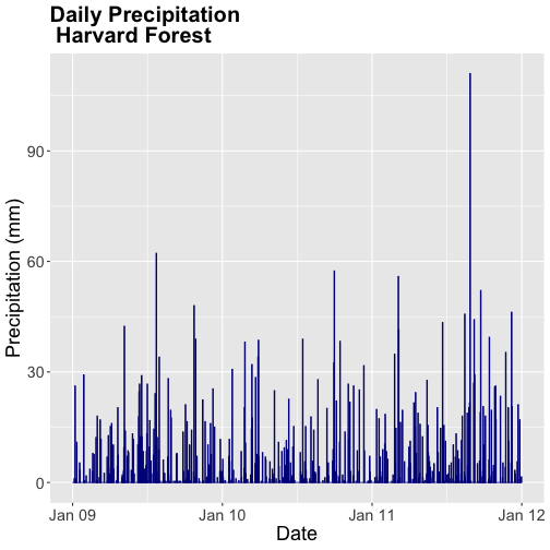
We can change the bar fill color by within the
geom_bar(colour="blue") element. We can also specify a separate fill and line
color using fill= and line=. Colors can be specified by name (e.g.,
"blue") or hexadecimal color codes (e.g, #FF9999).
There are many color cheatsheets out there to help with color selection!
# specifying color by name
PrecipDailyBarB <- PrecipDailyBarA+
  geom_bar(stat="identity", colour="darkblue")

PrecipDailyBarB
**Data Tip:** For more information on color,
including color blind friendly color palettes, checkout the
ggplot2 color information from Winston Chang's *Cookbook* *for* *R* site
based on the _R_ _Graphics_ _Cookbook_ text.
Figures with Lines
We can create line plots too using ggplot. To do this, we use geom_line()
instead of bar or point.
Note that lines may not be the best way to represent air temperature data given
lines suggest that the connecting points are directly related. It is important
to consider what type of plot best represents the type of data that you are
presenting.
### Challenge: Combine Points & Lines
You can combine geometries within one plot. For example, you can have a
`geom_line()` and `geom_point` element in a plot. Add `geom_line(na.rm=TRUE)` to
the `AirTempDaily`, a `geom_point` plot. What happens?
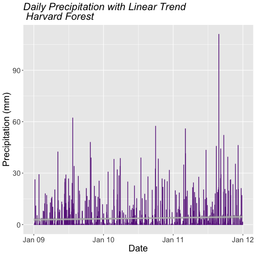
Trend Lines
We can add a trend line, which is a statistical transformation of our data to
represent general patterns, using stat_smooth(). stat_smooth() requires a
statistical method as follows:
For data with < 1000 observations: the default model is a loess model
(a non-parametric regression model)
For data with > 1,000 observations: the default model is a GAM (a general
additive model)
A specific model/method can also be specified: for example, a linear regression (method="lm").
For this tutorial, we will use the default trend line model. The gam method will
be used with given we have 1,095 measurements.
**Data Tip:** Remember a trend line is a statistical
transformation of the data, so prior to adding the line one must understand if a
particular statistical transformation is appropriate for the data.
# adding on a trend lin using loess
AirTempDaily_trend <- AirTempDaily + stat_smooth(colour="green")

AirTempDaily_trend

## `geom_smooth()` using method = 'gam' and formula 'y ~ s(x, bs = "cs")'
### Challenge: A Trend in Precipitation?
Create a bar plot of total daily precipitation. Add a:
Trend line for total daily precipitation.
Make the bars purple (or your favorite color!).
Make the trend line grey (or your other favorite color).
Adjust the tick spacing and format the dates to appear as "Jan 2009".
Render the title in italics.
## `geom_smooth()` using formula 'y ~ x'
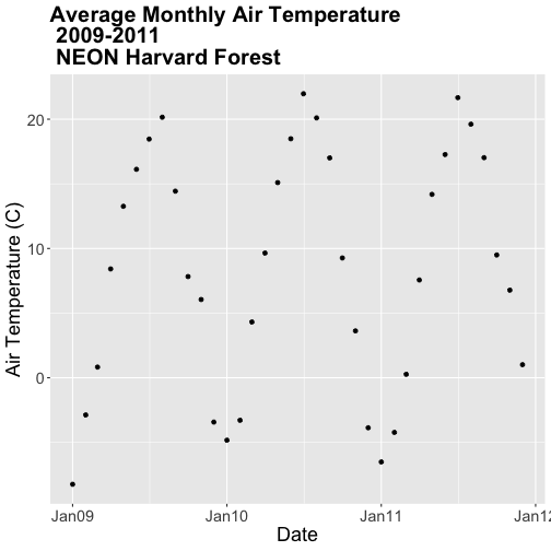
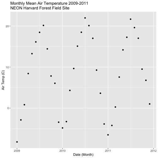
### Challenge: Plot Monthly Air Temperature
Plot the monthly air temperature across 2009-2011 using the
harTemp.monthly.09.11 data_frame. Name your plot "AirTempMonthly". Be sure to
label axes and adjust the plot ticks as you see fit.
Display Multiple Figures in Same Panel
It is often useful to arrange plots in a panel rather than displaying them
individually. In base R, we use par(mfrow=()) to accomplish this. However
the grid.arrange() function from the gridExtra package provides a more
efficient approach!
grid.arrange requires 2 things:
the names of the plots that you wish to render in the panel.
the number of columns (ncol).
grid.arrange(plotOne, plotTwo, ncol=1)
Let's plot AirTempMonthly and AirTempDaily on top of each other. To do this,
we'll specify one column.
# note - be sure library(gridExtra) is loaded!
# stack plots in one column
grid.arrange(AirTempDaily, AirTempMonthly, ncol=1)
### Challenge: Create Panel of Plots
Plot AirTempMonthly and AirTempDaily next to each other rather than stacked
on top of each other.
Additional ggplot2 Resources
In this tutorial, we've covered the basics of ggplot. There are many great
resources the cover refining ggplot figures. A few are below:
In this tutorial, we will use the group_by, summarize and mutate functions
in the dplyr package to efficiently manipulate atmospheric data collected at
the NEON Harvard Forest Field Site. We will use pipes to efficiently perform
multiple tasks within a single chunk of code.
Learning Objectives
After completing this tutorial, you will be able to:
Explain several ways to manipulate data using functions in the dplyr
package in R.
Use group-by(), summarize(), and mutate() functions.
Write and understand R code with pipes for cleaner, efficient coding.
Use the year() function from the lubridate package to extract year from a
date-time class variable.
Things You’ll Need To Complete This Tutorial
You will need the most current version of R and, preferably, RStudio loaded on
your computer to complete this tutorial.
R Script & Challenge Code: NEON data lessons often contain challenges that reinforce
learned skills. If available, the code for challenge solutions is found in the
downloadable R script of the entire lesson, available in the footer of each lesson page.
The dplyr package simplifies and increases efficiency of complicated yet
commonly performed data "wrangling" (manipulation / processing) tasks. It uses
the data_frame object as both an input and an output.
Load the Data
We will need the lubridate and the dplyr packages to complete this tutorial.
We will also use the 15-minute average atmospheric data subsetted to 2009-2011
for the NEON Harvard Forest Field Site. This subset was created in the
Subsetting Time Series Data tutorial.
If this object isn't already created, please load the .csv version:
Met_HARV_15min_2009_2011.csv. Be
sure to convert the date-time column to a POSIXct class after the .csv is
loaded.
# it's good coding practice to load packages at the top of a script

library(lubridate) # work with dates
library(dplyr)     # data manipulation (filter, summarize, mutate)
library(ggplot2)   # graphics
library(gridExtra) # tile several plots next to each other
library(scales)

# set working directory to ensure R can find the file we wish to import
wd <- "~/Git/data/"

# 15-min Harvard Forest met data, 2009-2011
harMet15.09.11<- read.csv(
  file=paste0(wd,"NEON-DS-Met-Time-Series/HARV/FisherTower-Met/Met_HARV_15min_2009_2011.csv"),
  stringsAsFactors = FALSE)

# convert datetime to POSIXct
harMet15.09.11$datetime<-as.POSIXct(harMet15.09.11$datetime,
                    format = "%Y-%m-%d %H:%M",
                    tz = "America/New_York")
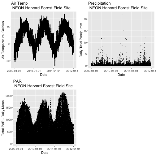
Explore The Data
Remember that we are interested in the drivers of phenology including -
air temperature, precipitation, and PAR (photosynthetic active radiation - or
the amount of visible light). Using the 15-minute averaged data, we could easily
plot each of these variables.
However, summarizing the data at a coarser scale (e.g., daily, weekly, by
season, or by year) may be easier to visually interpret during initial stages of
data exploration.
Extract Year from a Date-Time Column
To summarize by year efficiently, it is helpful to have a year column that we
can use to group by. We can use the lubridate function year() to extract
the year only from a date-time class R column.
# create a year column
harMet15.09.11$year <- year(harMet15.09.11$datetime)
Using names() we see that we now have a year column in our data_frame.
Now that we have added a year column to our data_frame, we can use dplyr to
summarize our data.
Manipulate Data using dplyr
Let's start by extracting a yearly air temperature value for the Harvard Forest
data. To calculate a yearly average, we need to:
Group our data by year.
Calculate the mean precipitation value for each group (ie for each year).
We will use dplyr functions group_by and summarize to perform these steps.
# Create a group_by object using the year column
HARV.grp.year <- group_by(harMet15.09.11, # data_frame object
                          year) # column name to group by

# view class of the grouped object
class(HARV.grp.year)

## [1] "grouped_df" "tbl_df"     "tbl"        "data.frame"
The group_by function creates a "grouped" object. We can then use this
grouped object to quickly calculate summary statistics by group - in this case,
year. For example, we can count how many measurements were made each year using
the tally() function. We can then use the summarize function to calculate
the mean air temperature value each year. Note that "summarize" is a common
function name across many different packages. If you happen to have two packages
loaded at the same time that both have a "summarize" function, you may not get
the results that you expect. Therefore, we will "disambiguate" our function by
specifying which package it comes from using the double colon notation
dplyr::summarize().
# how many measurements were made each year?
tally(HARV.grp.year)

## # A tibble: 3 x 2
##    year     n
##   <dbl> <int>
## 1  2009 35036
## 2  2010 35036
## 3  2011 35036

# what is the mean airt value per year?
dplyr::summarize(HARV.grp.year,
          mean(airt)   # calculate the annual mean of airt
          )

## # A tibble: 3 x 2
##    year `mean(airt)`
##   <dbl>        <dbl>
## 1  2009        NA
## 2  2010        NA
## 3  2011         8.75
Why did this return a NA value for years 2009 and 2010? We know there are some
values for both years. Let's check our data for NoData values.
# are there NoData values?
sum(is.na(HARV.grp.year$airt))

## [1] 2

# where are the no data values
# just view the first 6 columns of data
HARV.grp.year[is.na(HARV.grp.year$airt),1:6]

## # A tibble: 2 x 6
##        X datetime               jd  airt f.airt    rh
##    <int> <dttm>              <int> <dbl> <chr>  <int>
## 1 158360 2009-07-08 14:15:00   189    NA M         NA
## 2 203173 2010-10-18 09:30:00   291    NA M         NA
It appears as if there are two NoData values (in 2009 and 2010) that are
causing R to return a NA for the mean for those years. As we learned
previously, we can use na.rm to tell R to ignore those values and calculate
the final mean value.
# calculate mean but remove NA values
dplyr::summarize(HARV.grp.year,
          mean(airt, na.rm = TRUE)
          )

## # A tibble: 3 x 2
##    year `mean(airt, na.rm = TRUE)`
##   <dbl>                      <dbl>
## 1  2009                       7.63
## 2  2010                       9.03
## 3  2011                       8.75
Great! We've now used the group_by function to create groups for each year
of our data. We then calculated a summary mean value per year using summarize.
dplyr Pipes
The above steps utilized several steps of R code and created 1 R object -
HARV.grp.year. We can combine these steps using pipes in the dplyr
package.
We can use pipes to string functions or processing steps together. The output
of each step is fed directly into the next step using the syntax: %>%. This
means we don't need to save the output of each intermediate step as a new R
object.
A few notes about piping syntax:
A pipe begins with the object name that we will be manipulating, in our case
harMet15.09.11.
It then links that object with first manipulation step using %>%.
Finally, the first function is called, in our case group_by(year). Note
that because we specified the object name in step one above, we can just use the
column name
So, we have: harMet15.09.11 %>% group_by(year)
We can then add an additional function (or more functions!) to our pipe. For
example, we can tell R to tally or count the number of measurements per
year.
harMet15.09.11 %>% group_by(year) %>% tally()
Let's try it!
# how many measurements were made a year?
harMet15.09.11 %>%
  group_by(year) %>%  # group by year
  tally() # count measurements per year

## # A tibble: 3 x 2
##    year     n
##   <dbl> <int>
## 1  2009 35036
## 2  2010 35036
## 3  2011 35036
Piping allows us to efficiently perform operations on our data_frame in that:
It allows us to condense our code, without naming intermediate steps.
The dplyr package is optimized to ensure fast processing!
We can use pipes to summarize data by year too:
# what was the annual air temperature average
year.sum <- harMet15.09.11 %>%
  group_by(year) %>%  # group by year
  dplyr::summarize(mean(airt, na.rm=TRUE))

# what is the class of the output?
year.sum

## # A tibble: 3 x 2
##    year `mean(airt, na.rm = TRUE)`
##   <dbl>                      <dbl>
## 1  2009                       7.63
## 2  2010                       9.03
## 3  2011                       8.75

# view structure of output
str(year.sum)

## tibble [3 × 2] (S3: tbl_df/tbl/data.frame)
##  $ year                    : num [1:3] 2009 2010 2011
##  $ mean(airt, na.rm = TRUE): num [1:3] 7.63 9.03 8.75
### Challenge: Using Pipes
Use piping to create a `data_frame` called `jday.avg` that contains the average
`airt` per Julian day (`harMet15.09.11$jd`). Plot the output using `qplot`.
**Data Tip:** Older `dplyr` versions used the `%.%`
syntax to designate a pipe. Pipes are sometimes referred to as chains.
Other dplyr Functions
dplyr works based on a series of verb functions that allow us to manipulate
the data in different ways:
filter() & slice(): filter rows based on values in specified columns
group-by(): group all data by a column
arrange(): sort data by values in specified columns
select() & rename(): view and work with data from only specified columns
distinct(): view and work with only unique values from specified columns
mutate() & transmute(): add new data to a data frame
summarise(): calculate the specified summary statistics
sample_n() & sample_frac(): return a random sample of rows
the subsequent arguments dictate what to do with that data_frame and
the output is a new data frame.
Group by a Variable (or Two)
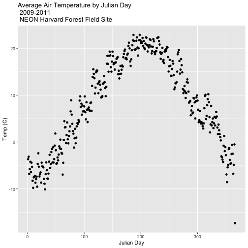
Our goal for this tutorial is to view drivers of annual phenology patterns.
Specifically, we want to explore daily average temperature throughout the year.
This means we need to calculate average temperature, for each day, across three
years. To do this we can use the group_by() function as we did earlier.
However this time, we can group by two variables: year and Julian Day (jd) as follows:
group_by(year, jd)
Let's begin by counting or tallying the total measurements per Julian day (or
year day) using the group_by() function and pipes.
harMet15.09.11 %>%         # use the harMet15.09.11 data_frame
  group_by(year, jd) %>%   # group data by Year & Julian day
  tally()                  # tally (count) observations per jd / year

## # A tibble: 1,096 x 3
## # Groups:   year [3]
##     year    jd     n
##    <dbl> <int> <int>
##  1  2009     1    96
##  2  2009     2    96
##  3  2009     3    96
##  4  2009     4    96
##  5  2009     5    96
##  6  2009     6    96
##  7  2009     7    96
##  8  2009     8    96
##  9  2009     9    96
## 10  2009    10    96
## # … with 1,086 more rows
The output shows we have 96 values for each day. Is that what we expect?
**Data Tip:** If Julian days weren't already in our
data, we could use the `yday()` function from the `lubridate` package
to create a new column containing Julian day
values. More information in this
NEON Data Skills tutorial.
Summarize by Group
We can use summarize() function to calculate a summary output value for each
"group" - in this case Julian day per year. Let's calculate the mean air
temperature for each Julian day per year. Note that we are still using
na.rm=TRUE to tell R to skip NA values.
harMet15.09.11 %>%         # use the harMet15.09.11 data_frame
  group_by(year, jd) %>%   # group data by Year & Julian day
  dplyr::summarize(mean_airt = mean(airt, na.rm = TRUE))  # mean airtemp per jd / year

## `summarise()` has grouped output by 'year'. You can override using the `.groups` argument.

## # A tibble: 1,096 x 3
## # Groups:   year [3]
##     year    jd mean_airt
##    <dbl> <int>     <dbl>
##  1  2009     1    -15.1
##  2  2009     2     -9.14
##  3  2009     3     -5.54
##  4  2009     4     -6.35
##  5  2009     5     -2.41
##  6  2009     6     -4.92
##  7  2009     7     -2.59
##  8  2009     8     -3.23
##  9  2009     9     -9.92
## 10  2009    10    -11.1
## # … with 1,086 more rows
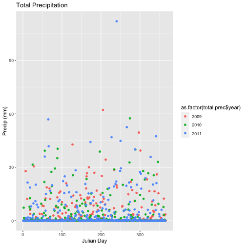
### Challenge: Summarization & Calculations with dplyr
We can use `sum` to calculate the total rather than mean value for each Julian
Day. Using this information, do the following:
Calculate total prec for each Julian Day over the 3 years - name your
data_frame total.prec.
Create a plot of Daily Total Precipitation for 2009-2011.
Add a title and x and y axis labels.
If you use qplot to create your plot, use
colour=as.factor(total.prec$year) to color the data points by year.
## `summarise()` has grouped output by 'year'. You can override using the `.groups` argument.
Mutate - Add data_frame Columns to dplyr Output
We can use the mutate() function of dplyr to add additional columns of
information to a data_frame. For instance, we added the year column
independently at the very beginning of the tutorial. However, we can add the
year using a dplyr pipe that also summarizes our data. To do this, we would
use the syntax:
mutate(year2 = year(datetime))
year2 is the name of the column that will be added to the output dplyr
data_frame.
**Data Tip:** The `mutate` function is similar to
`transform()` in base R. However,`mutate()` allows us to create and
immediately use the variable (`year2`).
Save dplyr Output as data_frame
We can save output from a dplyr pipe as a new R object to use for quick
plotting.
harTemp.daily.09.11<-harMet15.09.11 %>%
                    mutate(year2 = year(datetime)) %>%
                    group_by(year2, jd) %>%
                    dplyr::summarize(mean_airt = mean(airt, na.rm = TRUE))

## `summarise()` has grouped output by 'year2'. You can override using the `.groups` argument.

head(harTemp.daily.09.11)

## # A tibble: 6 x 3
## # Groups:   year2 [1]
##   year2    jd mean_airt
##   <dbl> <int>     <dbl>
## 1  2009     1    -15.1
## 2  2009     2     -9.14
## 3  2009     3     -5.54
## 4  2009     4     -6.35
## 5  2009     5     -2.41
## 6  2009     6     -4.92
Add Date-Time To dplyr Output
In the challenge above, we created a plot of daily precipitation data using
qplot. However, the x-axis ranged from 0-366 (Julian Days for the year). It
would have been easier to create a meaningful plot across all three years if we
had a continuous date variable in our data_frame representing the year and
date for each summary value.
We can add the the datetime column value to our data_frame by adding an
additional argument to the summarize() function. In this case, we will add the
first datetime value that R encounters when summarizing data by group as
follows:
datetime = first(datetime)
Our new summarize statement in our pipe will look like this:
Plot daily total precipitation from 2009-2011 as we did in the previous
challenge. However this time, use the new syntax that you learned (mutate and
summarize to add a datetime column to your output data_frame).
Create a data_frame of the average monthly air temperature for 2009-2011.
Name the new data frame harTemp.monthly.09.11. Plot your output.
## `summarise()` has grouped output by 'year'. You can override using the `.groups` argument.
## `summarise()` has grouped output by 'month'. You can override using the `.groups` argument.
This tutorial explores how to deal with NoData values encountered in a time
series dataset, in R. It also covers how to subset large files by date and
export the results to a .csv (text) file.
Learning Objectives
After completing this tutorial, you will be able to:
Subset data by date.
Search for NA or missing data values.
Describe different possibilities on how to deal with missing data.
Things You’ll Need To Complete This Tutorial
You will need the most current version of R and, preferably, RStudio loaded on
your computer to complete this tutorial.
R Script & Challenge Code: NEON data lessons often contain challenges that reinforce
learned skills. If available, the code for challenge solutions is found in the
downloadable R script of the entire lesson, available in the footer of each lesson page.
Cleaning Time Series Data
It is common to encounter, large files containing more
data than we need for our analysis. It is also common to encounter NoData
values that we need to account for when analyzing our data.
In this tutorial, we'll learn how to both manage NoData values and also
subset and export a portion of an R object as a new .csv file.
In this tutorial, we will work with atmospheric data, containing air temperature,
precipitation, and photosynthetically active radiation (PAR) data - metrics
that are key drivers of phenology. Our study area is the
NEON Harvard Forest Field Site.
Import Timeseries Data
We will use the lubridate and ggplot2 packages. Let's load those first.
If you have not already done so, import the hf001-10-15min-m.csv file, which
contains atmospheric data for Harvard Forest. Convert the datetime column
to a POSIXct class as covered in the tutorial:
Dealing With Dates & Times in R - as.Date, POSIXct, POSIXlt.
# Load packages required for entire script
library(lubridate)  # work with dates
library(ggplot2)  # plotting

# set working directory to ensure R can find the file we wish to import
wd <- "~/Git/data/"

# Load csv file containing 15 minute averaged atmospheric data
# for the NEON Harvard Forest Field Site

# Factors=FALSE so data are imported as numbers and characters
harMet_15Min <- read.csv(
  file=paste0(wd,"NEON-DS-Met-Time-Series/HARV/FisherTower-Met/hf001-10-15min-m.csv"),
  stringsAsFactors = FALSE)

# convert to POSIX date time class - US Eastern Time Zone
harMet_15Min$datetime <- as.POSIXct(harMet_15Min$datetime,
                                format = "%Y-%m-%dT%H:%M",
                                tz = "America/New_York")
Subset by Date
Our .csv file contains nearly a decade's worth of data which makes for a large
file. The time period we are interested in for our study is:
Start Time: 1 January 2009
End Time: 31 Dec 2011
Let's subset the data to only contain these three years. We can use the
subset() function, with the syntax:
NewObject <- subset ( ObjectToBeSubset, CriteriaForSubsetting ) .
We will set our criteria to be any datetime that:
Is greater than or equal to 1 Jan 2009 at 0:00
AND
Is less than or equal to 31 Dec 2011 at 23:59.
We also need to specify the timezone so R can handle daylight savings and
leap year.
It worked! The first entry is 1 January 2009 at 00:00 and the last entry is 31
December 2011 at 23:45.
Export data.frame to .CSV
We can export this subset in .csv format to use in other analyses or to
share with colleagues using write.csv.
**Data Tip:** Remember, to give your output files
concise, yet descriptive names so you can identify what it contains in the
future. By default, the `.csv` file will be written to your working directory.
# write harMet15 subset data to .csv
write.csv(harMet15.09.11,
          file=paste0(wd,"Met_HARV_15min_2009_2011.csv"))
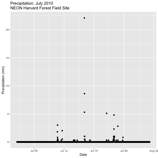
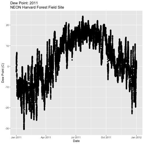
### Challenge: Subset & Plot Data
Create a plot of precipitation for the month of July 2010 in Harvard
Forest. Be sure to label x and y axes. Also be sure to give your plot a title.
Create a plot of dew point (dewp) for the year 2011 at Harvard Forest.
Bonus challenge: Complete this challenge using the available daily data
instead of the 15-minute data. What will need to change in your subsetting code?
Managing Missing Data: NoData values
Find NoData Values
If we are lucky when working with external data, the NoData value is clearly
specified
in the metadata. No data values can be stored differently:
NA / NaN: Sometimes this value is NA or NaN (not a number).
A Designated Numeric Value (e.g. -9999): Character strings such as NA can
not always be stored along side of numeric values in some file formats. Sometimes
you'll encounter numeric placeholders for noData values such as
-9999 (a value often used in the GIS / Remote Sensing and Micrometeorology
domains.
Blank Values: sometimes noData values are left blank. Blanks are
particularly problematic because we can't be certain if a data value is
purposefully missing (not measured that day or a bad measurement) or if someone
unintentionally deleted it.
Because the actual value used to designate missing data can vary depending upon
what data we are working with, it is important to always check the metadata for
the files associated NoData value. If the value is NA, we are in luck, R
will recognize and flag this value as NoData. If the value is numeric (e.g.,
-9999), then we might need to assign this value to NA.
**Data Tip:** `NA` values will be ignored when
performing calculations in R. However a `NoData` value of `-9999` will be
recognized as an integer and processed accordingly. If you encounter a numeric
`NoData` value be sure to assign it to `NA` in R:
`objectName[objectName==-9999] <- NA`
Excerpt from the metadata:airt: average air temperature. Average of daily averages. (unit: celsius / missing value: NA)
Check For NoData Values
We can quickly check for NoData values in our data using theis.na()
function. By asking for the sum() of is.na() we can see how many NA/ missing
values we have.
# Check for NA values
sum(is.na(harMet15.09.11$datetime))

## [1] 0

sum(is.na(harMet15.09.11$airt))

## [1] 2

# view rows where the air temperature is NA
harMet15.09.11[is.na(harMet15.09.11$airt),]

##                   datetime  jd airt f.airt rh f.rh dewp f.dewp prec
## 158360 2009-07-08 14:15:00 189   NA      M NA    M   NA      M    0
## 203173 2010-10-18 09:30:00 291   NA      M NA    M   NA      M    0
##        f.prec slrr f.slrr parr f.parr netr f.netr bar f.bar wspd
## 158360         290         485         139         NA     M  2.1
## 203173          NA      M   NA      M   NA      M  NA     M   NA
##        f.wspd wres f.wres wdir f.wdir wdev f.wdev gspd f.gspd s10t
## 158360         1.8          86          29         5.2        20.7
## 203173      M   NA      M   NA      M   NA      M   NA      M 10.9
##        f.s10t
## 158360
## 203173
The results above tell us there are NoData values in the airt column.
However, there are NoData values in other variables.
### Challenge: NoData Values
How many NoData values are in the precipitation (prec) and PAR (parr)
columns of our data?
Deal with NoData Values
When we encounter NoData values (blank, NaN, -9999, etc.) in our data we
need to decide how to deal with them. By default R treats NoData values
designated with a NA as a missing value rather than a zero. This is good, as a
value of zero (no rain today) is not the same as missing data (e.g. we didn't
measure the amount of rainfall today).
How we deal with NoData values will depend on:
the data type we are working with
the analysis we are conducting
the significance of the gap or missing value
Many functions in R contains a na.rm= option which will allow you to tell R
to ignore NA values in your data when performing calculations.
To Gap Fill? Or Not?
Sometimes we might need to "gap fill" our data. This means we will interpolate
or estimate missing values often using statistical methods. Gap filling can be
complex and is beyond the scope of this tutorial. The take away from this
is simply that it is important to acknowledge missing values in your data and to
carefully consider how you wish to account for them during analysis.
For this tutorial, we are exploring the patterns of precipitation,
and temperature as they relate to green-up and brown-down of vegetation at
Harvard Forest. To view overall trends during these early exploration stages, it
is okay for us to leave out the NoData values in our plots.
**Data Tip:** If we wanted to perform more advanced
statistical analysis, we might consider gap-filling as our next step. Many data
products, from towers such as FluxNet include a higher level, gap-filled
product that we can download.
More on Gap Filling
NoData Values Can Impact Calculations
It is important to consider NoData values when performing calculations on our
data. For example, R will not properly calculate certain functions if there
are NA values in the data, unless we explicitly tell it to ignore them.
# calculate mean of air temperature
mean(harMet15.09.11$airt)

## [1] NA

# are there NA values in our data?
sum(is.na(harMet15.09.11$airt))

## [1] 2
R will not return a value for the mean as there NA values in the air
temperature column. Because there are only 2 missing values (out of 105,108) for
air temperature, we aren't that worried about a skewed 3 year mean. We can tell
R to ignore noData values in the mean calculations using na.rm=
(NA.remove).
# calculate mean of air temperature, ignore NA values
mean(harMet15.09.11$airt,
     na.rm=TRUE)

## [1] 8.467904
We now see that the 3-year average air temperature is 8.5°C.
### Challenge: Import, Understand Metadata, and Clean a Data Set
We have been using the 15-minute data from the Harvard Forest. However, overall
we are interested in larger scale patterns of greening-up and browning-down.
Thus a daily summary is sufficient for us to see overall trends.
Import the Daily Meteorological data from the Harvard Forest (if you haven't
already done so in the
Intro to Time Series Data in R tutorial.)
Check the metadata to see what the column names are for the variable of
interest (precipitation, air temperature, PAR, day and time ).
If needed, convert the data class of different columns.
Check for missing data and decide what to do with any that exist.
Subset out the data for the duration of our study: 2009-2011. Name the object
"harMetDaily.09.11".
Export the subset to a .csv file.
Create a plot of Daily Air Temperature for 2009-2011. Be sure to label, x-
and y-axes. Also give the plot a title!
This tutorial explores working with date and time field in R. We will overview
the differences between as.Date, POSIXct and POSIXlt as used to convert
a date / time field in character (string) format to a date-time format that is
recognized by R. This conversion supports efficient plotting, subsetting and
analysis of time series data.
Learning Objectives
After completing this tutorial, you will be able to:
Describe various date-time classes and data structure in R.
Explain the difference between POSIXct and POSIXlt data classes are and
why POSIXct may be preferred for some tasks.
Convert a column containing date-time information in character
format to a date-time R class.
Convert a date-time column to different date-time classes.
Write out a date-time class object in different ways (month-day,
month-day-year, etc).
Things You’ll Need To Complete This Tutorials
You will need the most current version of R and, preferably, RStudio loaded on
your computer to complete this tutorial.
R Script & Challenge Code: NEON data lessons often contain challenges that reinforce
learned skills. If available, the code for challenge solutions is found in the
downloadable R script of the entire lesson, available in the footer of each lesson page.
The Data Approach
Intro to Time Series Data in R tutorial
we imported a time series dataset in .csv format into R. We learned how to
quickly plot these data by converting the date column to an R Date class.
In this tutorial we will explore how to work with a column that contains both a
date AND a time stamp.
We will use functions from both base R and the lubridate package to work
with date-time data classes.
# Load packages required for entire script
library(lubridate)  #work with dates

#Set the working directory and place your downloaded data there
wd <- "~/Git/data/"
Import CSV File
First, let's import our time series data. We are interested in temperature,
precipitation and photosynthetically active radiation (PAR) - metrics that are
strongly associated with vegetation green-up and brown down (phenology or
phenophase timing). We will use the hf001-10-15min-m.csv file
that contains atmospheric data for the NEON Harvard Forest field site,
aggregated at 15-minute intervals. Download the dataset for these exercises here.
# Load csv file of 15 min meteorological data from Harvard Forest
# contained within the downloaded directory, or available for download
# directly from:
# https://harvardforest.fas.harvard.edu/data/p00/hf001/hf001-10-15min-m.csv
# Factors=FALSE so strings, series of letters/words/numerals, remain characters
harMet_15Min <- read.csv(
  file=paste0(wd,"NEON-DS-Met-Time-Series/HARV/FisherTower-Met/hf001-10-15min-m.csv"),
  stringsAsFactors = FALSE)
Date and Time Data
Let's revisit the data structure of our harMet_15Min object. What is the class
of the date-time column?
# view column data class
class(harMet_15Min$datetime)

## [1] "character"

# view sample data
head(harMet_15Min$datetime)

## [1] "2005-01-01T00:15" "2005-01-01T00:30" "2005-01-01T00:45"
## [4] "2005-01-01T01:00" "2005-01-01T01:15" "2005-01-01T01:30"
Our datetime column is stored as a character class. We need to convert it to
date-time class. What happens when we use the as.Date method that we learned
about in the
Intro to Time Series Data in R tutorial?
# convert column to date class
dateOnly_HARV <- as.Date(harMet_15Min$datetime)

# view data
head(dateOnly_HARV)

## [1] "2005-01-01" "2005-01-01" "2005-01-01" "2005-01-01" "2005-01-01"
## [6] "2005-01-01"
When we use as.Date, we lose the time stamp.
Explore Date and Time Classes
R - Date Class - as.Date
As we just saw, the as.Date format doesn't store any time information. When we
use theas.Date method to convert a date stored as a character class to an R
date class, it will ignore all values after the date string.
# Convert character data to date (no time)
myDate <- as.Date("2015-10-19 10:15")
str(myDate)

##  Date[1:1], format: "2015-10-19"

# what happens if the date has text at the end?
myDate2 <- as.Date("2015-10-19Hello")
str(myDate2)

##  Date[1:1], format: "2015-10-19"
As we can see above the as.Date() function will convert the characters that it
recognizes to be part of a date into a date class and ignore all other
characters in the string.
R - Date-Time - The POSIX classes
If we have a column containing both date and time we need to use a class that
stores both date AND time. Base R offers two closely related classes for date
and time: POSIXct and POSIXlt.
POSIXct
The as.POSIXct method converts a date-time string into a POSIXct class.
# Convert character data to date and time.
timeDate <- as.POSIXct("2015-10-19 10:15")
str(timeDate)

##  POSIXct[1:1], format: "2015-10-19 10:15:00"

timeDate

## [1] "2015-10-19 10:15:00 MDT"
as.POSIXct stores both a date and time with an associated time zone. The
default time zone selected, is the time zone that your computer is set to which
is most often your local time zone.
POSIXct stores date and time in seconds with the number of seconds beginning
at 1 January 1970. Negative numbers are used to store dates prior to 1970.
Thus, the POSIXct format stores each date and time a single value in units of
seconds. Storing the data this way, optimizes use in data.frames and speeds up
computation, processing and conversion to other formats.
# to see the data in this 'raw' format, i.e., not formatted according to the
# class type to show us a date we recognize, use the `unclass()` function.
unclass(timeDate)

## [1] 1445271300
## attr(,"tzone")
## [1] ""
Here we see the number of seconds from 1 January 1970 to 9 October 2015
(1445271300). Also, we see that a time zone (tzone) is associated with the value in seconds.
**Data Tip:** The `unclass` method in R allows you
to view how a particular R object is stored.
POSIXlt
The POSIXct format is optimized for storage and computation. However, humans
aren't quite as computationally efficient as computers! Also, we often want to
quickly extract some portion of the data (e.g., months). The POSIXlt class
stores date and time information in a format that we are used to seeing (e.g.,
second, min, hour, day of month, month, year, numeric day of year, etc).
When we convert a string to POSIXlt, and view it in R, it still looks
similar to the POSIXct format. However, unclass() shows us that the data are
stored differently. The POSIXlt class stores the hour, minute, second, day,
month, and year separately.
Months in POSIXlt
POSIXlt has a few quirks. First, the month values stored in the POSIXlt
object use zero-based indexing. This means that month #1 (January) is stored
as 0, and month #2 (February) is stored as 1. Notice in the output above,
October is stored as the 9th month ($mon = 9).
Years in POSIXlt
Years are also stored differently in the POSIXlt class. Year values are stored
using a base index value of 1900. Thus, 2015 is stored as 115 ($year = 115
115 years since 1900).
**Data Tip:** To learn more about how R stores
information within date-time and other objects check out the R documentation
by using `?` (e.g., `?POSIXlt`). NOTE: you can use this same syntax to learn
about particular functions (e.g., `?ggplot`).
Having dates classified as separate components makes POSIXlt computationally
more resource intensive to use in data.frames. This slows things down! We will
thus use POSIXct for this tutorial.
**Data Tip:** There are other R packages that
support date-time data classes, including `readr`, `zoo` and `chron`.
Convert to Date-time Class
When we convert from a character to a date-time class we need to tell R how
the date and time information are stored in each string. To do this, we can use
format=. Let's have a look at one of our date-time strings to determine it's
format.
# view one date-time field
harMet_15Min$datetime[1]

## [1] "2005-01-01T00:15"
Looking at the results above, we see that our data are stored in the format:
Year-Month-Day "T" Hour:Minute (2005-01-01T00:15). We can use this information
to populate our format string using the following designations for the
components of the date-time data:
%Y - year
%m - month
%d - day
%H:%M - hours:minutes
**Data Tip:** A list of options for date-time format
is available in the `strptime` function help: `help(strptime)`. Check it out!
The "T" inserted into the middle of datetime isn't a standard character for
date and time, however we can tell R where the character is so it can ignore
it and interpret the correct date and time as follows:
format="%Y-%m-%dT%H:%M".
# convert single instance of date/time in format year-month-day hour:min:sec
as.POSIXct(harMet_15Min$datetime[1],format="%Y-%m-%dT%H:%M")

## [1] "2005-01-01 00:15:00 MST"

## The format of date-time MUST match the specified format or the data will not
# convert; see what happens when you try it a different way or without the "T"
# specified
as.POSIXct(harMet_15Min$datetime[1],format="%d-%m-%Y%H:%M")

## [1] NA

as.POSIXct(harMet_15Min$datetime[1],format="%Y-%m-%d%H:%M")

## [1] NA
Using the syntax we've learned, we can convert the entire datetime column into
POSIXct class.
new.date.time <- as.POSIXct(harMet_15Min$datetime,
                            format="%Y-%m-%dT%H:%M" #format time
                            )

# view output
head(new.date.time)

## [1] "2005-01-01 00:15:00 MST" "2005-01-01 00:30:00 MST"
## [3] "2005-01-01 00:45:00 MST" "2005-01-01 01:00:00 MST"
## [5] "2005-01-01 01:15:00 MST" "2005-01-01 01:30:00 MST"

# what class is the output
class(new.date.time)

## [1] "POSIXct" "POSIXt"
About Time Zones
Above, we successfully converted our data into a date-time class. However, what
timezone is the output new.date.time object that we created using?
2005-04-15 03:30:00 MDT
It appears as if our data were assigned MDT (which is the timezone of the
computer where these tutorials were processed originally - in Colorado - Mountain
Time). However, we know from the metadata, explored in the
Why Metadata Are Important: How to Work with Metadata in Text & EML Format tutorial,
that these data were stored in Eastern Standard Time.
Assign Time Zone
When we convert a date-time formatted column to POSIXct format, we need to
assign an associated time zone. If we don't assign a time zone,R will
default to the local time zone that is defined on your computer.
There are individual designations for different time zones and time zone
variants (e.g., does the time occur during daylight savings time).
**Data Tip:** Codes for time zones can be found in this
time zone table.
The code for the Eastern time zone that is the closest match to the NEON Harvard
Forest field site is America/New_York. Let's convert our datetime field
one more time, and define the associated timezone (tz=).
# assign time zone to just the first entry
as.POSIXct(harMet_15Min$datetime[1],
            format = "%Y-%m-%dT%H:%M",
            tz = "America/New_York")

## [1] "2005-01-01 00:15:00 EST"
The output above, shows us that the time zone is now correctly set as EST.
Convert to Date-time Data Class
Now, using the syntax that we learned above, we can convert the entire
datetime column to a POSIXct class.
# convert to POSIXct date-time class
harMet_15Min$datetime <- as.POSIXct(harMet_15Min$datetime,
                                format = "%Y-%m-%dT%H:%M",
                                tz = "America/New_York")

# view structure and time zone of the newly defined datetime column
str(harMet_15Min$datetime)

##  POSIXct[1:376800], format: "2005-01-01 00:15:00" "2005-01-01 00:30:00" ...

tz(harMet_15Min$datetime)

## [1] "America/New_York"
Now that our datetime data are properly identified as a POSIXct date-time
data class we can continue on and look at the patterns of precipitation,
temperature, and PAR through time.
This tutorial covers what metadata are, and why we need to work with
metadata. It covers the 3 most common metadata formats: text file format,
web page format and Ecological Metadata Language (EML).
R Skill Level: Introduction - you've got the basics of R down and
understand the general structure of tabular data.
Learning Objectives
After completing this tutorial, you will be able to:
Import a .csv file and examine the structure of the related R
object.
Use a metadata file to better understand the content of a dataset.
Explain the importance of including metadata details in your R script.
Describe what an EML file is.
Things You’ll Need To Complete This Tutorial
You will need the most current version of R and, preferably, RStudio loaded on
your computer to complete this tutorial.
Install R Packages
When presented in a workshop, the EML package will be presented as a
demonstration!
If completing EML portion of tutorial on your own, you must
install EML directly from GitHub (the package is in development and is not
yet on CRAN). You will need to install devtools to do this.
R Script & Challenge Code: NEON data lessons often contain challenges that reinforce
learned skills. If available, the code for challenge solutions is found in the
downloadable R script of the entire lesson, available in the footer of each lesson page.
Understand Our Data
In order to work with any data, we need to understand three things about the
data:
Structure
Format
Processing methods
If the data are collected by other people and organizations, we might also need
further information about:
What metrics are included in the dataset
The units those metrics were stored in
Explanation of where the metrics are stored in the data and what they are "called"
(e.g. what are the column names in a spreadsheet)
The time range that it covers
The spatial extent that the data covers
The above information, and more are stored in metadata - data
about the data. Metadata is information that describes a dataset and is integral
to working with external data (data that we did not collect ourselves).
Metadata Formats
Metadata come in different formats. We will discuss three of those in this tutorial:
Ecological Metadata Language (EML): A standardized metadata format stored
in xml format which is machine readable. Metadata has some standards however it's
common to encounter metadata stored differently in EML files created by different
organizations.
Text file: Sometimes metadata files can be found in text files that are either
downloaded with a data product OR that are available separately for the data.
Directly on a website (HTML / XML): Sometimes data are documented directly
in text format, on a web page.
**Data Tip:** When you find metadata for a dataset
that you are working with, immediately **DOWNLOAD AND SAVE IT** to the directory
on your computer where you saved the data. It is also a good idea to document
the URL where you found the metadata and data in a "readme" text file!
Metadata Stored on a Web Page
The metadata for the data that we are working with for the Harvard Forest field
site are stored in both EML format and on a web page. Let's explore the web
page first.
Let's begin by visiting that page above. At the top of the page, there is a list
of data available for Harvard Forest. NOTE: hf001-06: daily (metric) since
2001 (preview) is the data that we used in the
previous tutorial.
Scroll down to the Overview section on the website. Take note of the
information provided in that section and answer the questions in the
Challenge below.
### Challenge: Explore Metadata
Explore the metadata stored on the Harvard Forest LTER web page. Answer the
following questions.
What is the time span of the data available for this site?
You have some questions about these data. Who is the lead investigator / who
do you contact for more information? And how do you contact them?
Where is this field site located? How is the site location information stored
in the metadata? Is there any information that may be useful to you viewing the
location? HINT: What if you were not familiar with Harvard as a site / from
another country, etc?
Field Site Information: What is the elevation for the site? What is the
dominant vegetation cover for the site? HINT: Is dominant vegetation easy to
find in the metadata?
How is snow dealt with in the precipitation data?
Are there some metadata attributes that might be useful to access in a script
in R or Python rather than viewed on a web page? HINT: Can you answer all of
the questions above from the information provided on this website? Is there
additional information that you might want to find on the page?
View Metadata For Metrics of Interest
For this tutorial series, we are interested in the drivers of plant phenology -
specifically air and soil temperature, precipitation and photosynthetically
active radiation (PAR). Let's look for descriptions of these variables in the
metadata and determine several key attributes that we will need prior to working
with the data.
### Challenge: Metrics of Interest Metadata
View the metadata at the URL above. Answer the following questions about the
Harvard Forest LTER data - hf001-10: 15-minute (metric) since 2005:
What is the column heading name where each variable (air temperature, soil
temperature, precipitation and PAR) is stored?
What are the units that each variable are stored in?
What is the frequency of measurement collected for each and how are noData
values stored?
Where is the date information stored (in what field) and what timezone are
the dates stored in?
Why Metadata on a Web Page Is Not Ideal
It is nice to have a web page that displays metadata information, however
accessing metadata on a web page is difficult:
If the web page URL changes or the site goes down, the information is lost.
It's also more challenging to access metadata in text format on a web page
programatically - like using R as an interface - which we often
want to do when working with larger datasets.
A machine readable metadata file is better - especially when we are working with
large data and we want to automate and carefully document workflows. The
Ecological Metadata Language (EML) is one machine readable metadata format.
Ecological Metadata Language (EML)
While much of the documentation that we need to work with at the Harvard Forest
field site is available directly on the
Harvard Forest Data Archive page,
the website also offers metadata in EML format.
Introduction to EML
The Ecological Metadata Language (EML) is a data specification developed
specifically
to document ecological data. An EML file is created using a XML based format.
This means that content is embedded within hierarchical tags. For example,
the title of a dataset might be embedded in a <title> tag as follows:
<title>Fisher Meteorological Station at Harvard Forest since 2001</title>
Similarly, the creator of a dataset is also be found in a hierarchical tag
structure.
The EML package for R is designed to read and allow users to work with EML
formatted metadata. In this tutorial, we demonstrate how we can use EML in an
automated workflow.
NOTE: The EML package is still being developed, therefore we will not
explicitly teach all details of how to use it. Instead, we will provide
an example of how you can access EML files programmatically and background
information so that you can further explore EML and the EML package if you
need to work with it further.
EML Terminology
Let's first discuss some basic EML terminology. In the
context of EML, each EML file documents a dataset. This dataset may
consist of one or more files that contain the data in data tables. In the
case of our tabular meteorology data, the structure of our EML file includes:
The dataset. A dataset may contain
one or more data tables associated with it that may contain different types of
related information. For this Harvard Forest meteorological data, the data
tables contain tower measurements including precipitation and temperature, that
are aggregated at various time intervals (15 minute, daily, etc) and that date
back to 2001.
The data tables. Data tables refer to the actual data that make up the
dataset. For the Harvard Forest data, each data table contains a suite of
meteorological metrics, including precipitation and temperature (and associated
quality flags), that are aggregated at a particular time interval (e.g. one
data table contains monthly average data, another contains 15 minute
averaged data, etc).
Work With EML in R
To begin, we will load the EML package directly from ROpenSci's Git repository.
# install R EML tool
# load devtools (if you need to install "EML")
#library("devtools")
# IF YOU HAVE NOT DONE SO ALREADY: install EML from github -- package in
# development; not on CRAN
#install_github("ropensci/EML", build=FALSE, dependencies=c("DEPENDS", "IMPORTS"))

# load ROpenSci EML package
library(EML)
# load ggmap for mapping
library(ggmap)
# load tmaptools for mapping
library(tmaptools)
Next, we will read in the LTER EML file - directly from the online URL using
eml_read. This file documents multiple data products that can be downloaded.
Check out the
Harvard Forest Data Archive Page for Fisher Meteorological Station
for more on this dataset and to download the archive files directly.
Note that because this EML file is large, it takes a few seconds for the file to
load.
# data location
# http://harvardforest.fas.harvard.edu:8080/exist/apps/datasets/showData.html?id=hf001
# table 4 http://harvardforest.fas.harvard.edu/data/p00/hf001/hf001-04-monthly-m.csv

# import EML from Harvard Forest Met Data
# note, for this particular tutorial, we will work with an abridged version of the file
# that you can access directly on the harvard forest website. (see comment below)
eml_HARV <- read_eml("https://harvardforest1.fas.harvard.edu/sites/harvardforest.fas.harvard.edu/files/data/eml/hf001.xml")

# import a truncated version of the eml file for quicker demonstration
# eml_HARV <- read_eml("http://neonscience.github.io/NEON-R-Tabular-Time-Series/hf001-revised.xml")

# view size of object
object.size(eml_HARV)

## 1299568 bytes

# view the object class
class(eml_HARV)

## [1] "emld" "list"
The eml_read function creates an EML class object. This object can be
accessed using slots in R ($) rather than a typical subset [] approach.
Explore Metadata Attributes
We can begin to explore the contents of our EML file and associated data that it
describes. Let's start at the dataset level. We can use slots to view
the contact information for the dataset and a description of the methods.
# view the contact name listed in the file

eml_HARV$dataset$creator

## $individualName
## $individualName$givenName
## [1] "Emery"
##
## $individualName$surName
## [1] "Boose"

# view information about the methods used to collect the data as described in EML
eml_HARV$dataset$methods

## $methodStep
## $methodStep$description
## $methodStep$description$section
## $methodStep$description$section[[1]]
## [1] "<title>Observation periods</title><para>15-minute: 15 minutes, ending with given time. Hourly: 1 hour, ending with given time. Daily: 1 day, midnight to midnight. All times are Eastern Standard Time.</para>"
##
## $methodStep$description$section[[2]]
## [1] "<title>Instruments</title><para>Air temperature and relative humidity: Vaisala HMP45C (2.2m above ground). Precipitation: Met One 385 heated rain gage (top of gage 1.6m above ground). Global solar radiation: Licor LI200X pyranometer (2.7m above ground). PAR radiation: Licor LI190SB quantum sensor (2.7m above ground). Net radiation: Kipp and Zonen NR-LITE net radiometer (5.0m above ground). Barometric pressure: Vaisala CS105 barometer. Wind speed and direction: R.M. Young 05103 wind monitor (10m above ground). Soil temperature: Campbell 107 temperature probe (10cm below ground). Data logger: Campbell Scientific CR10X.</para>"
##
## $methodStep$description$section[[3]]
## [1] "<title>Instrument and flag notes</title><para>Air temperature. Daily air temperature is estimated from other stations as needed to complete record.</para><para>Precipitation. Daily precipitation is estimated from other stations as needed to complete record. Delayed melting of snow and ice (caused by problems with rain gage heater or heavy precipitation) is noted in log - daily values are corrected if necessary but 15-minute values are not.  The gage may underestimate actual precipitation under windy or cold conditions.</para><para>Radiation. Whenever possible, snow and ice are removed from radiation instruments after precipitation events.  Depth of snow or ice on instruments and time of removal are noted in log, but values are not corrected or flagged.</para><para>Wind speed and direction. During ice storms, values are flagged as questionable when there is evidence (from direct observation or the 15-minute record) that ice accumulation may have affected the instrument's operation.</para>"
Identify & Map Data Location
Looking at the coverage for our data, there is only one unique x and y value.
This suggests that our data were collected at (x,y) one point location. We know
this is a tower so a point location makes sense. Let's grab the x and y
coordinates and create a quick context map. We will use ggmap to create our
map.
NOTE: If this were a rectangular extent, we'd want the bounding box not just
the point. This is important if the data in raster, HDF5, or a similar format.
We need the extent to properly geolocate and process the data.
# grab x coordinate from the coverage information
XCoord <- eml_HARV$dataset$coverage$geographicCoverage$boundingCoordinates$westBoundingCoordinate[[1]]
# grab y coordinate from the coverage information
YCoord <- eml_HARV$dataset$coverage$geographicCoverage$boundingCoordinates$northBoundingCoordinate[[1]]
# make a map and add the xy coordinates to it
ggmap(get_stamenmap(rbind(as.numeric(paste(geocode_OSM("Massachusetts")$bbox))), zoom = 11, maptype=c("toner")), extent=TRUE) + geom_point(aes(x=as.numeric(XCoord),y=as.numeric(YCoord)),
             color="darkred", size=6, pch=18)
The above example, demonstrated how we can extract information from an EML
document and use it programatically in R! This is just the beginning of what
we can do!
Metadata For Your Own Data
Now, imagine that you are working with someone else's data and you don't have a
metadata file associated with it? How do you know what units the data were in?
How the data were collected? The location that the data covers? It is equally
important to create metadata for your own data, to make your data more
efficiently "shareable".
This tutorial will demonstrate how to import a time series dataset stored in .csv
format into R. It will explore data classes for columns in a data.frame and
will walk through how to
convert a date, stored as a character string, into a date class that R can
recognize and plot efficiently.
Learning Objectives
After completing this tutorial, you will be able to:
Open a .csv file in R using read.csv()and understand why we
are using that file type.
Work with data stored in different columns within a data.frame in R.
Examine R object structures and data classes.
Convert dates, stored as a character class, into an R date
class.
Create a quick plot of a time-series dataset using qplot.
Things You’ll Need To Complete This Tutorial
You will need the most current version of R and, preferably, RStudio loaded on your computer to complete this tutorial.
R Script & Challenge Code: NEON data lessons often contain challenges that reinforce
learned skills. If available, the code for challenge solutions is found in the
downloadable R script of the entire lesson, available in the footer of each lesson page.
Data Related to Phenology
In this tutorial, we will explore atmospheric data (including temperature,
precipitation and other metrics) collected by sensors mounted on a
flux tower
at the NEON Harvard Forest field site. We are interested in exploring
changes in temperature, precipitation, Photosynthetically Active Radiation (PAR) and day
length throughout the year -- metrics that impact changes in the timing of plant
phenophases (phenology).
About .csv Format
The data that we will use is in .csv (comma-separated values) file format. The
.csv format is a plain text format, where each value in the dataset is
separate by a comma and each "row" in the dataset is separated by a line break.
Plain text formats are ideal for working both across platforms (Mac, PC, LINUX,
etc) and also can be read by many different tools. The plain text
format is also less likely to become obsolete over time.
To begin, let's import the data into R. We can use base R functionality
to import a .csv file. We will use the ggplot2 package to plot our data.
# Load packages required for entire script.
# library(PackageName)  # purpose of package
library(ggplot2)   # efficient, pretty plotting - required for qplot function

# set working directory to ensure R can find the file we wish to import
# provide the location for where you've unzipped the lesson data
wd <- "~/Git/data/"
**Data Tip:** Good coding practice -- install and
load all libraries at top of script.
If you decide you need another package later on in the script, return to this
area and add it. That way, with a glance, you can see all packages used in a
given script.
Once our working directory is set, we can import the file using read.csv().
# Load csv file of daily meteorological data from Harvard Forest
harMet.daily <- read.csv(
      file=paste0(wd,"NEON-DS-Met-Time-Series/HARV/FisherTower-Met/hf001-06-daily-m.csv"),
      stringsAsFactors = FALSE
      )
stringsAsFactors=FALSE
When reading in files we most often use stringsAsFactors = FALSE. This
setting ensures that non-numeric data (strings) are not converted to
factors.
What Is A Factor?
A factor is similar to a category. However factors can be numerically interpreted
(they can have an order) and may have a level associated with them.
Examples of factors:
Month Names (an ordinal variable): Month names are non-numerical but we know
that April (month 4) comes after March (month 3) and each could be represented
by a number (4 & 3).
1 and 2s to represent male and female sex (a nominal variable): Numerical
interpretation of non-numerical data but no order to the levels.
After loading the data it is easy to convert any field that should be a factor by
using as.factor(). Therefore it is often best to read in a file with
stringsAsFactors = FALSE.
Data.Frames in R
The read.csv() imports our .csv into a data.frame object in R. data.frames
are ideal for working with tabular data - they are similar to a spreadsheet.
# what type of R object is our imported data?
class(harMet.daily)

## [1] "data.frame"
Data Structure
Once the data are imported, we can explore their structure. There are several
ways to examine the structure of a data frame:
head(): shows us the first 6 rows of the data (tail() shows the last 6
rows).
str() : displays the structure of the data as R interprets it.
Let's use both to explore our data.
# view first 6 rows of the dataframe
head(harMet.daily)

##         date jd  airt f.airt airtmax f.airtmax airtmin f.airtmin rh
## 1 2001-02-11 42 -10.7           -6.9             -15.1           40
## 2 2001-02-12 43  -9.8           -2.4             -17.4           45
## 3 2001-02-13 44  -2.0            5.7              -7.3           70
## 4 2001-02-14 45  -0.5            1.9              -5.7           78
## 5 2001-02-15 46  -0.4            2.4              -5.7           69
## 6 2001-02-16 47  -3.0            1.3              -9.0           82
##   f.rh rhmax f.rhmax rhmin f.rhmin  dewp f.dewp dewpmax f.dewpmax
## 1         58            22         -22.2          -16.8
## 2         85            14         -20.7           -9.2
## 3        100            34          -7.6           -4.6
## 4        100            59          -4.1            1.9
## 5        100            37          -6.0            2.0
## 6        100            46          -5.9           -0.4
##   dewpmin f.dewpmin prec f.prec slrt f.slrt part f.part netr f.netr
## 1   -25.7            0.0        14.9          NA      M   NA      M
## 2   -27.9            0.0        14.8          NA      M   NA      M
## 3   -10.2            0.0        14.8          NA      M   NA      M
## 4   -10.2            6.9         2.6          NA      M   NA      M
## 5   -12.1            0.0        10.5          NA      M   NA      M
## 6   -10.6            2.3         6.4          NA      M   NA      M
##    bar f.bar wspd f.wspd wres f.wres wdir f.wdir wdev f.wdev gspd
## 1 1025        3.3         2.9         287          27        15.4
## 2 1033        1.7         0.9         245          55         7.2
## 3 1024        1.7         0.9         278          53         9.6
## 4 1016        2.5         1.9         197          38        11.2
## 5 1010        1.6         1.2         300          40        12.7
## 6 1016        1.1         0.5         182          56         5.8
##   f.gspd s10t f.s10t s10tmax f.s10tmax s10tmin f.s10tmin
## 1          NA      M      NA         M      NA         M
## 2          NA      M      NA         M      NA         M
## 3          NA      M      NA         M      NA         M
## 4          NA      M      NA         M      NA         M
## 5          NA      M      NA         M      NA         M
## 6          NA      M      NA         M      NA         M

# View the structure (str) of the data
str(harMet.daily)

## 'data.frame':	5345 obs. of  46 variables:
##  $ date     : chr  "2001-02-11" "2001-02-12" "2001-02-13" "2001-02-14" ...
##  $ jd       : int  42 43 44 45 46 47 48 49 50 51 ...
##  $ airt     : num  -10.7 -9.8 -2 -0.5 -0.4 -3 -4.5 -9.9 -4.5 3.2 ...
##  $ f.airt   : chr  "" "" "" "" ...
##  $ airtmax  : num  -6.9 -2.4 5.7 1.9 2.4 1.3 -0.7 -3.3 0.7 8.9 ...
##  $ f.airtmax: chr  "" "" "" "" ...
##  $ airtmin  : num  -15.1 -17.4 -7.3 -5.7 -5.7 -9 -12.7 -17.1 -11.7 -1.3 ...
##  $ f.airtmin: chr  "" "" "" "" ...
##  $ rh       : int  40 45 70 78 69 82 66 51 57 62 ...
##  $ f.rh     : chr  "" "" "" "" ...
##  $ rhmax    : int  58 85 100 100 100 100 100 71 81 78 ...
##  $ f.rhmax  : chr  "" "" "" "" ...
##  $ rhmin    : int  22 14 34 59 37 46 30 34 37 42 ...
##  $ f.rhmin  : chr  "" "" "" "" ...
##  $ dewp     : num  -22.2 -20.7 -7.6 -4.1 -6 -5.9 -10.8 -18.5 -12 -3.5 ...
##  $ f.dewp   : chr  "" "" "" "" ...
##  $ dewpmax  : num  -16.8 -9.2 -4.6 1.9 2 -0.4 -0.7 -14.4 -4 0.6 ...
##  $ f.dewpmax: chr  "" "" "" "" ...
##  $ dewpmin  : num  -25.7 -27.9 -10.2 -10.2 -12.1 -10.6 -25.4 -25 -16.5 -5.7 ...
##  $ f.dewpmin: chr  "" "" "" "" ...
##  $ prec     : num  0 0 0 6.9 0 2.3 0 0 0 0 ...
##  $ f.prec   : chr  "" "" "" "" ...
##  $ slrt     : num  14.9 14.8 14.8 2.6 10.5 6.4 10.3 15.5 15 7.7 ...
##  $ f.slrt   : chr  "" "" "" "" ...
##  $ part     : num  NA NA NA NA NA NA NA NA NA NA ...
##  $ f.part   : chr  "M" "M" "M" "M" ...
##  $ netr     : num  NA NA NA NA NA NA NA NA NA NA ...
##  $ f.netr   : chr  "M" "M" "M" "M" ...
##  $ bar      : int  1025 1033 1024 1016 1010 1016 1008 1022 1022 1017 ...
##  $ f.bar    : chr  "" "" "" "" ...
##  $ wspd     : num  3.3 1.7 1.7 2.5 1.6 1.1 3.3 2 2.5 2 ...
##  $ f.wspd   : chr  "" "" "" "" ...
##  $ wres     : num  2.9 0.9 0.9 1.9 1.2 0.5 3 1.9 2.1 1.8 ...
##  $ f.wres   : chr  "" "" "" "" ...
##  $ wdir     : int  287 245 278 197 300 182 281 272 217 218 ...
##  $ f.wdir   : chr  "" "" "" "" ...
##  $ wdev     : int  27 55 53 38 40 56 24 24 31 27 ...
##  $ f.wdev   : chr  "" "" "" "" ...
##  $ gspd     : num  15.4 7.2 9.6 11.2 12.7 5.8 16.9 10.3 11.1 10.9 ...
##  $ f.gspd   : chr  "" "" "" "" ...
##  $ s10t     : num  NA NA NA NA NA NA NA NA NA NA ...
##  $ f.s10t   : chr  "M" "M" "M" "M" ...
##  $ s10tmax  : num  NA NA NA NA NA NA NA NA NA NA ...
##  $ f.s10tmax: chr  "M" "M" "M" "M" ...
##  $ s10tmin  : num  NA NA NA NA NA NA NA NA NA NA ...
##  $ f.s10tmin: chr  "M" "M" "M" "M" ...
**Data Tip:** You can adjust the number of rows
returned when using the `head()` and `tail()` functions. For example you can use
`head(harMet.daily, 10)` to display the first 10 rows of your data rather than 6.
Classes in R
The structure results above let us know that the attributes in our data.frame
are stored as several different data types or classes as follows:
chr - Character: It holds strings that are composed of letters and
words. Character class data can not be interpreted numerically - that is to say
we can not perform math on these values even if they contain only numbers.
int - Integer: It holds numbers that are whole integers without decimals.
Mathematical operations can be performed on integers.
num - Numeric: It accepts data that are a wide variety of numeric formats
including decimals (floating point values) and integers. Numeric also accept
larger numbers than int will.
Storing variables using different classes is a strategic decision by R (and
other programming languages) that optimizes processing and storage. It allows:
data to be processed more quickly & efficiently.
the program (R) to minimize the storage size.
Differences Between Classes
Certain functions can be performed on certain data classes and not on others.
For example:
a <- "mouse"
b <- "sparrow"
class(a)

## [1] "character"

class(b)

## [1] "character"

# subtract a-b
a-b

## Error in a - b: non-numeric argument to binary operator
You can not subtract two character values given they are not numbers.
Additionally, performing summary statistics and other calculations of different
types of classes can yield different results.
# create a new object
speciesObserved <- c("speciesb","speciesc","speciesa")
speciesObserved

## [1] "speciesb" "speciesc" "speciesa"

# determine the class
class(speciesObserved)

## [1] "character"

# calculate the minimum
min(speciesObserved)

## [1] "speciesa"

# create numeric object
prec <- c(1,2,5,3,6)
# view class
class(prec)

## [1] "numeric"

# calculate min value
min(prec)

## [1] 1
We can calculate the minimum value for SpeciesObserved, a character
data class, however it does not return a quantitative minimum. It simply
looks for the first element, using alphabetical (rather than numeric) order.
Yet, we can calculate the quantitative minimum value for prec a numeric
data class.
Plot Data Using qplot()
Now that we've got classes down, let's plot one of the metrics in our data,
air temperature -- airt. Given this is a time series dataset, we want to plot
air temperature as it changes over time. We have a date-time column, date, so
let's use that as our x-axis variable and airt as our y-axis variable.
We will use the qplot() (for quick plot) function in the ggplot2 package.
The syntax for qplot() requires the x- and y-axis variables and then the R
object that the variables are stored in.
**Data Tip:** Add a title to the plot using
`main="Title string"`.
# quickly plot air temperature
qplot(x=date, y=airt,
      data=harMet.daily,
      main="Daily Air Temperature\nNEON Harvard Forest Field Site")
We have successfully plotted some data. However, what is happening on the
x-axis?
R is trying to plot EVERY date value in our data, on the x-axis. This makes it
hard to read. Why? Let's have a look at the class of the x-axis variable - date.
# View data class for each column that we wish to plot
class(harMet.daily$date)

## [1] "character"

class(harMet.daily$airt)

## [1] "numeric"
In this case, the date column is stored in our data.frame as a character
class. Because it is a character, R does not know how to plot the dates as a
continuous variable. Instead it tries to plot every date value as a text string.
The airt data class is numeric so that metric plots just fine.
Date as a Date-Time Class
We need to convert our date column, which is currently stored as a character
to a date-time class that can be displayed as a continuous variable. Lucky
for us, R has a date class. We can convert the date field to a date class
using as.Date().
# convert column to date class
harMet.daily$date <- as.Date(harMet.daily$date)

# view R class of data
class(harMet.daily$date)

## [1] "Date"

# view results
head(harMet.daily$date)

## [1] "2001-02-11" "2001-02-12" "2001-02-13" "2001-02-14" "2001-02-15"
## [6] "2001-02-16"
Now that we have adjusted the date, let's plot again. Notice that it plots
much more quickly now that R recognizes date as a date class. R can
aggregate ticks on the x-axis by year instead of trying to plot every day!
# quickly plot the data and include a title using main=""
# In title string we can use '\n' to force the string to break onto a new line
qplot(x=date,y=airt,
      data=harMet.daily,
      main="Daily Air Temperature w/ Date Assigned\nNEON Harvard Forest Field Site")
### Challenge: Using ggplot2's qplot function
Create a quick plot of the precipitation. Use the full time frame of data available
in the harMet.daily object.
Do precipitation and air temperature have similar annual patterns?
Create a quick plot examining the relationship between air temperature and precipitation.
Hint: you can modify the X and Y axis labels using xlab="label text" and
ylab="label text".
This tutorial defines Julian (year) day as most often used in an ecological
context, explains why Julian days are useful for analysis and plotting, and
teaches how to create a Julian day variable from a Date or Data/Time class
variable.
Learning Objectives
After completing this tutorial, you will be able to:
Define a Julian day (year day) as used in most ecological
contexts.
Convert a Date or Date/Time class variable to a Julian day
variable.
Things You’ll Need To Complete This Tutorial
You will need the most current version of R and, preferably, RStudio loaded on your computer to complete this tutorial.
R Script & Challenge Code: NEON data lessons often contain challenges that reinforce
learned skills. If available, the code for challenge solutions is found in the
downloadable R script of the entire lesson, available in the footer of each lesson page.
Convert Between Time Formats - Julian Days
Julian days, as most often used in an ecological context, is a continuous count
of the number of days beginning at Jan 1 each year. Thus each year will have up
to 365 (non-leap year) or 366 (leap year) days.
**Data Note:** This format can also be called ordinal
day or year day. In some contexts, Julian day can refer specifically to a
numeric day count since 1 January 4713 BCE or as a count from some other origin
day, instead of an annual count of 365 or 366 days.
Including a Julian day variable in your dataset can be very useful when
comparing data across years, when plotting data, and when matching your data
with other types of data that include Julian day.
Load the Data
Load this dataset that we will use to convert a date into a year day or Julian
day.
Notice the date is read in as a character and must first be converted to a Date
class.
# Load packages required for entire script
library(lubridate)  #work with dates

# set working directory to ensure R can find the file we wish to import
wd <- "~/Git/data/"

# Load csv file of daily meteorological data from Harvard Forest
# Factors=FALSE so strings, series of letters/ words/ numerals, remain characters
harMet_DailyNoJD <- read.csv(
  file=paste0(wd,"NEON-DS-Met-Time-Series/HARV/FisherTower-Met/hf001-06-daily-m-NoJD.csv"),
  stringsAsFactors = FALSE
  )

# what data class is the date column?
str(harMet_DailyNoJD$date)

##  chr [1:5345] "2/11/01" "2/12/01" "2/13/01" "2/14/01" "2/15/01" ...

# convert "date" from chr to a Date class and specify current date format
harMet_DailyNoJD$date<- as.Date(harMet_DailyNoJD$date, "%m/%d/%y")
Convert with yday()
To quickly convert from from Date to Julian days, can we use yday(), a
function from the lubridate package.
# to learn more about it type
?yday
We want to create a new column in the existing data frame, titled julian, that
contains the Julian day data.
# convert with yday into a new column "julian"
harMet_DailyNoJD$julian <- yday(harMet_DailyNoJD$date)

# make sure it worked all the way through.
head(harMet_DailyNoJD$julian)

## [1] 42 43 44 45 46 47

tail(harMet_DailyNoJD$julian)

## [1] 268 269 270 271 272 273
**Data Tip:** In this tutorial we converted from
`Date` class to a Julian day, however, you can convert between any recognized
date/time class (POSIXct, POSIXlt, etc) and Julian day using `yday`.
This tutorial reviews how to plot a raster in R using the plot()
function. It also covers how to layer a raster on top of a hillshade to produce
an eloquent map.
Learning Objectives
After completing this tutorial, you will be able to:
Know how to plot a single band raster in R.
Know how to layer a raster dataset on top of a hillshade to create an elegant
basemap.
Things You’ll Need To Complete This Tutorial
You will need the most current version of R and, preferably, RStudio loaded
on your computer to complete this tutorial.
Set Working Directory: This lesson will explain how to set the working directory. You may wish to set your working directory to some other location, depending on how you prefer to organize your data.
In this tutorial, we will plot the Digital Surface Model (DSM) raster
for the NEON Harvard Forest Field Site. We will use the hist() function as a
tool to explore raster values. And render categorical plots, using the breaks
argument to get bins that are meaningful representations of our data.
We will use the terra package in this tutorial. If you do not
have the DSM_HARV variable as defined in the pervious tutorial, Intro To Raster In R, please download it using neonUtilities, as shown in the previous tutorial.
library(terra)


# set working directory

wd <- "~/data/"

setwd(wd)


# import raster into R

dsm_harv_file <- paste0(wd, "DP3.30024.001/neon-aop-products/2022/FullSite/D01/2022_HARV_7/L3/DiscreteLidar/DSMGtif/NEON_D01_HARV_DP3_732000_4713000_DSM.tif")

DSM_HARV <- rast(dsm_harv_file)
First, let's plot our Digital Surface Model object (DSM_HARV) using the
plot() function. We add a title using the argument main="title".
# Plot raster object

plot(DSM_HARV, main="Digital Surface Model - HARV")
Plotting Data Using Breaks
We can view our data "symbolized" or colored according to ranges of values
rather than using a continuous color ramp. This is comparable to a "classified"
map. However, to assign breaks, it is useful to first explore the distribution
of the data using a histogram. The breaks argument in the hist() function
tells R to use fewer or more breaks or bins.
If we name the histogram, we can also view counts for each bin and assigned
break values.
# Plot distribution of raster values

DSMhist<-hist(DSM_HARV,
     breaks=3,
     main="Histogram Digital Surface Model\n NEON Harvard Forest Field Site",
     col="lightblue",  # changes bin color
     xlab= "Elevation (m)")  # label the x-axis
# Where are breaks and how many pixels in each category?

DSMhist$breaks

## [1] 300 350 400 450

DSMhist$counts

## [1] 355269 611685  33046
Looking at our histogram, R has binned out the data as follows:
300-350m, 350-400m, 400-450m
We can determine that most of the pixel values fall in the 350-400m range with a
few pixels falling in the lower and higher range. We could specify different
breaks, if we wished to have a different distribution of pixels in each bin.
We can use those bins to plot our raster data. We will use the
terrain.colors() function to create a palette of 3 colors to use in our plot.
The breaks argument allows us to add breaks. To specify where the breaks
occur, we use the following syntax: breaks=c(value1,value2,value3).
We can include as few or many breaks as we'd like.
# plot using breaks.

plot(DSM_HARV,
     breaks = c(300, 350, 400, 450),
     col = terrain.colors(3),
     main="Digital Surface Model (DSM) - HARV")
Data Tip: Note that when we assign break values
a set of 4 values will result in 3 bins of data.
Format Plot
If we need to create multiple plots using the same color palette, we can create
an R object (myCol) for the set of colors that we want to use. We can then
quickly change the palette across all plots by simply modifying the myCol
object.
We can label the x- and y-axes of our plot too using xlab and ylab.
# Assign color to a object for repeat use/ ease of changing

myCol = terrain.colors(3)


# Add axis labels

plot(DSM_HARV,
     breaks = c(300, 350, 400, 450),
     col = myCol,
     main="Digital Surface Model - HARV",
     xlab = "UTM Easting (m)",
     ylab = "UTM Northing (m)")
Or we can also turn off the axes altogether.
# or we can turn off the axis altogether

plot(DSM_HARV,
     breaks = c(300, 350, 400, 450),
     col = myCol,
     main="Digital Surface Model - HARV",
     axes=FALSE)
Challenge: Plot Using Custom Breaks
Create a plot of the Harvard Forest Digital Surface Model (DSM) that has:
Six classified ranges of values (break points) that are evenly divided among
the range of pixel values.
Axis labels
A plot title
Hillshade & Layering Rasters
The terra package has built-in functions called terrain for calculating
slope and aspect, and shade for computing hillshade from the slope and aspect.
A hillshade is a raster that maps the shadows and texture that you would see
from above when viewing terrain.
The alpha value determines how transparent the colors will be (0 being
transparent, 1 being opaque). You can also change the color palette, for example,
use rainbow() instead of terrain.color().