Series
Introduction to Working with Raster Data in R
The tutorials in this series cover how to open, work with and plot raster-format spatial data in R. Additional topics include working with spatial metadata (extent and coordinate reference system), reprojecting spatial data and working with raster time series data.
Data used in this series cover NEON Harvard Forest and San Joaquin Experimental Range field sites and are in GeoTIFF and .csv formats.
Learning Objectives
After completing the series you will:
-
Raster 00
- Understand what a raster dataset is and its fundamental attributes.
- Know how to explore raster attributes in
R. - Be able to import rasters into
Rusing therasterpackage. - Be able to quickly plot a raster file in
R. - Understand the difference between single- and multi-band rasters.
-
Raster 01
- Know how to plot a single band raster in R.
- Know how to layer a raster dataset on top of a hillshade to create an elegant basemap.
-
Raster 02
- Be able to reproject a raster in R.
-
Raster 03
- Be able to to perform a subtraction (difference) between two rasters using raster math.
- Know how to perform a more efficient subtraction (difference) between two
rasters using the raster
overlay()function in R.
-
Raster 04
- Know how to identify a single vs. a multi-band raster file.
- Be able to import multi-band rasters into
Rusing therasterpackage. - Be able to plot multi-band color image rasters in
RusingplotRGB. - Understand what a
NoDatavalue is in a raster.
-
Raster 05
- Understand the format of a time series raster dataset.
- Know how to work with time series rasters.
- Be able to efficiently import a set of rasters stored in a single directory.
- Be able to plot and explore time series raster data using the
plot()function inR.
-
Raster 06
- Be able to assign custom names to bands in a RasterStack for prettier plotting.
- Understand advanced plotting of rasters using the
rasterVispackage andlevelplot.
-
Raster 07
- Be able to extract summary pixel values from a raster.
- Know how to save summary values to a .csv file.
- Be able to plot summary pixel values using
ggplot(). - Have experience comparing NDVI values between two different sites.
Things You’ll Need To Complete This Series
Setup RStudio
To complete the tutorial series you will need an updated version of R and,
preferably, RStudio installed on your computer.
R
is a programming language that specializes in statistical computing. It is a
powerful tool for exploratory data analysis. To interact with R, we strongly
recommend
RStudio,
an interactive development environment (IDE).
Install R Packages
You can chose to install packages with each lesson or you can download all
of the necessary R Packages now.
-
raster:
install.packages("raster") -
rgdal:
install.packages("rgdal") -
rasterVis:
install.packages("rasterVis") -
ggplot2:
install.packages("ggplot2") -
More on Packages in R – Adapted from Software Carpentry.
Working with Raster Data in R Tutorial Series: This tutorial series is part of a
Data Carpentry workshop
on using spatio-temporal in R.
Other related series include:
intro to spatio-temporal data and data management,
working with vector data in R,
and
working with tabular time series data in R.
Raster 00: Intro to Raster Data in R
Last Updated: Apr 2, 2026
In this tutorial, we will review the fundamental principles, packages and metadata/raster attributes that are needed to work with raster data in R. We discuss the three core metadata elements that we need to understand to work with rasters in R: CRS, extent and resolution. We also explore missing and bad data values as stored in a raster and how R handles these elements. Finally, we introduce the GeoTiff file format.
Learning Objectives
After completing this tutorial, you will be able to:
- Understand what a raster dataset is and its fundamental attributes.
- Know how to explore raster attributes in R.
- Be able to import rasters into R using the
terrapackage. - Be able to quickly plot a raster file in R.
- Understand the difference between single- and multi-band rasters.
Things You’ll Need To Complete This Tutorial
You will need the most current version of R and, preferably, RStudio loaded
on your computer to complete this tutorial.
Install R Packages
-
terra:
install.packages("terra") -
More on Packages in R – Adapted from Software Carpentry.
Download Data
Data required for this tutorial will be downloaded using neonUtilities in the lesson.
The LiDAR and imagery data used in this lesson were collected over the National Ecological Observatory Network's Harvard Forest (HARV) field site.
The entire dataset can be accessed from the NEON Data Portal.
Set Working Directory: This lesson will explain how to set the working directory. You may wish to set your working directory to some other location, depending on how you prefer to organize your data.
An overview of setting the working directory in R can be found here.
- Read more about the
terrapackage in R. - NEON Data Skills tutorial: Raster Data in R - The Basics
- NEON Data Skills tutorial: Image Raster Data in R - An Intro
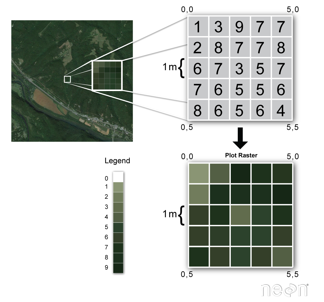
About Raster Data
Raster or "gridded" data are stored as a grid of values which are rendered on a map as pixels. Each pixel value represents an area on the Earth's surface.
Raster Data in R
Let's first import a raster dataset into R and explore its metadata. To open rasters in R, we will use the terra package.
library(terra)


# set working directory, you can change this if desired

wd <- "~/data/"

setwd(wd)
Download LiDAR Raster Data
We can use the neonUtilities function byTileAOP to download a single elevation tiles (DSM and DTM). You can run help(byTileAOP) to see more details on what the various inputs are. For this exercise, we'll specify the UTM Easting and Northing to be (732000, 4713500), which will download the tile with the lower left corner (732000,4713000). By default, the function will check the size total size of the download and ask you whether you wish to proceed (y/n). This file is ~8 MB, so make sure you have enough space on your local drive. You can set check.size=TRUE if you want to check the file size before downloading.
byTileAOP(dpID='DP3.30024.001', # lidar elevation

          site='HARV',

          year='2022',

          easting=732000,

          northing=4713500,

          check.size=FALSE, # set to TRUE or remove if you want to check the size before downloading

          savepath = wd)
This file will be downloaded into a nested subdirectory under the ~/data folder, inside a folder named DP3.30024.001 (the Data Product ID). The file should show up in this location: ~/data/DP3.30024.001/neon-aop-products/2022/FullSite/D01/2022_HARV_7/L3/DiscreteLidar/DSMGtif/NEON_D01_HARV_DP3_732000_4713000_DSM.tif.
Open a Raster in R
We can use terra's rast("path-to-raster-here") function to open a raster in R.
Data Tip: VARIABLE NAMES! To improve code
readability, file and object names should be used that make it clear what is in
the file. The data for this tutorial were collected over from Harvard Forest (HARV),
sowe'll use the naming convention of DATATYPE_HARV.
# Load raster into R
dsm_harv_file <- paste0(wd, "DP3.30024.001/neon-aop-products/2022/FullSite/D01/2022_HARV_7/L3/DiscreteLidar/DSMGtif/NEON_D01_HARV_DP3_732000_4713000_DSM.tif")
DSM_HARV <- rast(dsm_harv_file)
# View raster structure
DSM_HARV
## class : SpatRaster
## dimensions : 1000, 1000, 1 (nrow, ncol, nlyr)
## resolution : 1, 1 (x, y)
## extent : 732000, 733000, 4713000, 4714000 (xmin, xmax, ymin, ymax)
## coord. ref. : WGS 84 / UTM zone 18N (EPSG:32618)
## source : NEON_D01_HARV_DP3_732000_4713000_DSM.tif
## name : NEON_D01_HARV_DP3_732000_4713000_DSM
## min value : 317.91
## max value : 433.94
# plot raster
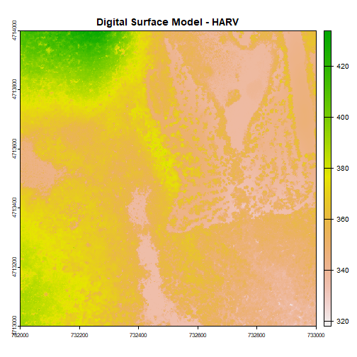
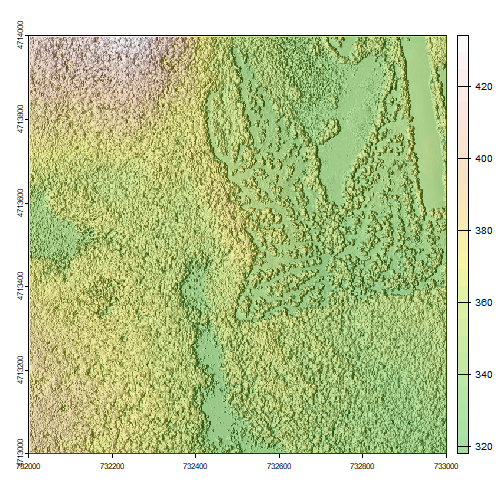
plot(DSM_HARV, main="Digital Surface Model - HARV")
Types of Data Stored in Raster Format
Raster data can be continuous or categorical. Continuous rasters can have a range of quantitative values. Some examples of continuous rasters include:
- Precipitation maps.
- Maps of tree height derived from LiDAR data.
- Elevation values for a region.
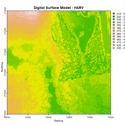
The raster we loaded and plotted earlier was a digital surface model, or a map of the elevation for Harvard Forest derived from the NEON AOP LiDAR sensor. Elevation is represented as a continuous numeric variable in this map. The legend shows the continuous range of values in the data from around 300 to 420 meters.
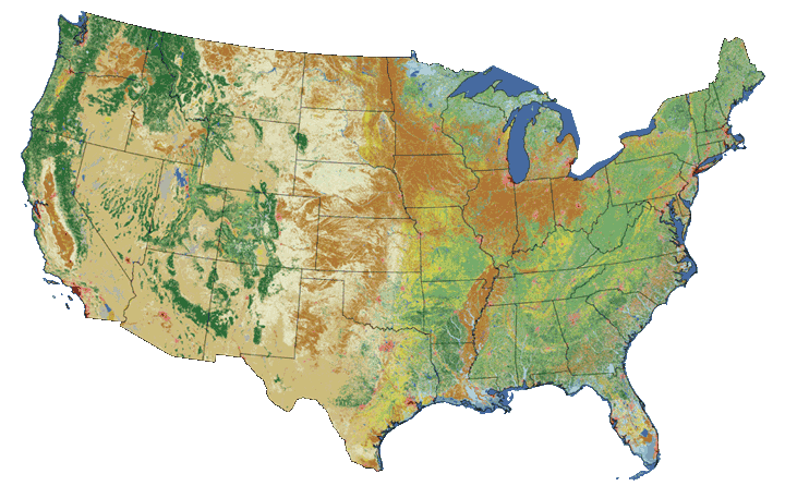
Some rasters contain categorical data where each pixel represents a discrete class such as a landcover type (e.g., "forest" or "grassland") rather than a continuous value such as elevation or temperature. Some examples of classified maps include:
- Landcover/land-use maps.
- Tree height maps classified as short, medium, tall trees.
- Elevation maps classified as low, medium and high elevation.
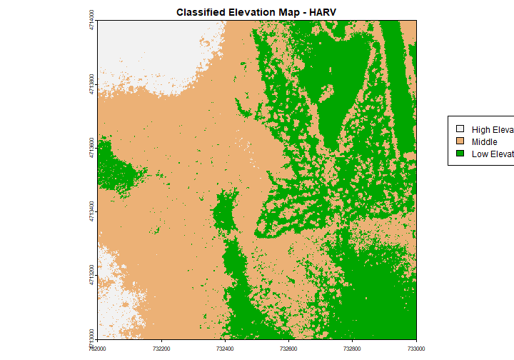
Categorical Landcover Map for the United States
Categorical Elevation Map of the NEON Harvard Forest Site
The legend of this map shows the colors representing each discrete class.
# add a color map with 5 colors

col=terrain.colors(3)

# add breaks to the colormap (4 breaks = 3 segments)

brk <- c(250,350, 380,500)


# Expand right side of clipping rect to make room for the legend

par(xpd = FALSE,mar=c(5.1, 4.1, 4.1, 4.5))

# DEM with a custom legend

plot(DSM_HARV,
	col=col,
	breaks=brk,
	main="Classified Elevation Map - HARV",
	legend = FALSE
	)


# turn xpd back on to force the legend to fit next to the plot.

par(xpd = TRUE)

# add a legend - but make it appear outside of the plot

legend( 733100, 4713700,
        legend = c("High Elevation", "Middle","Low Elevation"),
        fill = rev(col))
What is a GeoTIFF??
Raster data can come in many different formats. In this tutorial, we will use the
geotiff format which has the extension .tif. A .tif file stores metadata
or attributes about the file as embedded tif tags. For instance, your camera
might store a tag that describes the make and model of the camera or the date the
photo was taken when it saves a .tif. A GeoTIFF is a standard .tif image
format with additional spatial (georeferencing) information embedded in the file
as tags. These tags can include the following raster metadata:
- A Coordinate Reference System (
CRS) - Spatial Extent (
extent) - Values that represent missing data (
NoDataValue) - The
resolutionof the data
In this tutorial we will discuss all of these metadata tags.
More about the .tif format:
Coordinate Reference System
The Coordinate Reference System or CRS tells R where the raster is located
in geographic space. It also tells R what method should be used to "flatten"
or project the raster in geographic space.
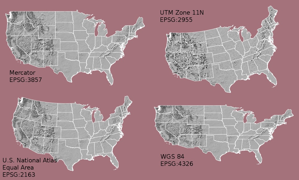
What Makes Spatial Data Line Up On A Map?
There are many great resources that describe coordinate reference systems and projections in greater detail (read more, below). For the purposes of this activity, it is important to understand that data from the same location but saved in different projections will not line up in any GIS or other program. Thus, it's important when working with spatial data in a program like R to identify the coordinate reference system applied to the data and retain it throughout data processing and analysis.
Read More:
- A comprehensive online library of CRS information.
- QGIS Documentation - CRS Overview.
- Choosing the Right Map Projection.
- NCEAS Overview of CRS in R.
How Map Projections Can Fool the Eye
Check out this short video, from Buzzfeed, highlighting how map projections can make continents seems proportionally larger or smaller than they actually are!
View Raster Coordinate Reference System (CRS) in R
We can view the CRS string associated with our R object using thecrs()
method. We can assign this string to an R object, too.
# view crs description

crs(DSM_HARV,describe=TRUE)

##                    name authority  code
## 1 WGS 84 / UTM zone 18N      EPSG 32618
##                                                                                                                                                                                                                                                          area
## 1 Between 78°W and 72°W, northern hemisphere between equator and 84°N, onshore and offshore. Bahamas. Canada - Nunavut; Ontario; Quebec. Colombia. Cuba. Ecuador. Greenland. Haiti. Jamaica. Panama. Turks and Caicos Islands. United States (USA). Venezuela
##            extent
## 1 -78, -72, 84, 0

# assign crs to an object (class) to use for reprojection and other tasks

harvCRS <- crs(DSM_HARV)
The CRS of our DSM_HARV object tells us that our data are in the UTM projection, in zone 18N.

The CRS in this case is in a char format. This means that the projection
information is strung together as a series of text elements.
We'll focus on the first few components of the CRS, as described above.
-
name: The projection of the dataset. Our data are in WGS84 (World Geodetic System 1984) / UTM (Universal Transverse Mercator) zone 18N. WGS84 is the datum. The UTM projection divides up the world into zones, this element tells you which zone the data are in. Harvard Forest is in Zone 18. -
authority: EPSG (European Petroleum Survey Group) - organization that maintains a geodetic parameter database with standard codes -
code: The EPSG code. For more details, see EPSG 32618.
Extent
The spatial extent is the geographic area that the raster data covers.
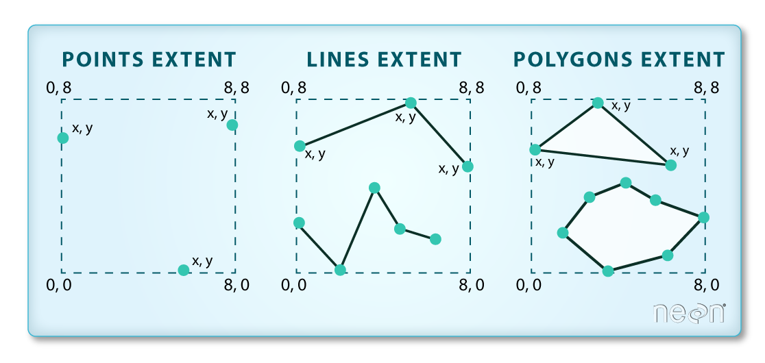
The spatial extent of an R spatial object represents the geographic "edge" or
location that is the furthest north, south, east and west. In other words, extent
represents the overall geographic coverage of the spatial object.
You can see the spatial extent using terra::ext:
ext(DSM_HARV)

## SpatExtent : 732000, 733000, 4713000, 4714000 (xmin, xmax, ymin, ymax)
Resolution
A raster has horizontal (x and y) resolution. This resolution represents the area on the ground that each pixel covers. The units for our data are in meters. Given our data resolution is 1 x 1, this means that each pixel represents a 1 x 1 meter area on the ground.
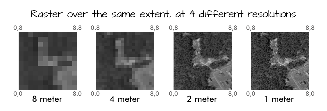
The best way to view resolution units is to look at the coordinate reference system string crs(rast,proj=TRUE). Notice our data contains: +units=m.
crs(DSM_HARV,proj=TRUE)

## [1] "+proj=utm +zone=18 +datum=WGS84 +units=m +no_defs"
Display Raster Min and Max Values
It can be useful to know the minimum or maximum values of a raster dataset. In this case, given we are working with elevation data, these values represent the min/max elevation range at our site.
Raster statistics are often calculated and embedded in a Geotiff for us.
However if they weren't already calculated, we can calculate them using the
min() or max() functions.
# view the min and max values

min(DSM_HARV)

## class       : SpatRaster
## dimensions  : 1000, 1000, 1  (nrow, ncol, nlyr)
## resolution  : 1, 1  (x, y)
## extent      : 732000, 733000, 4713000, 4714000  (xmin, xmax, ymin, ymax)
## coord. ref. : WGS 84 / UTM zone 18N (EPSG:32618)
## source(s)   : memory
## varname     : NEON_D01_HARV_DP3_732000_4713000_DSM
## name        :    min
## min value   : 317.91
## max value   : 433.94
We can see that the elevation at our site ranges from 317.91 m to 433.94 m.
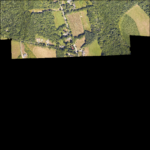
NoData Values in Rasters
Raster data often has a NoDataValue associated with it. This is a value
assigned to pixels where data are missing or no data were collected.
By default the shape of a raster is always square or rectangular. So if we
have a dataset that has a shape that isn't square or rectangular, some pixels
at the edge of the raster will have NoDataValues. This often happens when the
data were collected by an airplane which only flew over some part of a defined
region.
Let's take a look at some of the RGB Camera data over HARV, this time downloading a tile at the edge of the flight box.
byTileAOP(dpID='DP3.30010.001',

          site='HARV',

          year='2022',

          easting=737500,

          northing=4701500,

          check.size=FALSE, # set to TRUE or remove if you want to check the size before downloading

          savepath = wd)
This file will be downloaded into a nested subdirectory under the ~/data folder, inside a folder named DP3.30010.001 (the Camera Data Product ID). The file should show up in this location: ~/data/DP3.30010.001/neon-aop-products/2022/FullSite/D01/2022_HARV_7/L3/Camera/Mosaic/2022_HARV_7_737000_4701000_image.tif.
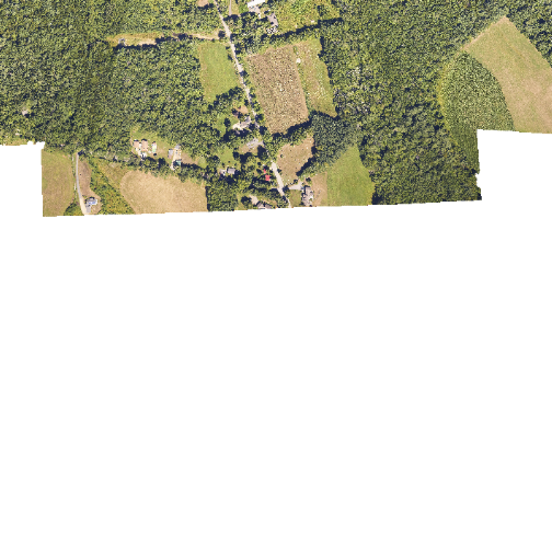
In the image below, the pixels that are black have NoDataValues. The camera did not collect data in these areas.
# Use rast function to read in all bands

RGB_HARV <-
  rast(paste0(wd,"DP3.30010.001/neon-aop-products/2022/FullSite/D01/2022_HARV_7/L3/Camera/Mosaic/2022_HARV_7_737000_4701000_image.tif"))


# Create an RGB image from the raster

par(col.axis="white",col.lab="white",tck=0)

plotRGB(RGB_HARV, r = 1, g = 2, b = 3, axes=TRUE)
In the next image, the black edges have been assigned NoDataValue. R doesn't
render pixels that contain a specified NoDataValue. R assigns missing data
with the NoDataValue as NA.
# reassign cells with 0,0,0 to NA

func <- function(x) {
  x[rowSums(x == 0) == 3, ] <- NA
  x}


newRGBImage <- app(RGB_HARV, func)

##
|---------|---------|---------|---------|
par(col.axis="white",col.lab="white",tck=0)

# Create an RGB image from the raster stack

plotRGB(newRGBImage, r = 1, g = 2, b = 3, axis=TRUE)

## Warning in plot.window(...): "axis" is not a graphical parameter

## Warning in plot.xy(xy, type, ...): "axis" is not a graphical parameter

## Warning in title(...): "axis" is not a graphical parameter
NoData Value Standard
The assigned NoDataValue varies across disciplines; -9999 is a common value
used in both the remote sensing field and the atmospheric fields. It is also
the standard used by the
National Ecological Observatory Network (NEON).
If we are lucky, our GeoTIFF file has a tag that tells us what is the
NoDataValue. If we are less lucky, we can find that information in the
raster's metadata. If a NoDataValue was stored in the GeoTIFF tag, when R
opens up the raster, it will assign each instance of the value to NA. Values
of NA will be ignored by R as demonstrated above.
Bad Data Values in Rasters
Bad data values are different from NoDataValues. Bad data values are values
that fall outside of the applicable range of a dataset.
Examples of Bad Data Values:
- The normalized difference vegetation index (NDVI), which is a measure of greenness, has a valid range of -1 to 1. Any value outside of that range would be considered a "bad" value.
- Reflectance data in an image should range from 0-1 (or 0-10,000 depending upon how the data are scaled). Thus a value greater than 1 or greater than 10,000 is likely caused by an error in either data collection or processing. These erroneous values can occur, for example, in water vapor absorption bands, which contain invalid data, and are meant to be disregarded.
Find Bad Data Values
Sometimes a raster's metadata will tell us the range of expected values for a raster. Values outside of this range are suspect and we need to consider than when we analyze the data. Sometimes, we need to use some common sense and scientific insight as we examine the data - just as we would for field data to identify questionable values.
Create A Histogram of Raster Values
We can explore the distribution of values contained within our raster using the
hist() function which produces a histogram. Histograms are often useful in
identifying outliers and bad data values in our raster data.
# view histogram of data

hist(DSM_HARV,
     main="Distribution of Digital Surface Model Values\n NEON Harvard Forest (HARV)",
     xlab="DSM Elevation Value (m)",
     ylab="Frequency",
     col="lightblue")
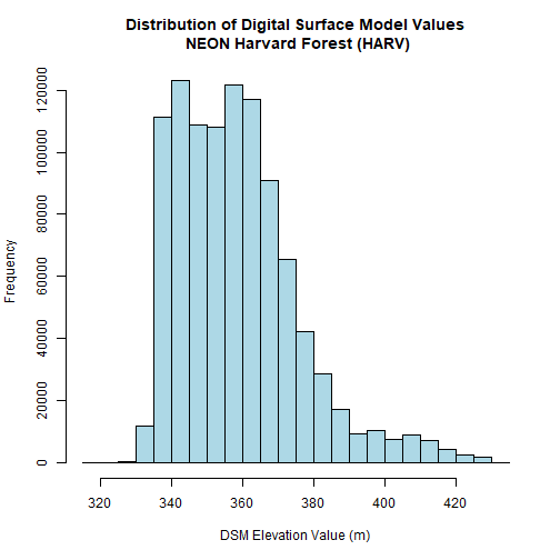
The distribution of elevation values for our Digital Surface Model (DSM) looks
reasonable. It is likely there are no bad data values in this particular raster.
Raster Bands
The Digital Surface Model object (DSM_HARV) that we've been working with
is a single band raster. This means that there is only one dataset stored in
the raster: surface elevation in meters for one time period.
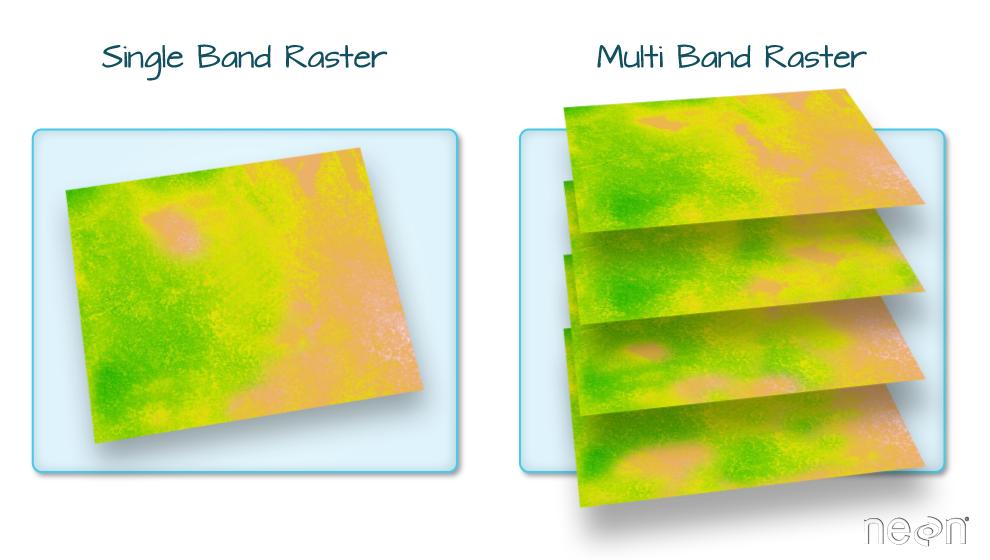
A raster dataset can contain one or more bands. We can use the rast()function to import all bands from a single OR multi-band raster. We can view the number of bands in a raster using thenlyr()` function.
# view number of bands in the Lidar DSM raster

nlyr(DSM_HARV)

## [1] 1

# view number of bands in the RGB Camera raster

nlyr(RGB_HARV)

## [1] 3
As we see from the RGB camera raster, raster data can also be multi-band,
meaning one raster file contains data for more than one variable or time period
for each cell. By default the terra::rast() function imports all bands of a
multi-band raster. You can set lyrs = 1 if you only want to read in the first
layer, for example.
Jump to the fourth tutorial in this series for a tutorial on multi-band rasters: Work with Multi-band Rasters: Images in R.
View Raster File Attributes
Remember that a GeoTIFF contains a set of embedded tags that contain
metadata about the raster. So far, we've explored raster metadata after
importing it in R. However, we can use the describe("path-to-raster-here")
function to view raster information (such as metadata) before we open a file in
R. Use help(describe) to see other options for exploring the file contents.
# view metadata attributes before opening the file

describe(path.expand(dsm_harv_file),meta=TRUE)

##  [1] "AREA_OR_POINT=Area"
##  [2] "TIFFTAG_ARTIST=Created by the National Ecological Observatory Network (NEON)"
##  [3] "TIFFTAG_COPYRIGHT=The National Ecological Observatory Network is a project sponsored by the National Science Foundation and managed under cooperative agreement by Battelle. This material is based in part upon work supported by the National Science Foundation under Grant No. DBI-0752017."
##  [4] "TIFFTAG_DATETIME=Flown on 2022080312, 2022080412, 2022081213, 2022081413"
##  [5] "TIFFTAG_IMAGEDESCRIPTION=Elevation LiDAR - NEON.DP3.30024 acquired at HARV by RIEGL LASER MEASUREMENT SYSTEMS Q780 2220855 as part of 2022-P3C1"
##  [6] "TIFFTAG_MAXSAMPLEVALUE=434"
##  [7] "TIFFTAG_MINSAMPLEVALUE=318"
##  [8] "TIFFTAG_RESOLUTIONUNIT=2 (pixels/inch)"
##  [9] "TIFFTAG_SOFTWARE=Tif file created with a Matlab script (write_gtiff.m) written by Tristan Goulden (tgoulden@battelleecology.org) with data processed from the following scripts: create_tiles_from_mosaic.m, combine_dtm_dsm_gtif.m, lastools_workflow.csh which implemented LAStools version 210418."
## [10] "TIFFTAG_XRESOLUTION=1"
## [11] "TIFFTAG_YRESOLUTION=1"
Specifying options=c("stats") will show some summary statistics:
# view summary statistics before opening the file

describe(path.expand(dsm_harv_file),options=c("stats"))

##  [1] "Driver: GTiff/GeoTIFF"
##  [2] "Files: C:/Users/bhass/Documents/data/DP3.30024.001/neon-aop-products/2022/FullSite/D01/2022_HARV_7/L3/DiscreteLidar/DSMGtif/NEON_D01_HARV_DP3_732000_4713000_DSM.tif"
##  [3] "       C:/Users/bhass/Documents/data/DP3.30024.001/neon-aop-products/2022/FullSite/D01/2022_HARV_7/L3/DiscreteLidar/DSMGtif/NEON_D01_HARV_DP3_732000_4713000_DSM.tif.aux.xml"
##  [4] "Size is 1000, 1000"
##  [5] "Coordinate System is:"
##  [6] "PROJCRS[\"WGS 84 / UTM zone 18N\","
##  [7] "    BASEGEOGCRS[\"WGS 84\","
##  [8] "        ENSEMBLE[\"World Geodetic System 1984 ensemble\","
##  [9] "            MEMBER[\"World Geodetic System 1984 (Transit)\"],"
## [10] "            MEMBER[\"World Geodetic System 1984 (G730)\"],"
## [11] "            MEMBER[\"World Geodetic System 1984 (G873)\"],"
## [12] "            MEMBER[\"World Geodetic System 1984 (G1150)\"],"
## [13] "            MEMBER[\"World Geodetic System 1984 (G1674)\"],"
## [14] "            MEMBER[\"World Geodetic System 1984 (G1762)\"],"
## [15] "            MEMBER[\"World Geodetic System 1984 (G2139)\"],"
## [16] "            ELLIPSOID[\"WGS 84\",6378137,298.257223563,"
## [17] "                LENGTHUNIT[\"metre\",1]],"
## [18] "            ENSEMBLEACCURACY[2.0]],"
## [19] "        PRIMEM[\"Greenwich\",0,"
## [20] "            ANGLEUNIT[\"degree\",0.0174532925199433]],"
## [21] "        ID[\"EPSG\",4326]],"
## [22] "    CONVERSION[\"UTM zone 18N\","
## [23] "        METHOD[\"Transverse Mercator\","
## [24] "            ID[\"EPSG\",9807]],"
## [25] "        PARAMETER[\"Latitude of natural origin\",0,"
## [26] "            ANGLEUNIT[\"degree\",0.0174532925199433],"
## [27] "            ID[\"EPSG\",8801]],"
## [28] "        PARAMETER[\"Longitude of natural origin\",-75,"
## [29] "            ANGLEUNIT[\"degree\",0.0174532925199433],"
## [30] "            ID[\"EPSG\",8802]],"
## [31] "        PARAMETER[\"Scale factor at natural origin\",0.9996,"
## [32] "            SCALEUNIT[\"unity\",1],"
## [33] "            ID[\"EPSG\",8805]],"
## [34] "        PARAMETER[\"False easting\",500000,"
## [35] "            LENGTHUNIT[\"metre\",1],"
## [36] "            ID[\"EPSG\",8806]],"
## [37] "        PARAMETER[\"False northing\",0,"
## [38] "            LENGTHUNIT[\"metre\",1],"
## [39] "            ID[\"EPSG\",8807]]],"
## [40] "    CS[Cartesian,2],"
## [41] "        AXIS[\"(E)\",east,"
## [42] "            ORDER[1],"
## [43] "            LENGTHUNIT[\"metre\",1]],"
## [44] "        AXIS[\"(N)\",north,"
## [45] "            ORDER[2],"
## [46] "            LENGTHUNIT[\"metre\",1]],"
## [47] "    USAGE["
## [48] "        SCOPE[\"Navigation and medium accuracy spatial referencing.\"],"
## [49] "        AREA[\"Between 78°W and 72°W, northern hemisphere between equator and 84°N, onshore and offshore. Bahamas. Canada - Nunavut; Ontario; Quebec. Colombia. Cuba. Ecuador. Greenland. Haiti. Jamaica. Panama. Turks and Caicos Islands. United States (USA). Venezuela.\"],"
## [50] "        BBOX[0,-78,84,-72]],"
## [51] "    ID[\"EPSG\",32618]]"
## [52] "Data axis to CRS axis mapping: 1,2"
## [53] "Origin = (732000.000000000000000,4714000.000000000000000)"
## [54] "Pixel Size = (1.000000000000000,-1.000000000000000)"
## [55] "Metadata:"
## [56] "  AREA_OR_POINT=Area"
## [57] "  TIFFTAG_ARTIST=Created by the National Ecological Observatory Network (NEON)"
## [58] "  TIFFTAG_COPYRIGHT=The National Ecological Observatory Network is a project sponsored by the National Science Foundation and managed under cooperative agreement by Battelle. This material is based in part upon work supported by the National Science Foundation under Grant No. DBI-0752017."
## [59] "  TIFFTAG_DATETIME=Flown on 2022080312, 2022080412, 2022081213, 2022081413"
## [60] "  TIFFTAG_IMAGEDESCRIPTION=Elevation LiDAR - NEON.DP3.30024 acquired at HARV by RIEGL LASER MEASUREMENT SYSTEMS Q780 2220855 as part of 2022-P3C1"
## [61] "  TIFFTAG_MAXSAMPLEVALUE=434"
## [62] "  TIFFTAG_MINSAMPLEVALUE=318"
## [63] "  TIFFTAG_RESOLUTIONUNIT=2 (pixels/inch)"
## [64] "  TIFFTAG_SOFTWARE=Tif file created with a Matlab script (write_gtiff.m) written by Tristan Goulden (tgoulden@battelleecology.org) with data processed from the following scripts: create_tiles_from_mosaic.m, combine_dtm_dsm_gtif.m, lastools_workflow.csh which implemented LAStools version 210418."
## [65] "  TIFFTAG_XRESOLUTION=1"
## [66] "  TIFFTAG_YRESOLUTION=1"
## [67] "Image Structure Metadata:"
## [68] "  INTERLEAVE=BAND"
## [69] "Corner Coordinates:"
## [70] "Upper Left  (  732000.000, 4714000.000) ( 72d10'28.52\"W, 42d32'36.84\"N)"
## [71] "Lower Left  (  732000.000, 4713000.000) ( 72d10'29.98\"W, 42d32' 4.46\"N)"
## [72] "Upper Right (  733000.000, 4714000.000) ( 72d 9'44.73\"W, 42d32'35.75\"N)"
## [73] "Lower Right (  733000.000, 4713000.000) ( 72d 9'46.20\"W, 42d32' 3.37\"N)"
## [74] "Center      (  732500.000, 4713500.000) ( 72d10' 7.36\"W, 42d32'20.11\"N)"
## [75] "Band 1 Block=1000x1 Type=Float32, ColorInterp=Gray"
## [76] "  Min=317.910 Max=433.940 "
## [77] "  Minimum=317.910, Maximum=433.940, Mean=358.584, StdDev=17.156"
## [78] "  NoData Value=-9999"
## [79] "  Metadata:"
## [80] "    STATISTICS_MAXIMUM=433.94000244141"
## [81] "    STATISTICS_MEAN=358.58371301653"
## [82] "    STATISTICS_MINIMUM=317.91000366211"
## [83] "    STATISTICS_STDDEV=17.156044149253"
## [84] "    STATISTICS_VALID_PERCENT=100"
It can be useful to use describe to explore your file before reading it into R.
Challenge: Explore Raster Metadata
Without using the terra function to read the file into R, determine the following information about the DTM file. This was downloaded at the same time as the DSM file, and as long as you didn't move the data, it should be located here: ~/data/DP3.30024.001/neon-aop-products/2022/FullSite/D01/2022_HARV_7/L3/DiscreteLidar/DTMGtif/NEON_D01_HARV_DP3_732000_4713000_DTM.tif.
- Does this file has the same
CRSasDSM_HARV? - What is the
NoDataValue? - What is resolution of the raster data?
- Is the file a multi- or single-band raster?
- On what dates was this site flown?
Get Lesson Code
Raster 01: Plot Raster Data in R
Last Updated: Apr 2, 2026
This tutorial reviews how to plot a raster in R using the plot()
function. It also covers how to layer a raster on top of a hillshade to produce
an eloquent map.
Learning Objectives
After completing this tutorial, you will be able to:
- Know how to plot a single band raster in R.
- Know how to layer a raster dataset on top of a hillshade to create an elegant basemap.
Things You’ll Need To Complete This Tutorial
You will need the most current version of R and, preferably, RStudio loaded
on your computer to complete this tutorial.
Install R Packages
-
terra:
install.packages("terra") -
More on Packages in R – Adapted from Software Carpentry.
Download Data
Data required for this tutorial will be downloaded using neonUtilities in the lesson.
The LiDAR and imagery data used in this lesson were collected over the National Ecological Observatory Network's Harvard Forest (HARV) field site.
The entire dataset can be accessed from the NEON Data Portal.
Set Working Directory: This lesson will explain how to set the working directory. You may wish to set your working directory to some other location, depending on how you prefer to organize your data.
An overview of setting the working directory in R can be found here.
Additional Resources
Plot Raster Data in R
In this tutorial, we will plot the Digital Surface Model (DSM) raster
for the NEON Harvard Forest Field Site. We will use the hist() function as a
tool to explore raster values. And render categorical plots, using the breaks
argument to get bins that are meaningful representations of our data.
We will use the terra package in this tutorial. If you do not
have the DSM_HARV variable as defined in the pervious tutorial, Intro To Raster In R, please download it using neonUtilities, as shown in the previous tutorial.
library(terra)


# set working directory

wd <- "~/data/"

setwd(wd)


# import raster into R

dsm_harv_file <- paste0(wd, "DP3.30024.001/neon-aop-products/2022/FullSite/D01/2022_HARV_7/L3/DiscreteLidar/DSMGtif/NEON_D01_HARV_DP3_732000_4713000_DSM.tif")

DSM_HARV <- rast(dsm_harv_file)
First, let's plot our Digital Surface Model object (DSM_HARV) using the
plot() function. We add a title using the argument main="title".
# Plot raster object

plot(DSM_HARV, main="Digital Surface Model - HARV")

Plotting Data Using Breaks
We can view our data "symbolized" or colored according to ranges of values
rather than using a continuous color ramp. This is comparable to a "classified"
map. However, to assign breaks, it is useful to first explore the distribution
of the data using a histogram. The breaks argument in the hist() function
tells R to use fewer or more breaks or bins.
If we name the histogram, we can also view counts for each bin and assigned break values.
# Plot distribution of raster values

DSMhist<-hist(DSM_HARV,
     breaks=3,
     main="Histogram Digital Surface Model\n NEON Harvard Forest Field Site",
     col="lightblue",  # changes bin color
     xlab= "Elevation (m)")  # label the x-axis
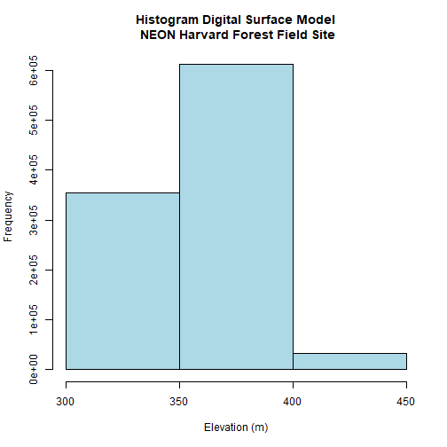
# Where are breaks and how many pixels in each category?

DSMhist$breaks

## [1] 300 350 400 450

DSMhist$counts

## [1] 355269 611685  33046
Looking at our histogram, R has binned out the data as follows:
- 300-350m, 350-400m, 400-450m
We can determine that most of the pixel values fall in the 350-400m range with a few pixels falling in the lower and higher range. We could specify different breaks, if we wished to have a different distribution of pixels in each bin.
We can use those bins to plot our raster data. We will use the
terrain.colors() function to create a palette of 3 colors to use in our plot.
The breaks argument allows us to add breaks. To specify where the breaks
occur, we use the following syntax: breaks=c(value1,value2,value3).
We can include as few or many breaks as we'd like.
# plot using breaks.

plot(DSM_HARV,
     breaks = c(300, 350, 400, 450),
     col = terrain.colors(3),
     main="Digital Surface Model (DSM) - HARV")
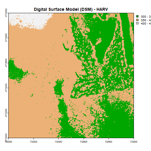
Data Tip: Note that when we assign break values a set of 4 values will result in 3 bins of data.
Format Plot
If we need to create multiple plots using the same color palette, we can create
an R object (myCol) for the set of colors that we want to use. We can then
quickly change the palette across all plots by simply modifying the myCol
object.
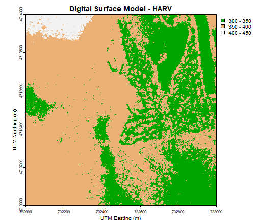
We can label the x- and y-axes of our plot too using xlab and ylab.
# Assign color to a object for repeat use/ ease of changing

myCol = terrain.colors(3)


# Add axis labels

plot(DSM_HARV,
     breaks = c(300, 350, 400, 450),
     col = myCol,
     main="Digital Surface Model - HARV",
     xlab = "UTM Easting (m)",
     ylab = "UTM Northing (m)")
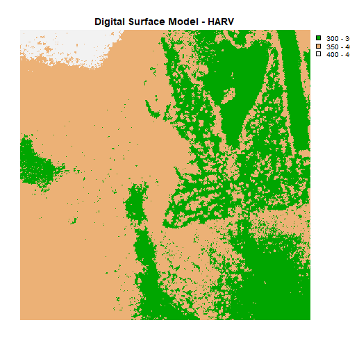
Or we can also turn off the axes altogether.
# or we can turn off the axis altogether

plot(DSM_HARV,
     breaks = c(300, 350, 400, 450),
     col = myCol,
     main="Digital Surface Model - HARV",
     axes=FALSE)
Challenge: Plot Using Custom Breaks
Create a plot of the Harvard Forest Digital Surface Model (DSM) that has:
- Six classified ranges of values (break points) that are evenly divided among the range of pixel values.
- Axis labels
- A plot title
Hillshade & Layering Rasters
The terra package has built-in functions called terrain for calculating
slope and aspect, and shade for computing hillshade from the slope and aspect.
A hillshade is a raster that maps the shadows and texture that you would see
from above when viewing terrain.
See the shade documentation for more details.
We can layer a raster on top of a hillshade raster for the same area, and use a transparency factor to created a 3-dimensional shaded effect.
slope <- terrain(DSM_HARV, "slope", unit="radians")

aspect <- terrain(DSM_HARV, "aspect", unit="radians")

hill <- shade(slope, aspect, 45, 270)

plot(hill, col=grey(0:100/100), legend=FALSE, mar=c(2,2,1,4))

plot(DSM_HARV, col=terrain.colors(25, alpha=0.35), add=TRUE, main="HARV DSM with Hillshade")
The alpha value determines how transparent the colors will be (0 being
transparent, 1 being opaque). You can also change the color palette, for example,
use rainbow() instead of terrain.color().
- More information can be found in the R color palettes documentation.
Challenge: Create DTM & DSM for SJER
Download data from the NEON field site San Joaquin Experimental Range (SJER) and create maps of the Digital Terrain and Digital Surface Models.
Make sure to:
- include hillshade in the maps,
- label axes on the DSM map and exclude them from the DTM map,
- add titles for the maps,
- experiment with various alpha values and color palettes to represent the data.
Get Lesson Code
Raster 04: Work With Multi-Band Rasters - Image Data in R
Last Updated: Apr 2, 2026
This tutorial explores how to import and plot a multiband raster in
R. It also covers how to plot a three-band color image using the plotRGB()
function in R.
Learning Objectives
After completing this tutorial, you will be able to:
- Know how to identify a single vs. a multiband raster file.
- Be able to import multiband rasters into R using the
terrapackage. - Be able to plot multiband color image rasters in R using
plotRGB(). - Understand what a
NoDatavalue is in a raster.
Things You’ll Need To Complete This Tutorial
You will need the most current version of R and, preferably, RStudio installed on your computer to complete this tutorial.
Install R Packages
-
terra:
install.packages("terra") -
neonUtilities:
install.packages("neonUtilities") -
More on Packages in R – Adapted from Software Carpentry.
Data to Download
Data required for this tutorial will be downloaded using neonUtilities in the lesson.
The LiDAR and imagery data used in this lesson were collected over the National Ecological Observatory Network's Harvard Forest (HARV) field site.
The entire dataset can be accessed from the NEON Data Portal.
Set Working Directory: This lesson assumes that you have set your working directory to the location of the downloaded and unzipped data subsets.
An overview of setting the working directory in R can be found here.
R Script & Challenge Code: NEON data lessons often contain challenges that reinforce skills. If available, the code for challenge solutions is found in the downloadable R script of the entire lesson, available in the footer of each lesson page.
The Basics of Imagery - About Spectral Remote Sensing Data
About Raster Bands in R
As discussed in the Intro to Raster Data tutorial, a raster can contain 1 or more bands.
To work with multiband rasters in R, we need to change how we import and plot our data in several ways.
- To import multiband raster data we will use the
stack()function. - If our multiband data are imagery that we wish to composite, we can use
plotRGB()(instead ofplot()) to plot a 3 band raster image.
About MultiBand Imagery
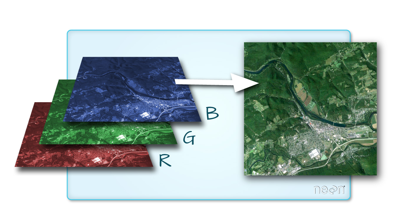
One type of multiband raster dataset that is familiar to many of us is a color image. A basic color image consists of three bands: red, green, and blue. Each band represents light reflected from the red, green or blue portions of the electromagnetic spectrum. The pixel brightness for each band, when composited creates the colors that we see in an image.
Getting Started with Multi-Band Data in R
To work with multiband raster data we will use the terra package.
# terra package to work with raster data

library(terra)


# package for downloading NEON data

library(neonUtilities)


# package for specifying color palettes

library(RColorBrewer)


# set working directory to ensure R can find the file we wish to import

wd <- "~/data/" # this will depend on your local environment environment

# be sure that the downloaded file is in this directory

setwd(wd)
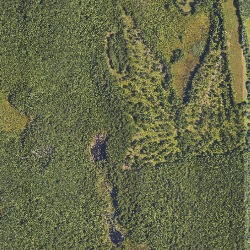
In this tutorial, the multi-band data that we are working with is imagery collected using the NEON Airborne Observation Platform high resolution camera over the NEON Harvard Forest field site. Each RGB image is a 3-band raster. The same steps would apply to working with a multi-spectral image with 4 or more bands - like Landsat imagery, or even hyperspectral imagery (in geotiff format). We can plot each band of a multi-band image individually.
byTileAOP(dpID='DP3.30010.001', # rgb camera data
          site='HARV',
          year='2022',
          easting=732000,
          northing=4713500,
          check.size=FALSE, # set to TRUE or remove if you want to check the size before downloading
          savepath = wd)

## Downloading files totaling approximately 351.004249 MB
## Downloading 1 files
##
|
| | 0%
|
|====================================================================================================================================================================| 100%
## Successfully downloaded 1 files to ~/data//DP3.30010.001
Or we can plot each bands separately as follows:
# Determine the number of bands

num_bands <- nlyr(RGB_HARV)


# Define colors to plot each

# Define color palettes for each band using RColorBrewer

colors <- list(
  brewer.pal(9, "Reds"),
  brewer.pal(9, "Greens"),
  brewer.pal(9, "Blues")
)


# Plot each band in a loop, with the specified colors

for (i in 1:num_bands) {
  plot(RGB_HARV[[i]], main=paste("Band", i), col=colors[[i]])
}
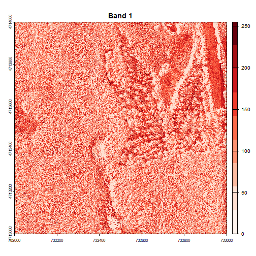
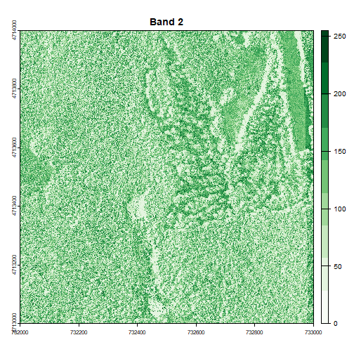
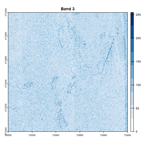
Image Raster Data Attributes
We can display some of the attributes about the raster, as shown below:
# Print dimensions

cat("Dimensions:\n")

## Dimensions:

cat("Number of rows:", nrow(RGB_HARV), "\n")

## Number of rows: 10000

cat("Number of columns:", ncol(RGB_HARV), "\n")

## Number of columns: 10000

cat("Number of layers:", nlyr(RGB_HARV), "\n")

## Number of layers: 3

# Print resolution

resolutions <- res(RGB_HARV)

cat("Resolution:\n")

## Resolution:

cat("X resolution:", resolutions[1], "\n")

## X resolution: 0.1

cat("Y resolution:", resolutions[2], "\n")

## Y resolution: 0.1

# Get the extent of the raster

rgb_extent <- ext(RGB_HARV)


# Convert the extent to a string with rounded values

extent_str <- sprintf("xmin: %d, xmax: %d, ymin: %d, ymax: %d",
                      round(xmin(rgb_extent)),
                      round(xmax(rgb_extent)),
                      round(ymin(rgb_extent)),
                      round(ymax(rgb_extent)))


# Print the extent string

cat("Extent of the raster: \n")

## Extent of the raster:

cat(extent_str, "\n")

## xmin: 732000, xmax: 733000, ymin: 4713000, ymax: 4714000
Let's take a look at the coordinate reference system, or CRS. You can use the parameters describe=TRUE to display this information more succinctly.
crs(RGB_HARV, describe=TRUE)

##                    name authority  code
## 1 WGS 84 / UTM zone 18N      EPSG 32618
##                                                                                                                                                                                                                                                          area
## 1 Between 78°W and 72°W, northern hemisphere between equator and 84°N, onshore and offshore. Bahamas. Canada - Nunavut; Ontario; Quebec. Colombia. Cuba. Ecuador. Greenland. Haiti. Jamaica. Panama. Turks and Caicos Islands. United States (USA). Venezuela
##            extent
## 1 -78, -72, 84, 0
Let's next examine the raster's minimum and maximum values. What is the range of values for each band?
# Replace Inf and -Inf with NA

values(RGB_HARV)[is.infinite(values(RGB_HARV))] <- NA


# Get min and max values for all bands

min_max_values <- minmax(RGB_HARV)


# Print the results

cat("Min and Max Values for All Bands:\n")

## Min and Max Values for All Bands:

print(min_max_values)

##     2022_HARV_7_732000_4713000_image_1 2022_HARV_7_732000_4713000_image_2 2022_HARV_7_732000_4713000_image_3
## min                                  0                                  0                                  0
## max                                255                                255                                255
This raster contains values between 0 and 255. These values represent the intensity of brightness associated with the image band. In the case of a RGB image (red, green and blue), band 1 is the red band. When we plot the red band, larger numbers (towards 255) represent pixels with more red in them (a strong red reflection). Smaller numbers (towards 0) represent pixels with less red in them (less red was reflected). To plot an RGB image, we mix red + green + blue values into one single color to create a full color image - this is the standard color image a digital camera creates.
Challenge: Making Sense of Single Bands of a Multi-Band Image
Go back to the code chunk where you plotted each band separately. Compare the plots of band 1 (red) and band 2 (green). Is the forested area darker or lighter in band 2 (the green band) compared to band 1 (the red band)?
Other Types of Multi-band Raster Data
Multi-band raster data might also contain:
- Time series: the same variable, over the same area, over time.
- Multi or hyperspectral imagery: image rasters that have 4 or more (multi-spectral) or more than 10-15 (hyperspectral) bands. Check out the NEON Data Skills Imaging Spectroscopy HDF5 in R tutorial to learn how to work with hyperspectral data cubes.
The true color image plotted at the beginning of this lesson looks pretty decent. We can explore whether applying a stretch to the image might improve clarity and contrast using stretch="lin" or stretch="hist".
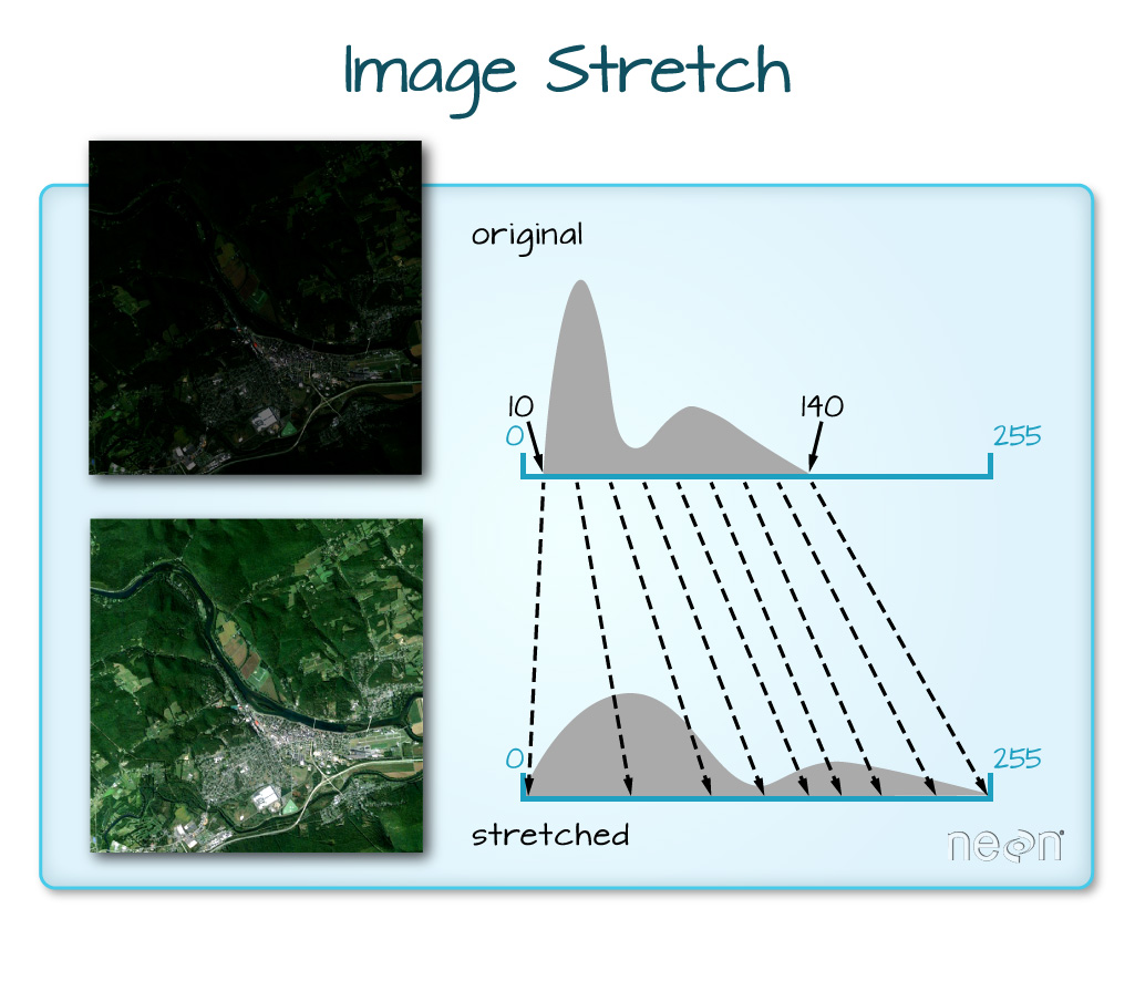
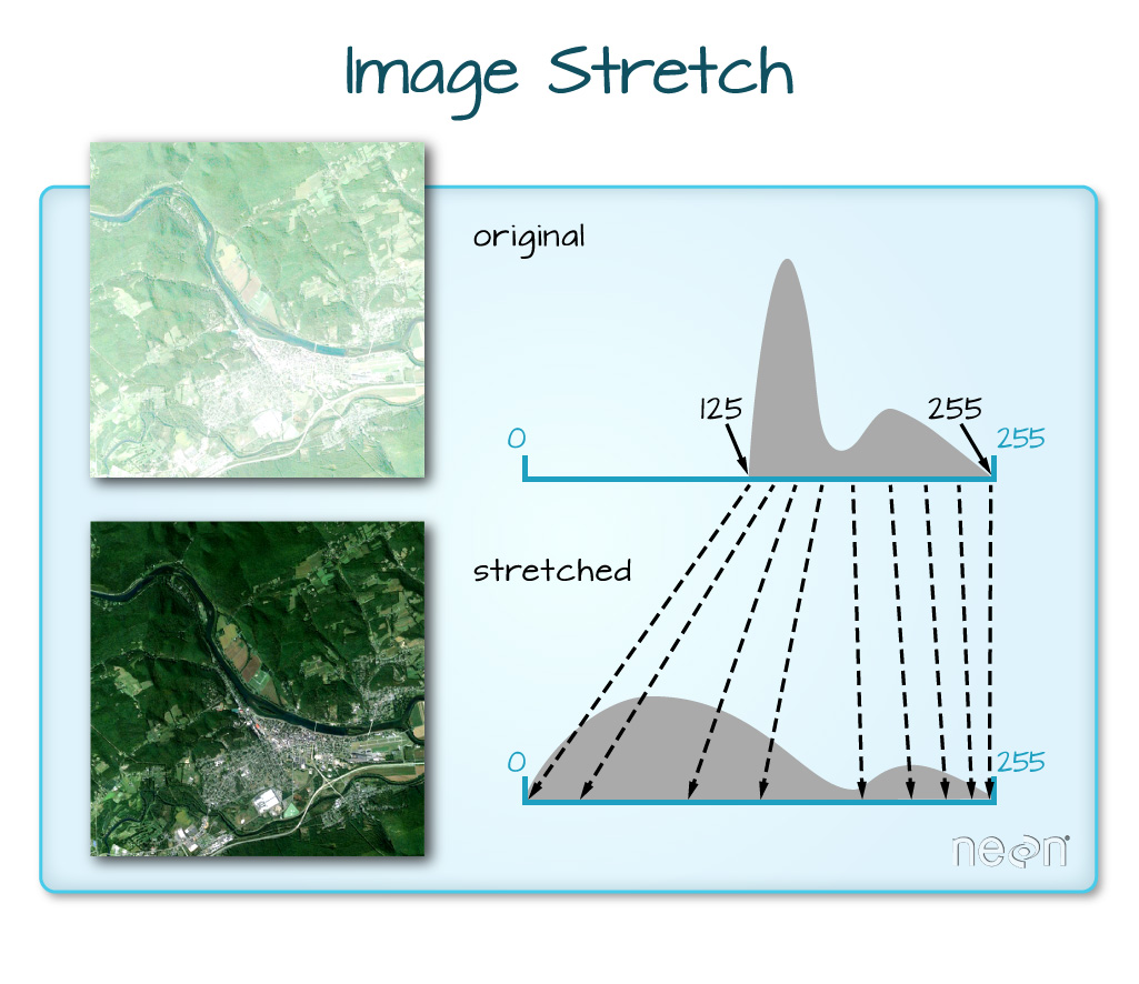
# What does stretch do?


# Plot the linearly stretched raster

plotRGB(RGB_HARV, stretch="lin")
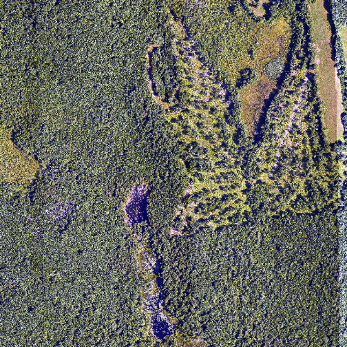
# Plot the histogram-stretched raster

plotRGB(RGB_HARV, stretch="hist")
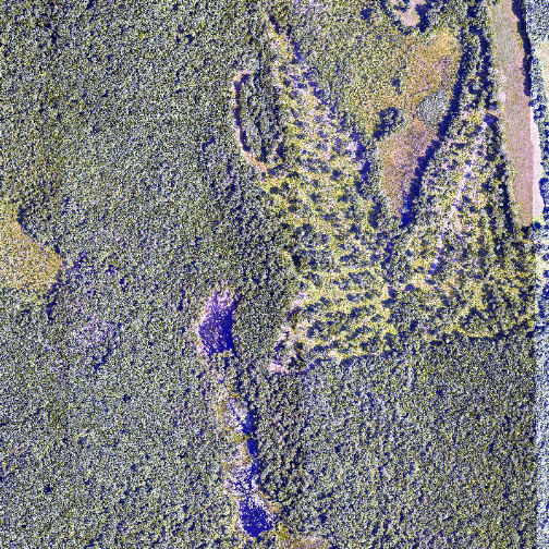
In this case, the stretch doesn't enhance the contrast our image significantly given the distribution of reflectance (or brightness) values is distributed well between 0 and 255, and applying a stretch appears to introduce some artificial, almost purple-looking brightness to the image.
Challenge: What Methods Can Be Used on an R Object?
We can view various methods available to call on an R object with methods(class=class(objectNameHere)). Use this to figure out:
- What methods can be used to call on the
RGB_HARVobject? - What methods are available for a single band within
RGB_HARV? - Why do you think there is a difference?