Series
Work with NEON OS & IS Data - Plant Phenology & Temperature
This series covers how to import, manipulate, format and plot time series data stored in .csv format in R. We will work with temperature (NEON.DP1.00002) and plant phenology (NEON.DP1.10055) data to explore working with and visualizing data with different time scale intervals.
To find each tutorial, select from the left menu to continue after this introduction.
Learning Objectives
After completing the series, you will be able to:
- work with data.frames in R (dplyr package),
- convert timestamps stored as text strings to R date or datetime (e.g. POSIX) classes (lubridate package),
- aggregate data across different time scales (day vs month) and
- plot time series data (ggplot2 package).
Things You’ll Need To Complete This Series
Setup RStudio
To complete the tutorial series you will need an updated version of R and, preferably, RStudio installed on your computer.
R
is a programming language that specializes in statistical computing. It is a
powerful tool for exploratory data analysis. To interact with R, we strongly
recommend
RStudio,
an interactive development environment (IDE).
Install R Packages
You can chose to install packages with each lesson or you can download all of the necessary R packages now.
-
dplyr:
install.packages("dplyr") -
ggplot2:
install.packages("ggplot2") -
lubridate:
install.packages("lubridate") -
scales:
install.packages("scales") -
tidyr:
install.packages("tidyr") -
gridExtra:
install.packages("gridExtra")
More on Packages in R – Adapted from Software Carpentry.
Work With NEON's Plant Phenology Data
Last Updated: Jun 30, 2026
Many organisms, including plants, show patterns of change across seasons - the different stages of this observable change are called phenophases. In this tutorial we explore how to work with NEON plant phenophase data.
Objectives
After completing this activity, you will be able to:
- work with NEON Plant Phenology Observation data.
- use dplyr functions to filter data.
- plot time series data in a bar plot using ggplot the function.
Things You’ll Need To Complete This Tutorial
- You will need a current version of R (4+) and, preferably,
RStudioloaded on your computer to complete this tutorial. - Create a NEON user account
- Generate an API token for downloading data
Install R Packages
-
neonUtilities:
install.packages("neonUtilities") -
neonOS
install.packages("neonOS") -
ggplot2:
install.packages("ggplot2") -
dplyr:
install.packages("dplyr")
More on Packages in R – Adapted from Software Carpentry.
Additional Resources
- NEON data portal
- NEON Plant Phenology Observations data product user guide
- RStudio's data wrangling (dplyr/tidyr) cheatsheet
- NEONScience GitHub Organization
- nneo API wrapper on CRAN
Plants change throughout the year - these are phenophases. Why do they change?
Explore Phenology Data
The following sections provide a brief overview of the NEON plant phenology observation data. When designing a research project using this data, you need to consult the documents associated with this data product and not rely solely on this summary.
The following description of the NEON Plant Phenology Observation data is modified from the data product user guide.
NEON Plant Phenology Observation Data
NEON collects plant phenology data and provides it as NEON data product DP1.10055.001.
The plant phenology observations data product provides in-situ observations of the phenological status and intensity of tagged plants (or patches) during discrete observations events.
Sampling occurs at all terrestrial field sites at site and season specific intervals. During Phase I (dominant species) sampling (pre-2021), three species with 30 individuals each are sampled. In 2021, Phase II (community) sampling will begin, with <=20 species with 5 or more individuals sampled will occur.
Status-based Monitoring
NEON employs status-based monitoring, in which the phenological condition of an individual is reported any time that individual is observed. At every observations bout, records are generated for every phenophase that is occurring and for every phenophase not occurring. With this approach, events (such as leaf emergence in Mediterranean zones, or flowering in many desert species) that may occur multiple times during a single year, can be captured. Continuous reporting of phenophase status enables quantification of the duration of phenophases rather than just their date of onset while allows enabling the explicit quantification of uncertainty in phenophase transition dates that are introduced by monitoring in discrete temporal bouts.
Specific products derived from this sampling include the observed phenophase status (whether or not a phenophase is occurring) and the intensity of phenophases for individuals in which phenophase status = ‘yes’. Phenophases reported are derived from the USA National Phenology Network (USA-NPN) categories. The number of phenophases observed varies by growth form and ranges from 1 phenophase (cactus) to 7 phenophases (semi-evergreen broadleaf). In this tutorial we will focus only on the state of the phenophase, not the phenophase intensity data.
Phenology Transects
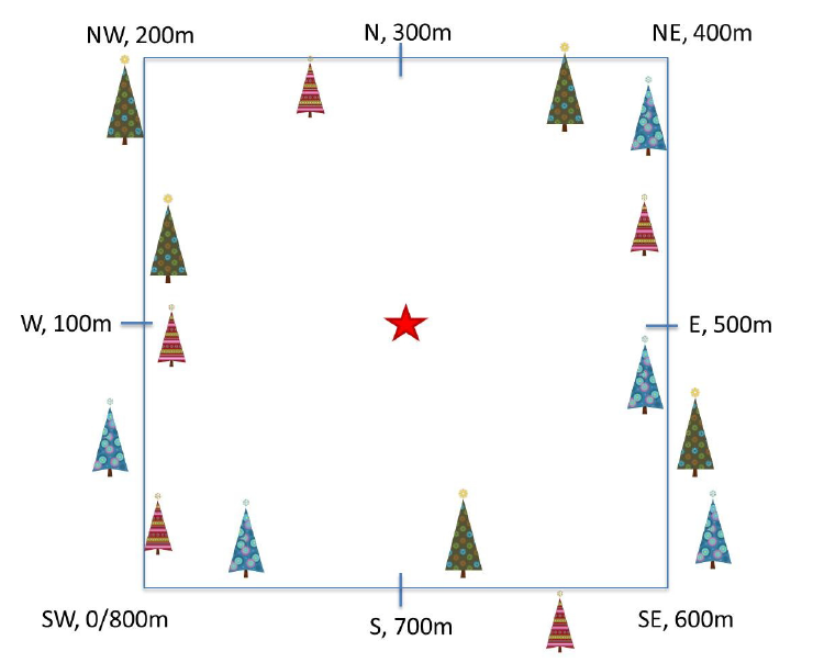
Plant phenology observations occur at all terrestrial NEON sites along an 800 meter square loop transect (primary) and within a 200 m x 200 m plot located within view of a canopy level, tower-mounted, phenology camera.
Timing of Observations
At each site, there are:
- ~50 observation bouts per year.
- no more that 100 sampling points per phenology transect.
- no more than 9 sampling points per phenocam plot.
- 1 annual measurement per year to collect annual size and disease status measurements from each sampling point.
Available Data Tables
The phenology dataset contains three data tables:
- phe_statusintensity: Plant phenophase status and intensity data
- phe_perindividual: Geolocation and taxonomic identification for phenology plants
- phe_perindividualperyear: Pecorded once per year, essentially the "metadata" about the plant: DBH, height, etc.
There are other files in each download including a readme with information on the data product and the download; a variables file that defines the term descriptions, data types, and units; a validation file with data entry validation and parsing rules; and a citation file giving the BibTeX citation for the downloaded data.
Set up R environment
This tutorial is designed to have you download data from the NEON
API using the neonUtilities package. As of June 2026, NEON requires an API token
for data downloads, to reduce bot scraping and improve user support. Tokens can
be generated in NEON data portal user accounts - log in to your account or
create one, and go to the API Tokens section. For best practices in storing and
using tokens, follow the instructions here.
Install and load packages, and load your token. This code assumes you have stored your token as an environment variable, as described at the link above. If your token is stored in a different way, modify the line of code below as needed.
# install needed package (only uncomment & run if not already installed)

#install.packages("neonUtilities")

#install.packages("dplyr")

#install.packages("ggplot2")


# load needed packages

library(neonUtilities)

library(neonOS)

library(dplyr)

library(ggplot2)

token <- Sys.getenv("NEON_TOKEN")


# set working directory to ensure R can find the file we wish to import and where

# we want to save our files. Be sure to move the download into your working directory!

wd <- "~/data" # Change this to match your local environment

setwd(wd)
Let's start by loading our data of interest. For this series, we'll work with data from the NEON Domain 02 sites:
- Blandy Farm (BLAN)
- Smithsonian Conservation Biology Institute (SCBI)
- Smithsonian Environmental Research Center (SERC)
And we'll use data from January 2017 to December 2019. This downloads over 9MB of data. If this is too large, use a smaller date range. If you opt to do this, your figures and some output may look different later in the tutorial.
With this information, we can download our data using the neonUtilities package.
phe <- loadByProduct(dpID = "DP1.10055.001",
                     site=c("BLAN","SCBI","SERC"),
										 startdate = "2017-01",
										 enddate="2019-12",
										 release="RELEASE-2026",
										 token=token,
										 check.size = F)


# save dataframes from the downloaded list

ind <- phe$phe_perindividual  #individual information

status <- phe$phe_statusintensity  #status & intensity info
Let's explore the data. Let's get to know what the ind dataframe looks like.
# What are the fieldnames in this dataset?

names(ind)

##  [1] "uid"                         "namedLocation"               "domainID"                    "siteID"
##  [5] "plotID"                      "decimalLatitude"             "decimalLongitude"            "geodeticDatum"
##  [9] "coordinateUncertainty"       "elevation"                   "elevationUncertainty"        "subtypeSpecification"
## [13] "transectMeter"               "directionFromTransect"       "ninetyDegreeDistance"        "sampleLatitude"
## [17] "sampleLongitude"             "sampleCoordinateUncertainty" "sampleElevation"             "sampleElevationUncertainty"
## [21] "date"                        "editedDate"                  "individualID"                "taxonID"
## [25] "scientificName"              "identificationQualifier"     "taxonRank"                   "nativeStatusCode"
## [29] "identificationHistoryID"     "growthForm"                  "vstTag"                      "measuredBy"
## [33] "identifiedBy"                "recordedBy"                  "remarks"                     "dataQF"
## [37] "publicationDate"             "release"

# Unsure of what some of the variables are? Look at the variables table!

View(phe$variables_10055)


# how many rows are in the data?

nrow(ind)

## [1] 791

# look at the first six rows of data.

head(ind)

##                                    uid          namedLocation domainID siteID   plotID decimalLatitude decimalLongitude
## 1 c1949cda-a607-4f9c-b866-3c77c1c47856 BLAN_061.phenology.phe      D02   BLAN BLAN_061        39.05963        -78.07385
## 2 4871339b-5815-43e1-b0ee-2f0491b28be7 BLAN_061.phenology.phe      D02   BLAN BLAN_061        39.05963        -78.07385
## 3 9f170c36-214b-49e9-9571-84475b10c37a BLAN_061.phenology.phe      D02   BLAN BLAN_061        39.05963        -78.07385
## 4 2c8bb258-91f3-444b-85e0-6a589bd5fb6a BLAN_061.phenology.phe      D02   BLAN BLAN_061        39.05963        -78.07385
## 5 76afbf22-34f0-4e73-979a-4daeac316ab3 BLAN_061.phenology.phe      D02   BLAN BLAN_061        39.05963        -78.07385
## 6 fc3cfb08-d6df-4112-ae08-6f2ad3544cd2 BLAN_061.phenology.phe      D02   BLAN BLAN_061        39.05963        -78.07385
##   geodeticDatum coordinateUncertainty elevation elevationUncertainty subtypeSpecification transectMeter
## 1         WGS84                    NA       183                   NA              primary           491
## 2         WGS84                    NA       183                   NA              primary           139
## 3         WGS84                    NA       183                   NA              primary           575
## 4         WGS84                    NA       183                   NA              primary           501
## 5         WGS84                    NA       183                   NA              primary           632
## 6         WGS84                    NA       183                   NA              primary           657
##   directionFromTransect ninetyDegreeDistance sampleLatitude sampleLongitude sampleCoordinateUncertainty sampleElevation
## 1                  Left                  0.5             NA              NA                          NA              NA
## 2                  Left                  2.0             NA              NA                          NA              NA
## 3                 Right                  2.0             NA              NA                          NA              NA
## 4                 Right                  3.0             NA              NA                          NA              NA
## 5                  Left                  3.0             NA              NA                          NA              NA
## 6                  Left                  2.0             NA              NA                          NA              NA
##   sampleElevationUncertainty       date editedDate            individualID taxonID         scientificName
## 1                         NA 2016-04-20 2016-05-09 NEON.PLA.D02.BLAN.06290    RHDA Rhamnus davurica Pall.
## 2                         NA 2017-02-24 2021-07-13 NEON.PLA.D02.BLAN.06231    RHDA Rhamnus davurica Pall.
## 3                         NA 2017-02-24 2021-07-13 NEON.PLA.D02.BLAN.06208    RHDA Rhamnus davurica Pall.
## 4                         NA 2017-02-24 2021-07-13 NEON.PLA.D02.BLAN.06503   SOAL6  Solidago altissima L.
## 5                         NA 2017-02-24 2021-07-13 NEON.PLA.D02.BLAN.06508   SOAL6  Solidago altissima L.
## 6                         NA 2017-02-24 2021-07-13 NEON.PLA.D02.BLAN.06214    RHDA Rhamnus davurica Pall.
##   identificationQualifier taxonRank nativeStatusCode identificationHistoryID          growthForm vstTag
## 1                    <NA>   species                I                    <NA> Deciduous broadleaf      N
## 2                    <NA>   species                I                    <NA> Deciduous broadleaf      N
## 3                    <NA>   species                I                    <NA> Deciduous broadleaf      N
## 4                    <NA>   species                N                    <NA>                Forb      N
## 5                    <NA>   species                N                    <NA>                Forb      N
## 6                    <NA>   species                I                    <NA> Deciduous broadleaf      N
##                     measuredBy          identifiedBy           recordedBy
## 1          jcoloso@neoninc.org  shackley@neoninc.org shackley@neoninc.org
## 2 mastersb@battelleecology.org llemmon@field-ops.org                 <NA>
## 3 mastersb@battelleecology.org llemmon@field-ops.org                 <NA>
## 4 mastersb@battelleecology.org llemmon@field-ops.org                 <NA>
## 5 mastersb@battelleecology.org llemmon@field-ops.org                 <NA>
## 6 mastersb@battelleecology.org llemmon@field-ops.org                 <NA>
##                                                                remarks dataQF  publicationDate      release
## 1                                               Nearly dead shaded out   <NA> 20251222T234455Z RELEASE-2026
## 2                                                                 <NA>   <NA> 20251222T234455Z RELEASE-2026
## 3                                                                 <NA>   <NA> 20251222T234455Z RELEASE-2026
## 4 Dropped 20190717 no individuals present had been small and unhealthy   <NA> 20251222T234455Z RELEASE-2026
## 5                                                                 <NA>   <NA> 20251222T234455Z RELEASE-2026
## 6                                                                 <NA>   <NA> 20251222T234455Z RELEASE-2026

# look at the structure of the dataframe.

str(ind)

## 'data.frame':	791 obs. of  38 variables:
##  $ uid                        : chr  "c1949cda-a607-4f9c-b866-3c77c1c47856" "4871339b-5815-43e1-b0ee-2f0491b28be7" "9f170c36-214b-49e9-9571-84475b10c37a" "2c8bb258-91f3-444b-85e0-6a589bd5fb6a" ...
##  $ namedLocation              : chr  "BLAN_061.phenology.phe" "BLAN_061.phenology.phe" "BLAN_061.phenology.phe" "BLAN_061.phenology.phe" ...
##  $ domainID                   : chr  "D02" "D02" "D02" "D02" ...
##  $ siteID                     : chr  "BLAN" "BLAN" "BLAN" "BLAN" ...
##  $ plotID                     : chr  "BLAN_061" "BLAN_061" "BLAN_061" "BLAN_061" ...
##  $ decimalLatitude            : num  39.1 39.1 39.1 39.1 39.1 ...
##  $ decimalLongitude           : num  -78.1 -78.1 -78.1 -78.1 -78.1 ...
##  $ geodeticDatum              : chr  "WGS84" "WGS84" "WGS84" "WGS84" ...
##  $ coordinateUncertainty      : num  NA NA NA NA NA NA NA NA NA NA ...
##  $ elevation                  : num  183 183 183 183 183 183 183 183 183 183 ...
##  $ elevationUncertainty       : num  NA NA NA NA NA NA NA NA NA NA ...
##  $ subtypeSpecification       : chr  "primary" "primary" "primary" "primary" ...
##  $ transectMeter              : num  491 139 575 501 632 657 336 680 753 38 ...
##  $ directionFromTransect      : chr  "Left" "Left" "Right" "Right" ...
##  $ ninetyDegreeDistance       : num  0.5 2 2 3 3 2 6 5 2 2 ...
##  $ sampleLatitude             : num  NA NA NA NA NA NA NA NA NA NA ...
##  $ sampleLongitude            : num  NA NA NA NA NA NA NA NA NA NA ...
##  $ sampleCoordinateUncertainty: num  NA NA NA NA NA NA NA NA NA NA ...
##  $ sampleElevation            : num  NA NA NA NA NA NA NA NA NA NA ...
##  $ sampleElevationUncertainty : num  NA NA NA NA NA NA NA NA NA NA ...
##  $ date                       : Date, format: "2016-04-20" "2017-02-24" "2017-02-24" "2017-02-24" ...
##  $ editedDate                 : Date, format: "2016-05-09" "2021-07-13" "2021-07-13" "2021-07-13" ...
##  $ individualID               : chr  "NEON.PLA.D02.BLAN.06290" "NEON.PLA.D02.BLAN.06231" "NEON.PLA.D02.BLAN.06208" "NEON.PLA.D02.BLAN.06503" ...
##  $ taxonID                    : chr  "RHDA" "RHDA" "RHDA" "SOAL6" ...
##  $ scientificName             : chr  "Rhamnus davurica Pall." "Rhamnus davurica Pall." "Rhamnus davurica Pall." "Solidago altissima L." ...
##  $ identificationQualifier    : chr  NA NA NA NA ...
##  $ taxonRank                  : chr  "species" "species" "species" "species" ...
##  $ nativeStatusCode           : chr  "I" "I" "I" "N" ...
##  $ identificationHistoryID    : chr  NA NA NA NA ...
##  $ growthForm                 : chr  "Deciduous broadleaf" "Deciduous broadleaf" "Deciduous broadleaf" "Forb" ...
##  $ vstTag                     : chr  "N" "N" "N" "N" ...
##  $ measuredBy                 : chr  "jcoloso@neoninc.org" "mastersb@battelleecology.org" "mastersb@battelleecology.org" "mastersb@battelleecology.org" ...
##  $ identifiedBy               : chr  "shackley@neoninc.org" "llemmon@field-ops.org" "llemmon@field-ops.org" "llemmon@field-ops.org" ...
##  $ recordedBy                 : chr  "shackley@neoninc.org" NA NA NA ...
##  $ remarks                    : chr  "Nearly dead shaded out" NA NA "Dropped 20190717 no individuals present had been small and unhealthy" ...
##  $ dataQF                     : chr  NA NA NA NA ...
##  $ publicationDate            : chr  "20251222T234455Z" "20251222T234455Z" "20251222T234455Z" "20251222T234455Z" ...
##  $ release                    : chr  "RELEASE-2026" "RELEASE-2026" "RELEASE-2026" "RELEASE-2026" ...
Notice that the neonUtilities package read the data type from the variables file
and then automatically converts the data to the correct date type in R.
Phenology status
Now let's look at the status data.
# What variables are included in this dataset?

names(status)

##  [1] "uid"                           "namedLocation"                 "domainID"
##  [4] "siteID"                        "plotID"                        "date"
##  [7] "editedDate"                    "dayOfYear"                     "eventID"
## [10] "individualID"                  "phenophaseName"                "phenophaseStatus"
## [13] "phenophaseIntensityDefinition" "phenophaseIntensity"           "samplingProtocolVersion"
## [16] "measuredBy"                    "recordedBy"                    "remarks"
## [19] "dataEntryRecordID"             "dataQF"                        "publicationDate"
## [22] "release"

nrow(status)

## [1] 219327

head(status)

##                                    uid          namedLocation domainID siteID   plotID       date editedDate dayOfYear
## 1 25367e54-14e2-4d60-add6-57e9232a4b4a BLAN_061.phenology.phe      D02   BLAN BLAN_061 2017-02-24 2017-03-31        55
## 2 95dc8be6-a8e7-44f6-a510-3d7024794fa5 BLAN_061.phenology.phe      D02   BLAN BLAN_061 2017-02-24 2017-03-31        55
## 3 29994dd9-6bf7-4fe5-9420-03fbdc9c6d35 BLAN_061.phenology.phe      D02   BLAN BLAN_061 2017-02-24 2017-03-31        55
## 4 03514dba-fa81-4734-b39c-3deacb4bece2 BLAN_061.phenology.phe      D02   BLAN BLAN_061 2017-02-24 2017-03-31        55
## 5 e93412c3-ec6d-4608-9a71-33e8cae7ac66 BLAN_061.phenology.phe      D02   BLAN BLAN_061 2017-02-24 2017-03-31        55
## 6 8d2ec4e2-58a1-4ec0-93ae-6544a5f877de BLAN_061.phenology.phe      D02   BLAN BLAN_061 2017-02-24 2017-03-31        55
##   eventID            individualID       phenophaseName phenophaseStatus phenophaseIntensityDefinition phenophaseIntensity
## 1    <NA> NEON.PLA.D02.BLAN.06238 Increasing leaf size               no                          <NA>                <NA>
## 2    <NA> NEON.PLA.D02.BLAN.06229       Colored leaves               no                          <NA>                <NA>
## 3    <NA> NEON.PLA.D02.BLAN.06221   Breaking leaf buds               no                          <NA>                <NA>
## 4    <NA> NEON.PLA.D02.BLAN.06212               Leaves               no                          <NA>                <NA>
## 5    <NA> NEON.PLA.D02.BLAN.06514       Initial growth               no                          <NA>                <NA>
## 6    <NA> NEON.PLA.D02.BLAN.06245   Breaking leaf buds               no                          <NA>                <NA>
##   samplingProtocolVersion          measuredBy          recordedBy remarks dataEntryRecordID     dataQF  publicationDate
## 1                    <NA> llemmon@neoninc.org llemmon@neoninc.org    <NA>              <NA> legacyData 20251222T234455Z
## 2                    <NA> llemmon@neoninc.org llemmon@neoninc.org    <NA>              <NA> legacyData 20251222T234455Z
## 3                    <NA> llemmon@neoninc.org llemmon@neoninc.org    <NA>              <NA> legacyData 20251222T234455Z
## 4                    <NA> llemmon@neoninc.org llemmon@neoninc.org    <NA>              <NA> legacyData 20251222T234455Z
## 5                    <NA> llemmon@neoninc.org llemmon@neoninc.org    <NA>              <NA> legacyData 20251222T234455Z
## 6                    <NA> llemmon@neoninc.org llemmon@neoninc.org    <NA>              <NA> legacyData 20251222T234455Z
##        release
## 1 RELEASE-2026
## 2 RELEASE-2026
## 3 RELEASE-2026
## 4 RELEASE-2026
## 5 RELEASE-2026
## 6 RELEASE-2026

str(status)

## 'data.frame':	219327 obs. of  22 variables:
##  $ uid                          : chr  "25367e54-14e2-4d60-add6-57e9232a4b4a" "95dc8be6-a8e7-44f6-a510-3d7024794fa5" "29994dd9-6bf7-4fe5-9420-03fbdc9c6d35" "03514dba-fa81-4734-b39c-3deacb4bece2" ...
##  $ namedLocation                : chr  "BLAN_061.phenology.phe" "BLAN_061.phenology.phe" "BLAN_061.phenology.phe" "BLAN_061.phenology.phe" ...
##  $ domainID                     : chr  "D02" "D02" "D02" "D02" ...
##  $ siteID                       : chr  "BLAN" "BLAN" "BLAN" "BLAN" ...
##  $ plotID                       : chr  "BLAN_061" "BLAN_061" "BLAN_061" "BLAN_061" ...
##  $ date                         : Date, format: "2017-02-24" "2017-02-24" "2017-02-24" "2017-02-24" ...
##  $ editedDate                   : Date, format: "2017-03-31" "2017-03-31" "2017-03-31" "2017-03-31" ...
##  $ dayOfYear                    : int  55 55 55 55 55 55 55 55 55 55 ...
##  $ eventID                      : chr  NA NA NA NA ...
##  $ individualID                 : chr  "NEON.PLA.D02.BLAN.06238" "NEON.PLA.D02.BLAN.06229" "NEON.PLA.D02.BLAN.06221" "NEON.PLA.D02.BLAN.06212" ...
##  $ phenophaseName               : chr  "Increasing leaf size" "Colored leaves" "Breaking leaf buds" "Leaves" ...
##  $ phenophaseStatus             : chr  "no" "no" "no" "no" ...
##  $ phenophaseIntensityDefinition: chr  NA NA NA NA ...
##  $ phenophaseIntensity          : chr  NA NA NA NA ...
##  $ samplingProtocolVersion      : chr  NA NA NA NA ...
##  $ measuredBy                   : chr  "llemmon@neoninc.org" "llemmon@neoninc.org" "llemmon@neoninc.org" "llemmon@neoninc.org" ...
##  $ recordedBy                   : chr  "llemmon@neoninc.org" "llemmon@neoninc.org" "llemmon@neoninc.org" "llemmon@neoninc.org" ...
##  $ remarks                      : chr  NA NA NA NA ...
##  $ dataEntryRecordID            : chr  NA NA NA NA ...
##  $ dataQF                       : chr  "legacyData" "legacyData" "legacyData" "legacyData" ...
##  $ publicationDate              : chr  "20251222T234455Z" "20251222T234455Z" "20251222T234455Z" "20251222T234455Z" ...
##  $ release                      : chr  "RELEASE-2026" "RELEASE-2026" "RELEASE-2026" "RELEASE-2026" ...

# date range

min(status$date)

## [1] "2017-02-24"

max(status$date)

## [1] "2019-12-12"
Data cleanup and transformation
- Check for duplicates
- Retain only the most recent
editedDatein each table - Join tables
Check for duplicates
NEON data are quality-controlled on data entry and ingest to the database, but
one of the most common data entry errors is duplicate entry. The neonOS
package contains a function, removeDups(), that uses metadata from the
variables file to check for duplicate records and resolve them if possible. Of
course NEON also uses these tools internally; if you detect duplicates in data
in one Release, they may be resolved in the next Release.
Let's check both tables for duplicates.
ind_noD <- removeDups(ind,
                      variables=phe$variables_10055,
                      table="phe_perindividual")

## No duplicated key values found!

status_noD <- removeDups(status,
                         variables=phe$variables_10055,
                         table="phe_statusintensity")

## 1761 duplicated key values found, representing 3522 non-unique records. Attempting to resolve.

## 833 resolveable duplicates merged into matching records
## 833 resolved records flagged with duplicateRecordQF=1

## 1856 unresolveable duplicates flagged with duplicateRecordQF=2
There are no duplicates in the perindividual table, but there are 3522 duplicate
records (out of 219327 total records) in the statusintensity table. Inspecting
the records, the majority are commissioning tests, when two people recorded each
phenophase to check for agreement. removeDups() has resolved each pair to a
single record when the phenophase data matched, and left as duplicates when the
data didn't match.
Filter to last editedDate
The individual (ind) table contains all instances that any of the location or
taxonomy data of an individual was updated. Therefore there are many rows for
some individuals. We only want the latest editedDate in the ind table.
ind_last <- ind_noD %>%
	group_by(individualID) %>%
	filter(editedDate==max(editedDate))
In this case no rows were removed from the table; NEON staff have already
resolved the data to the most recent editedDate. It is always good to check
for this, but it is more likely to come up in Provisional data.
Prepare to join: Variable overlap between tables
From the initial inspection of the data we can see there is overlap in variable names between the fields.
Let's see what they are.
intersect(names(status_noD),
          names(ind_last))

##  [1] "uid"               "namedLocation"     "domainID"          "siteID"            "plotID"            "date"
##  [7] "editedDate"        "individualID"      "measuredBy"        "recordedBy"        "remarks"           "dataQF"
## [13] "publicationDate"   "release"           "duplicateRecordQF"
There are several fields that overlap between the datasets. Some of these are expected to be the same and will be what we join on.
However, some of these will have different values in each table. We want to keep those distinct value and not join on them. Therefore, we rename these fields before joining:
- uid
- date
- editedDate
- measuredBy
- recordedBy
- samplingProtocolVersion
- remarks
- dataQF
- publicationDate
We'll rename all the variables in the status object to have "Stat" at the end of the variable name.
status_noD <- status_noD %>%
  rename(uidStat=uid, dateStat=date,
         editedDateStat=editedDate,
         measuredByStat=measuredBy,
         recordedByStat=recordedBy,
         samplingProtocolVersionStat=samplingProtocolVersion,
         remarksStat=remarks,
         dataQFStat=dataQF,
         publicationDateStat=publicationDate)
Join Dataframes
Now we can join the two data frames on all the variables with the same name.
We use a left_join() from the dpylr package because we want to match all the
rows from the "left" (status) dataframe to any rows that also occur in the "right"
(individual) dataframe.
Check out RStudio's data wrangling (dplyr/tidyr) cheatsheet for other types of joins.
phe_ind <- left_join(status_noD,
                     ind_last)

## Joining with `by = join_by(namedLocation, domainID, siteID, plotID, individualID, release, duplicateRecordQF)`
In some cases, the steps above result in date fields being converted to string. Check, and convert back to dates if necessary.
if(class(phe_ind$date)=="character") {
  phe_ind$date <- as.POSIXct(phe_ind$date,
                             format="%Y-%m-%d",
                             tz="GMT")
}


if(class(phe_ind$dateStat)=="character") {
  phe_ind$dateStat <- as.POSIXct(phe_ind$dateStat,
                             format="%Y-%m-%d",
                             tz="GMT")
}
Now that we have a clean, joined dataset we can begin to explore our research question: do plants show patterns of changes in phenophase across season?
Patterns in phenophase
From our larger dataset (several sites, species, phenophases), let's create a
dataframe with only the data from a single site, species, and phenophase and
call it phe_1sp.
Select site(s) of interest
To do this, we'll first select our site of interest. Note how we set this up with an object that is our site of interest. This will allow us to more easily change which site or sites if we want to adapt our code later.
siteOfInterest <- "SCBI"


## using %in% allows one to add a vector if you want more than one site.

## could also do it with == but won't work with vectors


phe_1st <- phe_ind %>%
  filter(siteID %in% siteOfInterest)
Select species of interest
Now we may only want to view a single species or a set of species. Let's first
look at the species that are present in our data. We could do this just by looking
at the taxonID field which give the four letter UDSA plant code for each
species. But if we don't know all the plant codes, we can get a bit fancier and
view both the taxonID and scientificName.
unique(phe_1st$taxonID)

## [1] "JUNI" "LITU" "MIVI" NA

unique(paste(phe_1st$taxonID,
             phe_1st$scientificName,
             sep=' - '))

## [1] "JUNI - Juglans nigra L."                       "LITU - Liriodendron tulipifera L."
## [3] "MIVI - Microstegium vimineum (Trin.) A. Camus" "NA - NA"
For now, let's choose only the flowering tree Liriodendron tulipifera (LITU).
By writing it this way, we could also add a list of species to the speciesOfInterest
object to select for multiple species.
speciesOfInterest <- "LITU"


phe_1sp <- phe_1st %>%
  filter(taxonID==speciesOfInterest)


# check that it worked

unique(phe_1sp$taxonID)

## [1] "LITU"
Select phenophase of interest
And, perhaps a single phenophase.
# see which phenophases are present

unique(phe_1sp$phenophaseName)

## [1] "Increasing leaf size" "Leaves"               "Colored leaves"       "Open flowers"         "Falling leaves"
## [6] "Breaking leaf buds"

phenophaseOfInterest <- "Leaves"


# subset to just the phenophase of interest

phe_1sp <- phe_1sp %>%
  filter(phenophaseName %in% phenophaseOfInterest)


# check that it worked

unique(phe_1sp$phenophaseName)

## [1] "Leaves"
Select only primary plots
NEON plant phenology observations are collected in two types of plots.
- Primary plots: an 800 meter square phenology loop transect
- Phenocam plots: a 200 m x 200 m plot located within view of a canopy level, tower-mounted, phenology camera
In the data, these plots are differentiated by the subtypeSpecification.
Depending on your question you may want to use only one or both of these plot types.
For this activity, we're going to only look at the primary plots.
# what plots are present?

unique(phe_1sp$subtypeSpecification)

## [1] "primary"  "phenocam"

# filter

phe_1spPrimary <- phe_1sp %>%
  filter(subtypeSpecification == 'primary')


# check that it worked

unique(phe_1spPrimary$subtypeSpecification)

## [1] "primary"
Total in phenophase of interest
The phenophaseState is recorded as "yes" or "no" that the individual is in that
phenophase. The phenophaseIntensity are categories for how much of the individual
is in that state. For now, we will stick with phenophaseState.
We can now calculate the total number of individuals in that state. We use
n_distinct(indvidualID) to count the individuals (and not the records) in case
there are duplicate records for an individual.
But later on we'll also want to calculate the percent of the observed individuals in the "leaves" status, therefore, we're also adding in a step here to retain the sample size so that we can calculate % later.
sampSize <- phe_1spPrimary %>%
  group_by(dateStat) %>%
  summarise(numInd=n_distinct(individualID))


inStat <- phe_1spPrimary %>%
  group_by(dateStat, phenophaseStatus) %>%
  summarise(countYes=n_distinct(individualID))

## `summarise()` has regrouped the output.
## ℹ Summaries were computed grouped by dateStat and phenophaseStatus.
## ℹ Output is grouped by dateStat.
## ℹ Use `summarise(.groups = "drop_last")` to silence this message.
## ℹ Use `summarise(.by = c(dateStat, phenophaseStatus))` for per-operation grouping (`?dplyr::dplyr_by`) instead.

inStat <- full_join(sampSize,
                    inStat,
                    by="dateStat")


# Retain only Yes

inStat_T <- inStat %>%
  filter(phenophaseStatus %in% "yes")


# check that it worked

unique(inStat_T$phenophaseStatus)

## [1] "yes"
Now that we have the data we can plot it.
Plot with ggplot
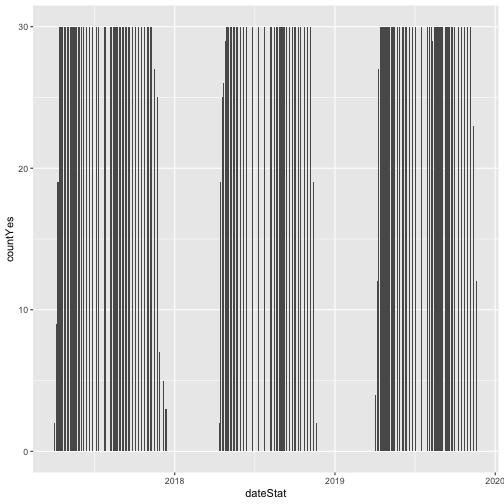
The default setting for a ggplot bar plot - geom_bar() - is a histogram
designated by stat="bin". However, in this case, we want to plot count values.
We can use geom_bar(stat="identity") to force ggplot to plot actual values.
# plot number of individuals in leaf

phenoPlot <- ggplot(inStat_T,
                    aes(dateStat, countYes)) +
    geom_bar(stat="identity", na.rm = TRUE)


phenoPlot
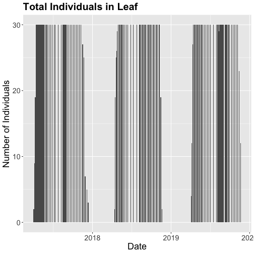
# Now let's make the plot look a bit more presentable

phenoPlot <- ggplot(inStat_T,
                    aes(dateStat, countYes)) +
    geom_bar(stat="identity", na.rm = TRUE) +
    ggtitle("Total Individuals in Leaf") +
    xlab("Date") + ylab("Number of Individuals") +
    theme(plot.title = element_text(lineheight=.8,
                                    face="bold",
                                    size = 20)) +
    theme(text = element_text(size=18))


phenoPlot
We could also covert this to percentage and plot that.
# convert to percent

inStat_T$percent <- ((inStat_T$countYes)/
                       inStat_T$numInd)*100


# plot percent of leaves

phenoPlot_P <- ggplot(inStat_T,
                      aes(dateStat, percent)) +
    geom_bar(stat="identity", na.rm = TRUE) +
    ggtitle("Proportion in Leaf") +
    xlab("Date") + ylab("% of Individuals") +
    theme(plot.title = element_text(lineheight=.8,
                                    face="bold",
                                    size = 20)) +
    theme(text = element_text(size=18))


phenoPlot_P
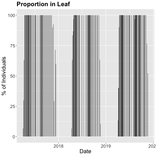
The plots demonstrate the nice expected pattern of increasing leaf-out, peak, and drop-off.
Drivers of phenology
Now that we see that there are differences in and shifts in phenophases, what are the drivers of phenophases?
The NEON phenology measurements track sensitive and easily observed indicators of biotic responses to meteorological variability by monitoring the timing and duration of phenological stages in plant communities. Plant phenology is affected by forces such as temperature, timing and duration of pest infestations and disease outbreaks, water fluxes, nutrient budgets, carbon dynamics, and food availability and has feedbacks to trophic interactions, carbon sequestration, community composition and ecosystem function. (quoted from Plant Phenology Observations user guide.)
Filter by date
In the next part of this series, we will be exploring temperature as a driver of phenology. Temperature data are quite large (NEON provides this in 1 minute or 30 minute intervals) so let's trim our phenology date down to only one year so that we aren't working with as large a dataset.
Let's filter to just 2018 data.
# use filter to select only the date of interest

phe_1sp_2018 <- inStat_T %>%
  filter(dateStat >= "2018-01-01" &
           dateStat <= "2018-12-31")


# did it work?

range(phe_1sp_2018$dateStat)

## [1] "2018-04-13 GMT" "2018-11-20 GMT"
How does that look?
# Now let's make the plot look a bit more presentable

phenoPlot18 <- ggplot(phe_1sp_2018,
                      aes(dateStat, countYes)) +
    geom_bar(stat="identity", na.rm = TRUE) +
    ggtitle("Total Individuals in Leaf") +
    xlab("Date") + ylab("Number of Individuals") +
    theme(plot.title = element_text(lineheight=.8,
                                    face="bold",
                                    size = 20)) +
    theme(text = element_text(size=18))


phenoPlot18
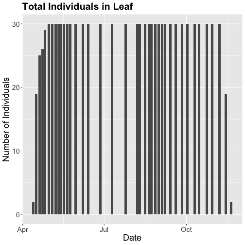
Now that we've filtered down to just the 2018 data from SCBI for LITU in leaf, we may want to save that subsetted data for another use. To do that you can write the data frame to a .csv file.
You do not need to follow this step if you are continuing on to the next tutorials in this series as you already have the data frame in your environment. Of course if you close R and then come back to it, you will need to re-load this data and instructions for that are provided in the relevant tutorials.
# optional

write.csv(phe_1sp_2018 ,

          file="NEONpheno_LITU_Leaves_SCBI_2018.csv",

          row.names=F)
Get Lesson Code
Work with NEON's Single-Aspirated Air Temperature Data
Last Updated: Jun 30, 2026
In this tutorial, we explore NEON single-aspirated air temperature data. We then discuss how to interpret the variables, how to work with date-time and date formats, and finally how to plot the data.
This tutorial is part of a series on how to work with both discrete and continuous time series data with NEON plant phenology and temperature data products.
Objectives
After completing this activity, you will be able to:
- work with "stacked" NEON Single-Aspirated Air Temperature data.
- correctly format date-time data.
- use dplyr functions to filter data.
- plot time series data in scatter plots using ggplot function.
Things You’ll Need To Complete This Tutorial
- You will need a current version of R (4+) and, preferably,
RStudioloaded on your computer to complete this tutorial. - Create a NEON user account
- Generate an API token for downloading data
Install R Packages
-
neonUtilities:
install.packages("neonUtilities") -
ggplot2:
install.packages("ggplot2") -
dplyr:
install.packages("dplyr") -
tidyr:
install.packages("tidyr") -
lubridate:
install.packages("lubridate")
More on Packages in R – Adapted from Software Carpentry.
Additional Resources
- NEON data portal
- RStudio's data wrangling (dplyr/tidyr) cheatsheet
- NEONScience GitHub Organization
- nneo API wrapper on CRAN
- RStudio's data wrangling (dplyr/tidyr) cheatsheet
- Hadley Wickham's
documentation
on the
ggplot2package. - Winston Chang's
Background information about NEON air temperature data
Air temperature is continuously monitored by NEON by two methods. At terrestrial sites temperature at the top of the tower is derived from a triple redundant aspirated air temperature sensor. This is provided as NEON data product DP1.00003.001. Single Aspirated Air Temperature sensors (SAAT) are deployed to develop temperature profiles at multiple levels on the tower at NEON terrestrial sites and on the meteorological stations at NEON aquatic sites. This is provided as NEON data product DP1.00002.001.
When designing a research project using this data, consult the Data Product Details Page for more detailed documentation.
Single-aspirated Air Temperature
Air temperature profiles are ascertained by deploying SAATs at various heights on NEON tower infrastructure. Air temperature at aquatic sites is measured using a single SAAT at a standard height of 3m above ground level. Air temperature for this data product is provided as one- and thirty-minute averages of 1 Hz observations. Temperature observations are made using platinum resistance thermometers, which are housed in a fan aspirated shield to reduce radiative heating. The temperature is measured in Ohms and subsequently converted to degrees Celsius during data processing. Details on the conversion can be found in the associated Algorithm Theoretic Basis Document (ATBD; see Product Details page linked above).
Available data tables
The SAAT data product contains two data tables for each site and month selected, consisting of the 1-minute and 30-minute averaging intervals. In addition, there are several metadata files that provide additional useful information.
- readme with information on the data product and the download
- variables file that defines the terms, data types, and units
- citation file with the BibTeX citation for the data downloaded
Access data
There are several ways to access NEON data, directly from the NEON data portal,
access through a data partner (select data products only), writing code to
directly pull data from the NEON API, or, as we'll do here, using the neonUtilities
package which is a wrapper for the API to make working with the data easier.
As of June 2026, NEON requires an API token for data downloads, to reduce bot scraping and improve user support. Tokens can be generated in NEON data portal user accounts - log in to your account or create one, and go to the API Tokens section. For best practices in storing and using tokens, follow the instructions here.’
First, we need to set up our environment with the packages needed for this tutorial and our API token.
# Install needed package (only uncomment & run if not already installed)

#install.packages("neonUtilities")

#install.packages("ggplot2")

#install.packages("dplyr")

#install.packages("tidyr")


# Load required libraries

library(neonUtilities)

library(ggplot2)

library(dplyr)

library(tidyr)

library(lubridate)

token <- Sys.getenv("NEON_TOKEN")


# set working directory, modify as needed

wd <- "~/data"

setwd(wd)
This tutorial is part of series working with discrete plant phenology data and (nearly) continuous temperature data. Our overall "research" question is to explore the correlation between plant phenology and temperature. Therefore, we will want to work with data that align with the plant phenology data that we worked with in the first tutorial. If you are only interested in working with the temperature data, you do not need to complete the previous tutorial.
Our data of interest will be the temperature data from 2018 from NEON's Smithsonian Conservation Biology Institute (SCBI) field site located in Virginia near the northern terminus of the Blue Ridge Mountains.
NEON single aspirated air temperature data are available in two averaging intervals, 1 minute and 30 minute intervals. Which data you want to work with is going to depend on your research questions. Here, we're going to only download and work with the 30 minute interval data as we're primarily interest in longer term (daily, weekly, annual) patterns.
This will download 7.7 MB of data. check.size is set to false (F) to improve flow
of the script but is always a good idea to view the size with true (T) before
downloading a new dataset.
saat <- loadByProduct(dpID="DP1.00002.001",
                      site="SCBI",
                      startdate="2018-01",
                      enddate="2018-12",
                      package="basic",
                      timeIndex="30",
                      release="RELEASE-2026",
                      check.size = F,
                      token=token)
Explore temperature data
Now that we have the data, let's take a look at the structure and understand
what's in the data. The data (saat) come in as a large list of four items.
names(saat)

## [1] "citation_00002_RELEASE-2026" "issueLog_00002"              "readme_00002"                "SAAT_30min"
## [5] "science_review_flags_00002"  "sensor_positions_00002"      "variables_00002"
What are the individual tables and how should they be used?
-
data file(s): There will always be one or more dataframes that include the
primary data of the data product you downloaded. Since we downloaded only the 30
minute averaged data we only have one data table
SAAT_30min. - readme_xxxxx: The readme file, with the corresponding 5 digits from the data product number, provides you with important information relevant to the data product and the specific instance of downloading the data.
- sensor_positions_xxxxx: This table contains the spatial coordinates of each sensor, relative to a reference location.
- variables_xxxxx: This table contains all the variables found in the associated data table(s). This includes full definitions, units, and rounding.
- citation_xxxxx: BibTeX citation for the data downloaded.
- issueLog_xxxxx: This table contains records of any known issues with the data product, such as sensor malfunctions.
- scienceReviewFlags_xxxxx: This table may or may not be present. It contains descriptions of adverse events that led to manual flagging of the data, and is usually more detailed than the issue log. It only contains records relevant to the sites and dates of data downloaded.
Since we want to work with the individual files, we'll save the elements of the list as independent objects.
list2env(saat, .GlobalEnv)

## <environment: R_GlobalEnv>
Now let's take a look at the data table.
str(SAAT_30min)

## 'data.frame':	87600 obs. of  16 variables:
##  $ domainID           : chr  "D02" "D02" "D02" "D02" ...
##  $ siteID             : chr  "SCBI" "SCBI" "SCBI" "SCBI" ...
##  $ horizontalPosition : chr  "000" "000" "000" "000" ...
##  $ verticalPosition   : chr  "010" "010" "010" "010" ...
##  $ startDateTime      : POSIXct, format: "2018-01-01 00:00:00" "2018-01-01 00:30:00" "2018-01-01 01:00:00" "2018-01-01 01:30:00" ...
##  $ endDateTime        : POSIXct, format: "2018-01-01 00:30:00" "2018-01-01 01:00:00" "2018-01-01 01:30:00" "2018-01-01 02:00:00" ...
##  $ tempSingleMean     : num  -11.8 -11.8 -12 -12.2 -12.4 ...
##  $ tempSingleMinimum  : num  -12.1 -12.2 -12.3 -12.6 -12.8 ...
##  $ tempSingleMaximum  : num  -11.4 -11.3 -11.3 -11.7 -12.1 ...
##  $ tempSingleVariance : num  0.0208 0.0315 0.0412 0.0393 0.0361 0.0289 0.0126 0.0211 0.0115 0.0022 ...
##  $ tempSingleNumPts   : num  1800 1800 1800 1800 1800 1800 1800 1800 1800 1800 ...
##  $ tempSingleExpUncert: num  0.13 0.13 0.13 0.13 0.129 ...
##  $ tempSingleStdErMean: num  0.0034 0.0042 0.0048 0.0047 0.0045 0.004 0.0026 0.0034 0.0025 0.0011 ...
##  $ finalQF            : int  0 0 0 0 0 0 0 0 0 0 ...
##  $ publicationDate    : chr  "20230213T171855Z" "20230213T171855Z" "20230213T171855Z" "20230213T171855Z" ...
##  $ release            : chr  "RELEASE-2026" "RELEASE-2026" "RELEASE-2026" "RELEASE-2026" ...
Quality flags
The sensor data undergo a variety of automated quality assurance and quality control
checks. You can read about them in detail in the Quality Flags and Quality Metrics ATBD, in the Documentation section of the product details page.
The expanded data package
includes all of these quality flags, which can allow you to decide if not passing
one of the checks will significantly hamper your research and if you should
therefore remove the data from your analysis. Here, we're using the
basic data package, which only includes the final quality flag (finalQF),
which is aggregated from the full set of quality flags.
A pass of the check is 0, while a fail is 1. Let's see what percentage of the data we downloaded passed the quality checks.
sum(SAAT_30min$finalQF==1)/nrow(SAAT_30min)

## [1] 0.2340297
What should we do with the 23% of the data that are flagged? This may depend on why it is flagged and what questions you are asking, and the expanded data package would be useful for determining this.
We'll keep the flagged data for now, to illustrate how errors appear in these datasets.
What about null (NA) data?
sum(is.na(SAAT_30min$tempSingleMean))/nrow(SAAT_30min)

## [1] 0.1475

mean(SAAT_30min$tempSingleMean)

## [1] NA
22% of the mean temperature values are NA. Note that this is not
additive with the flagged data! Empty data records are flagged, so this
indicates nearly all of the flagged data in our download are empty records.
Why was there no output from the calculation of mean temperature?
The R programming language, by default, won't calculate a mean (and many other
summary statistics) in data that contain NA values. We could override this
using the input parameter na.rm=TRUE in the mean() function, or just
remove the empty values from our analysis.
SAAT_30min_noNA <- SAAT_30min %>%
	drop_na(tempSingleMean)


sum(is.na(SAAT_30min_noNA$tempSingleMean))

## [1] 0
Scatterplots with ggplot
We can use ggplot to create scatter plots. Which data should we plot, as we have several options?
- tempSingleMean: the mean temperature for the interval
- tempSingleMinimum: the minimum temperature during the interval
- tempSingleMaximum: the maximum temperature for the interval
Depending on exactly what question you are asking you may prefer to use one over the other. For many applications, the mean temperature of the 1- or 30-minute interval will provide the best representation of the data.
Let's plot it. (This is a plot of a large amount of data. It can take 1-2 mins to process. It is not essential for completing the next steps if this takes too much of your computer memory.)
tempPlot <- ggplot(SAAT_30min,
                   aes(startDateTime,
                       tempSingleMean)) +
    geom_point(size=0.2) +
    ggtitle("Single Aspirated Air Temperature") +
    xlab("Date") + ylab("Temp (C)") +
    theme(plot.title = element_text(lineheight=.8,
                                    face="bold",
                                    size = 20)) +
    theme(text = element_text(size=18))


tempPlot

## Warning: Removed 12921 rows containing missing values or values outside the scale range (`geom_point()`).
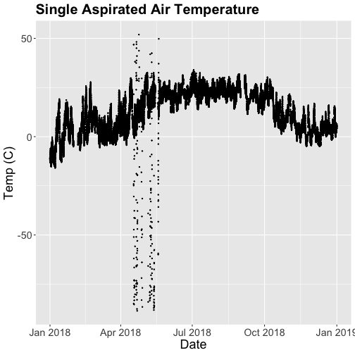
What patterns can you see in the data?
Something odd seems to have happened in late April/May 2018. Since it is unlikely Virginia experienced -50C during this time, these are probably erroneous sensor readings and why we should probably remove data that are flagged with those quality flags.
Right now we are also looking at all the data points in the dataset. However, we may want to view or aggregate the data differently:
- aggregated data: min, mean, or max over a some duration
- the number of days since a freezing temperatures
- or some other segregation of the data.
Given that in the previous tutorial, Work With NEON's Plant Phenology Data, we were working with phenology data collected on a daily scale let's aggregate to that level.
To make this plot better, lets do two things
- Remove flagged data
- Aggregate to a daily mean.
Subset to remove quality flagged data
We already removed the empty records. Now we'll subset the data to remove the remaining flagged data.
SAAT_30minC <- SAAT_30min_noNA %>%
  filter(finalQF==0)
Now we can plot only the unflagged data.
tempPlot <- ggplot(SAAT_30minC,
                   aes(startDateTime,
                       tempSingleMean)) +
    geom_point(size=0.2) +
    ggtitle("Single Aspirated Air Temperature") +
    xlab("Date") + ylab("Temp (C)") +
    theme(plot.title = element_text(lineheight=.8,
                                    face="bold",
                                    size = 20)) +
    theme(text = element_text(size=18))


tempPlot
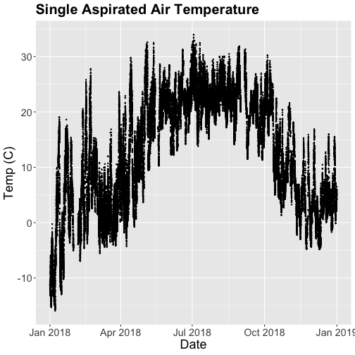
That looks better! But we're still working with the 30-minute data.
Aggregate data by day
We can use the dplyr package functions to aggregate the data. However, we have to choose which data we want to aggregate. Again, you might want daily minimum temps, mean temperature or maximum temps depending on your question.
In the context of phenology, minimum temperatures might be very important if you are interested in a species that is very frost susceptible. Any days with a minimum temperature below 0C could dramatically change the phenophase. For other species or meteorological zones, maximum thresholds may be very important. Or you might be most interested in the daily mean.
And note that you can combine different input values with different aggregation functions - for example, you could calculate the minimum of the half-hourly average temperature, or the average of the half-hourly maximum temperature.
Also keep in mind the removal of NA and flagged data we did above. Always use caution when aggregating incomplete data - if, for example, the missing data tend to occur at particular times of day, a daily mean will be biased.
For this tutorial, let's use maximum daily temperature, i.e. the maximum of the
tempSingleMax values for the day.
temp_day <- SAAT_30minC %>%
	group_by(date(startDateTime)) %>%
	distinct(date(startDateTime), .keep_all=T) %>%
	mutate(dayMax=max(tempSingleMaximum))
Now we can plot the cleaned up daily temperature.
tempPlot_dayMax <- ggplot(temp_day,
                          aes(startDateTime,
                              dayMax)) +
    geom_point(size=0.5) +
    ggtitle("Daily Max Air Temperature") +
    xlab("") + ylab("Temp (C)") +
    theme(plot.title = element_text(lineheight=.8,
                                    face="bold",
                                    size = 20)) +
    theme(text = element_text(size=18))


tempPlot_dayMax
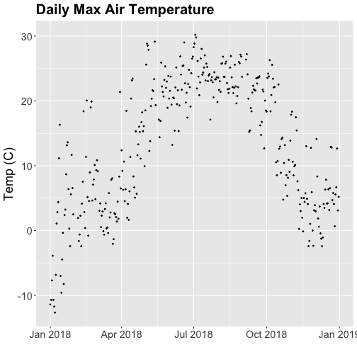
Thought questions:
- What do we gain by this visualization?
- What do we lose relative to the 30 minute intervals?
ggplot - subset by time
Sometimes we want to scale the x- or y-axis to a particular time subset without
subsetting the entire data_frame. To do this, we can define start and end
times. We can then define these limits in the scale_x_date object as
follows:
scale_x_date(limits=start.end) +
Let's plot just the first three months of the year.
# Define Start and end times for the subset

startTime <- as.Date("2018-01-01")

endTime <- as.Date("2018-03-31")


start.end <- c(startTime,endTime)


tempPlot_dayMax3m <- ggplot(temp_day,
                            aes(startDateTime,
                                dayMax)) +
           geom_point(color="blue", size=0.5) +
           ggtitle("Air Temperature\n Jan - March") +
           xlab("Date") + ylab("Air Temperature (C)")+
           (scale_x_date(limits=start.end,
                date_breaks="1 week",
                date_labels="%b %d"))


tempPlot_dayMax3m

## Warning: Removed 268 rows containing missing values or values outside the scale range (`geom_point()`).
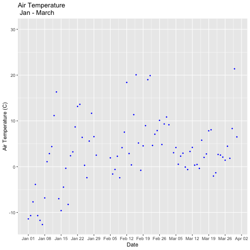
Now we have the temperature data matching our Phenology data from the previous tutorial, we want to save it to our computer to use in future analyses (or the next tutorial). This is optional if you are continuing directly to the next tutorial as you already have the data in R.
# optional

write.csv(temp_day, file="NEONsaat_daily_SCBI_2018.csv", row.names=F)
Get Lesson Code
Plot Continuous & Discrete Data Together
Last Updated: Apr 2, 2026
This tutorial discusses ways to plot plant phenology (discrete time series) and single-aspirated temperature (continuous time series) together. It uses data frames created in the first two parts of this series, Work with NEON OS & IS Data - Plant Phenology & Temperature. If you have not completed these tutorials, please download the dataset below.
Objectives
After completing this tutorial, you will be able to:
- plot multiple figures together with grid.arrange()
- plot only a subset of dates
Things You’ll Need To Complete This Tutorial
You will need the most current version of R and, preferably, RStudio loaded
on your computer to complete this tutorial.
Install R Packages
-
neonUtilities:
install.packages("neonUtilities") -
ggplot2:
install.packages("ggplot2") -
dplyr:
install.packages("dplyr") -
gridExtra:
install.packages("gridExtra")
More on Packages in R – Adapted from Software Carpentry.
Download Data
This tutorial is designed to have you download data directly from the NEON
portal API using the neonUtilities package. However, you can also directly
download this data, prepackaged, from FigShare. This data set includes all the
files needed for the Work with NEON OS & IS Data - Plant Phenology & Temperature
tutorial series. The data are in the format you would receive if downloading them
using the zipsByProduct() function in the neonUtilities package.
To start, we need to set up our R environment. If you're continuing from the previous tutorial in this series, you'll only need to load the new packages.
# Install needed package (only uncomment & run if not already installed)
#install.packages("dplyr")
#install.packages("ggplot2")
#install.packages("scales")

# Load required libraries
library(ggplot2)
library(dplyr)

##
## Attaching package: 'dplyr'

## The following objects are masked from 'package:stats':
##
##     filter, lag

## The following objects are masked from 'package:base':
##
##     intersect, setdiff, setequal, union

library(gridExtra)

##
## Attaching package: 'gridExtra'

## The following object is masked from 'package:dplyr':
##
##     combine

library(scales)

options(stringsAsFactors=F) #keep strings as character type not factors

# set working directory to ensure R can find the file we wish to import and where
# we want to save our files. Be sure to move the download into your working directory!
wd <- "~/Documents/data/" # Change this to match your local environment
setwd(wd)
If you don't already have the R objects, temp_day and phe_1sp_2018, loaded
you'll need to load and format those data. If you do, you can skip this code.
# Read in data -> if in series this is unnecessary
temp_day <- read.csv(paste0(wd,'NEON-pheno-temp-timeseries/NEONsaat_daily_SCBI_2018.csv'))

phe_1sp_2018 <- read.csv(paste0(wd,'NEON-pheno-temp-timeseries/NEONpheno_LITU_Leaves_SCBI_2018.csv'))

# Convert dates
temp_day$Date <- as.Date(temp_day$Date)
# use dateStat - the date the phenophase status was recorded
phe_1sp_2018$dateStat <- as.Date(phe_1sp_2018$dateStat)
Separate Plots, Same Panel
In this dataset, we have phenology and temperature data from the Smithsonian Conservation Biology Institute (SCBI) NEON field site. There are a variety of ways we may want to look at this data, including aggregated at the site level, by a single plot, or viewing all plots at the same time but in separate plots. In the Work With NEON's Plant Phenology Data and the Work with NEON's Single-Aspirated Air Temperature Data tutorials, we created separate plots of the number of individuals who had leaves at different times of the year and the temperature in 2018.
However, plot the data next to each other to aid comparisons. The grid.arrange()
function from the gridExtra package can help us do this.
# first, create one plot
phenoPlot <- ggplot(phe_1sp_2018, aes(dateStat, countYes)) +
    geom_bar(stat="identity", na.rm = TRUE) +
    ggtitle("Total Individuals in Leaf") +
    xlab("") + ylab("Number of Individuals")

# create second plot of interest
tempPlot_dayMax <- ggplot(temp_day, aes(Date, dayMax)) +
    geom_point() +
    ggtitle("Daily Max Air Temperature") +
    xlab("Date") + ylab("Temp (C)")

# Then arrange the plots - this can be done with >2 plots as well.
grid.arrange(phenoPlot, tempPlot_dayMax)
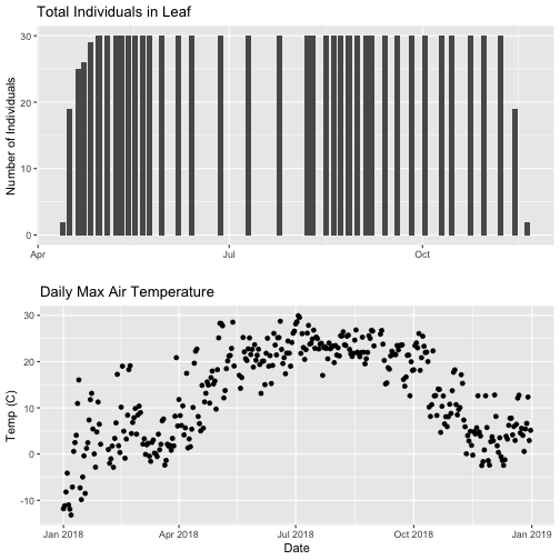
Now, we can see both plots in the same window. But, hmmm... the x-axis on both plots is kinda wonky. We want the same spacing in the scale across the year (e.g., July in one should line up with July in the other) plus we want the dates to display in the same format(e.g. 2016-07 vs. Jul vs Jul 2018).
Format Dates in Axis Labels
The date format parameter can be adjusted with scale_x_date. Let's format the x-axis
ticks so they read "month" (%b) in both graphs. We will use the syntax:
scale_x_date(labels=date_format("%b"")
Rather than re-coding the entire plot, we can add the scale_x_date element
to the plot object phenoPlot we just created.
-
You can type
?strptimeinto the R console to find a list of date format conversion specifications (e.g. %b = month). Typescale_x_datefor a list of parameters that allow you to format dates on the x-axis. -
If you are working with a date & time class (e.g. POSIXct), you can use
scale_x_datetimeinstead ofscale_x_date.
# format x-axis: dates
phenoPlot <- phenoPlot +
  (scale_x_date(breaks = date_breaks("1 month"), labels = date_format("%b")))

tempPlot_dayMax <- tempPlot_dayMax +
  (scale_x_date(breaks = date_breaks("1 month"), labels = date_format("%b")))

# New plot.
grid.arrange(phenoPlot, tempPlot_dayMax)
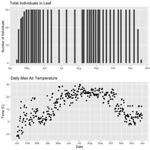
But this only solves one of the problems, we still have a different range on the x-axis which makes it harder to see trends.
Align data sets with different start dates
Now let's work to align the values on the x-axis. We can do this in two ways,
- setting the x-axis to have the same date range or 2) by filtering the dataset itself to only include the overlapping data. Depending on what you are trying to demonstrate and if you're doing additional analyses and want only the overlapping data, you may prefer one over the other. Let's try both.
Set range of x-axis
Alternatively, we can set the x-axis range for both plots by adding the limits
parameter to the scale_x_date() function.
# first, lets recreate the full plot and add in the
phenoPlot_setX <- ggplot(phe_1sp_2018, aes(dateStat, countYes)) +
    geom_bar(stat="identity", na.rm = TRUE) +
    ggtitle("Total Individuals in Leaf") +
    xlab("") + ylab("Number of Individuals") +
    scale_x_date(breaks = date_breaks("1 month"),
                  labels = date_format("%b"),
                  limits = as.Date(c('2018-01-01','2018-12-31')))

# create second plot of interest
tempPlot_dayMax_setX <- ggplot(temp_day, aes(Date, dayMax)) +
    geom_point() +
    ggtitle("Daily Max Air Temperature") +
    xlab("Date") + ylab("Temp (C)") +
    scale_x_date(date_breaks = "1 month",
                 labels=date_format("%b"),
                  limits = as.Date(c('2018-01-01','2018-12-31')))

# Plot
grid.arrange(phenoPlot_setX, tempPlot_dayMax_setX)
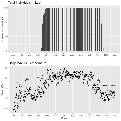
Now we can really see the pattern over the full year. This emphasizes the point that during much of the late fall, winter, and early spring none of the trees have leaves on them (or that data were not collected - this plot would not distinguish between the two).
Subset one data set to match other
Alternatively, we can simply filter the dataset with the larger date range so the we only plot the data from the overlapping dates.
# filter to only having overlapping data
temp_day_filt <- filter(temp_day, Date >= min(phe_1sp_2018$dateStat) &
                         Date <= max(phe_1sp_2018$dateStat))

# Check
range(phe_1sp_2018$date)

## [1] "2018-04-13" "2018-11-20"

range(temp_day_filt$Date)

## [1] "2018-04-13" "2018-11-20"

#plot again
tempPlot_dayMaxFiltered <- ggplot(temp_day_filt, aes(Date, dayMax)) +
    geom_point() +
    scale_x_date(breaks = date_breaks("months"), labels = date_format("%b")) +
    ggtitle("Daily Max Air Temperature") +
    xlab("Date") + ylab("Temp (C)")


grid.arrange(phenoPlot, tempPlot_dayMaxFiltered)
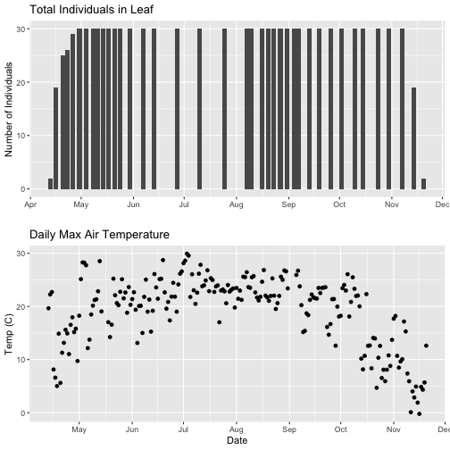
With this plot, we really look at the area of overlap in the plotted data (but this does cut out the time where the data are collected but not plotted).
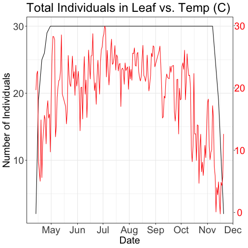
Same plot with two Y-axes
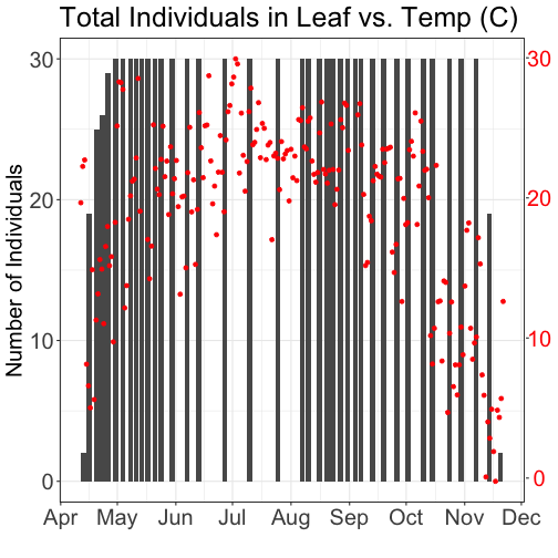
What about layering these plots and having two y-axes (right and left) that have the different scale bars?
Some argue that you should not do this as it can distort what is actually going
on with the data. The author of the ggplot2 package is one of these individuals.
Therefore, you cannot use ggplot() to create a single plot with multiple y-axis
scales. You can read his own discussion of the topic on this
StackOverflow post.
However, individuals have found work arounds for these plots. The code below is provided as a demonstration of this capability. Note, by showing this code here, we don't necessarily endorse having plots with two y-axes.
This code is adapted from code by Jake Heare.
# Source: http://heareresearch.blogspot.com/2014/10/10-30-2014-dual-y-axis-graph-ggplot2_30.html

# Additional packages needed
library(gtable)
library(grid)


# Plot 1: Pheno data as bars, temp as scatter
grid.newpage()
phenoPlot_2 <- ggplot(phe_1sp_2018, aes(dateStat, countYes)) +
  geom_bar(stat="identity", na.rm = TRUE) +
  scale_x_date(breaks = date_breaks("1 month"), labels = date_format("%b")) +
  ggtitle("Total Individuals in Leaf vs. Temp (C)") +
  xlab(" ") + ylab("Number of Individuals") +
  theme_bw()+
  theme(legend.justification=c(0,1),
        legend.position=c(0,1),
        plot.title=element_text(size=25,vjust=1),
        axis.text.x=element_text(size=20),
        axis.text.y=element_text(size=20),
        axis.title.x=element_text(size=20),
        axis.title.y=element_text(size=20))


tempPlot_dayMax_corr_2 <- ggplot() +
  geom_point(data = temp_day_filt, aes(Date, dayMax),color="red") +
  scale_x_date(breaks = date_breaks("months"), labels = date_format("%b")) +
  xlab("") + ylab("Temp (C)") +
  theme_bw() %+replace%
  theme(panel.background = element_rect(fill = NA),
        panel.grid.major.x=element_blank(),
        panel.grid.minor.x=element_blank(),
        panel.grid.major.y=element_blank(),
        panel.grid.minor.y=element_blank(),
        axis.text.y=element_text(size=20,color="red"),
        axis.title.y=element_text(size=20))

g1<-ggplot_gtable(ggplot_build(phenoPlot_2))
g2<-ggplot_gtable(ggplot_build(tempPlot_dayMax_corr_2))

pp<-c(subset(g1$layout,name=="panel",se=t:r))
g<-gtable_add_grob(g1, g2$grobs[[which(g2$layout$name=="panel")]],pp$t,pp$l,pp$b,pp$l)

ia<-which(g2$layout$name=="axis-l")
ga <- g2$grobs[[ia]]
ax <- ga$children[[2]]
ax$widths <- rev(ax$widths)
ax$grobs <- rev(ax$grobs)
ax$grobs[[1]]$x <- ax$grobs[[1]]$x - unit(1, "npc") + unit(0.15, "cm")
g <- gtable_add_cols(g, g2$widths[g2$layout[ia, ]$l], length(g$widths) - 1)
g <- gtable_add_grob(g, ax, pp$t, length(g$widths) - 1, pp$b)

grid.draw(g)
# Plot 2: Both pheno data and temp data as line graphs
grid.newpage()
phenoPlot_3 <- ggplot(phe_1sp_2018, aes(dateStat, countYes)) +
  geom_line(na.rm = TRUE) +
  scale_x_date(breaks = date_breaks("months"), labels = date_format("%b")) +
  ggtitle("Total Individuals in Leaf vs. Temp (C)") +
  xlab("Date") + ylab("Number of Individuals") +
  theme_bw()+
  theme(legend.justification=c(0,1),
        legend.position=c(0,1),
        plot.title=element_text(size=25,vjust=1),
        axis.text.x=element_text(size=20),
        axis.text.y=element_text(size=20),
        axis.title.x=element_text(size=20),
        axis.title.y=element_text(size=20))

tempPlot_dayMax_corr_3 <- ggplot() +
  geom_line(data = temp_day_filt, aes(Date, dayMax),color="red") +
  scale_x_date(breaks = date_breaks("months"), labels = date_format("%b")) +
  xlab("") + ylab("Temp (C)") +
  theme_bw() %+replace%
  theme(panel.background = element_rect(fill = NA),
        panel.grid.major.x=element_blank(),
        panel.grid.minor.x=element_blank(),
        panel.grid.major.y=element_blank(),
        panel.grid.minor.y=element_blank(),
        axis.text.y=element_text(size=20,color="red"),
        axis.title.y=element_text(size=20))

g1<-ggplot_gtable(ggplot_build(phenoPlot_3))
g2<-ggplot_gtable(ggplot_build(tempPlot_dayMax_corr_3))

pp<-c(subset(g1$layout,name=="panel",se=t:r))
g<-gtable_add_grob(g1, g2$grobs[[which(g2$layout$name=="panel")]],pp$t,pp$l,pp$b,pp$l)

ia<-which(g2$layout$name=="axis-l")
ga <- g2$grobs[[ia]]
ax <- ga$children[[2]]
ax$widths <- rev(ax$widths)
ax$grobs <- rev(ax$grobs)
ax$grobs[[1]]$x <- ax$grobs[[1]]$x - unit(1, "npc") + unit(0.15, "cm")
g <- gtable_add_cols(g, g2$widths[g2$layout[ia, ]$l], length(g$widths) - 1)
g <- gtable_add_grob(g, ax, pp$t, length(g$widths) - 1, pp$b)

grid.draw(g)