Tutorial
Raster 01: Plot Raster Data in R
Last Updated: Apr 2, 2026
This tutorial reviews how to plot a raster in R using the plot()
function. It also covers how to layer a raster on top of a hillshade to produce
an eloquent map.
Learning Objectives
After completing this tutorial, you will be able to:
- Know how to plot a single band raster in R.
- Know how to layer a raster dataset on top of a hillshade to create an elegant basemap.
Things You’ll Need To Complete This Tutorial
You will need the most current version of R and, preferably, RStudio loaded
on your computer to complete this tutorial.
Install R Packages
-
terra:
install.packages("terra") -
More on Packages in R – Adapted from Software Carpentry.
Download Data
Data required for this tutorial will be downloaded using neonUtilities in the lesson.
The LiDAR and imagery data used in this lesson were collected over the National Ecological Observatory Network's Harvard Forest (HARV) field site.
The entire dataset can be accessed from the NEON Data Portal.
Set Working Directory: This lesson will explain how to set the working directory. You may wish to set your working directory to some other location, depending on how you prefer to organize your data.
An overview of setting the working directory in R can be found here.
Additional Resources
Plot Raster Data in R
In this tutorial, we will plot the Digital Surface Model (DSM) raster
for the NEON Harvard Forest Field Site. We will use the hist() function as a
tool to explore raster values. And render categorical plots, using the breaks
argument to get bins that are meaningful representations of our data.
We will use the terra package in this tutorial. If you do not
have the DSM_HARV variable as defined in the pervious tutorial, Intro To Raster In R, please download it using neonUtilities, as shown in the previous tutorial.
library(terra)


# set working directory

wd <- "~/data/"

setwd(wd)


# import raster into R

dsm_harv_file <- paste0(wd, "DP3.30024.001/neon-aop-products/2022/FullSite/D01/2022_HARV_7/L3/DiscreteLidar/DSMGtif/NEON_D01_HARV_DP3_732000_4713000_DSM.tif")

DSM_HARV <- rast(dsm_harv_file)
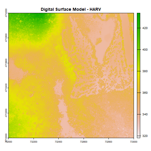
First, let's plot our Digital Surface Model object (DSM_HARV) using the
plot() function. We add a title using the argument main="title".
# Plot raster object

plot(DSM_HARV, main="Digital Surface Model - HARV")
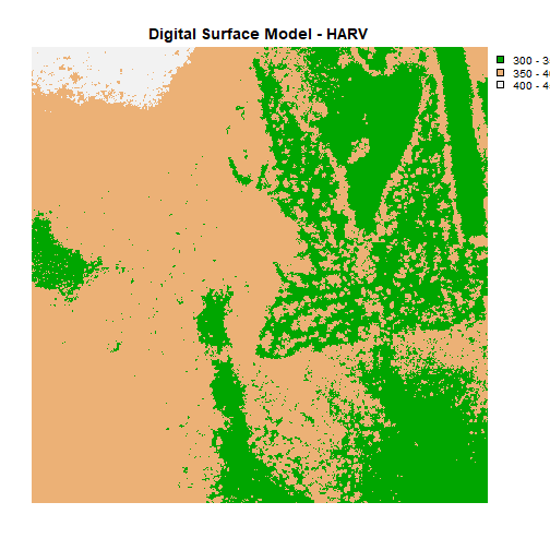
Plotting Data Using Breaks
We can view our data "symbolized" or colored according to ranges of values
rather than using a continuous color ramp. This is comparable to a "classified"
map. However, to assign breaks, it is useful to first explore the distribution
of the data using a histogram. The breaks argument in the hist() function
tells R to use fewer or more breaks or bins.
If we name the histogram, we can also view counts for each bin and assigned break values.
# Plot distribution of raster values

DSMhist<-hist(DSM_HARV,
     breaks=3,
     main="Histogram Digital Surface Model\n NEON Harvard Forest Field Site",
     col="lightblue",  # changes bin color
     xlab= "Elevation (m)")  # label the x-axis
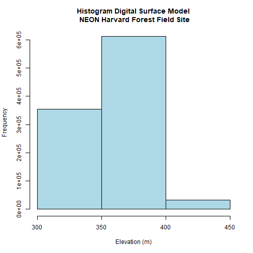
# Where are breaks and how many pixels in each category?

DSMhist$breaks

## [1] 300 350 400 450

DSMhist$counts

## [1] 355269 611685  33046
Looking at our histogram, R has binned out the data as follows:
- 300-350m, 350-400m, 400-450m
We can determine that most of the pixel values fall in the 350-400m range with a few pixels falling in the lower and higher range. We could specify different breaks, if we wished to have a different distribution of pixels in each bin.
We can use those bins to plot our raster data. We will use the
terrain.colors() function to create a palette of 3 colors to use in our plot.
The breaks argument allows us to add breaks. To specify where the breaks
occur, we use the following syntax: breaks=c(value1,value2,value3).
We can include as few or many breaks as we'd like.
# plot using breaks.

plot(DSM_HARV,
     breaks = c(300, 350, 400, 450),
     col = terrain.colors(3),
     main="Digital Surface Model (DSM) - HARV")
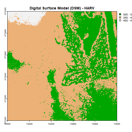
Data Tip: Note that when we assign break values a set of 4 values will result in 3 bins of data.
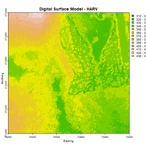
Format Plot
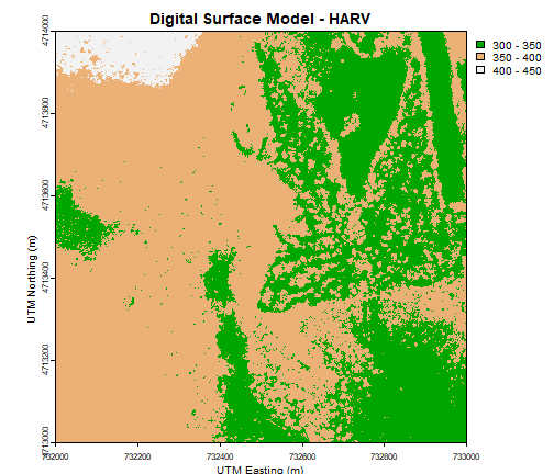
If we need to create multiple plots using the same color palette, we can create
an R object (myCol) for the set of colors that we want to use. We can then
quickly change the palette across all plots by simply modifying the myCol
object.
We can label the x- and y-axes of our plot too using xlab and ylab.
# Assign color to a object for repeat use/ ease of changing

myCol = terrain.colors(3)


# Add axis labels

plot(DSM_HARV,
     breaks = c(300, 350, 400, 450),
     col = myCol,
     main="Digital Surface Model - HARV",
     xlab = "UTM Easting (m)",
     ylab = "UTM Northing (m)")
Or we can also turn off the axes altogether.
# or we can turn off the axis altogether

plot(DSM_HARV,
     breaks = c(300, 350, 400, 450),
     col = myCol,
     main="Digital Surface Model - HARV",
     axes=FALSE)
Challenge: Plot Using Custom Breaks
Create a plot of the Harvard Forest Digital Surface Model (DSM) that has:
- Six classified ranges of values (break points) that are evenly divided among the range of pixel values.
- Axis labels
- A plot title
Hillshade & Layering Rasters
The terra package has built-in functions called terrain for calculating
slope and aspect, and shade for computing hillshade from the slope and aspect.
A hillshade is a raster that maps the shadows and texture that you would see
from above when viewing terrain.
See the shade documentation for more details.
We can layer a raster on top of a hillshade raster for the same area, and use a transparency factor to created a 3-dimensional shaded effect.
slope <- terrain(DSM_HARV, "slope", unit="radians")

aspect <- terrain(DSM_HARV, "aspect", unit="radians")

hill <- shade(slope, aspect, 45, 270)

plot(hill, col=grey(0:100/100), legend=FALSE, mar=c(2,2,1,4))

plot(DSM_HARV, col=terrain.colors(25, alpha=0.35), add=TRUE, main="HARV DSM with Hillshade")
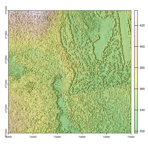
The alpha value determines how transparent the colors will be (0 being
transparent, 1 being opaque). You can also change the color palette, for example,
use rainbow() instead of terrain.color().
- More information can be found in the R color palettes documentation.
Challenge: Create DTM & DSM for SJER
Download data from the NEON field site San Joaquin Experimental Range (SJER) and create maps of the Digital Terrain and Digital Surface Models.
Make sure to:
- include hillshade in the maps,
- label axes on the DSM map and exclude them from the DTM map,
- add titles for the maps,
- experiment with various alpha values and color palettes to represent the data.