Tutorial
Work with NEON's Single-Aspirated Air Temperature Data
Last Updated: Jun 30, 2026
In this tutorial, we explore NEON single-aspirated air temperature data. We then discuss how to interpret the variables, how to work with date-time and date formats, and finally how to plot the data.
This tutorial is part of a series on how to work with both discrete and continuous time series data with NEON plant phenology and temperature data products.
Objectives
After completing this activity, you will be able to:
- work with "stacked" NEON Single-Aspirated Air Temperature data.
- correctly format date-time data.
- use dplyr functions to filter data.
- plot time series data in scatter plots using ggplot function.
Things You’ll Need To Complete This Tutorial
- You will need a current version of R (4+) and, preferably,
RStudioloaded on your computer to complete this tutorial. - Create a NEON user account
- Generate an API token for downloading data
Install R Packages
-
neonUtilities:
install.packages("neonUtilities") -
ggplot2:
install.packages("ggplot2") -
dplyr:
install.packages("dplyr") -
tidyr:
install.packages("tidyr") -
lubridate:
install.packages("lubridate")
More on Packages in R – Adapted from Software Carpentry.
Additional Resources
- NEON data portal
- RStudio's data wrangling (dplyr/tidyr) cheatsheet
- NEONScience GitHub Organization
- nneo API wrapper on CRAN
- RStudio's data wrangling (dplyr/tidyr) cheatsheet
- Hadley Wickham's
documentation
on the
ggplot2package. - Winston Chang's
Background information about NEON air temperature data
Air temperature is continuously monitored by NEON by two methods. At terrestrial sites temperature at the top of the tower is derived from a triple redundant aspirated air temperature sensor. This is provided as NEON data product DP1.00003.001. Single Aspirated Air Temperature sensors (SAAT) are deployed to develop temperature profiles at multiple levels on the tower at NEON terrestrial sites and on the meteorological stations at NEON aquatic sites. This is provided as NEON data product DP1.00002.001.
When designing a research project using this data, consult the Data Product Details Page for more detailed documentation.
Single-aspirated Air Temperature
Air temperature profiles are ascertained by deploying SAATs at various heights on NEON tower infrastructure. Air temperature at aquatic sites is measured using a single SAAT at a standard height of 3m above ground level. Air temperature for this data product is provided as one- and thirty-minute averages of 1 Hz observations. Temperature observations are made using platinum resistance thermometers, which are housed in a fan aspirated shield to reduce radiative heating. The temperature is measured in Ohms and subsequently converted to degrees Celsius during data processing. Details on the conversion can be found in the associated Algorithm Theoretic Basis Document (ATBD; see Product Details page linked above).
Available data tables
The SAAT data product contains two data tables for each site and month selected, consisting of the 1-minute and 30-minute averaging intervals. In addition, there are several metadata files that provide additional useful information.
- readme with information on the data product and the download
- variables file that defines the terms, data types, and units
- citation file with the BibTeX citation for the data downloaded
Access data
There are several ways to access NEON data, directly from the NEON data portal,
access through a data partner (select data products only), writing code to
directly pull data from the NEON API, or, as we'll do here, using the neonUtilities
package which is a wrapper for the API to make working with the data easier.
As of June 2026, NEON requires an API token for data downloads, to reduce bot scraping and improve user support. Tokens can be generated in NEON data portal user accounts - log in to your account or create one, and go to the API Tokens section. For best practices in storing and using tokens, follow the instructions here.’
First, we need to set up our environment with the packages needed for this tutorial and our API token.
# Install needed package (only uncomment & run if not already installed)

#install.packages("neonUtilities")

#install.packages("ggplot2")

#install.packages("dplyr")

#install.packages("tidyr")


# Load required libraries

library(neonUtilities)

library(ggplot2)

library(dplyr)

library(tidyr)

library(lubridate)

token <- Sys.getenv("NEON_TOKEN")


# set working directory, modify as needed

wd <- "~/data"

setwd(wd)
This tutorial is part of series working with discrete plant phenology data and (nearly) continuous temperature data. Our overall "research" question is to explore the correlation between plant phenology and temperature. Therefore, we will want to work with data that align with the plant phenology data that we worked with in the first tutorial. If you are only interested in working with the temperature data, you do not need to complete the previous tutorial.
Our data of interest will be the temperature data from 2018 from NEON's Smithsonian Conservation Biology Institute (SCBI) field site located in Virginia near the northern terminus of the Blue Ridge Mountains.
NEON single aspirated air temperature data are available in two averaging intervals, 1 minute and 30 minute intervals. Which data you want to work with is going to depend on your research questions. Here, we're going to only download and work with the 30 minute interval data as we're primarily interest in longer term (daily, weekly, annual) patterns.
This will download 7.7 MB of data. check.size is set to false (F) to improve flow
of the script but is always a good idea to view the size with true (T) before
downloading a new dataset.
saat <- loadByProduct(dpID="DP1.00002.001",
                      site="SCBI",
                      startdate="2018-01",
                      enddate="2018-12",
                      package="basic",
                      timeIndex="30",
                      release="RELEASE-2026",
                      check.size = F,
                      token=token)
Explore temperature data
Now that we have the data, let's take a look at the structure and understand
what's in the data. The data (saat) come in as a large list of four items.
names(saat)

## [1] "citation_00002_RELEASE-2026" "issueLog_00002"              "readme_00002"                "SAAT_30min"
## [5] "science_review_flags_00002"  "sensor_positions_00002"      "variables_00002"
What are the individual tables and how should they be used?
-
data file(s): There will always be one or more dataframes that include the
primary data of the data product you downloaded. Since we downloaded only the 30
minute averaged data we only have one data table
SAAT_30min. - readme_xxxxx: The readme file, with the corresponding 5 digits from the data product number, provides you with important information relevant to the data product and the specific instance of downloading the data.
- sensor_positions_xxxxx: This table contains the spatial coordinates of each sensor, relative to a reference location.
- variables_xxxxx: This table contains all the variables found in the associated data table(s). This includes full definitions, units, and rounding.
- citation_xxxxx: BibTeX citation for the data downloaded.
- issueLog_xxxxx: This table contains records of any known issues with the data product, such as sensor malfunctions.
- scienceReviewFlags_xxxxx: This table may or may not be present. It contains descriptions of adverse events that led to manual flagging of the data, and is usually more detailed than the issue log. It only contains records relevant to the sites and dates of data downloaded.
Since we want to work with the individual files, we'll save the elements of the list as independent objects.
list2env(saat, .GlobalEnv)

## <environment: R_GlobalEnv>
Now let's take a look at the data table.
str(SAAT_30min)

## 'data.frame':	87600 obs. of  16 variables:
##  $ domainID           : chr  "D02" "D02" "D02" "D02" ...
##  $ siteID             : chr  "SCBI" "SCBI" "SCBI" "SCBI" ...
##  $ horizontalPosition : chr  "000" "000" "000" "000" ...
##  $ verticalPosition   : chr  "010" "010" "010" "010" ...
##  $ startDateTime      : POSIXct, format: "2018-01-01 00:00:00" "2018-01-01 00:30:00" "2018-01-01 01:00:00" "2018-01-01 01:30:00" ...
##  $ endDateTime        : POSIXct, format: "2018-01-01 00:30:00" "2018-01-01 01:00:00" "2018-01-01 01:30:00" "2018-01-01 02:00:00" ...
##  $ tempSingleMean     : num  -11.8 -11.8 -12 -12.2 -12.4 ...
##  $ tempSingleMinimum  : num  -12.1 -12.2 -12.3 -12.6 -12.8 ...
##  $ tempSingleMaximum  : num  -11.4 -11.3 -11.3 -11.7 -12.1 ...
##  $ tempSingleVariance : num  0.0208 0.0315 0.0412 0.0393 0.0361 0.0289 0.0126 0.0211 0.0115 0.0022 ...
##  $ tempSingleNumPts   : num  1800 1800 1800 1800 1800 1800 1800 1800 1800 1800 ...
##  $ tempSingleExpUncert: num  0.13 0.13 0.13 0.13 0.129 ...
##  $ tempSingleStdErMean: num  0.0034 0.0042 0.0048 0.0047 0.0045 0.004 0.0026 0.0034 0.0025 0.0011 ...
##  $ finalQF            : int  0 0 0 0 0 0 0 0 0 0 ...
##  $ publicationDate    : chr  "20230213T171855Z" "20230213T171855Z" "20230213T171855Z" "20230213T171855Z" ...
##  $ release            : chr  "RELEASE-2026" "RELEASE-2026" "RELEASE-2026" "RELEASE-2026" ...
Quality flags
The sensor data undergo a variety of automated quality assurance and quality control
checks. You can read about them in detail in the Quality Flags and Quality Metrics ATBD, in the Documentation section of the product details page.
The expanded data package
includes all of these quality flags, which can allow you to decide if not passing
one of the checks will significantly hamper your research and if you should
therefore remove the data from your analysis. Here, we're using the
basic data package, which only includes the final quality flag (finalQF),
which is aggregated from the full set of quality flags.
A pass of the check is 0, while a fail is 1. Let's see what percentage of the data we downloaded passed the quality checks.
sum(SAAT_30min$finalQF==1)/nrow(SAAT_30min)

## [1] 0.2340297
What should we do with the 23% of the data that are flagged? This may depend on why it is flagged and what questions you are asking, and the expanded data package would be useful for determining this.
We'll keep the flagged data for now, to illustrate how errors appear in these datasets.
What about null (NA) data?
sum(is.na(SAAT_30min$tempSingleMean))/nrow(SAAT_30min)

## [1] 0.1475

mean(SAAT_30min$tempSingleMean)

## [1] NA
22% of the mean temperature values are NA. Note that this is not
additive with the flagged data! Empty data records are flagged, so this
indicates nearly all of the flagged data in our download are empty records.
Why was there no output from the calculation of mean temperature?
The R programming language, by default, won't calculate a mean (and many other
summary statistics) in data that contain NA values. We could override this
using the input parameter na.rm=TRUE in the mean() function, or just
remove the empty values from our analysis.
SAAT_30min_noNA <- SAAT_30min %>%
	drop_na(tempSingleMean)


sum(is.na(SAAT_30min_noNA$tempSingleMean))

## [1] 0
Scatterplots with ggplot
We can use ggplot to create scatter plots. Which data should we plot, as we have several options?
- tempSingleMean: the mean temperature for the interval
- tempSingleMinimum: the minimum temperature during the interval
- tempSingleMaximum: the maximum temperature for the interval
Depending on exactly what question you are asking you may prefer to use one over the other. For many applications, the mean temperature of the 1- or 30-minute interval will provide the best representation of the data.
Let's plot it. (This is a plot of a large amount of data. It can take 1-2 mins to process. It is not essential for completing the next steps if this takes too much of your computer memory.)
tempPlot <- ggplot(SAAT_30min,
                   aes(startDateTime,
                       tempSingleMean)) +
    geom_point(size=0.2) +
    ggtitle("Single Aspirated Air Temperature") +
    xlab("Date") + ylab("Temp (C)") +
    theme(plot.title = element_text(lineheight=.8,
                                    face="bold",
                                    size = 20)) +
    theme(text = element_text(size=18))


tempPlot

## Warning: Removed 12921 rows containing missing values or values outside the scale range (`geom_point()`).
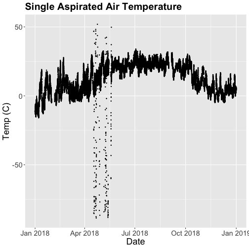
What patterns can you see in the data?
Something odd seems to have happened in late April/May 2018. Since it is unlikely Virginia experienced -50C during this time, these are probably erroneous sensor readings and why we should probably remove data that are flagged with those quality flags.
Right now we are also looking at all the data points in the dataset. However, we may want to view or aggregate the data differently:
- aggregated data: min, mean, or max over a some duration
- the number of days since a freezing temperatures
- or some other segregation of the data.
Given that in the previous tutorial, Work With NEON's Plant Phenology Data, we were working with phenology data collected on a daily scale let's aggregate to that level.
To make this plot better, lets do two things
- Remove flagged data
- Aggregate to a daily mean.
Subset to remove quality flagged data
We already removed the empty records. Now we'll subset the data to remove the remaining flagged data.
SAAT_30minC <- SAAT_30min_noNA %>%
  filter(finalQF==0)
Now we can plot only the unflagged data.
tempPlot <- ggplot(SAAT_30minC,
                   aes(startDateTime,
                       tempSingleMean)) +
    geom_point(size=0.2) +
    ggtitle("Single Aspirated Air Temperature") +
    xlab("Date") + ylab("Temp (C)") +
    theme(plot.title = element_text(lineheight=.8,
                                    face="bold",
                                    size = 20)) +
    theme(text = element_text(size=18))


tempPlot
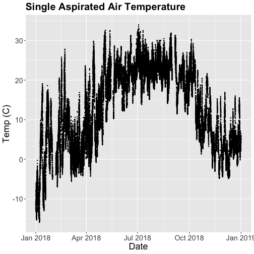
That looks better! But we're still working with the 30-minute data.
Aggregate data by day
We can use the dplyr package functions to aggregate the data. However, we have to choose which data we want to aggregate. Again, you might want daily minimum temps, mean temperature or maximum temps depending on your question.
In the context of phenology, minimum temperatures might be very important if you are interested in a species that is very frost susceptible. Any days with a minimum temperature below 0C could dramatically change the phenophase. For other species or meteorological zones, maximum thresholds may be very important. Or you might be most interested in the daily mean.
And note that you can combine different input values with different aggregation functions - for example, you could calculate the minimum of the half-hourly average temperature, or the average of the half-hourly maximum temperature.
Also keep in mind the removal of NA and flagged data we did above. Always use caution when aggregating incomplete data - if, for example, the missing data tend to occur at particular times of day, a daily mean will be biased.
For this tutorial, let's use maximum daily temperature, i.e. the maximum of the
tempSingleMax values for the day.
temp_day <- SAAT_30minC %>%
	group_by(date(startDateTime)) %>%
	distinct(date(startDateTime), .keep_all=T) %>%
	mutate(dayMax=max(tempSingleMaximum))
Now we can plot the cleaned up daily temperature.
tempPlot_dayMax <- ggplot(temp_day,
                          aes(startDateTime,
                              dayMax)) +
    geom_point(size=0.5) +
    ggtitle("Daily Max Air Temperature") +
    xlab("") + ylab("Temp (C)") +
    theme(plot.title = element_text(lineheight=.8,
                                    face="bold",
                                    size = 20)) +
    theme(text = element_text(size=18))


tempPlot_dayMax
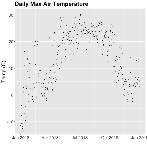
Thought questions:
- What do we gain by this visualization?
- What do we lose relative to the 30 minute intervals?
ggplot - subset by time
Sometimes we want to scale the x- or y-axis to a particular time subset without
subsetting the entire data_frame. To do this, we can define start and end
times. We can then define these limits in the scale_x_date object as
follows:
scale_x_date(limits=start.end) +
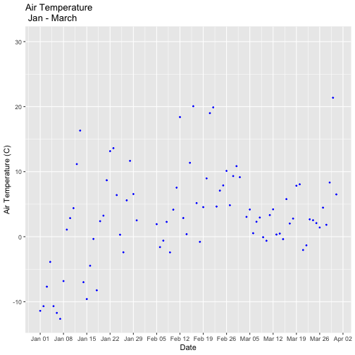
Let's plot just the first three months of the year.
# Define Start and end times for the subset

startTime <- as.Date("2018-01-01")

endTime <- as.Date("2018-03-31")


start.end <- c(startTime,endTime)


tempPlot_dayMax3m <- ggplot(temp_day,
                            aes(startDateTime,
                                dayMax)) +
           geom_point(color="blue", size=0.5) +
           ggtitle("Air Temperature\n Jan - March") +
           xlab("Date") + ylab("Air Temperature (C)")+
           (scale_x_date(limits=start.end,
                date_breaks="1 week",
                date_labels="%b %d"))


tempPlot_dayMax3m

## Warning: Removed 268 rows containing missing values or values outside the scale range (`geom_point()`).
Now we have the temperature data matching our Phenology data from the previous tutorial, we want to save it to our computer to use in future analyses (or the next tutorial). This is optional if you are continuing directly to the next tutorial as you already have the data in R.
# optional

write.csv(temp_day, file="NEONsaat_daily_SCBI_2018.csv", row.names=F)