Tutorial
Time Series 06: Create Plots with Multiple Panels, Grouped by Time Using ggplot Facets
Last Updated: Apr 2, 2026
This tutorial covers how to plot subsetted time series data using the facets()
function (e.g., plot by season) and to plot time series data with NDVI.
Learning Objectives
After completing this tutorial, you will be able to:
- Use
facets()in theggplot2package. - Combine different types of data into one plot layout.
Things You’ll Need To Complete This Tutorial
You will need the most current version of R and, preferably, RStudio loaded on your computer to complete this tutorial.
Install R Packages
-
ggplot2:
install.packages("ggplot2") -
scales:
install.packages("scales") -
gridExtra:
install.packages("gridExtra") -
grid:
install.packages("grid") -
dplyr:
install.packages("dplyr") -
reshape2:
install.packages("reshape2") -
zoo:
install.packages("zoo")
More on Packages in R – Adapted from Software Carpentry.
Download Data
NEON Teaching Data Subset: Meteorological Data for Harvard Forest
The data used in this lesson were collected at the National Ecological Observatory Network's Harvard Forest field site. These data are proxy data for what will be available for 30 years on the NEON data portal for the Harvard Forest and other field sites located across the United States.
Set Working Directory: This lesson assumes that you have set your working directory to the location of the downloaded and unzipped data subsets.
An overview of setting the working directory in R can be found here.
R Script & Challenge Code: NEON data lessons often contain challenges that reinforce learned skills. If available, the code for challenge solutions is found in the downloadable R script of the entire lesson, available in the footer of each lesson page.
Recommended Tutorials
This tutorial uses both dplyr and ggplot2. If you are new to either of these
R packages, we recommend the following NEON Data Skills tutorials before
working through this one.
Plot Data Subsets Using Facets
In this tutorial we will learn how to create a panel of individual plots - known
as facets in ggplot2. Each plot represents a particular data_frame
time-series subset, for example a year or a season.
Load the Data
We will use the daily micro-meteorology data for 2009-2011 from the Harvard
Forest. If you do not have this data loaded into an R data_frame, please
load them and convert date-time columns to a date-time class now.
# Remember it is good coding technique to add additional libraries to the top of
# your script
library(lubridate) # for working with dates
library(ggplot2)  # for creating graphs
library(scales)   # to access breaks/formatting functions
library(gridExtra) # for arranging plots
library(grid)   # for arranging plots
library(dplyr)  # for subsetting by season

# set working directory to ensure R can find the file we wish to import
wd <- "~/Git/data/"

# daily HARV met data, 2009-2011
harMetDaily.09.11 <- read.csv(
  file=paste0(wd,"NEON-DS-Met-Time-Series/HARV/FisherTower-Met/Met_HARV_Daily_2009_2011.csv"),
  stringsAsFactors = FALSE
  )

# covert date to Date  class
harMetDaily.09.11$date <- as.Date(harMetDaily.09.11$date)
ggplot2 Facets
Facets allow us to plot subsets of data in one cleanly organized panel. We use
facet_grid() to create a plot of a particular variable subsetted by a
particular group.
Let's plot air temperature as we did previously. We will name the ggplot
object AirTempDaily.
AirTempDaily <- ggplot(harMetDaily.09.11, aes(date, airt)) +
           geom_point() +
           ggtitle("Daily Air Temperature\n NEON Harvard Forest\n 2009-2011") +
           xlab("Date") + ylab("Temperature (C)") +
           scale_x_date(labels=date_format ("%m-%y"))+
           theme(plot.title = element_text(lineheight=.8, face="bold",
                 size = 20)) +
           theme(text = element_text(size=18))

AirTempDaily
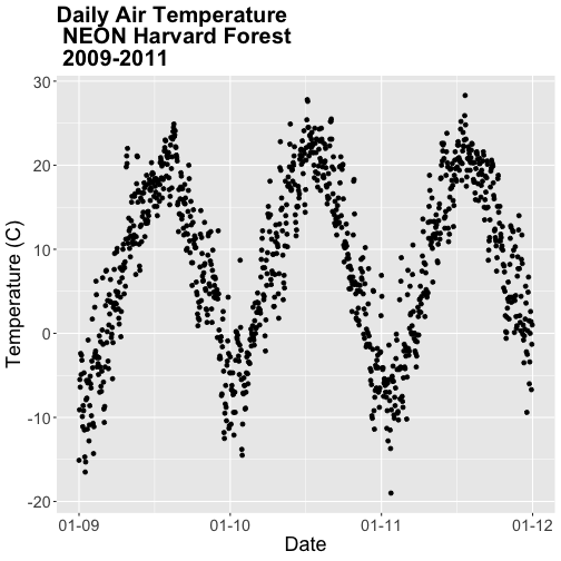
This plot tells us a lot about the annual increase and decrease of temperature at the NEON Harvard Forest field site. However, what if we want to plot each year's worth of data individually?
We can use the facet() element in ggplot to create facets or a panel of
plots that are grouped by a particular category or time period. To create a
plot for each year, we will first need a year column in our data to use as a
subset factor. We created a year column using the year function in the
lubridate package in the
Subset and Manipulate Time Series Data with dplyr tutorial.
# add year column to daily values
harMetDaily.09.11$year <- year(harMetDaily.09.11$date)

# view year column head and tail
head(harMetDaily.09.11$year)

## [1] 2009 2009 2009 2009 2009 2009

tail(harMetDaily.09.11$year)

## [1] 2011 2011 2011 2011 2011 2011
Facet by Year
Once we have a column that can be used to group or subset our data, we can create a faceted plot - plotting each year's worth of data in an individual, labelled panel.
# run this code to plot the same plot as before but with one plot per season
AirTempDaily + facet_grid(. ~ year)

## Error: At least one layer must contain all faceting variables: `year`.
## * Plot is missing `year`
## * Layer 1 is missing `year`

Oops - what happened? The plot did not render because we added the year column
after creating the ggplot object AirTempDaily. Let's rerun the plotting code
to ensure our newly added column is recognized.
AirTempDaily <- ggplot(harMetDaily.09.11, aes(date, airt)) +
           geom_point() +
           ggtitle("Daily Air Temperature\n NEON Harvard Forest") +
            xlab("Date") + ylab("Temperature (C)") +
            scale_x_date(labels=date_format ("%m-%y"))+
           theme(plot.title = element_text(lineheight=.8, face="bold",
                 size = 20)) +
           theme(text = element_text(size=18))

# facet plot by year
AirTempDaily + facet_grid(. ~ year)
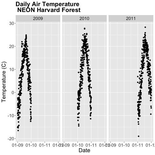
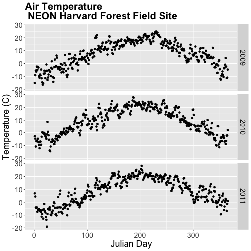
The faceted plot is interesting, however the x-axis on each plot is formatted as: month-day-year starting in 2009 and ending in 2011. This means that the data for 2009 is on the left end of the x-axis and the data for 2011 is on the right end of the x-axis of the 2011 plot.
Our plots would be easier to visually compare if the days were formatted in
Julian or year days rather than date. We have Julian days stored in our
data_frame (harMetDaily.09.11) as jd.
AirTempDaily_jd <- ggplot(harMetDaily.09.11, aes(jd, airt)) +
           geom_point() +
           ggtitle("Air Temperature\n NEON Harvard Forest Field Site") +
           xlab("Julian Day") + ylab("Temperature (C)") +
           theme(plot.title = element_text(lineheight=.8, face="bold",
                 size = 20)) +
           theme(text = element_text(size=18))

# create faceted panel
AirTempDaily_jd + facet_grid(. ~ year)
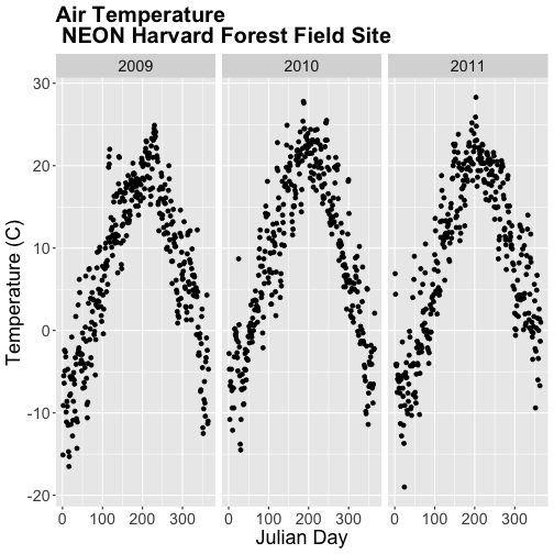
Using Julian day, our plots are easier to visually compare. Arranging our plots this way, side by side, allows us to quickly scan for differences along the y-axis. Notice any differences in min vs max air temperature across the three years?
Arrange Facets
We can rearrange the facets in different ways, too.
# move labels to the RIGHT and stack all plots
AirTempDaily_jd + facet_grid(year ~ .)
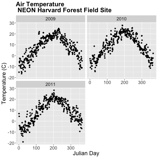
If we use facet_wrap we can specify the number of columns.
# display in two columns
AirTempDaily_jd + facet_wrap(~year, ncol = 2)
Graph Two Variables on One Plot
Next, let's explore the relationship between two variables - air temperature and soil temperature. We might expect soil temperature to fluctuate with changes in air temperature over time.
We will use ggplot() to plot airt and s10t (soil temperature 10 cm below
the ground).
airSoilTemp_Plot <- ggplot(harMetDaily.09.11, aes(airt, s10t)) +
           geom_point() +
           ggtitle("Air vs. Soil Temperature\n NEON Harvard Forest Field Site\n 2009-2011") +
           xlab("Air Temperature (C)") + ylab("Soil Temperature (C)") +
           theme(plot.title = element_text(lineheight=.8, face="bold",
                 size = 20)) +
           theme(text = element_text(size=18))

airSoilTemp_Plot
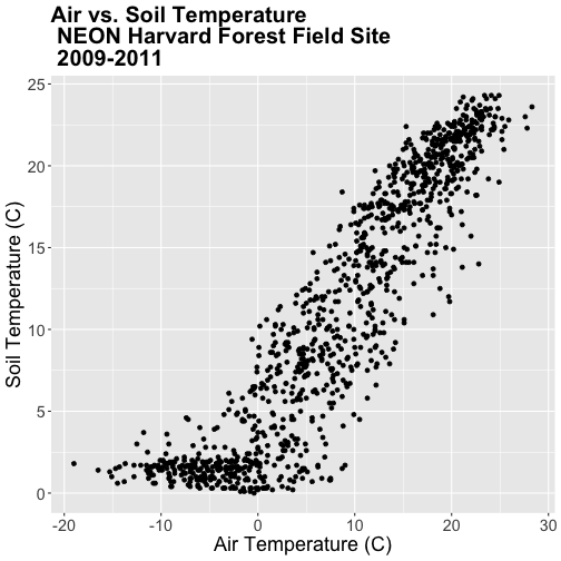
The plot above suggests a relationship between the air and soil temperature as we might expect. However, it clumps all three years worth of data into one plot.
Let's create a stacked faceted plot of air vs. soil temperature grouped by year.
Lucky for us, we can do this quickly with one line of code while reusing the plot we created above.
# create faceted panel
airSoilTemp_Plot + facet_grid(year ~ .)
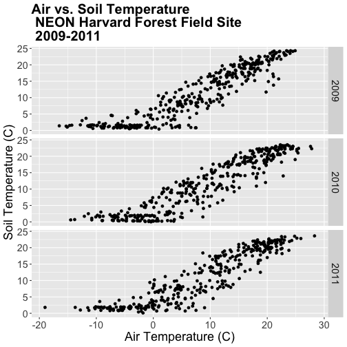
Have a close look at the data. Are there any noticeable min/max temperature differences between the three years?
Create a faceted plot of air temperature vs soil temperature by month rather than year.
HINT: To create this plot, you will want to add a month column to our
data_frame. We can use lubridate month in the same way we used year to add
a year column.

Faceted Plots & Categorical Groups
In the challenge above, we grouped our data by month - specified by a numeric value between 1 (January) and 12 (December). However, what if we wanted to organize our plots using a categorical (character) group such as month name? Let's do that next.
If we want to group our data by month name, we first need to create a month
name column in our data_frame. We can create this column using the following
syntax:
format(harMetDaily.09.11$date,"%B"),
which tells R to extract the month name (%B) from the date field.
# add text month name column
harMetDaily.09.11$month_name <- format(harMetDaily.09.11$date,"%B")

# view head and tail
head(harMetDaily.09.11$month_name)

## [1] "January" "January" "January" "January" "January" "January"

tail(harMetDaily.09.11$month_name)

## [1] "December" "December" "December" "December" "December" "December"

# recreate plot
airSoilTemp_Plot <- ggplot(harMetDaily.09.11, aes(airt, s10t)) +
           geom_point() +
           ggtitle("Air vs. Soil Temperature \n NEON Harvard Forest Field Site\n 2009-2011") +
            xlab("Air Temperature (C)") + ylab("Soil Temperature (C)") +
           theme(plot.title = element_text(lineheight=.8, face="bold",
                 size = 20)) +
           theme(text = element_text(size=18))

# create faceted panel
airSoilTemp_Plot + facet_wrap(~month_name, nc=3)
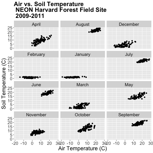
Great! We've created a nice set of plots by month. However, how are the plots
ordered? It looks like R is ordering things alphabetically, yet we know
that months are ordinal not character strings. To account for order, we can
reassign the month_name field to a factor. This will allow us to specify
an order to each factor "level" (each month is a level).
The syntax for this operation is
- Turn field into a factor:
factor(fieldName). - Designate the
levelsusing a listc(level1, level2, level3).
In our case, each level will be a month.
# order the factors
harMetDaily.09.11$month_name = factor(harMetDaily.09.11$month_name,
                                      levels=c('January','February','March',
                                               'April','May','June','July',
                                               'August','September','October',
                                               'November','December'))
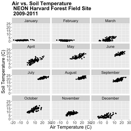
Once we have specified the factor column and its associated levels, we can plot
again. Remember, that because we have modified a column in our data_frame, we
need to rerun our ggplot code.
# recreate plot
airSoilTemp_Plot <- ggplot(harMetDaily.09.11, aes(airt, s10t)) +
           geom_point() +
           ggtitle("Air vs. Soil Temperature \n NEON Harvard Forest Field Site\n 2009-2011") +
            xlab("Air Temperature (C)") + ylab("Soil Temperature (C)") +
           theme(plot.title = element_text(lineheight=.8, face="bold",
                 size = 20)) +
           theme(text = element_text(size=18))

# create faceted panel
airSoilTemp_Plot + facet_wrap(~month_name, nc=3)
Subset by Season - Advanced Topic
Sometimes we want to group data by custom time periods. For example, we might want to group by season. However, the definition of various seasons may vary by region which means we need to manually define each time period.
In the next coding section, we will add a season column to our data using a manually defined query. Our field site is Harvard Forest (Massachusetts), located in the northeastern portion of the United States. Based on the weather of this region, we can divide the year into 4 seasons as follows:
- Winter: December - February
- Spring: March - May
- Summer: June - August
- Fall: September - November
In order to subset the data by season we will use the dplyr package. We
can use the numeric month column that we added to our data earlier in this
tutorial.
# add month to data_frame - note we already performed this step above.
harMetDaily.09.11$month  <- month(harMetDaily.09.11$date)

# view head and tail of column
head(harMetDaily.09.11$month)

## [1] 1 1 1 1 1 1

tail(harMetDaily.09.11$month)

## [1] 12 12 12 12 12 12
We can use mutate() and a set of ifelse statements to create a new
categorical variable called season by grouping three months together.
Within dplyr %in% is short-hand for "contained within". So the syntax
ifelse(month %in% c(12, 1, 2), "Winter",
can be read as "if the month column value is 12 or 1 or 2, then assign the
value "Winter"".
Our ifelse statement ends with
ifelse(month %in% c(9, 10, 11), "Fall", "Error")
which we can translate this as "if the month column value is 9 or 10 or 11,
then assign the value "Winter"."
The last portion , "Error" tells R that if a month column value does not
fall within any of the criteria laid out in previous ifelse statements,
assign the column the value of "Error".
harMetDaily.09.11 <- harMetDaily.09.11 %>%
  mutate(season =
           ifelse(month %in% c(12, 1, 2), "Winter",
           ifelse(month %in% c(3, 4, 5), "Spring",
           ifelse(month %in% c(6, 7, 8), "Summer",
           ifelse(month %in% c(9, 10, 11), "Fall", "Error")))))


# check to see if this worked
head(harMetDaily.09.11$month)

## [1] 1 1 1 1 1 1

head(harMetDaily.09.11$season)

## [1] "Winter" "Winter" "Winter" "Winter" "Winter" "Winter"

tail(harMetDaily.09.11$month)

## [1] 12 12 12 12 12 12

tail(harMetDaily.09.11$season)

## [1] "Winter" "Winter" "Winter" "Winter" "Winter" "Winter"
Now that we have a season column, we can plot our data by season!
# recreate plot
airSoilTemp_Plot <- ggplot(harMetDaily.09.11, aes(airt, s10t)) +
geom_point() +
ggtitle("Air vs. Soil Temperature\n 2009-2011\n NEON Harvard Forest Field Site") +
xlab("Air Temperature (C)") + ylab("Soil Temperature (C)") +
theme(plot.title = element_text(lineheight=.8, face="bold",
size = 20)) +
theme(text = element_text(size=18))
# run this code to plot the same plot as before but with one plot per season
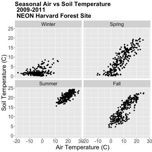
airSoilTemp_Plot + facet_grid(. ~ season)
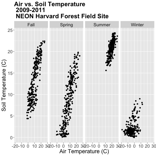
Note, that once again, we re-ran our ggplot code to make sure our new column
is recognized by R. We can experiment with various facet layouts next.
# for a landscape orientation of the plots we change the order of arguments in
# facet_grid():
airSoilTemp_Plot + facet_grid(season ~ .)
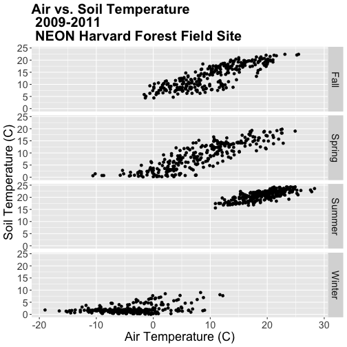
Once again, R is arranging the plots in an alphabetical order not an order relevant to the data.
-
Create a factor class season variable by converting the season column that we just created to a factor, then organize the seasons chronologically as follows: Winter, Spring, Summer, Fall.
-
Create a new faceted plot that is 2 x 2 (2 columns of plots). HINT: One can neatly plot multiple variables using facets as follows:
facet_grid(variable1 ~ variable2). -
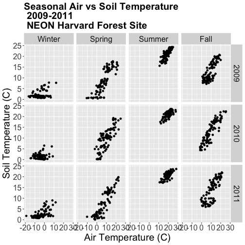
Create a plot of air vs soil temperature grouped by year and season.
Work with Year-Month Data: base R and zoo Package
Some data will have month formatted in Year-Month
(e.g. met_monthly_HARV$date).
(Note: You will load this file in the Challenge below)
## [1] "2001-03" "2001-04" "2001-05" "2001-06" "2001-07" "2001-08"
For many analyses, we might want to summarize this data into a yearly total. Base R does NOT have a distinct year-month date class. Instead to work with a year-month field using base R, we need to convert to a Date class, which necessitates adding an associated day value. The syntax would be:
as.Date(paste(met_monthly_HARV$date,"-01", sep=""))
The syntax above creates a Date column from the met_montly_HARV$date column.
We then add the arbitrary date - the first ("-01"). The final bit of code
(sep="") designates the character string used to separate the month, day,
and year portions of the returned string (in our case nothing, as we have
included the hyphen with our inserted date value).
Alternatively, to work directly with a year-month data we could use the zoo
package and its included year-month date class - as.yearmon. With zoo the
syntax would be:
as.Date(as.yearmon(met_monthly_HARV$date))
Load the NEON-DS-Met-Time-Series/HARV/FisherTower-Met/hf001-04-monthly-m.csv
file and give it the name met_monthly_HARV. Then:
- Convert the date field into a date/time class using both base R and the
zoopackage. Name the new fieldsdate_baseandymon_zoorespectively. - Look at the format and check the class of both new date fields.
- Convert the
ymon_zoofield into a new Date class field (date_zoo) so it can be used in base R, ggplot, etc.
HINT: be sure to load the zoo package, if you have not already.
Do you prefer to use base R or zoo to convert these data to a date/time
class?