Tutorial
Visualize Elevation Changes Caused by the 2013 Colorado Floods using NEON LiDAR Data in R
Last Updated: Nov 28, 2023
This tutorial explains how to visualize digital elevation models derived from LiDAR data in R. The tutorial is part of the Data Activities that can be used with the Quantifying The Drivers and Impacts of Natural Disturbance Events Teaching Module.
Learning Objectives
After completing this tutorial, you will be able to:
- Plot raster objects in R (this activity is not designed to be an introduction to raster objects in R)
- Create a Digital Elevation Model Difference Pre- and Post- Flood.
- Specify color palettes and breaks when plotting rasters in R.
Things You'll Need To Complete This Lesson
Please be sure you have the most current version of R and, preferably, RStudio to write your code.
R Libraries to Install:
-
terra:
install.packages("terra")
Data to Download
The data for this data activity can be downloaded directly from the NEON Data Skills account on FigShare.
Set Working Directory This lesson assumes that you have set your working directory to the location of the downloaded and unzipped data subsets.
An overview of setting the working directory in R can be found here.
R Script & Challenge Code: NEON data lessons often contain challenges that
reinforce learned skills. If available, the code for challenge solutions is found
in the downloadable R script of the entire lesson, available in the footer of each lesson page.
Research Question: How do We Measure Changes in Terrain?
Questions
- How can LiDAR data be collected?
- How might we use LiDAR to help study the 2013 Colorado Floods?
Additional LiDAR Background Materials
This data activity below assumes basic understanding of remote sensing and associated landscape models and the use of raster data and plotting raster objects in R. Consider using these other resources if you wish to gain more background in these areas.
Using LiDAR Data
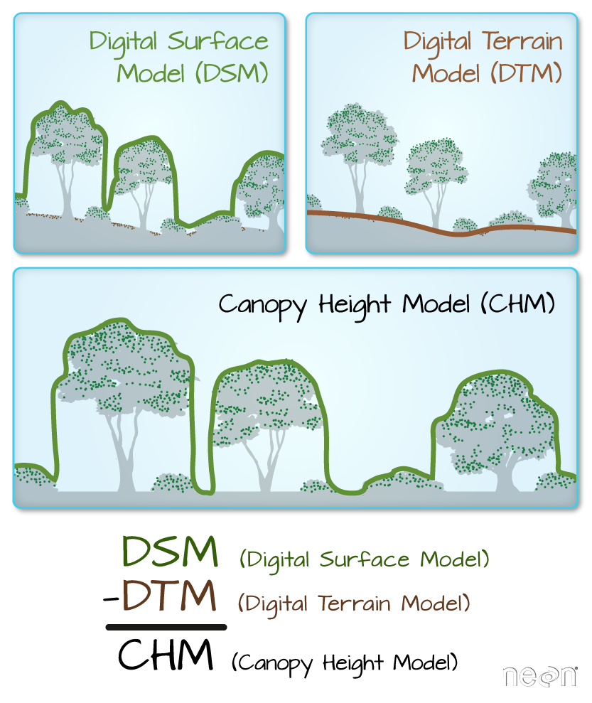
LiDAR data can be used to create many different models of a landscape. This brief lesson on "What is a CHM, DSM and DTM? About Gridded, Raster LiDAR Data" explores three important landscape models that are commonly used.
- How might we use a CHM, DSM or DTM model to better understand what happened in the 2013 Colorado Flood?
- Would you use only one of the models or could you use two or more of them together?
In this Data Activity, we will be using Digital Terrain Models (DTMs).
More Details on LiDAR
If you are particularly interested in how LiDAR works consider taking a closer look at how the data are collected and represented by going through this tutorial on "Light Detection and Ranging."
Digital Terrain Models
We can use a digital terrain model (DTM) to view the surface of the earth. By comparing a DTM from before a disturbance event with one from after a disturbance event, we can get measurements of where the landscape changed.
First, we need to load the necessary R packages to work with raster files and set our working directory to the location of our data.
Then we can read in two DTMs. The first DTM preDTM3.tif is a terrain model created from data
collected 26-27 June 2013 and the postDTM3.tif is a terrain model made from data collected
on 8 October 2013.
# Load DTMs into R
DTM_pre <- rast(paste0(wd,"disturb-events-co13/lidar/pre-flood/preDTM3.tif"))
DTM_post <- rast(paste0(wd,"disturb-events-co13/lidar/post-flood/postDTM3.tif"))

# View raster structure
DTM_pre

## class       : SpatRaster
## dimensions  : 2000, 2000, 1  (nrow, ncol, nlyr)
## resolution  : 1, 1  (x, y)
## extent      : 473000, 475000, 4434000, 4436000  (xmin, xmax, ymin, ymax)
## coord. ref. : WGS 84 / UTM zone 13N (EPSG:32613)
## source      : preDTM3.tif
## name        : preDTM3

DTM_post

## class       : SpatRaster
## dimensions  : 2000, 2000, 1  (nrow, ncol, nlyr)
## resolution  : 1, 1  (x, y)
## extent      : 473000, 475000, 4434000, 4436000  (xmin, xmax, ymin, ymax)
## coord. ref. : WGS 84 / UTM zone 13N (EPSG:32613)
## source      : postDTM3.tif
## name        : postDTM3
Among the information we now about our data from looking at the raster structure, is that the units are in meters for both rasters.
Hillshade layers are models created to add visual depth to maps. It represents what the terrain would look like in shadow with the sun at a specific azimuth. The default azimuth for many hillshades is 315 degrees -- to the NW.
# Creating hillshade for DTM_pre & DTM_post
# In order to generate the hillshde, we need both the slope and the aspect of
# the extent we are working on.

DTM_pre_slope <- terrain(DTM_pre, v="slope", unit="radians")
DTM_pre_aspect <- terrain(DTM_pre, v="aspect", unit="radians")
DTM_pre_hillshade <- shade(DTM_pre_slope, DTM_pre_aspect)

DTM_post_slope <- terrain(DTM_post, v="slope", unit="radians")
DTM_post_aspect <- terrain(DTM_post, v="aspect", unit="radians")
DTM_post_hillshade <- shade(DTM_post_slope, DTM_post_aspect)
Now we can plot the raster objects (DTM & hillshade) together by using add=TRUE
when plotting the second plot. To be able to see the first (hillshade) plot,
through the second (DTM) plot, we also set a value between 0 (transparent) and 1
(not transparent) for the alpha= argument.
# plot Pre-flood w/ hillshade
plot(DTM_pre_hillshade,
        col=grey(1:90/100),  # create a color ramp of grey colors for hillshade
        legend=FALSE,         # no legend, we don't care about the values of the hillshade
        main="Pre-Flood DEM: Four Mile Canyon, Boulder County",
        axes=FALSE)           # makes for a cleaner plot, if the coordinates aren't necessary

plot(DTM_pre,
        axes=FALSE,
        alpha=0.3,   # sets how transparent the object will be (0=transparent, 1=not transparent)
        add=TRUE)  # add=TRUE (or T), add plot to the previous plotting frame

# plot Post-flood w/ hillshade
plot(DTM_post_hillshade,
        col=grey(1:90/100),
        legend=FALSE,
        main="Post-Flood DEM: Four Mile Canyon, Boulder County",
        axes=FALSE)

plot(DTM_post,
        axes=FALSE,
        alpha=0.3,
        add=T)

Questions?
- What does the color scale represent?
- Can you see changes in these two plots?
- Zoom in on the main stream bed. Are changes more visible? Can you tell where erosion has occurred? Where soil deposition has occurred?
Digital Elevation Model of Difference (DoD)
A Digital Elevation Model of Difference (DoD) is a model of the change (or difference) between two other digital elevation models - in our case DTMs.
# DoD: erosion to be neg, deposition to be positive, therefore post - pre
DoD <- DTM_post-DTM_pre

plot(DoD,
        main="Digital Elevation Model (DEM) Difference",
        axes=FALSE)
.")
Here we have our DoD, but it is a bit hard to read. What does the scale bar tell us?
Everything in the yellow shades are close to 0m of elevation change, those areas toward green are up to 10m increase of elevation, and those areas to red and white are a 5m or more decrease in elevation.
We can see a distribution of the values better by viewing a histogram of all
the values in the DoD raster object.
# histogram of values in DoD
hist(DoD)

## Warning: [hist] a sample of25% of the cells was used
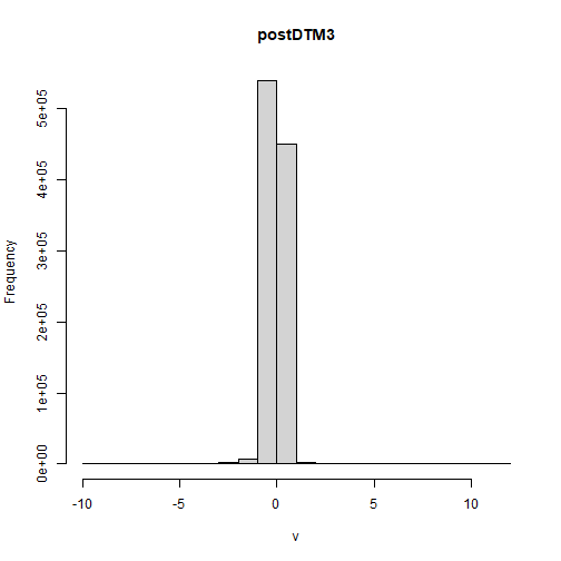
Most of the areas have a very small elevation change. To make the map easier to read, we can do two things.
-
Set breaks for where we want the color to represent: The plot of the DoD above uses a continuous scale to show the gradation between the loss of elevation and the gain in elevation. While this provides a great deal of information, in this case with much of the change around 0 and only a few outlying values near -5m or 10m a categorical scale could help us visualize the data better. In the plotting code we can set this with the
breaks=argument in theplot()function. Let's use breaks of -5, -1, -0.5, 0.5, 1, 10 -- which will give use 5 categories. -
Change the color scheme: We can specify a color for each of elevation categories we just specified with the
breaks.
Let's now implement these two changes in our code.
# Color palette for 5 categories
difCol5 = c("#d7191c","#fdae61","#ffffbf","#abd9e9","#2c7bb6")

# Alternate palette for 7 categories - try it out!
#difCol7 = c("#d73027","#fc8d59","#fee090","#ffffbf","#e0f3f8","#91bfdb","#4575b4")

# plot hillshade first
plot(DTM_post_hillshade,
        col=grey(1:90/100),  # create a color ramp of grey colors
        legend=FALSE,
        main="Elevation Change Post-Flood: Four Mile Canyon, Boulder County",
        axes=FALSE)

# add the DoD to it with specified breaks & colors
plot(DoD,
        breaks = c(-5,-1,-0.5,0.5,1,10),
        col= difCol5,
        axes=FALSE,
        alpha=0.3,
        add =T)
.")
Question
Do you think this is the best color scheme or set point for the breaks? Create a new map that uses different colors and/or breaks. Does it more clearly show patterns than this plot?
Optional Extension: Crop to Defined Area
If we want to crop the map to a smaller area, say the mouth of the canyon where most of the erosion and deposition appears to have occurred, we can crop by using known geographic locations (in the same CRS as the raster object) or by manually drawing a box.
Method 1: Manually draw cropbox
# plot the rasters you want to crop from
plot(DTM_post_hillshade,
        col=grey(1:90/100),  # create a color ramp of grey colors
        legend=FALSE,
        main="Pre-Flood Elevation: Four Mile Canyon, Boulder County",
        axes=FALSE)

plot(DoD,
        breaks = c(-5,-1,-0.5,0.5,1,10),
        col= difCol5,
        axes=FALSE,
        alpha=0.3,
        add =T)

# crop by designating two opposite corners
cropbox1 <- draw()

After executing the draw() function, we now physically click on the plot
at the two opposite corners of the box you want to crop to. You should see a
red bordered polygon display on the raster at this point.
When we call this new object, we can view the new extent.
# view the extent of the cropbox1
cropbox1

## [1]  473814  474982 4434537 4435390
It is a good idea to write this new extent down, so that you can use the extent again the next time you run the script.
Method 2: Define the cropbox
If you know the desired extent of the object you can also use it to crop the box, by creating an object that is a vector containing the four vertices (x min, x max, y min, and y max) of the polygon.
# desired coordinates of the box
cropbox2 <- c(473792.6,474999,4434526,4435453)
Once you have the crop box defined, either by manually clicking or by setting the coordinates, you can crop the desired layer to the crop box.
# crop desired layers to the cropbox2 extent
DTM_pre_crop <- crop(DTM_pre, cropbox2)
DTM_post_crop <- crop(DTM_post, cropbox2)
DTMpre_hill_crop <- crop(DTM_pre_hillshade,cropbox2)
DTMpost_hill_crop <- crop(DTM_post_hillshade,cropbox2)
DoD_crop <- crop(DoD, cropbox2)

# plot the pre- and post-flood elevation + DEM difference rasters again, using the cropped layers

# PRE-FLOOD (w/ hillshade)
plot(DTMpre_hill_crop,
        col=grey(1:90/100),  # create a color ramp of grey colors:
        legend=FALSE,
        main="Pre-Flood Elevation: Four Mile Canyon, Boulder County ",
        axes=FALSE)

plot(DTM_pre_crop,
        axes=FALSE,
        alpha=0.3,
        add=T)

# POST-FLOOD (w/ hillshade)
plot(DTMpost_hill_crop,
        col=grey(1:90/100),  # create a color ramp of grey colors
        legend=FALSE,
        main="Post-Flood Elevation: Four Mile Canyon, Boulder County",
        axes=FALSE)

plot(DTM_post_crop,
        axes=FALSE,
        alpha=0.3,
        add=T)

# ELEVATION CHANGE - DEM Difference
plot(DTMpost_hill_crop,
        col=grey(1:90/100),  # create a color ramp of grey colors
        legend=FALSE,
        main="Post-Flood Elevation Change: Four Mile Canyon, Boulder County",
        axes=FALSE)

plot(DoD_crop,
        breaks = c(-5,-1,-0.5,0.5,1,10),
        col= difCol5,
        axes=FALSE,
        alpha=0.3,
        add =T)
.")
Now you have a graphic of your particular area of interest.
Additional Resources
- How could you create a DEM difference if you only had LiDAR data from a single date, but you had historical maps? Check out: Allen James et al. 2012. Geomorphic change detection using historic maps and DEM differencing: The temporal dimension of geospatial analysis. Geomorphology 137:181-198.