Tutorial
Data Activity: Visualize Palmer Drought Severity Index Data in R to Better Understand the 2013 Colorado Floods
Last Updated: Jan 24, 2024
This tutorial focuses on how to visualize Palmer Drought Severity Index data in R and Plotly. The tutorial is part of the Data Activities that can be used with the Quantifying The Drivers and Impacts of Natural Disturbance Events Teaching Module.
Learning Objectives
After completing this tutorial, you will be able to:
- Download Palmer Drought Severity Index (and related indices) data from NOAA's Climate Divisional Database (nCLIMDIV).
- Plot Palmer Drought Severity Index data in R.
- Publish & share an interactive plot of the data using Plotly.
- Subset data by date (if completing Additional Resources code).
- Set a NoData Value to NA in R (if completing Additional Resources code).
Things You'll Need To Complete This Lesson
Please be sure you have the most current version of R and, preferably, RStudio to write your code.
R Libraries to Install:
-
ggplot2:
install.packages("ggplot2") -
plotly:
install.packages("plotly")
Data to Download
Part of this lesson is to access and download the data directly from NOAA's National
Climate Divisional Database. If instead you would prefer to download the data as a
single compressed file, it can be downloaded from the NEON Data Skills account
on FigShare.
Set Working Directory This lesson assumes that you have set your working directory to the location of the downloaded and unzipped data subsets.
An overview of setting the working directory in R can be found here.
R Script & Challenge Code: NEON data lessons often contain challenges that
reinforce learned skills. If available, the code for challenge solutions is found
in the downloadable R script of the entire lesson, available in the footer of each lesson page.
Research Question
What was the pattern of drought leading up to the 2013 flooding events in Colorado?
Drought Data - the Palmer Drought Index
The Palmer Drought Severity Index is an overall index of drought that is useful to understand drought associated with agriculture. It uses temperature, precipitation and soil moisture data to calculate water supply and demand. The values of the Palmer Drought Severity Index range from extreme drought (values <-4.0) through near normal (-.49 to .49) to extremely moist (>4.0).
Access the Data
This section of the tutorial describes how to access and download the data
directly from NOAA's National Climate Divisional Database. You can also
download the pre-compiled data as a compressed file following the directions
in the Data Download section at the top of this lesson. Even if you choose to
use the pre-compiled data, you should still go through this section to learn
about the data we are using and the metadata that accompanies it.
The data used in this tutorial comes from NOAA's Climate Divisional Database (nCLIMDIV). This dataset contains temperature, precipitation, and drought indication data from across the United States. Data can be accessed over national, state, or divisional extents.
Explore the nCLIMDIV portal to learn more about the data they provide and how to retrieve it.
The nCLIMDIV page shows several boxes where we can enter search criteria to find the particular datasets we need. First, though, we should figure out:
- what data are available,
- what format the data are available in,
- what spatial and temporal extent for the data can we access,
- the meaning of any abbreviations & technical terms used in the data files, and
- any other information that we'd need to know before deciding which datasets to work with.
What data are available?
Below the search boxes, the nCLIMDIV page shows a table (reproduced below) with the different indices that are included in any downloaded dataset. Here we see that the Palmer Drought Severity Index (PDSI) is one of many indices available.
Indecies
| Abbreviation | Index |
|---|---|
| PCP | Precipitation Index |
| TAVG | Temperature Index |
| TMIN | Minimum Temperature Index |
| TMAX | Maximum Temperature Index |
| PDSI | Palmer Drought Severity Index |
| PHDI | Palmer Hydrological Drought Index |
| ZNDX | Palmer Z-Index |
| PMDI | Modified Palmer Drought Severity Index |
| CDD | Cooling Degree Days |
| HDD | Heating Degree Days |
| SPnn | Standard Precipitation Index |
Sample Data
Below the table is a link to the Comma Delimited Sample where you can see
a sample of what the data looks like. Using the table above we can can identify
most of the headers. YearMonth is also pretty self-explanatory - it is the year
then the month digit (YYYYMM) with no space. However, what do StateCode
and Division mean? We need to know more about these abbreviations before we can use this dataset.
Metadata File
Below the table is another link to the Divisional Data Description. Click on
this link and you will be taken to a page with the metadata for the nCLIMDIV data (this file
is included in the Download Data .zip file -- divisional-readme.txt).
Skim through this metadata file.
- Can you find out what the
StateCodeis? - What other information is important or interesting to you?
- We are interested in the Palmer Drought Severity Index. What information does the metadata give you about this Index?
Download the Data
Now that we know a bit more about the contents of the dataset, we can access and download the particular data we need explore the drought leading up to the 2013 flooding events in Colorado.
Let's look at a 25-year period from 1990-2015. We will enter the following
information on the State tab to get our desired dataset:
- Select Nation: US
- Select State: Colorado
- Start Period: January (01) 1991
- End Period: December (12) 2015
- Text Output: Comma Delimited
These search criteria result in a text file (.txt) that you can open in your browser or download and open with a text editor.
Save the Data
To save this data file to your computer, right click on the link and select Save link as.
Each download from this site is given a unique code, therefore your file
will have a slightly different name from this examples. To help remember where the data
are from, add the initials _CO to the end of the file name (but before the
file extension) so that it looks like this CDODiv8506877122044_CO.txt (remember
that the code name for your file will be different).
Save the file to the ~/Documents/data/disturb-events-co13/drought directory
that you created in the set up for this tutorial.
Load the Data in R
Now that we have the data we can start working with it in R.
R Libraries
We will use ggplot2 to efficiently plot our data and plotly to create
interactive plots of our data.
library(ggplot2)   # create efficient, professional plots
library(plotly)    # create interactive plots
Import the Data
We are interested in looking at the severity (or lack thereof) of drought in Colorado before the 2013 floods. The first step is to import the data we just downloaded into R.
Our data have a header (which we saw in the sample file). This first row represents the
variable name for each column. We will use header=TRUE when we import the
data to tell R to use that first row as a list of column names rather than a row of data.
## Set your working directory to ensure R can find the file we wish to import and where we want to save our files. Be sure to move the downloaded files into your working directory!
wd <- "~/Git/data/" # This will depend on your local environment
setwd(wd)

# Import CO state-wide nCLIMDIV data
nCLIMDIV <- read.csv(paste0(wd,"disturb-events-co13/drought/CDODiv8506877122044_CO.txt"), header = TRUE)

# view data structure
str(nCLIMDIV)

## 'data.frame':	300 obs. of  21 variables:
##  $ StateCode: int  5 5 5 5 5 5 5 5 5 5 ...
##  $ Division : int  0 0 0 0 0 0 0 0 0 0 ...
##  $ YearMonth: int  199101 199102 199103 199104 199105 199106 199107 199108 199109 199110 ...
##  $ PCP      : num  0.8 0.44 1.98 1.27 1.63 1.88 2.69 2.44 1.36 1.06 ...
##  $ TAVG     : num  21.9 32.5 34.9 41.9 53.5 62.5 66.5 65.5 57.5 47.4 ...
##  $ PDSI     : num  -1.37 -1.95 -1.77 -1.89 -2.11 0.11 0.6 1.03 0.95 0.67 ...
##  $ PHDI     : num  -1.37 -1.95 -1.77 -1.89 -2.11 -1.79 -1.11 1.03 0.95 0.67 ...
##  $ ZNDX     : num  -0.9 -2.17 -0.07 -0.92 -1.25 0.33 1.49 1.5 0.07 -0.54 ...
##  $ PMDI     : num  -0.4 -1.48 -1.28 -1.63 -2.11 -1.57 -0.15 1.03 0.89 0.09 ...
##  $ CDD      : int  0 0 0 0 3 62 95 73 12 0 ...
##  $ HDD      : int  1296 868 900 678 343 113 30 45 227 555 ...
##  $ SP01     : num  -0.4 -1.78 0.89 -0.56 -0.35 0.65 0.96 0.7 -0.01 -0.26 ...
##  $ SP02     : num  -0.47 -1.42 -0.11 0.09 -0.67 0.15 1.01 1.07 0.42 -0.26 ...
##  $ SP03     : num  0.05 -1.28 -0.36 -0.56 -0.19 -0.28 0.55 1.11 0.78 0.13 ...
##  $ SP06     : num  0.42 0.15 0.03 -0.47 -0.86 -0.48 -0.03 0.51 0.24 0.35 ...
##  $ SP09     : num  0.41 0.11 0.85 -0.07 -0.07 -0.19 -0.02 0 0.03 0.01 ...
##  $ SP12     : num  0.69 0.41 0.43 0.08 -0.06 0.39 0.19 0.49 0.21 0.03 ...
##  $ SP24     : num  -0.41 -0.72 -0.49 -0.37 -0.26 -0.24 -0.06 0.12 0.05 0.11 ...
##  $ TMIN     : num  9.5 17.7 22.3 28.4 39.3 48.1 52 51.6 43.1 31.9 ...
##  $ TMAX     : num  34.3 47.4 47.5 55.3 67.7 76.9 81.1 79.5 72 62.9 ...
##  $ X        : logi  NA NA NA NA NA NA ...
Using head() or str() allows us to view just a sampling of our data.
One of the first things we always check is if whether the format that R
interpreted the data to be in is the format we want.
The Palmer Drought Severity Index (PDSI) is a number, so it was imported correctly!
Date Fields
Let's have a look at the date field in our data, which has the column name YearMonth.
Viewing the structure, it appears as if it is not in a standard date format.
It imported into R as an integer (int).
$ YearMonth: int 199001 199002 199003 199004 199005 ...
We want to convert these numbers into a date field. We might be able to use the
as.Date function to convert our string of numbers into a date that R will
recognize.
# convert to date, and create a new Date column
nCLIMDIV$Date <- as.Date(nCLIMDIV$YearMonth, format="%Y%m")
Oops, that doesn't work! R returned an origin error. The date class expects to
have day, month, and year data instead of just year and month. R needs a day
of the month in order to properly
convert this to a date class. The origin error is saying that it doesn't know where
to start counting the dates. (Note: If you have the zoo package installed you
will not get this error but Date will be filled with NAs.)
We can add a fake "day" to our YearMonth data using the paste0 function. Let's
add 01 to each field so R thinks that each date represents the first of the
month.
#add a day of the month to each year-month combination
nCLIMDIV$Date <- paste0(nCLIMDIV$YearMonth,"01")

#convert to date
nCLIMDIV$Date <- as.Date(nCLIMDIV$Date, format="%Y%m%d")

# check to see it works
str(nCLIMDIV$Date)

##  Date[1:300], format: "1991-01-01" "1991-02-01" "1991-03-01" "1991-04-01" ...
We've now successfully converted our integer class YearMonth column into the
Date column in a date class.
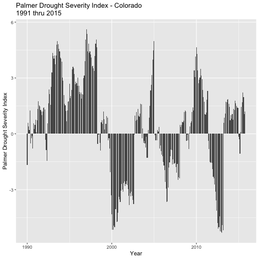
Plot the Data
Next, let's plot the data using ggplot().
# plot the Palmer Drought Index (PDSI)
palmer.drought <- ggplot(data=nCLIMDIV,
			 aes(Date,PDSI)) +  # x is Date & y is drought index
	     geom_bar(stat="identity",position = "identity") +   # bar plot
       xlab("Date") + ylab("Palmer Drought Severity Index") +  # axis labels
       ggtitle("Palmer Drought Severity Index - Colorado \n 1991-2015")   # title on 2 lines (\n)

# view the plot
palmer.drought
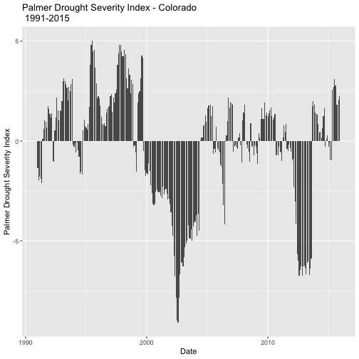
Great - we've successfully created a plot!
Questions
- Which values, positive or negative, correspond to years of drought?
- Were the months leading up to the September 2013 floods a drought?
- What overall patterns do you see in "wet" and "dry" years over these 25 years?
- Is the average year in Colorado wet or dry?
- Are there more wet years or dry years over this period of time?
These last two questions are a bit hard to determine from this plot. Let's look at a quick summary of our data to help us out.
#view summary stats of the Palmer Drought Severity Index
summary(nCLIMDIV$PDSI)

##    Min. 1st Qu.  Median    Mean 3rd Qu.    Max.
##  -9.090  -1.702   0.180  -0.310   1.705   5.020

#view histogram of the data
hist(nCLIMDIV$PDSI,   # the date we want to use
     main="Histogram of PDSI",  # title
		 xlab="Palmer Drought Severity Index (PDSI)",  # x-axis label
     col="wheat3")  #  the color of the bars
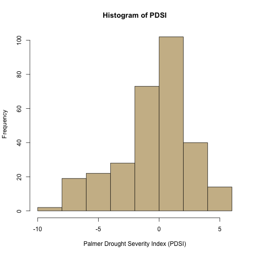
Now we can see that the "median" year is slightly wet (0.180) but the "mean" year is slightly dry (-0.310), although both are within the "near-normal" range of -0.41 to 0.41. We can also see that there is a longer tail on the dry side of the histogram than on the wet side.
Both of these figures only give us a static view of the data. There are packages in R that allow us to create figures that can be published to the web and allow us to explore the data in a more interactive way.
Plotly - Interactive (and Online) Plots
Plotly allows you to create interactive plots that can be shared online. If you are new to Plotly, view the companion mini-lesson Interactive Data Vizualization with R and Plotly to learn how to set up an account and access your username and API key.
Step 1: Connect your Plotly account to R
First, we need to connect our R session to our Plotly account. If you only want to create interactive plots and not share them on a Plotly account, you can skip this step.
# set plotly user name
Sys.setenv("plotly_username"="YOUR_plotly_username")

# set plotly API key
Sys.setenv("plotly_api_key"="YOUR_api_key")
Step 2: Create a Plotly plot
We can create an interactive version of our plot using plot.ly. We should simply be able to use our existing ggplot palmer.drought with the
ggplotly() function to create an interactive plot.
# Use existing ggplot plot & view as plotly plot in R
palmer.drought_ggplotly <- ggplotly(palmer.drought)
palmer.drought_ggplotly
That doesn't look right. The current plotly package has a bug! This
bug has been reported and a fix may come out in future updates to the package.
Until that happens, we can build our plot again using the plot_ly() function.
In the future, you could just skip the ggplot() step and plot directly with
plot_ly().
# use plotly function to create plot
palmer.drought_plotly <- plot_ly(nCLIMDIV,    # the R object dataset
	type= "bar", # the type of graph desired
	x=nCLIMDIV$Date,      # our x data
	y=nCLIMDIV$PDSI,      # our y data
	orientation="v",   # for bars to orient vertically ("h" for horizontal)
	title=("Palmer Drought Severity Index - Colorado 1991-2015"))

palmer.drought_plotly
Questions
Check out the differences between the ggplot() and the plot_ly() plot.
- From both plots, answer these questions (Hint: Hover your cursor over the bars
of the
plotlyplot)
- What is the minimum value?
- In what month did the lowest PDSI occur?
- In what month, and of what magnitude, did the highest PDSI occur?
- What was the drought severity value in August 2013, the month before the flooding?
- Contrast
ggplot()andplot_ly()functions.
- What are the biggest differences you see between
ggplot&plot_lyfunction? - When might you want to use
ggplot()? - When might
plotly()be better?
Step 3: Push to Plotly online
Once the plot is built with a Plotly related function (plot_ly or ggplotly) you can post the plot to your online account. Make sure you are signed in to Plotly to complete this step.
# publish plotly plot to your plot.ly online account when you are happy with it
# skip this step if you haven't connected a Plotly account

api_create(palmer.drought_plotly)
Questions
Now that we can see the online Plotly user interface, we can explore our plots a bit more.
- Each plot can have comments added below the plot to serve as a caption. What would be appropriate information to add for this plot?
- Who might you want to share this plot with? What tools are there to share this plot?
Challenge: Does spatial scale affect the pattern?
In the steps above we have been looking at data aggregated across the entire state of Colorado. What if we look just at the watershed that includes the Boulder area where our investigation is centered?
If you zoom in on the Divisional Map, you can see that Boulder, CO is in the CO-04 Platte River Drainage.
Use the divisional data and the process you've just learned to create a plot of the PDSI for Colorado Division 04 to compare to the plot for the state of Colorado that you've already made.
If you are using the downloaded dataset accompanying this lesson, this data can be found at "drought/CDODiv8868227122048_COdiv04.txt".
Challenge: Do different measures show the same pattern?
The nCLIMDIV dataset includes not only the Palmer Drought Severity Index but also several other measures of precipitation, drought, and temperature. Choose one and repeat the steps above to see if a different but related measure shows a similar pattern. Make sure to go back to the metadata so that you understand what the index or measurement you choose represents.
Additional Resources
No Data Values
If you choose to explore other time frames or spatial scales you may
come across data that appear as if they have a negative value -99.99.
If this were real, it would be a very severe drought!
This value is just a common placeholder for a No Data Value.
Think about what happens if the instruments failed for a little while and stopped producing meaningful data. The instruments can't record 0 for this Index because 0 means "normal" levels. Using a blank entry isn't a good idea for several
reason: they cause problems for software reading a file, they can mess up table structure, and you don't know if the data was missing (someone forgot to enter it)
or if no data were available. Therefore, a placeholder value is often used. This value changes between disciplines but -9999 or -99.99 are common.
In R, we need to assign this placeholder value to NA, which is R's
representation of a null or NoData value. If we don't, R will include the -99.99 value whenever calculations are performed
or plots are created. By defining the placeholders as NA, R will correctly interpret, and not plot, the bad values.
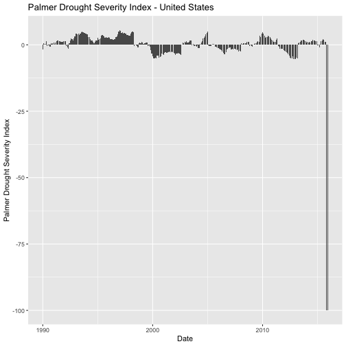
Using the nCLIMDIV dataset for the entire US, this is how we'd assign the placeholder value to NA and plot the data.
# NoData Value in the nCLIMDIV data from 1990-2015 US spatial scale
nCLIMDIV_US <- read.csv(paste0(wd,"disturb-events-co13/drought/CDODiv5138116888828_US.txt"), header = TRUE)

# add a day of the month to each year-month combination
nCLIMDIV_US$Date <- paste0(nCLIMDIV_US$YearMonth,"01")

# convert to date
nCLIMDIV_US$Date <- as.Date(nCLIMDIV_US$Date, format="%Y%m%d")

# check to see it works
str(nCLIMDIV_US$Date)

##  Date[1:312], format: "1990-01-01" "1990-02-01" "1990-03-01" "1990-04-01" ...

# view histogram of data -- great way to check the data range
hist(nCLIMDIV_US$PDSI,
     main="Histogram of PDSI values",
     col="springgreen4")
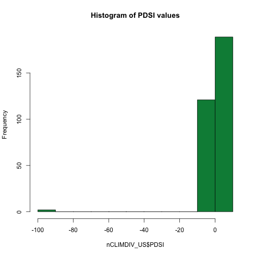
# easy to see the "wrong" values near 100
# check for these values using min() - what is the minimum value?
min(nCLIMDIV_US$PDSI)

## [1] -99.99

# assign -99.99 to NA in the PDSI column
# Note: you may want to do this across the entire data.frame or with other columns
# but check out the metadata -- there are different NoData Values for each column!
nCLIMDIV_US[nCLIMDIV_US$PDSI==-99.99,] <-  NA  # == is the short hand for "it is"

#view the histogram again - does the range look reasonable?
hist(nCLIMDIV_US$PDSI,
     main="Histogram of PDSI value with NA value assigned",
     col="springgreen4")
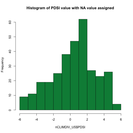
# that looks better!

#plot Palmer Drought Index data
ggplot(data=nCLIMDIV_US,
       aes(Date,PDSI)) +
       geom_bar(stat="identity",position = "identity") +
       xlab("Year") + ylab("Palmer Drought Severity Index") +
       ggtitle("Palmer Drought Severity Index - Colorado\n1991 thru 2015")

## Warning: Removed 2 rows containing missing values (geom_bar).
# The warning message lets you know that two "entries" will be missing from the
# graph -- these are the ones we assigned NA.
Subsetting Data
After you have downloaded the data, you might decide that you want to plot only a subset of the data range you downloaded -- say, just the decade 2005 to 2015 instead of the full record from 1990 to 2015. With the Plotly interactive plots you can zoom in on that section, but even so you might want a plot with only a section of the data.
You could re-download the data with a new search, but that would create extra,
possibly confusing, data files! Instead, we can easily select a subset of the data within R. Once we
have a column of data defined as a Date class in R, we can quickly
subset the data by date and create a new R object using the subset() function.
To subset, we use the subset function, and specify:
- the R object that we wish to subset,
- the date column and start date of the subset, and
- the date column and end date of the subset.
Let's subset the data.
# subset out data between 2005 and 2015
nCLIMDIV2005.2015 <- subset(nCLIMDIV,    # our R object dataset
                        Date >= as.Date('2005-01-01') &  # start date
                        Date <= as.Date('2015-12-31'))   # end date

# check to make sure it worked
head(nCLIMDIV2005.2015$Date)  # head() shows first 6 lines

## [1] "2005-01-01" "2005-02-01" "2005-03-01" "2005-04-01" "2005-05-01"
## [6] "2005-06-01"

tail(nCLIMDIV2005.2015$Date)  # tail() shows last 6 lines

## [1] "2015-07-01" "2015-08-01" "2015-09-01" "2015-10-01" "2015-11-01"
## [6] "2015-12-01"
Now we can plot this decade of data. Hint, we can copy/paste and edit the previous code.
# use plotly function to create plot
palmer_plotly0515 <- plot_ly(nCLIMDIV2005.2015,    # the R object dataset
				type= "bar", # the type of graph desired
				x=nCLIMDIV2005.2015$Date,      # our x data
				y=nCLIMDIV2005.2015$PDSI,      # our y data
				orientation="v",   # for bars to orient vertically ("h" for horizontal)
        title=("Palmer Drought Severity Index - Colorado 2005-2015"))

palmer_plotly0515


# publish plotly plot to your plot.ly online account when you are happy with it
# skip this step if you haven't connected a Plotly account

api_create(palmer_plotly0515)