Tutorial
Exploratory Analysis of Interannual AOP Data in GEE
Last Updated: Aug 18, 2022
GEE is a great place to conduct exploratory analysis to better understand the datasets you are working with. In this lesson, we will show how to pull in AOP Surface Directional Reflectance (SDR) datasets, as well as the Ecosystem Structure (CHM) data to look at interannual differences at the site SRER. We will discuss some of the acquisition parameters and other factors that affect data quality and interperatation.
Objectives
After completing this activity, you will be able to:
- Write GEE functions to display map images of AOP SDR, NDVI, and CHM data.
- Create chart images (histogram and line graphs) to summarize data over an area.
- Understand how acquisition parameters may affect the interpretation of data.
- Understand how weather conditions during acquisition may affect reflectance data quality.
You will gain familiarity with:
- User-defined GEE functions
- The GEE charting functions (ui.Chart.image)
Requirements
- A gmail (@gmail.com) account
- An Earth Engine account. You can sign up for an Earth Engine account here: https://earthengine.google.com/new_signup/
- A basic understanding of the GEE code editor and the GEE JavaScript API.
- Optionally, complete the previous GEE tutorials in this tutorial series:
Additional Resources
If this is your first time using GEE, we recommend starting on the Google Developers website, and working through some of the introductory tutorials. The links below are good places to start.
Functions to Read in SDR and CHM Image Collections
Let's get started. In this first chunk of code, we are setting the center location of SRER, reading in the SDR image collection, and then creating a function to display the NIS image in GEE. Optionally, we've included lines of code that also calculate and display NDVI from the SDR data, so you can uncomment this and run on your own, if you wish. For more details on how this function works, you can refer to the tutorial Intro to GEE Functions.
// Specify center location of SRER
var mySite = ee.Geometry.Point([-110.83549, 31.91068])

// Read in the SDR Image Collection
var NISimages = ee.ImageCollection('projects/neon/DP3-30006-001_SDR')
  .filterBounds(mySite)

// Function to display NIS Image + NDVI
function addNISImage(image) {
  var imageId = ee.Image(image.id); // get the system:id and convert to string
  var sysID = ee.String(imageId.get("system:id")).getInfo();  // get the system:id - this is an object on the server
  var fileName = sysID.slice(46,100); // extract the fileName (NEON domain + site code + product code + year)
  var imageMasked = imageId.updateMask(imageId.gte(0.0000)) // mask out no-data values
  var imageRGB = imageMasked.select(['band053', 'band035', 'band019']);  // select only RGB bands for display

  Map.addLayer(imageRGB, {min:2, max:20}, fileName, 0)   // add RGB composite to the map, 0 means it is deselected initially

  // uncomment the lines below to calculate NDVI from the SDR and display NDVI
  // var nisNDVI =imageMasked.normalizedDifference(["band097", "band055"]).rename("ndvi") // band097 = NIR , band055 = red
  // var ndviViz= {min:0.05, max:.95,palette:['brown','white','green']}

  // Map.addLayer(nisNDVI, ndviViz, "NDVI "+fileName, 0) // optionally add NDVI to the map
}

// call the addNISimages function to add SDR and NDVI layers to map
NISimages.evaluate(function(NISimages) {
  NISimages.features.map(addNISImage);
})
Next we can create a similar function for reading in the CHM dataset over all the years. The main differences between this function and the previous one are that 1) it is set to display a single band image, and 2) instead of hard-coding in the minimum and maximum values to display, we dynamically determine them from the data itself, so it will scale appropriately. Note that we can use the .filterMetadata property to select only the CHM data from the DEM image collection, since the CHM is stored in that collection, along with the DTM and DSM.
// Read in only the CHM Images (using .filterMetadata by Type)
var CHMimages =  ee.ImageCollection('projects/neon/DP3-30024-001_DEM')
  .filterBounds(mySite)
  .filterMetadata('Type','equals','CHM')

// Function to display Single Band Images setting display range to linear 2%
function addSingleBandImage(image) { // display each image in collection
  var imageId = ee.Image(image.id); // get the system:id and convert to string
  var sysID = ee.String(imageId.get("system:id")).getInfo();
  var fileName = sysID.slice(46,100); // extract the fileName (NEON domain + site code + product code + year)
  // print(fileName) // optionally print the filename, this will be the name of the layer

  // dynamically determine the range of data to display
  // sets color scale to show all but lowest/highest 2% of data
  var pctClip = imageId.reduceRegion({
    reducer: ee.Reducer.percentile([2, 98]),
    scale: 10,
    maxPixels: 3e7});

  var keys = pctClip.keys();
  var pct02 = ee.Number(pctClip.get(keys.get(0))).round().getInfo()
  var pct98 = ee.Number(pctClip.get(keys.get(1))).round().getInfo()

  var imageDisplay = imageId.updateMask(imageId.gte(0.0000));
  Map.addLayer(imageDisplay, {min:pct02, max:pct98}, fileName, 0)
// print(image)
}

// call the addSingleBandImage function to add CHM layers to map
// you could also add all DEM images (DSM/DTM/CHM) but for now let's just add CHM
CHMimages.evaluate(function(CHMimages) {
  CHMimages.features.map(addSingleBandImage);
})

// Center the map on SRER and set zoom level
Map.setCenter(-110.83549, 31.91068, 11);
Now that you've read in these two datasets over all the years, we encourage you to explore the different layers and see if you notice any patterns!
Creating CHM Difference Layers
Next let's create a new raster layer of the difference between the CHMs from 2 different years. We will difference the CHMs from 2018 and 2021 because these years were both collected with the Riegl Q780 system and so have a vertical resolution (CHM height cutoff) of 2/3 m. By contrast the Gemini system (which was used in 2017 and 2020) has a 2m cutoff, so some of the smaller shrubs are not resolved with that sensor. It is important to be aware of factors such as these that may affect the interpretation of the data! We encourage all AOP data users to read the associated metadata pdf documents that are provided with the data products (when downloading from the data portal or using the API).
For more information on the vertical resolution, read the footnotes at the end of this lesson.
var SRER_CHM2018 = ee.ImageCollection('projects/neon/DP3-30024-001_DEM')
  .filterDate('2018-01-01', '2018-12-31')
  .filterBounds(mySite).first();

var SRER_CHM2021 = ee.ImageCollection('projects/neon/DP3-30024-001_DEM')
  .filterDate('2021-01-01', '2021-12-31')
  .filterBounds(mySite).first();

var CHMdiff_2021_2018 = SRER_CHM2021.subtract(SRER_CHM2018);
// print(CHMdiff_2021_2018)
Map.addLayer(CHMdiff_2021_2018, {min: -1, max: 1, palette: ['#FF0000','#FFFFFF','#008000']},'CHM diff 2021-2018')
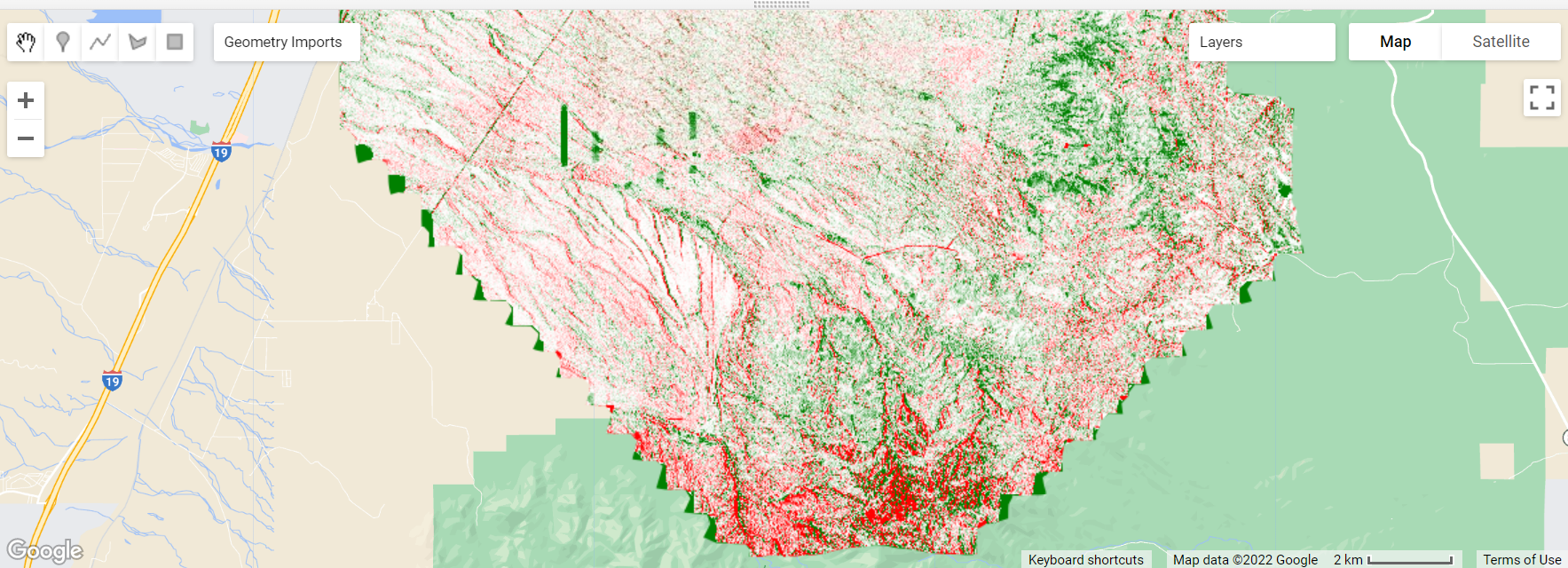
You can see some broad differences, but there also appear to be some noisy artifacts. We can smooth out some of this noise by using a spatial filter.
// Smooth out the difference raster (filter out high-frequency patterns)
// Define a boxcar or low-pass kernel.
var boxcar = ee.Kernel.square({
radius: 1.5, units: 'pixels', normalize: true
});
// Smooth the image by convolving with the boxcar kernel.
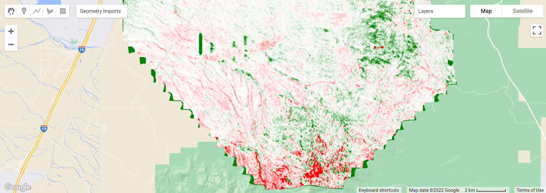
var smooth = CHMdiff_2021_2018.convolve(boxcar);
Map.addLayer(smooth, {min: -1, max: 1, palette: ['#FF0000','#FFFFFF','#008000']}, 'CHM diff, smoothed');
CHM Difference Histograms
Next let's plot histograms of the CHM differences, between 2021-2018 as well as between 2021-2019 and 2019-2018. For this example, we'll just look at the values over a small area of the site. Looking at these 3 sets of years, we will see some of the artifacts related to the lidar sensor used (Riegl Q780 or Optech Gemini). If you didn't know about the differences between the sensors, it would look like the canopy was growing and shrinking from year to year.
Before running this chunk of code, you'll need to create a polygon of a region of interest. For this example, I selected a region in the center of the map, shown below, although you can select any region within the site. To create the polygon, select the rectangle out of the shapes in the upper left corner of the map window (hovering over it should say "Draw a rectangle"). Then drag the cursor over the area you wish to cover.
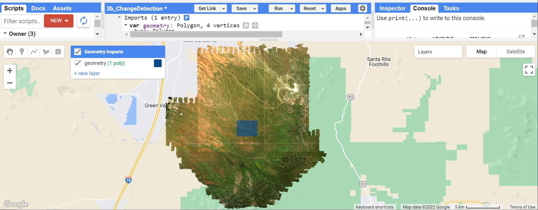
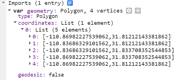
When you load in this geometry, you should see the geometry variable imported at the top of the code editor window, under Imports. It should look something like this:
Once you have this geometry polygon variable set, you can run the following code to generate histograms of the CHM differences over this area.
// read in CHMs from 2019 and 2017
var SRER_CHM2019 = ee.ImageCollection('projects/neon/DP3-30024-001_DEM')
  .filterDate('2019-01-01', '2019-12-31')
  .filterBounds(mySite).first();

var SRER_CHM2017 = ee.ImageCollection('projects/neon/DP3-30024-001_DEM')
  .filterDate('2017-01-01', '2017-12-31')
  .filterBounds(mySite).first();

// calculate the CHM difference histograms (2021-2019 & 2019-2018)
var CHMdiff_2021_2019 = SRER_CHM2021.subtract(SRER_CHM2019);
var CHMdiff_2019_2018 = SRER_CHM2019.subtract(SRER_CHM2018);

// Define the histogram charts for each CHM difference image, print to the console.
var hist1 =
    ui.Chart.image.histogram({image: CHMdiff_2021_2019, region: geometry, scale: 50})
        .setOptions({title: 'CHM Difference Histogram, 2021-2019',
                    hAxis: {title: 'CHM Difference (m)',titleTextStyle: {italic: false, bold: true},},
                    vAxis: {title: 'Count', titleTextStyle: {italic: false, bold: true}},});
print(hist1);

var hist2 =
    ui.Chart.image.histogram({image: CHMdiff_2019_2018, region: geometry, scale: 50})
        .setOptions({title: 'CHM Difference Histogram, 2019-2018',
                    hAxis: {title: 'CHM Difference (m)',titleTextStyle: {italic: false, bold: true},},
                    vAxis: {title: 'Count', titleTextStyle: {italic: false, bold: true}},});
print(hist2);

var hist3 =
    ui.Chart.image.histogram({image: CHMdiff_2021_2018, region: geometry, scale: 50})
        .setOptions({title: 'CHM Difference Histogram, 2021-2018',
                    hAxis: {title: 'CHM Difference (m)',titleTextStyle: {italic: false, bold: true},},
                    vAxis: {title: 'Count', titleTextStyle: {italic: false, bold: true}},});
print(hist3);
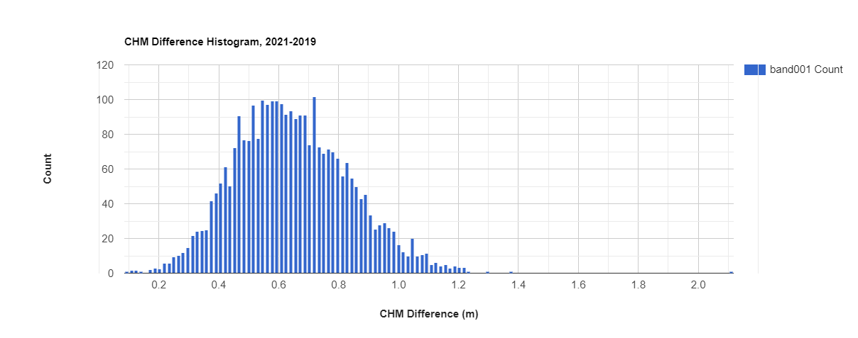
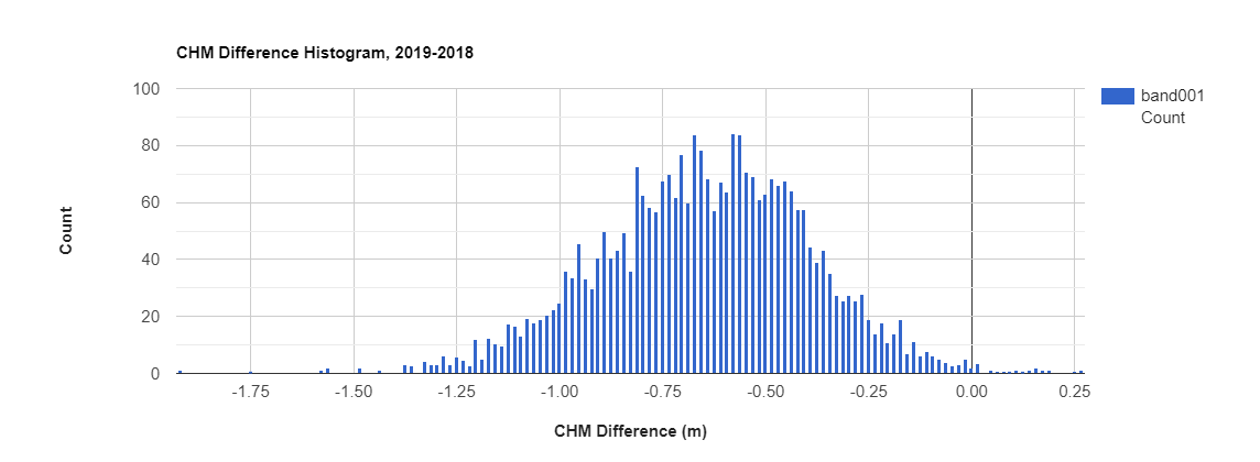
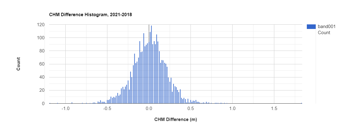
Let's take a minute to understand what's going on here. In each case, we subtracted the earlier year from the later year. So from 2019 to 2021, it looks like the vegetation grew on average by ~0.6m, but from 2018 to 2019 it shrunk by the same amount. This is because in 2021 there was a lower vertical cutoff, so shrubs of at least 0.67m were resolved, where before anything below 2m was obscured. These low shrubs are likely the dominant source of the change we're seeing. We can see the same pattern, but in reverse between 2018 and 2019. The difference histogram from 2021 to 2018 more accurately represents the change, which is centered around 0, and the map we displayed shows local changes in certain areas, related to actual vegetation growth and ecological drivers. Note that 2021 was a particularly wet year, and AOP's flight was in optimal peak greenness, as you can see when comparing the SDR imagery to earlier years.
NDVI Time Series
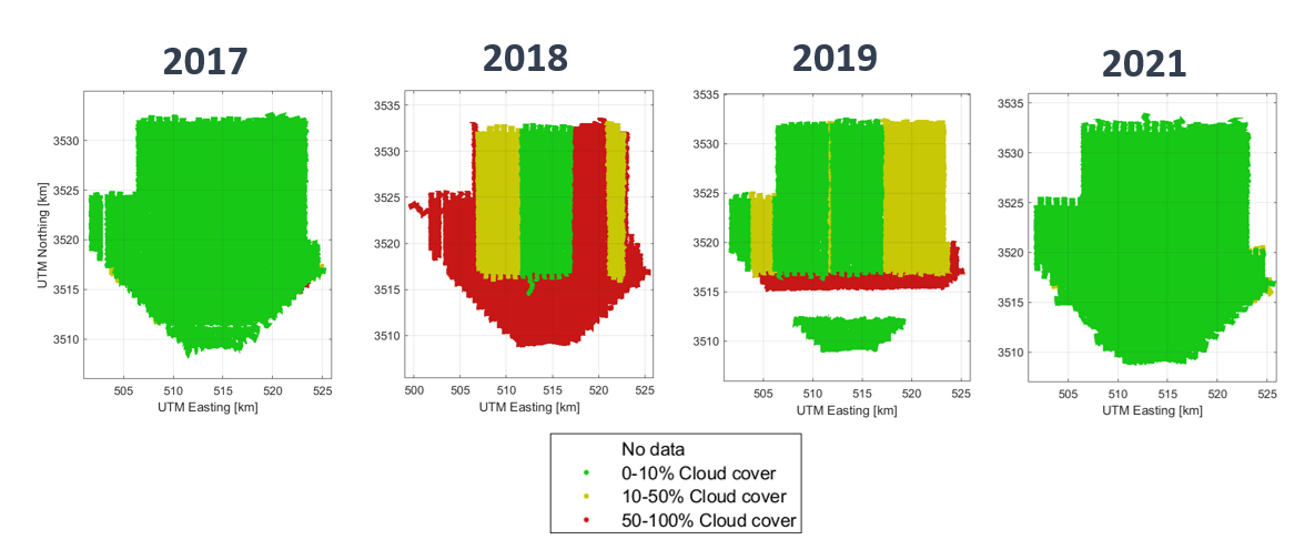
Last but not least, we can take a quick look at NDVI changes over the four years of data. A quick way to look at the interannual changes are to make a line plot, which we'll do shortly. First let's take a step back and see the weather conditions during the collections. For every mission, the AOP flight operators assess the cloud conditions and note whether the cloud clover is <10% (green), 10-50% (yellow), or >50% (red). This information gets passed through to the reflectance hdf5 data, and is also available in the summary metadata documents, delivered with all the spectrometer data products. The weather conditions have direct implications for data quality, and while we strive to collect data in "green" weather conditions, it is not always possible, so the user must take this into consideration when working with the data.
The figure below shows the weather conditions at SRER for each of the 4 collections. In 2017 and 2021, the full site was collected in <10% cloud conditions, while in 2018 and 2019 there were mixed weather conditions. However, for all four years, the center of the site was collected in optimal cloud conditions.
With this in mind, let's use the same geometry we used before, centered in the middle of the plot, to look at the mean NDVI over the four years in a small part of the site. Here's the GEE code for doing this:
// calculate NDVI for the geometry
var ndvi = NISimages.map(function(image) {
    var ndviClip = image.clip(geometry)
    return ndviClip.addBands(ndviClip.normalizedDifference(["band097", "band055"]).rename('NDVI'))
});

// Create a time series chart, with image, geometry & median reducer
var plotNDVI = ui.Chart.image.seriesByRegion(ndvi, geometry, ee.Reducer.median(),
              'NDVI', 100, 'system:time_start') // band, scale, x-axis property
              .setChartType('LineChart').setOptions({
                title: 'Median NDVI for Selected Geometry',
                hAxis: {title: 'Date'},
                vAxis: {title: 'NDVI'},
                legend: {position: "none"},
                lineWidth: 1,
                pointSize: 3
});

// Display the chart
print(plotNDVI);
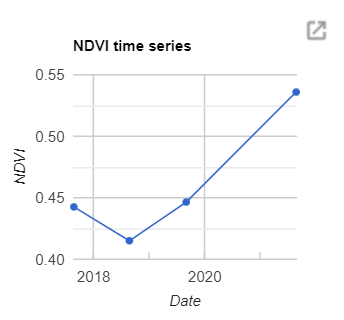
We can see how much NDVI has increased in 2021 relative to the earlier years, which makes sense when we look at the reflectance RGB composites - it is much greener in 2021! While this line plot doesn't show us a lot of information now, as the AOP data set builds up in years to come, this may become a more interesting figure.
On your own, we encourage you to dig into the code from this tutorial and modify according to your scientific interests. Think of some questions you have about this dataset, and modify these functions or try writing your own function to answer your question. For example, try out a different reducer, repeat the plots for different areas of the site, and see if there are any other datasets that you could bring in to help you with your analysis. You can also pull in satellite data and see how the NEON data compares. This is just the starting point!
Get Lesson Code
AOP GEE Internannual Change Exploratory Analysis
Footnotes
- To download the metadata documentation without downloading all the data products, you can go through the process of downloading the data product, and when you get to the files, select only the ".pdf" extension. The Algorithm Theoretical Basis Documents (ATBDs), which can be downloaded either from the data product information page or from the data portal, also discuss the uncertainty and important information pertaining to the data.
- The vertical resolution is related to the outgoing pulse width of the lidar system. Optech Gemini has a 10ns outgoing pulse, while the Riegl Q780 and Optech Galaxy Prime sensors have a 3ns outgoing pulse width. At the nominal flying altitude of 1000m AGL, 10ns translates to a range resolution of ~2m, while 3ns corresponds to 2/3m.
- From 2021 onward, all NEON lidar collections have the improved vertical resolution of .67m, as NEON started operating the Optech Galaxy Prime, which replaced one of the Optech Gemini sensors. This has a 3ns outgoing pulse width, matching the Riegl Q780 system.